Whenever I look at the Pilot Myu, I think of Concorde. And not just because of the strong visual resemblance.

The Concorde of pens, against a bright blue sky (well, paper)
Like Concorde, the Myu is an audacious design, unlike anything before (as long as we choose to ignore the Parker T1). Both the Myu and Concorde had their heyday in the 1970s, and simply nothing like them is produced today.
Breathe in the 1970s. I SAID BREATHE IT IN
And while both the Myu and Concorde were excellent at achieving their intended purpose, both had significant drawbacks.
But anyway, I’ll stop wringing out that comparison now.
Simple fact is, like most pen addicts, one look at the Myu was all it took for me. I had to have one. I ended up waiting several years before pulling the trigger, but all the while it was there in the back of my mind, calling to me.
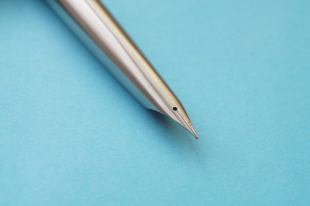
And that’s purely down to the star of the show, the swooping, Concorde-like integral nib. It’s visually stunning, an engineering tour de force, utter minimalist beauty.
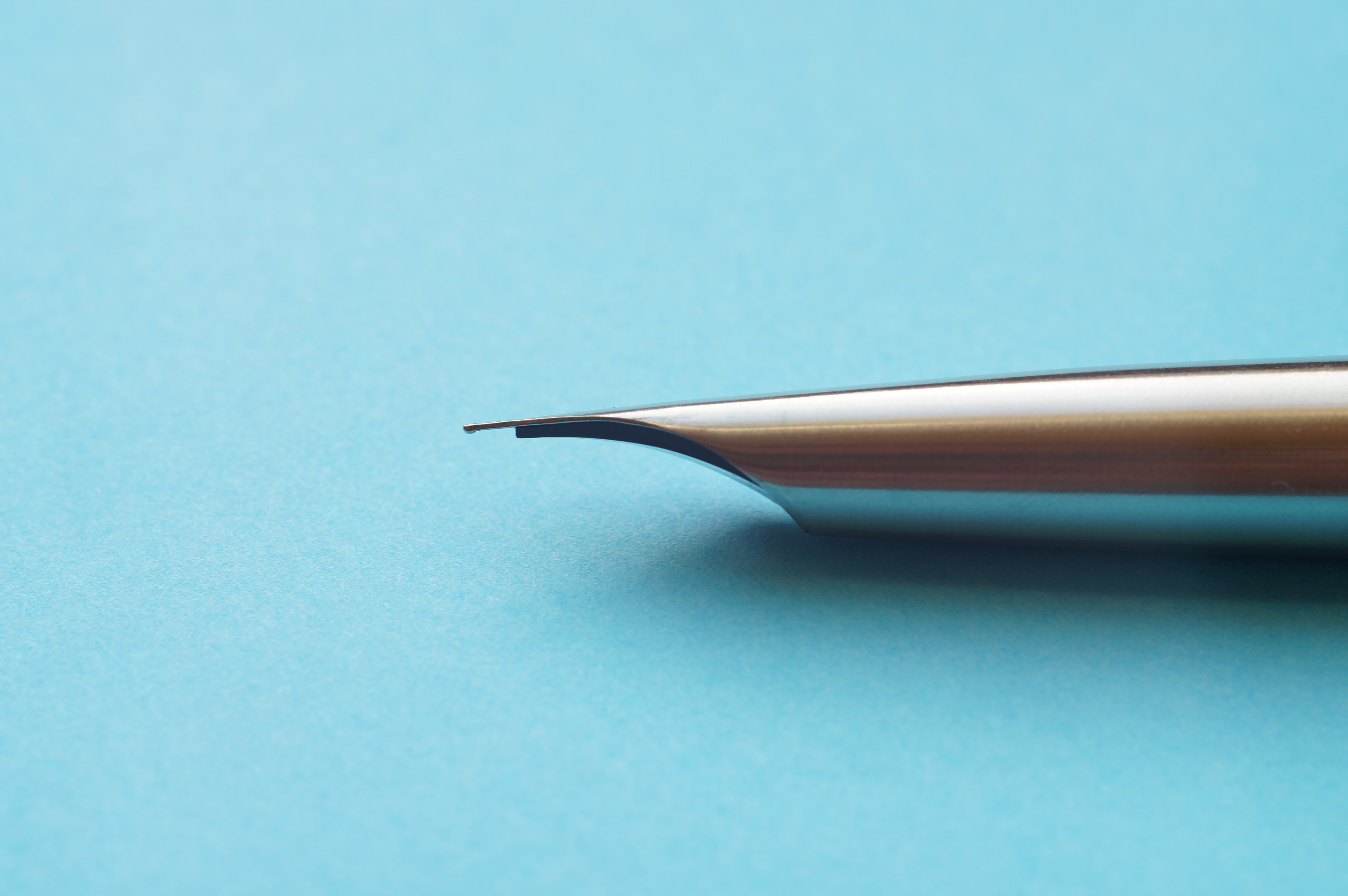
Those lines couldn’t get any cleaner.
I’ll be honest: literally everything else about the Myu is opposite my usual preference in pens. It’s a pocket pen in the extreme: super slim, super light, super short. It’s a steel nib, no bounce, no flex.
You can have any colour you like, as long as it’s brushed stainless steel.
But even so, I just had to have that design in my collection.
So I bought one. From a Japanese eBay seller, mint condition.
It arrived in a Jiffy bag, and after unwrapping it, my first reaction was: jesus, this thing is tiny. And light. We’re culturally attuned to associate weight with value; the lightweight Myu therefore felt cheap to me. I had a pang of buyer’s remorse, sitting there in the car outside the post office.
But uncapping it, wow, that nib is every bit as clean and gorgeous in the flesh as you’d imagine.
I rushed home to ink it, only to discover that the famous nib was ludicrously dry. Only a serious amount of pressure produced any kind of flow. I went through several agonising days of flushing, ultrasonic cleaning, soaking and experimenting with different inks, before admitting that the problem wasn’t dried-in 40 year old ink, but just a too-tight nib.
Five minutes with a brass shim and everything was good. A medium-wet, Japanese fine line, with a bit of toothiness but no scratch. In fact, the writing experience is rather pleasurable: light, precise, quick. Phew. Thanks, helpful Reddit folks.
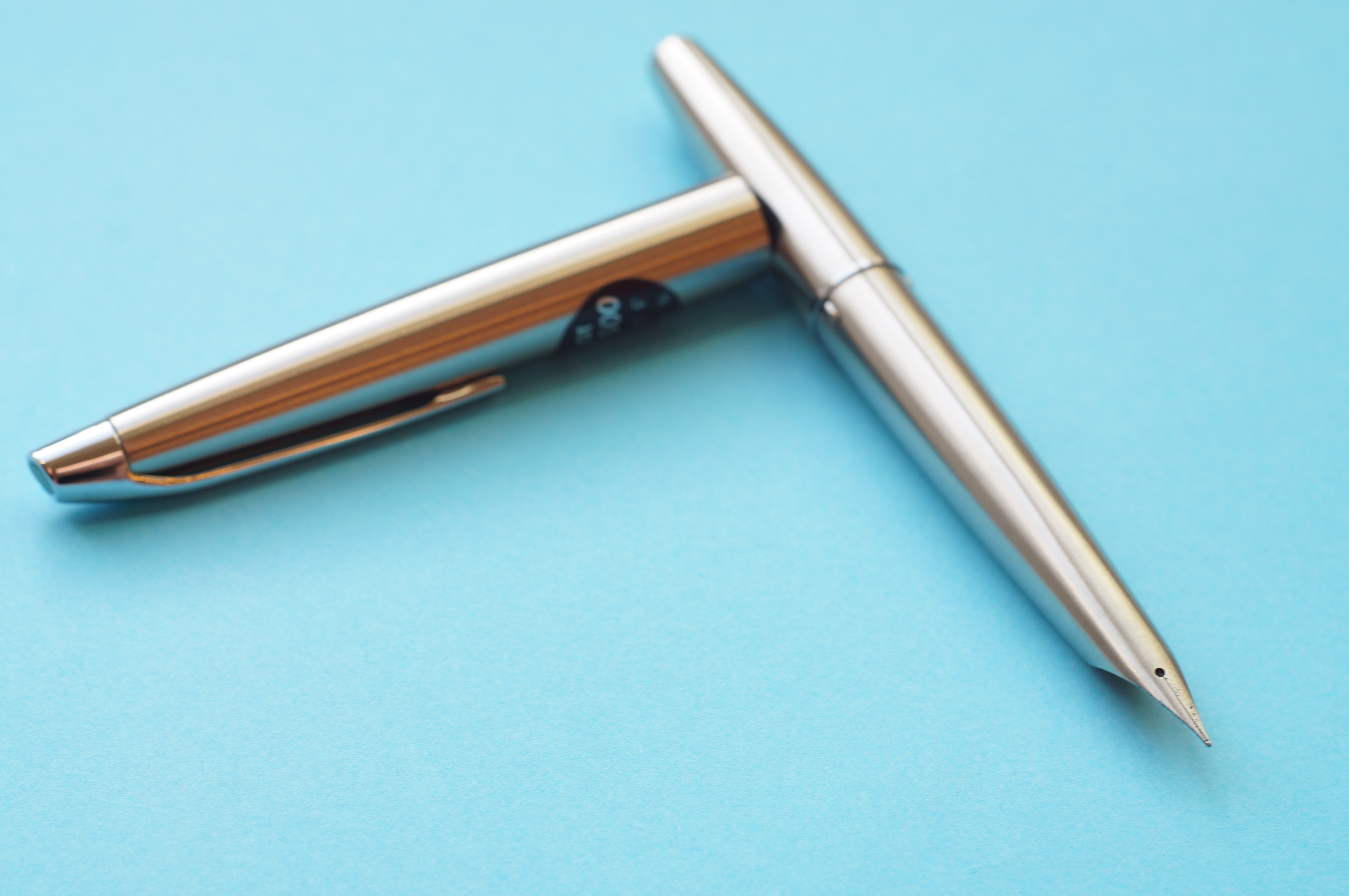
So what about the rest of the pen? The uncompromising focus on the nib has led to, uh, some compromises. The Myu is very slim and light, and the section slopes down toward the tip. I sometimes found that my grip slipped and needed adjustment (despite the brushed finish on the steel), and after short writing sessions my hand started to ache even using the Myu posted. This is definitely a pocket pen for quick notes. And, as a pocket pen, it’s great: the slip cap makes for quick access, and it’s slimmer than the Kaweco AL Sport, for instance.
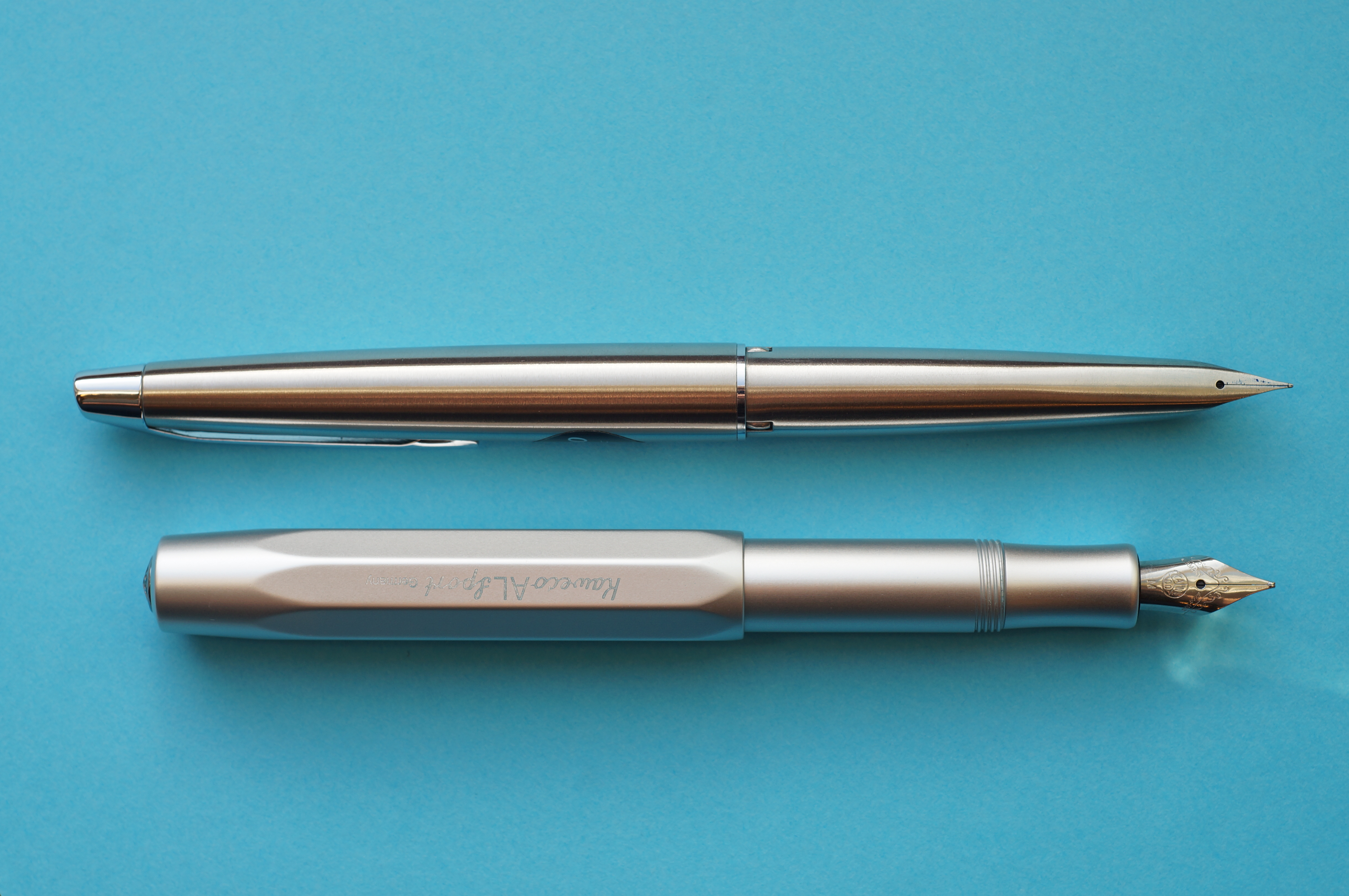
Never has the AL Sport looked so squat and chunky.
Really, for my kind of use journalling or in meetings, I should have got a Murex — but let’s face it, it doesn’t look as cool as the Myu.
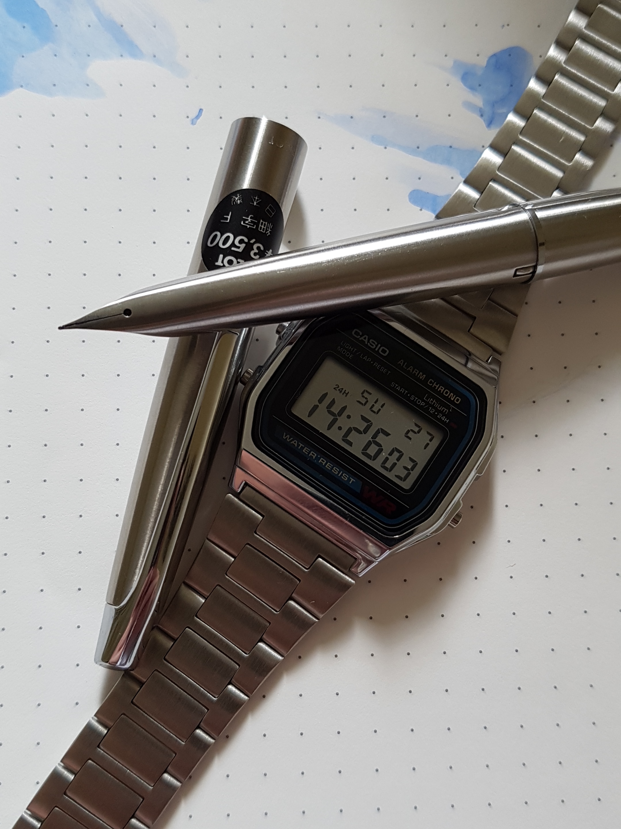
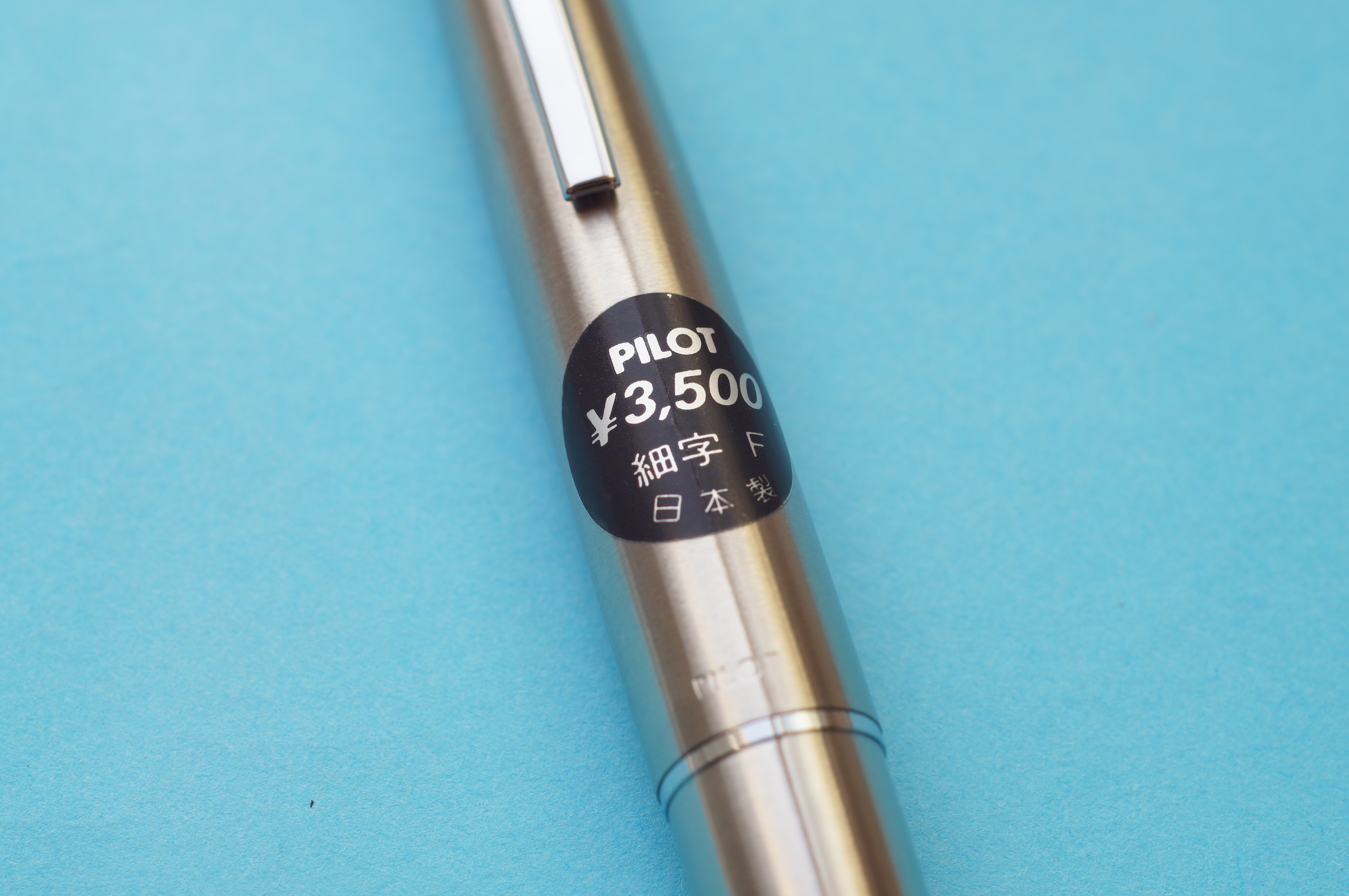
The Myu was originally a cheap-ish pen, at 3500 yen (or so the sticker on the cap tells me), and it’s stainless steel, so back in the 70s I probably would have chucked it in a pocket without worry. Nowadays, it’s far too expensive to consider doing that. I’d have clipped it to a pocket, but the clip is very tight. So I’ve been carrying it like my other pens, in a little slip case, or in my Nock.
This is one sticker I’m going to leave in place.
A CON-40 or CON-50 fits perfectly, so the whole world of bottled ink is available to you, without having to muck about with syringing cartridges or using mini converters. So it’s not all impractical.
At £200+ for the standard Myu, and twice that for the re-released Myu 90 from 2008, this is an expensive pen — especially considering there’s no gold nib, no fancy filling mechanism, no unusual materials. You’re paying for the unique design and the mythos that’s built up around this model in recent years.
Some of that mythos is justified. The design is graceful, efficient, purposeful. Like Concorde, it just looks right — and unfortunately, like Concorde, nothing like it is still being made today.
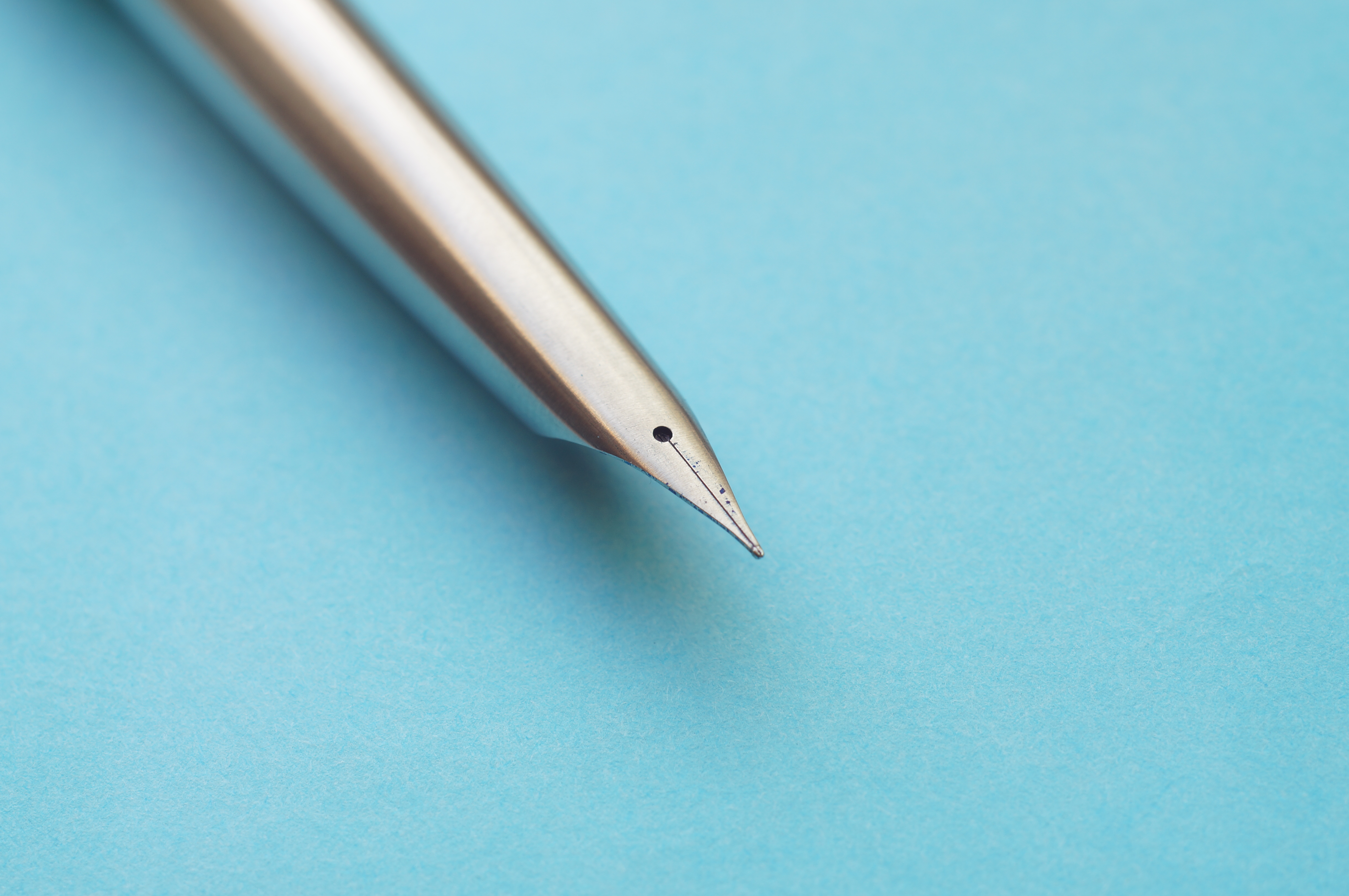
This nib would look wrong with BB tipping.
I use my Myu, and I carry it. It’s not a shelf queen. But I have to admit to myself that I enjoy it for the way it looks, not the way it writes. There’s nothing exceptional about that.
Is appearance alone enough to keep the Myu in my collection alongside some truly wonderful pens? For now, yes. And I certainly don’t regret buying it and getting to see this gorgeous nib up close.
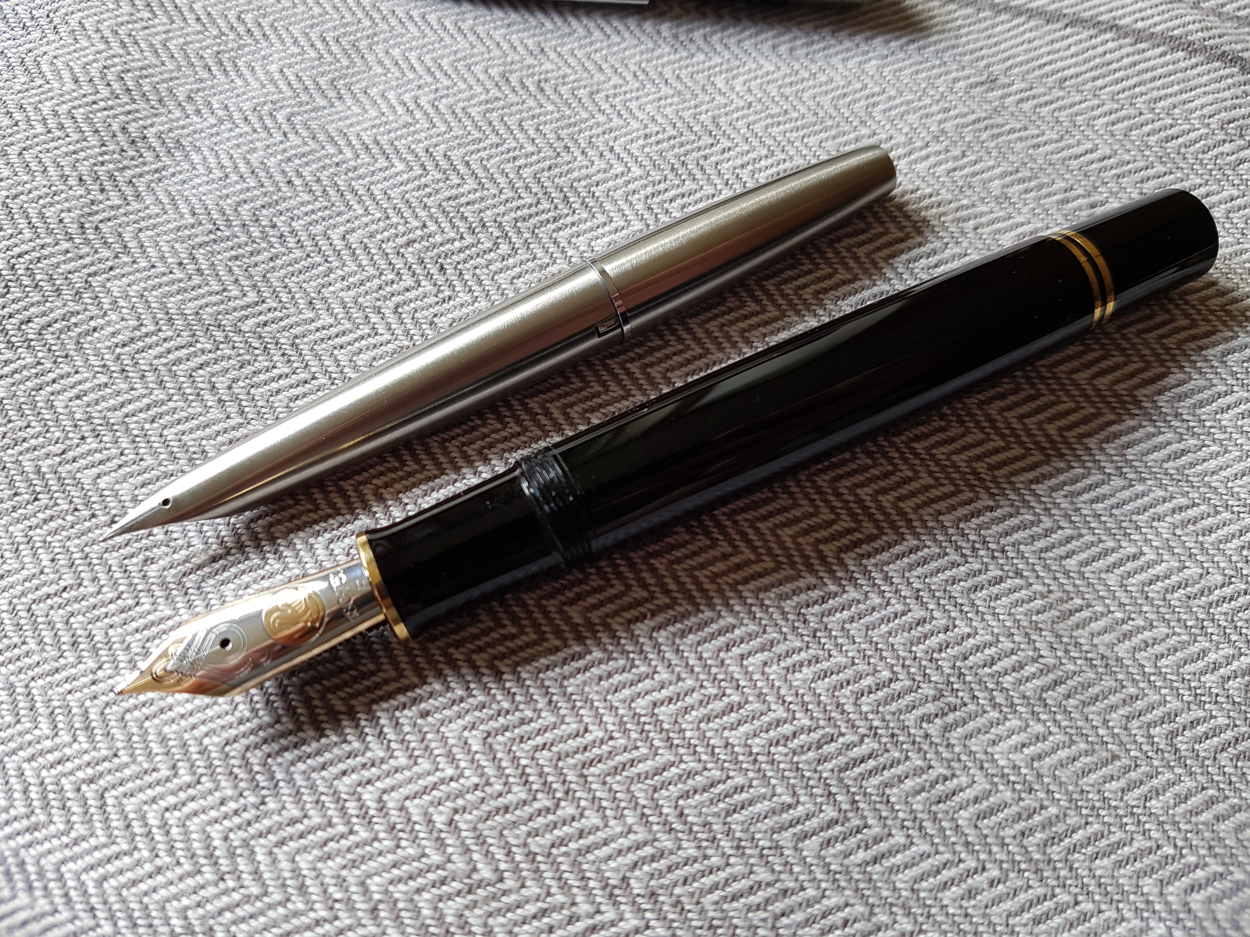
Chalk and cheese, side by side.
Dear collector
I have 2 new pieces of Pilot MYU and 5 new pieces of Pilot Murex
Any interest please to contact me by email
[email protected]