Let’s get the name out of the way first: the pen I’m reviewing here is the Montegrappa Extra 1930 Colori del Mare ‘The Sea’, a limited edition of 27 pens produced for Chatterley Luxuries (there are six other colours too, each in an edition of 15 pens). I’m going to call it the ‘Extra’ from now on to give my RSI a break.
This is one of those pens that I knew I was going to end up getting, even though I fought the urge for some time. The odds were stacked against me from the start:
- It uses the same beautiful blue celluloid as the Delta Fantasia that I borrowed from Jon at Pensharing, which I fell in love with.
- It’s a true limited edition, so I knew I had to buy it now or risk losing it forever.
- I’ve never owned a Montegrappa before, and was keen to try one (and hey, now I’ve got an Aurora too so with Visconti and Pineider my Italian range is getting pretty complete).
- As always, Bryant at Chatterley had an amazing price compared to other Extras available in the UK. “Just” $800.
- I was on a business trip to the US, so a window of opportunity arose.
Ah what the hell. I clicked buy. I couldn’t fight it any longer.
There aren’t that many reviews of the Extra around, given that it’s a long-running model. And I certainly don’t know of any reviews of this particular version. So it might be worth covering the basics to start with.
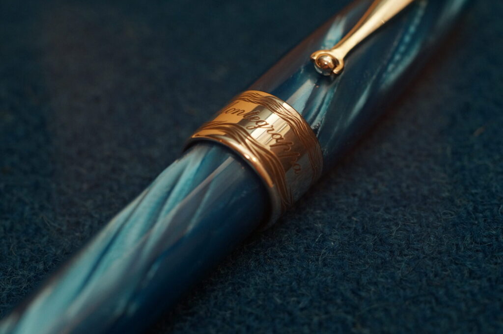
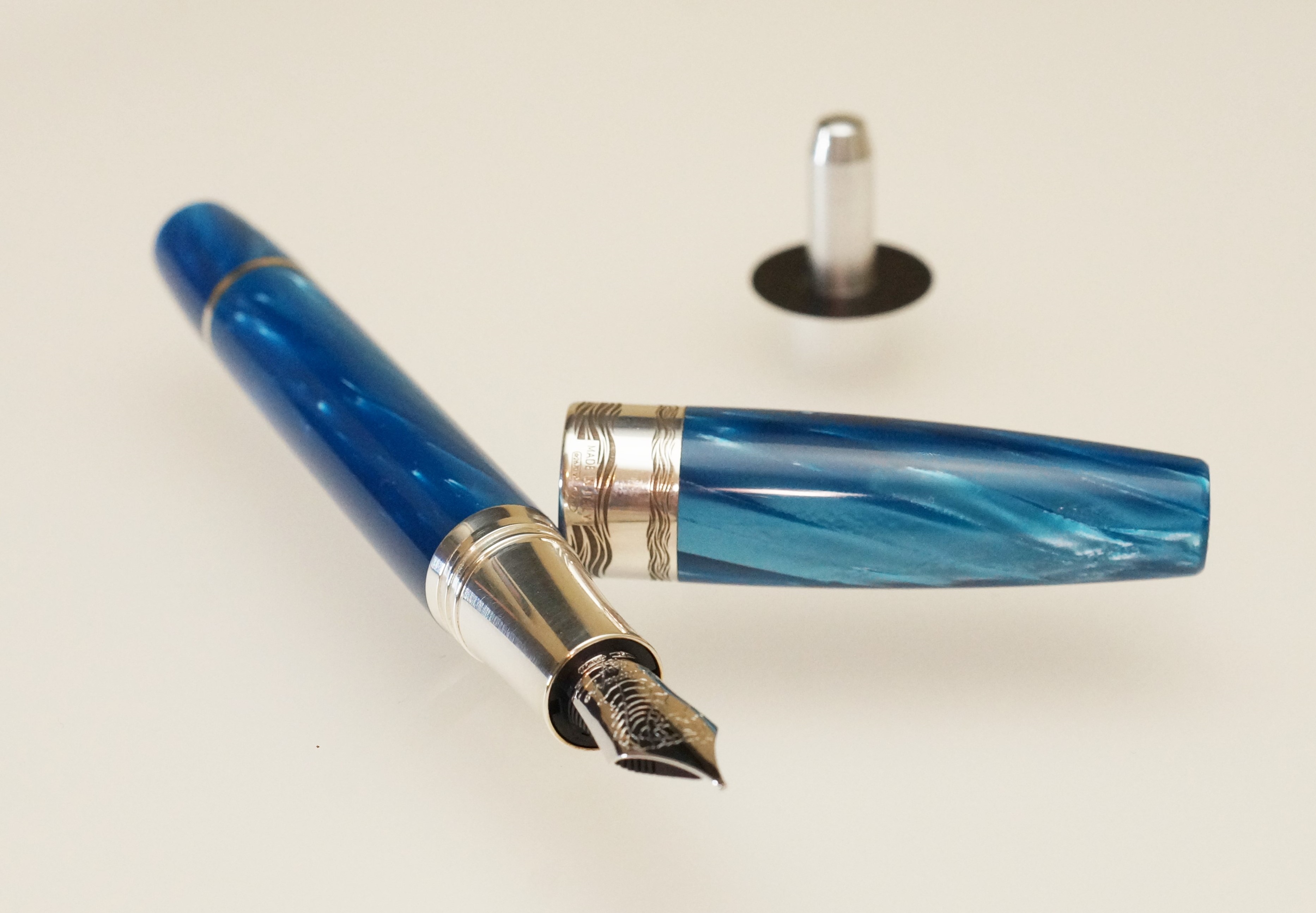
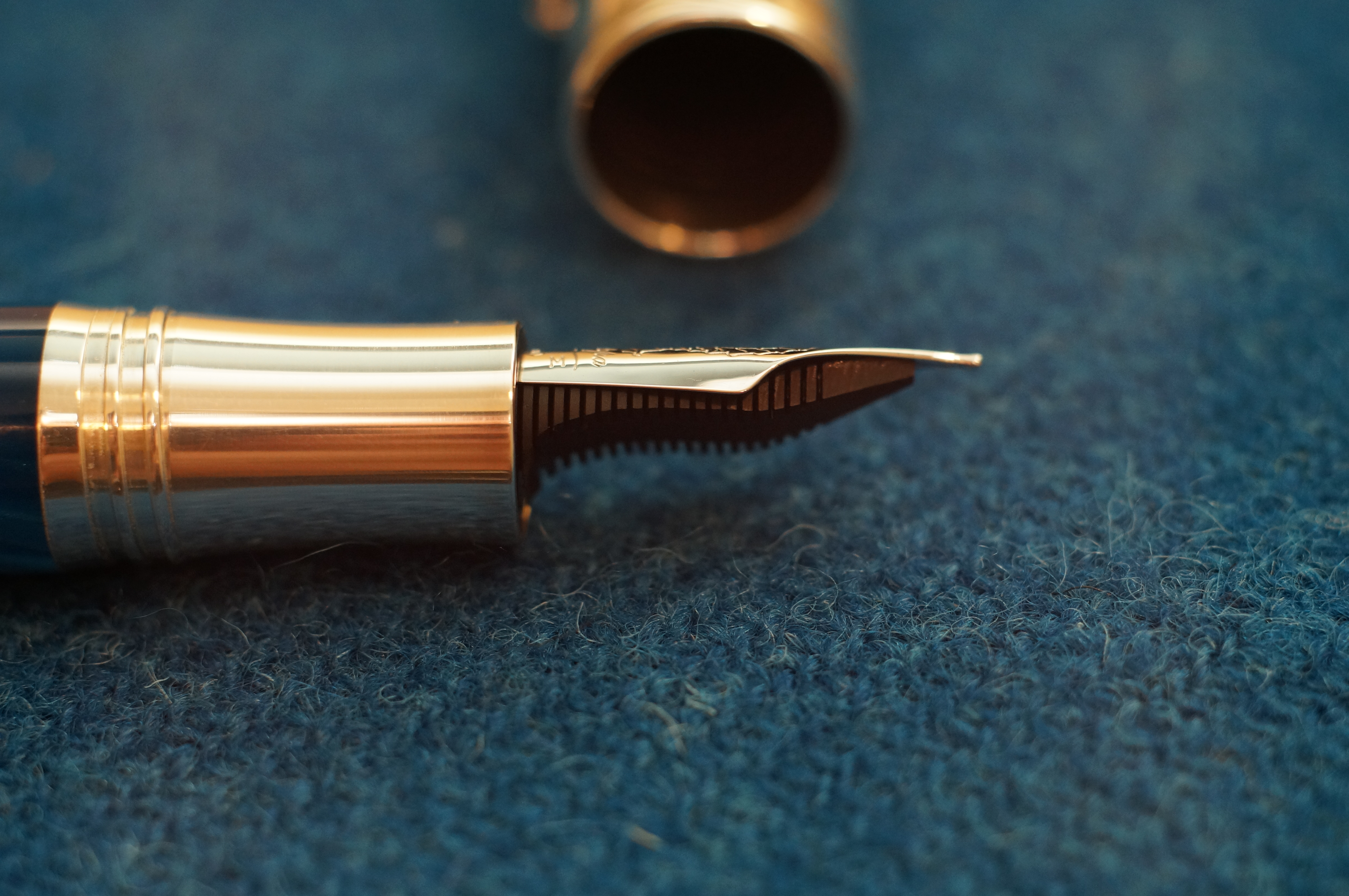
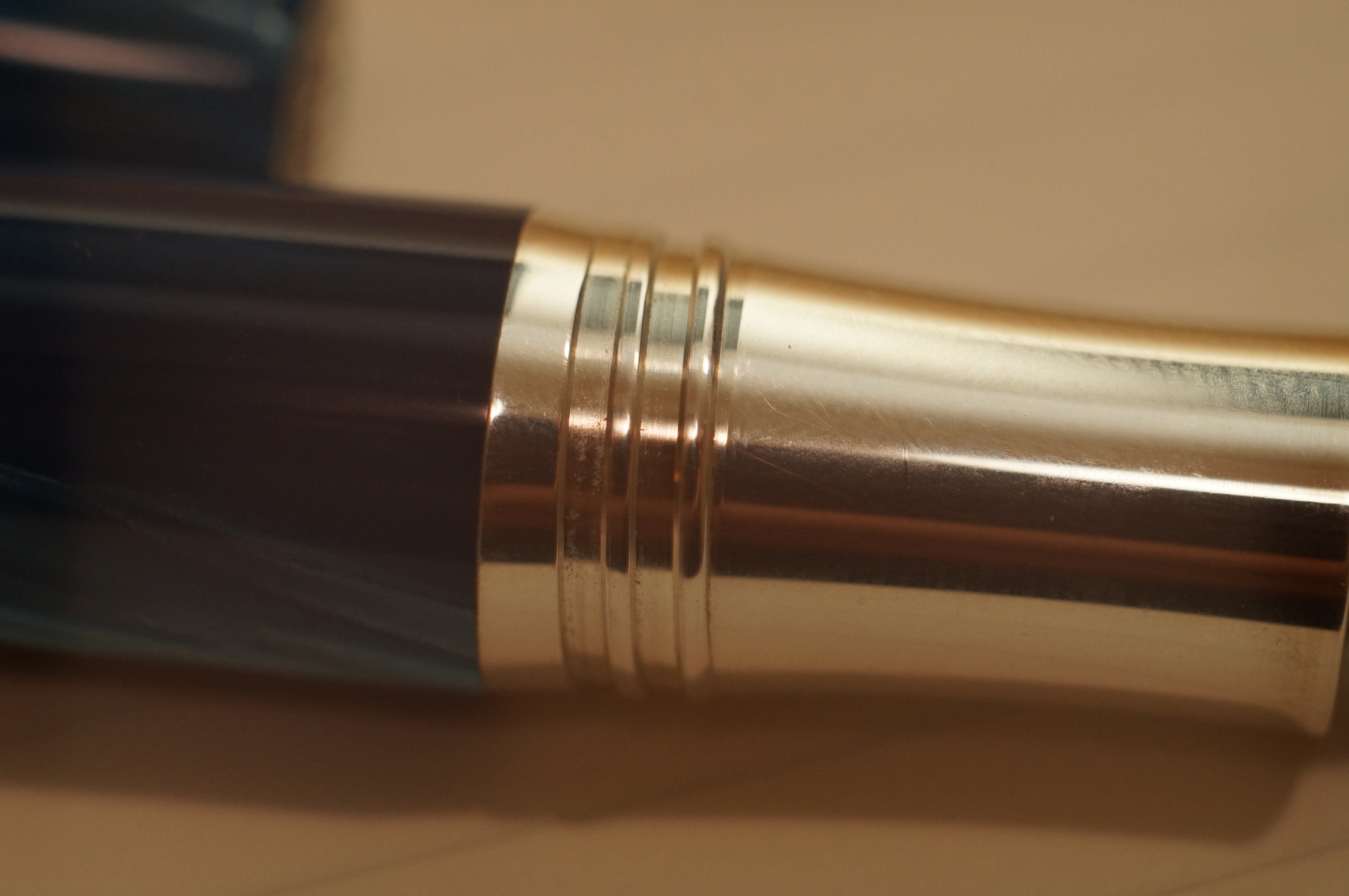
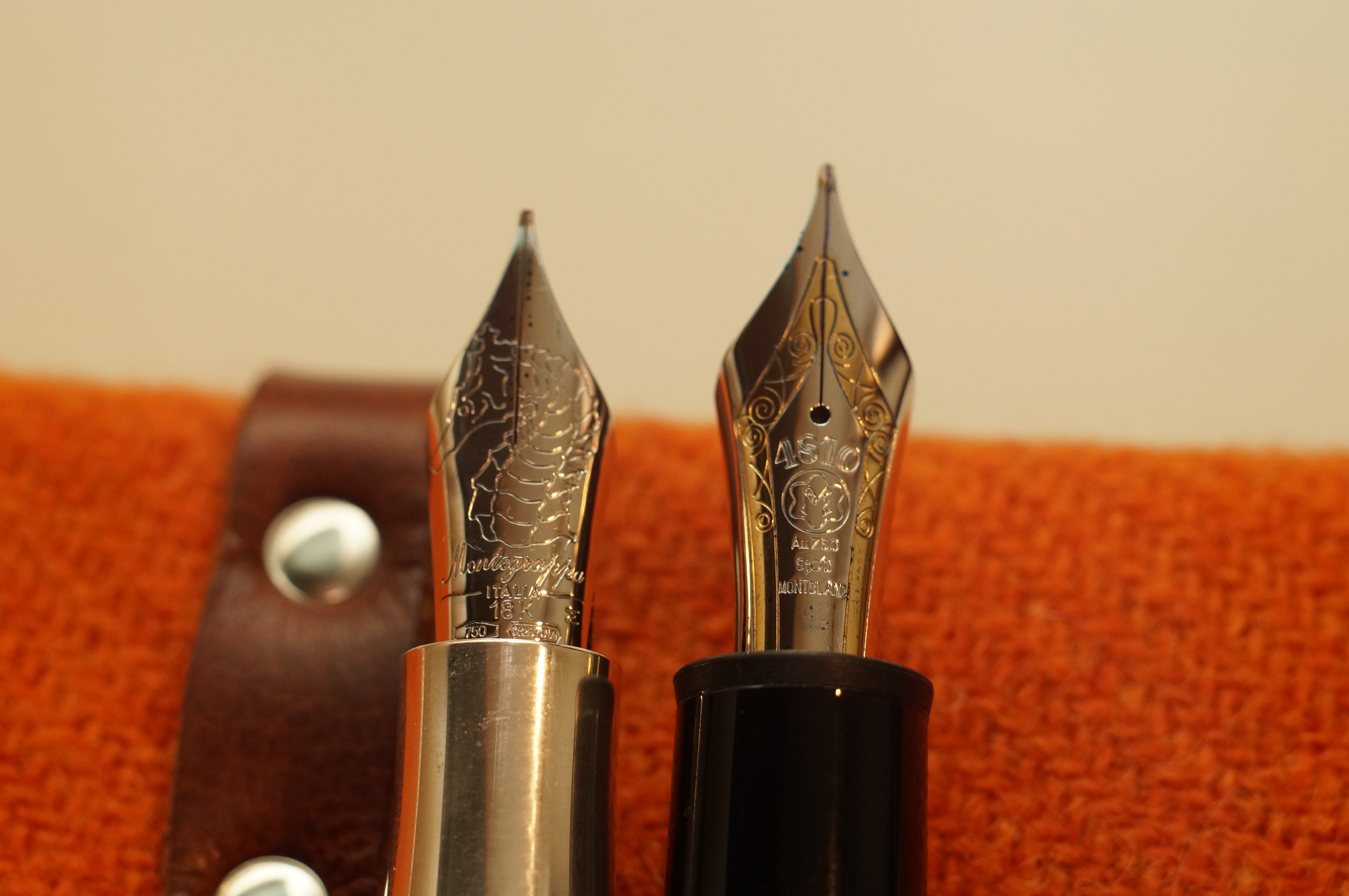
This is a short but chunky pen with plenty of weight to it. It has a large #8 18k gold nib without a breather hole, in single-colour rhodium. The section and trim are sterling silver. There’s an ebonite feed, and a ratcheting piston filler (the knob is flush with the barrel no matter how far it’s twisted). It’s a “mystery filler”: there’s no ink window.
It’s beautiful, but not in an understated way by any means. Everything is curved and blingy, although the particular Extra I chose is far from the most garish of Montegrappas — some of its designs are frankly ugly, in my opinion.
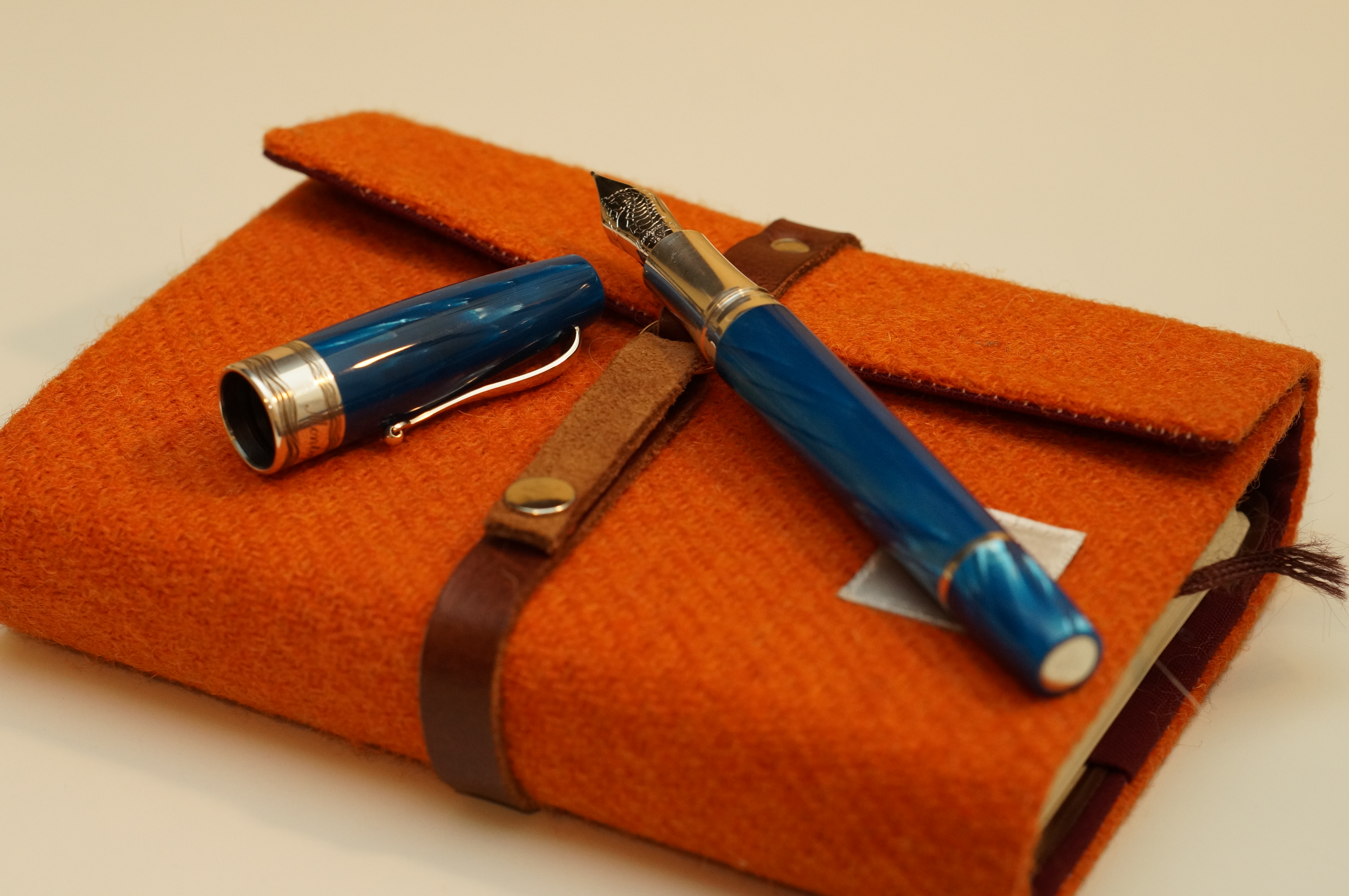
Just as I remembered from the Delta Fantasia, the blue celluloid shimmers and glows — it’s magical. Depending on angle and light, it ranges from deep-sea dark blue to brightest turquoise. Unlike the Pelikan Ocean Swirl, there’s no real green in it.
And the rest of the pen matches well. The silver is polished, the clip is flamboyant (but unusably tight).
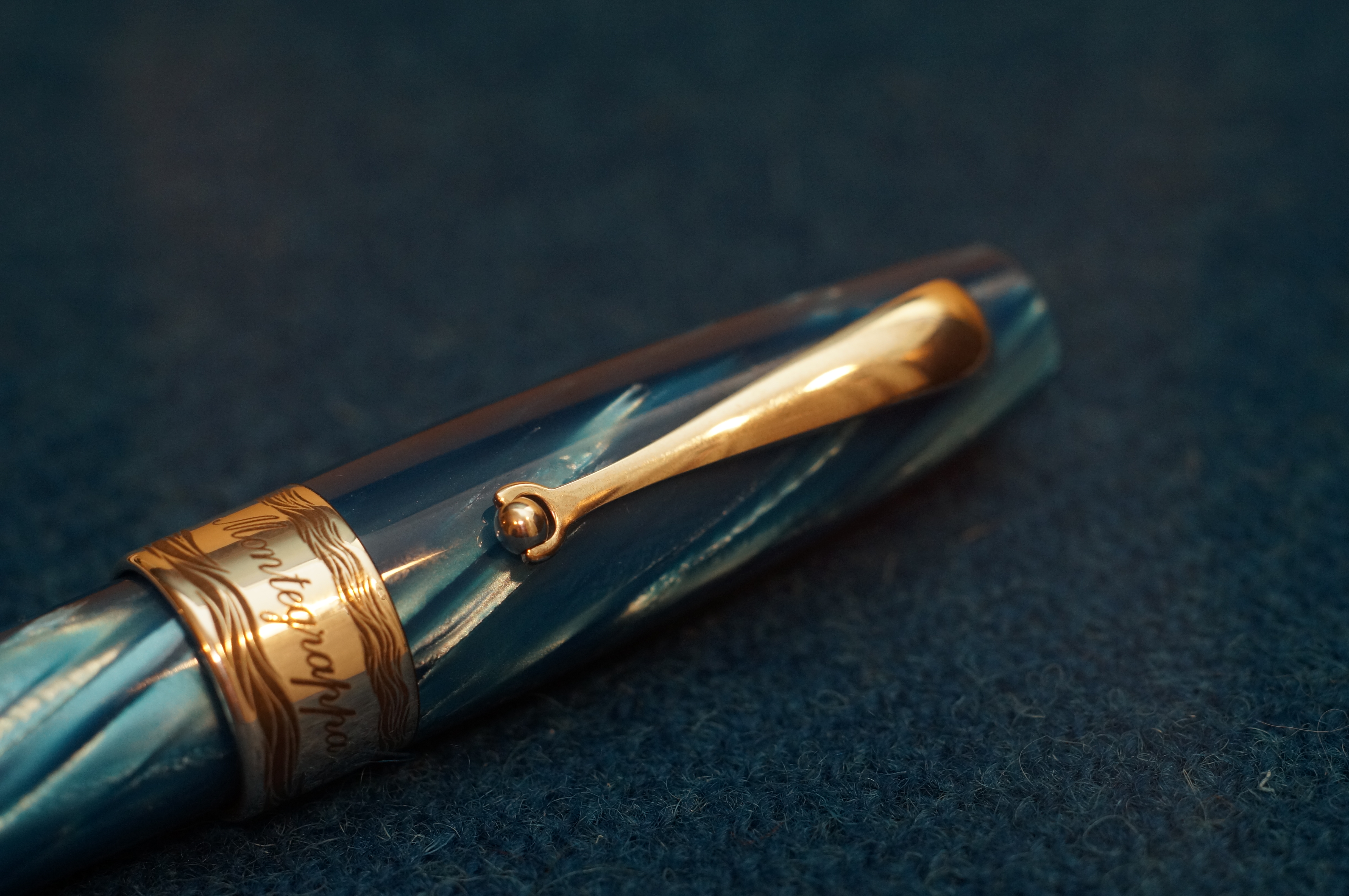
There’s the world’s fattest cap band, decorated with waves instead of Montegrappa’s usual Greek key or Art Deco designs.

The rhodium-coated nib has a huge seahorse on it. Did I mention that this range is all about the sea, in partnership with 4Ocean? It even comes with a recycled plastic bracelet in the enormous box.
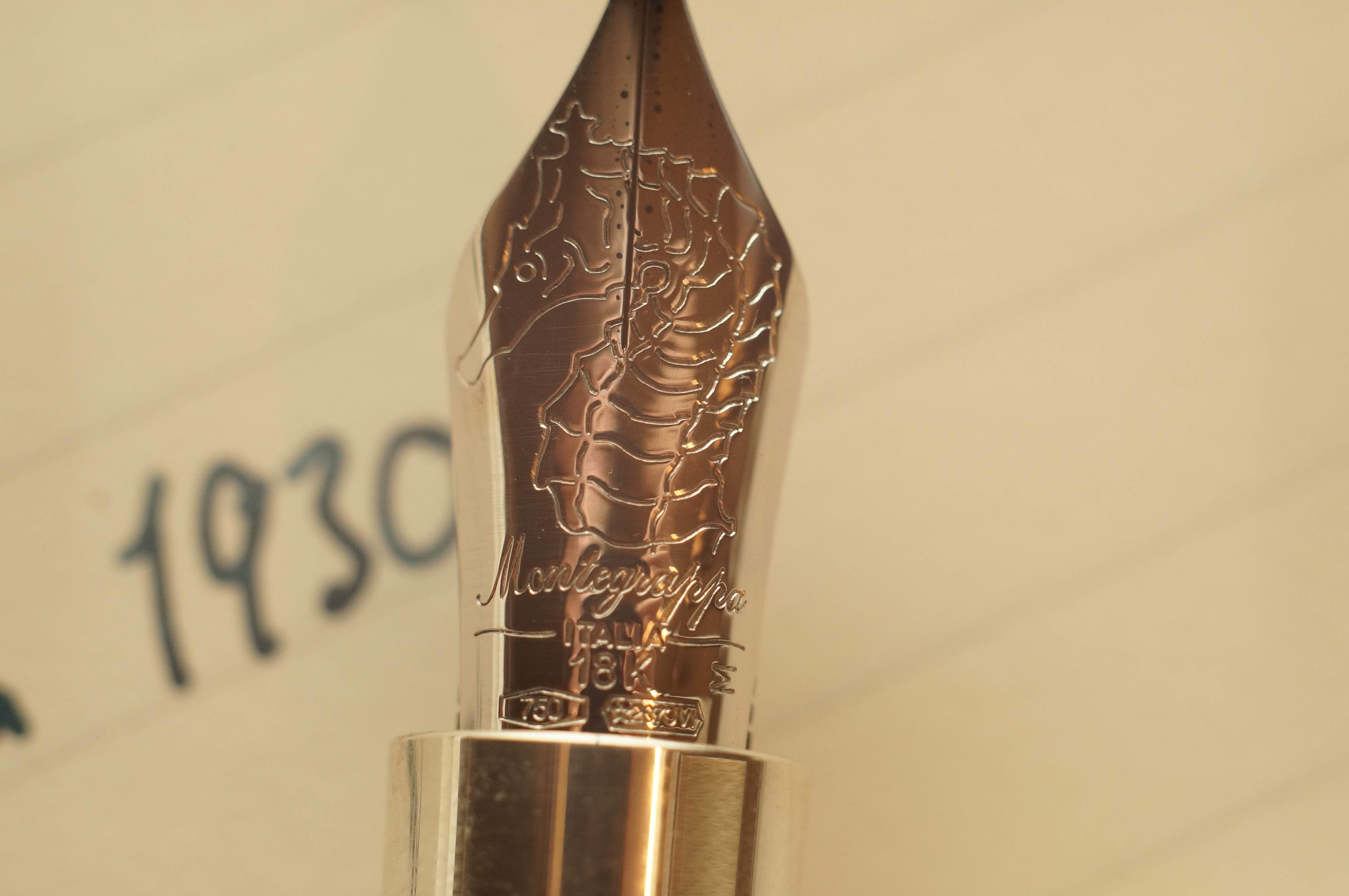
Even the feed is curved like a wave, beautifully.
On the cap finial there’s Montegrappa’s 1912 birth year; on the end of the piston knob is a rather cheap-looking flat disc with my serial number etched (10/27).
But that’s my only complaint about fit and finish — otherwise the polish is flawless, metalwork smooth, no gaps or rough edges or inconsistencies in the design.
The cap twists off very quickly. The threads on the section are squared and robust; there’s a plastic insert in the cap to prevent any squeaking. The cap snugs closed very positively.
Uncapped, I find the Extra extremely comfortable. The section is metal, but it’s broad and subtly concave and I find it fits my fingers well. There’s no step back to the barrel. This is a heavy pen and a lot of the weight falls to the back where the piston knob is, but because it’s quite a short pen I don’t find this a problem. Those with smaller hands might do.
My nib is a fine. Although it’s a number 8 nib, it’s somewhat recessed into the section so it’s not as large as that on the Montblanc 149, and the waist doesn’t taper in so much, so the overall shape is not so graceful.

On the page the nib writes quite soft, but not as much as say a Pelikan M1000. It’s moderately wet, but not crazily so, and I was actually expecting more given that it’s an Italian pen with an ebonite feed. I have it filled with Birmingham Polar Bear right now; Birmingham inks in my experience run wet and I still find it perfectly usable.
The tip is smooth and very rounded, and I need no pressure to lay a good line, although sometimes there’s the tiniest bit of hard starting — although the cap is completely airtight, often the ink is darker for the first couple of words, which suggests a degree of evaporation. This isn’t enough to be a problem for me though, and I am easily infuriated by hard starting. I certainly have no itch to have nib work done — I’m happy with the way it writes.

The piston works well and the nib is easy to clean after a fill, although I admit I really do miss having an ink window. I ran dry mid-sentence in a meeting after my first fill, which is a pian.
The Montegrappa Extra 1930 Colori del Mare The Sea is a serious flagship pen. It’s big, heavy, made of premium materials. It looks beautiful in an attention-grabbing way. It’s comfortable in the hand (as long as you don’t mind the weight) and the nib writes very well. I often find myself picking it from my pen case just to look at, and finding excuses to write with it. All good signs.
To me, the Montblanc 149 is similarly priced but a much more practical writer. The lighter weight, ink window, and more robust stiff nib lend themselves better to daily use. The Pelikan M1000 is cheaper, with a softer nib and again an ink window, but a much more conservative style. A Visconti Opera Master would be good competition — both have metal sections and a range of beautiful colour options, but the Operas are longer, thinner, more angular — not as voluptuous as the Montegrappa.
This post comes hot on the heels of one about the practicalities of reviewing expensive pens — the Montegrappa is a perfect case in point. It’s expensive, heavy, ostentatious and to some extent impractical; it’s a strict limited edition. Literally on paper it writes no better than pens one-sixth the price — there is no logical reason for me to recommend it to you. Yet I really enjoy owning it, and I want to inform you that Chatterley still has several Extras available if you are interested in joining my club.
Congrats on the L/E Extra. It reminds me of my ‘snakeskin’ Delta, the body of which is a joy to hold and turn in your hand. But the Extra has the gold nib, the sterling silver section and the groovy piston filler so you are getting a lot more for your money. Enjoy!
Hope to see you in London on the first to show it to you in person!
Great. I hope to be there.
I picked up the yellow (Sun) version of this, also with a fine nib, at the Dallas Pen Show, and by coincidence, just inked it for the first time today, with J. Herbin Rouge Grenat. I don’t like the nib and cap band decorations on this pen quite as much as the traditional Greek-key motif on my Bamboo Black Extra 1930, but the yellow celluloid is so lovely that I don’t care. This is one of a dozen new-to-me pens that I’ll be taking to the Fort Worth Pen Club meeting tomorrow night. Thanks for the great review of this beautiful blue pen.
You have fine taste, Jim! And good choice with Rouge Grenat. I’m sure a few folks at the meeting will be feeling a pang of envy when you show them your haul 😎
Great. I hope to be there.
This is an absolutely beautiful pen. What I’m really curious about though is what kind of notebook you have pictured?
Thanks!
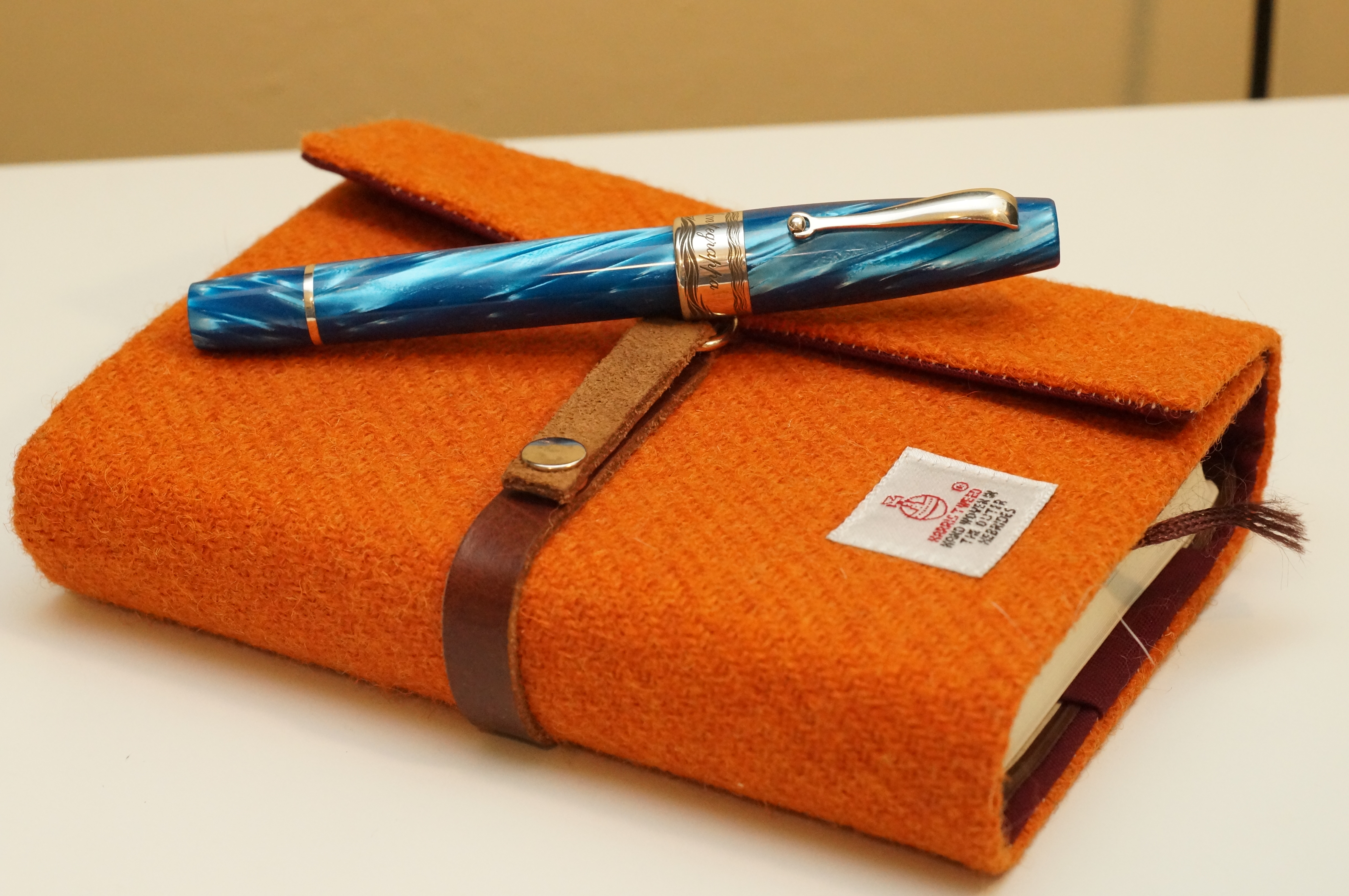
Hah, everyone asks! The orange one is a 5-year hobonichi in a tweed cover from Esplanade London on Etsy. Google.
I have just re-read your excellent review after handling a gorgeous Montegrappa Extra 1930 in Mediterranean blue at Harrods this afternoon. I started by looking at the retro Monte Grappa model, in coral but was then rather blown away by the Extra. One to add to the wish list, I fear!
Funnily enough I have been considering the same pen, wondering if I would be underwhelmed after owning the Extra!