As a vinyl lover, I often think about this cartoon from the New Yorker.
Funny thing is, it accurately sums up how I feel about the Montblanc Heritage 1912, too.
The pen costs about three times as much as the turntable.
Like vinyl, it’s expensive. Retail price in the UK is £755, which is even higher than the considerably more impressive-looking Montblanc 149. For your money you get what? A very simple-looking pen with a tiny 14k nib and no fancy materials.

The 149 definitely looks like better value…
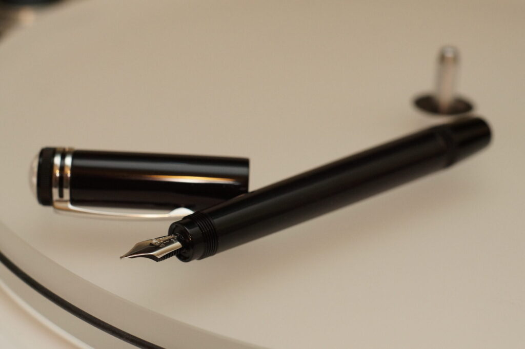
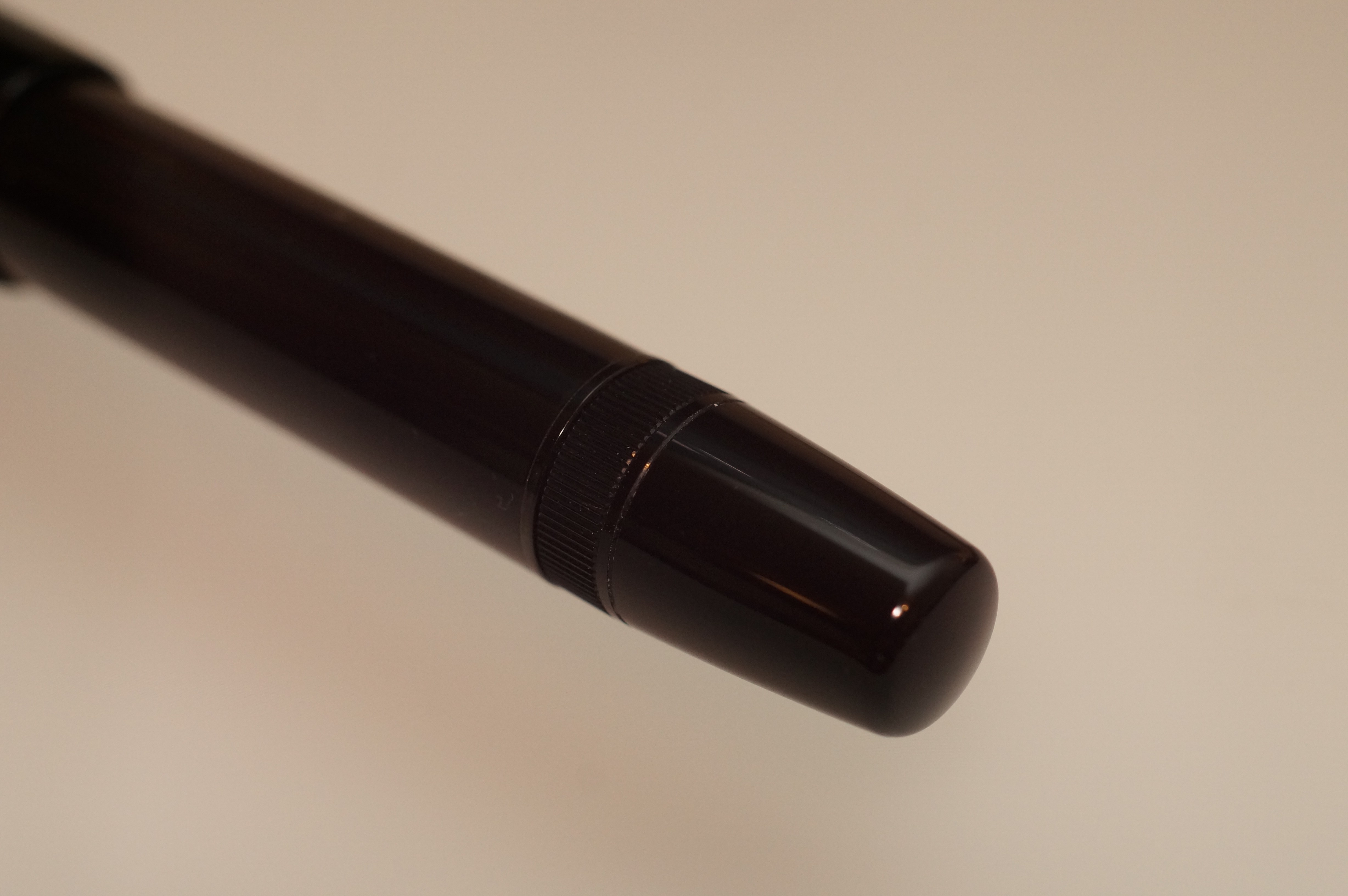
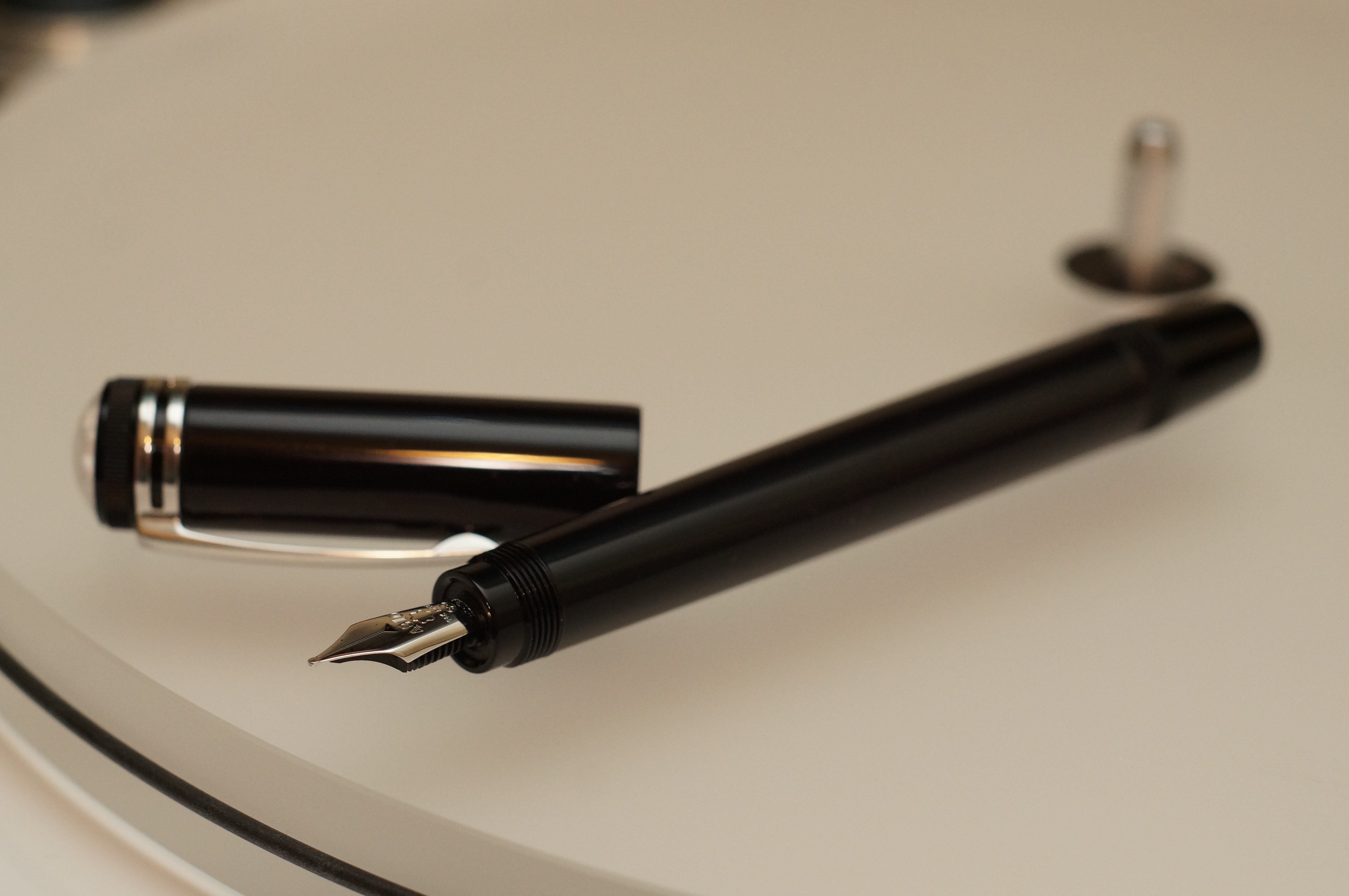
And the 1912 is certainly inconvenient, even moreso than most fountain pens. That’s because it has a retractable nib, in homage to the vintage Simplo Safety Filler. So to write with it you first have to remove the cap and then twist out the nib. When you’re done, you have to wind the nib back in and then re-cap. This is not a pen for quick notes.
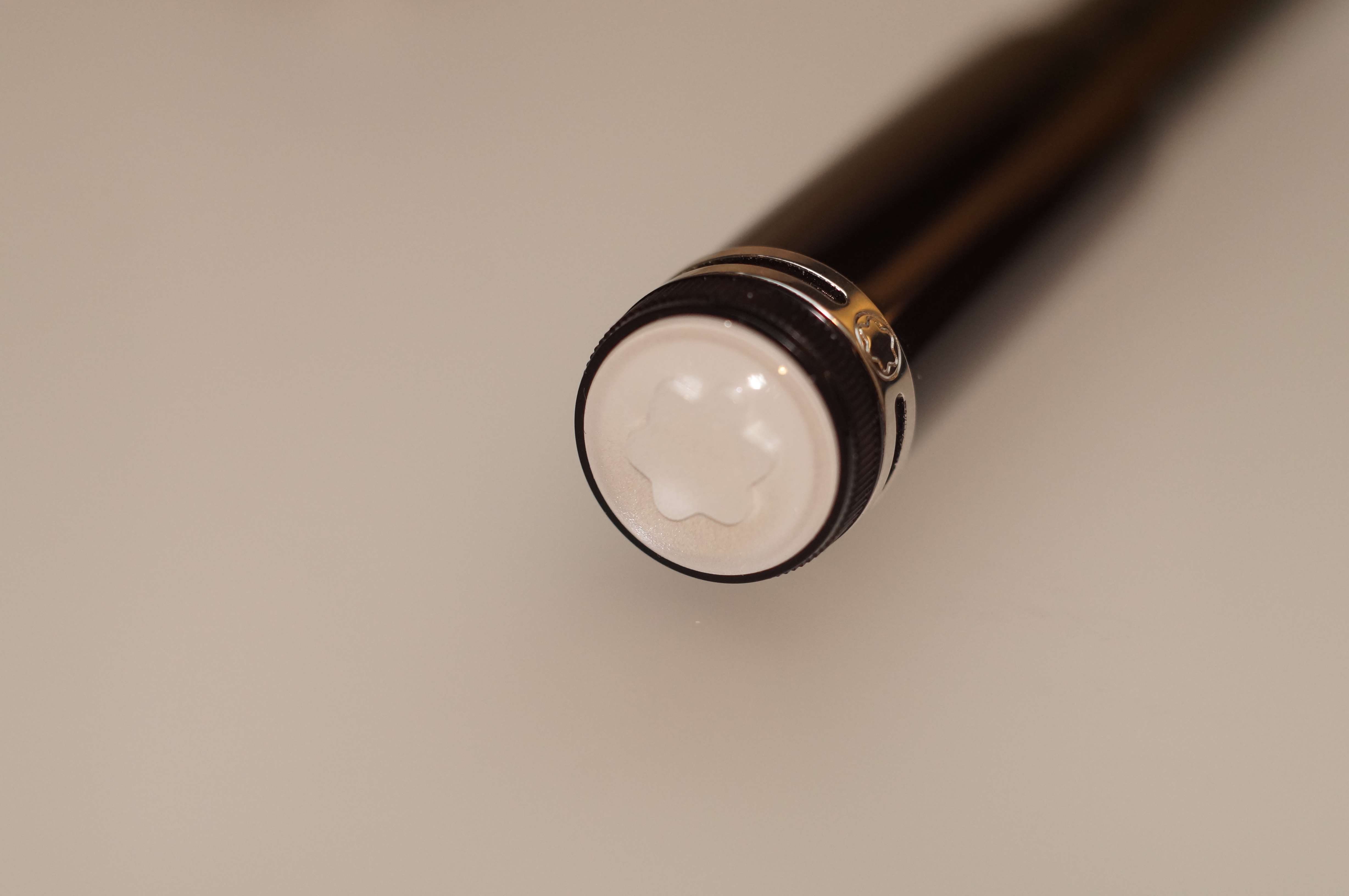
The nib is shy.
That’s not all. The cap doesn’t post. And it’s a “mystery filler”: a piston filler without an ink window, so you never know how much ink you have left until it runs dry on you. And since the 1912 holds less than 1ml of ink, that may happen at any time.
Just like vinyl, the 1912 makes not a jot of sense. And yet, once you experience it the appeal is unmistakable.
I recently went on a business trip, and found myself unable to get in the taxi to the airport until I had it safely in my jacket pocket, like a weighty talisman. Not many pens do that to me.
Here are the five things that captivated me.
Magical design
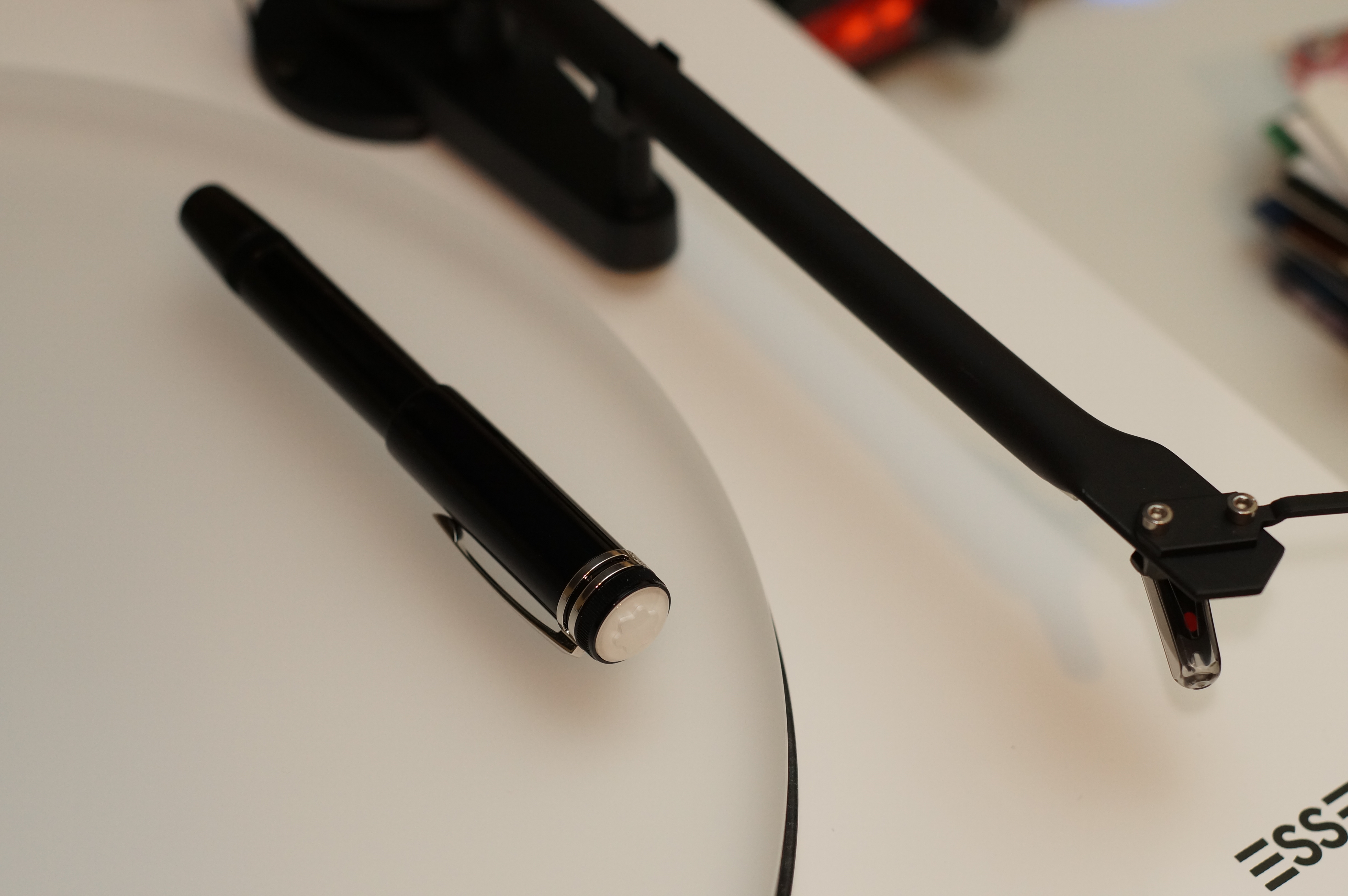
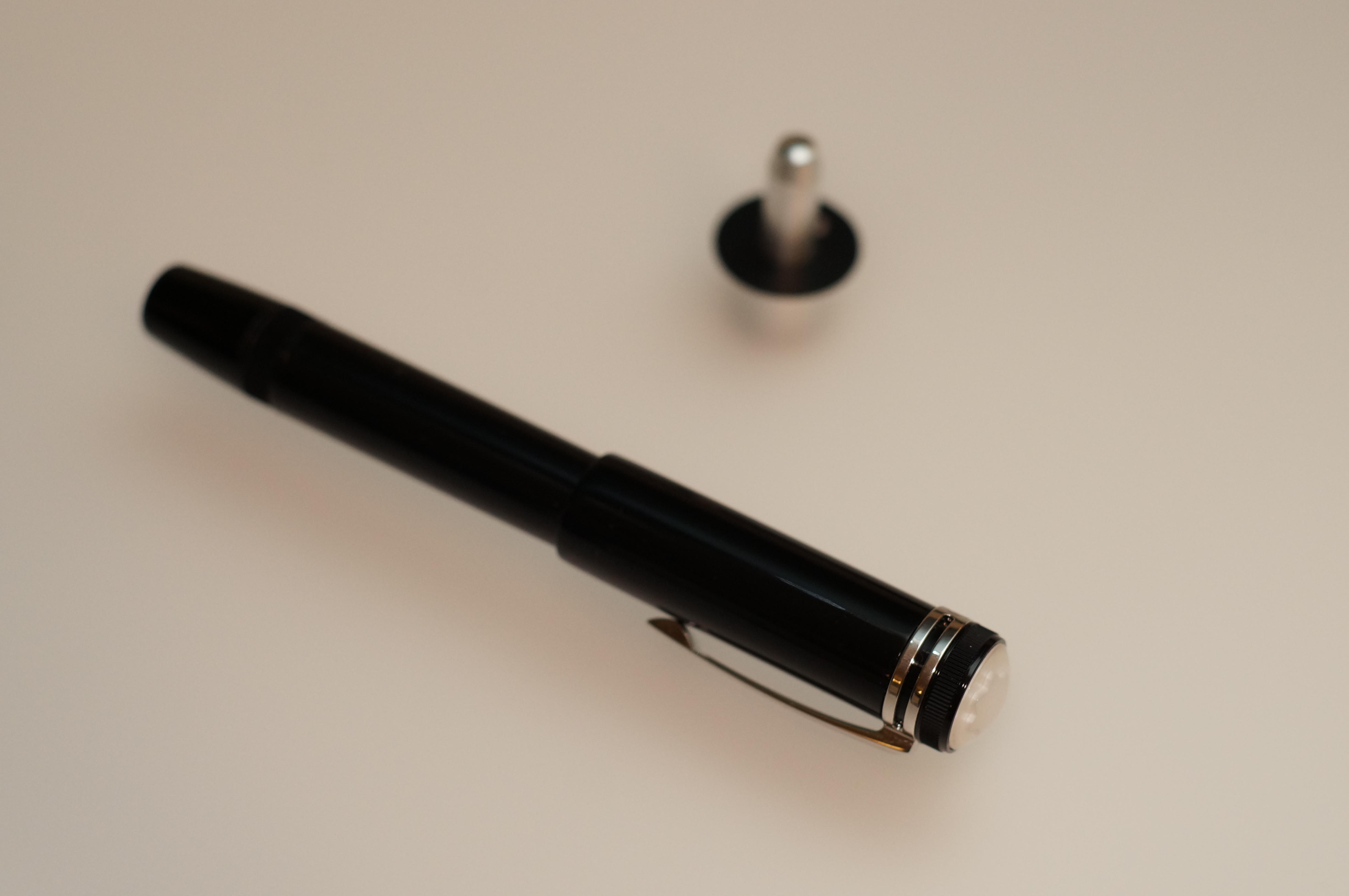
With the cap on, this is a short, stout pen. Then you take the cap off and magically there’s a normal length barrel inside. A quick twist of what would, on a normal pen, be a piston knob and the nib glides out silently.
This knob controls both nib and piston. Clever.
Pull on the knob and it converts into a knob for the piston filler. It’s an ingenious and elegant mechanism. So when I say “design”, I’m not talking about style; the 1912 is a marvel of engineering.
There’s a lot of engineering hidden in there.
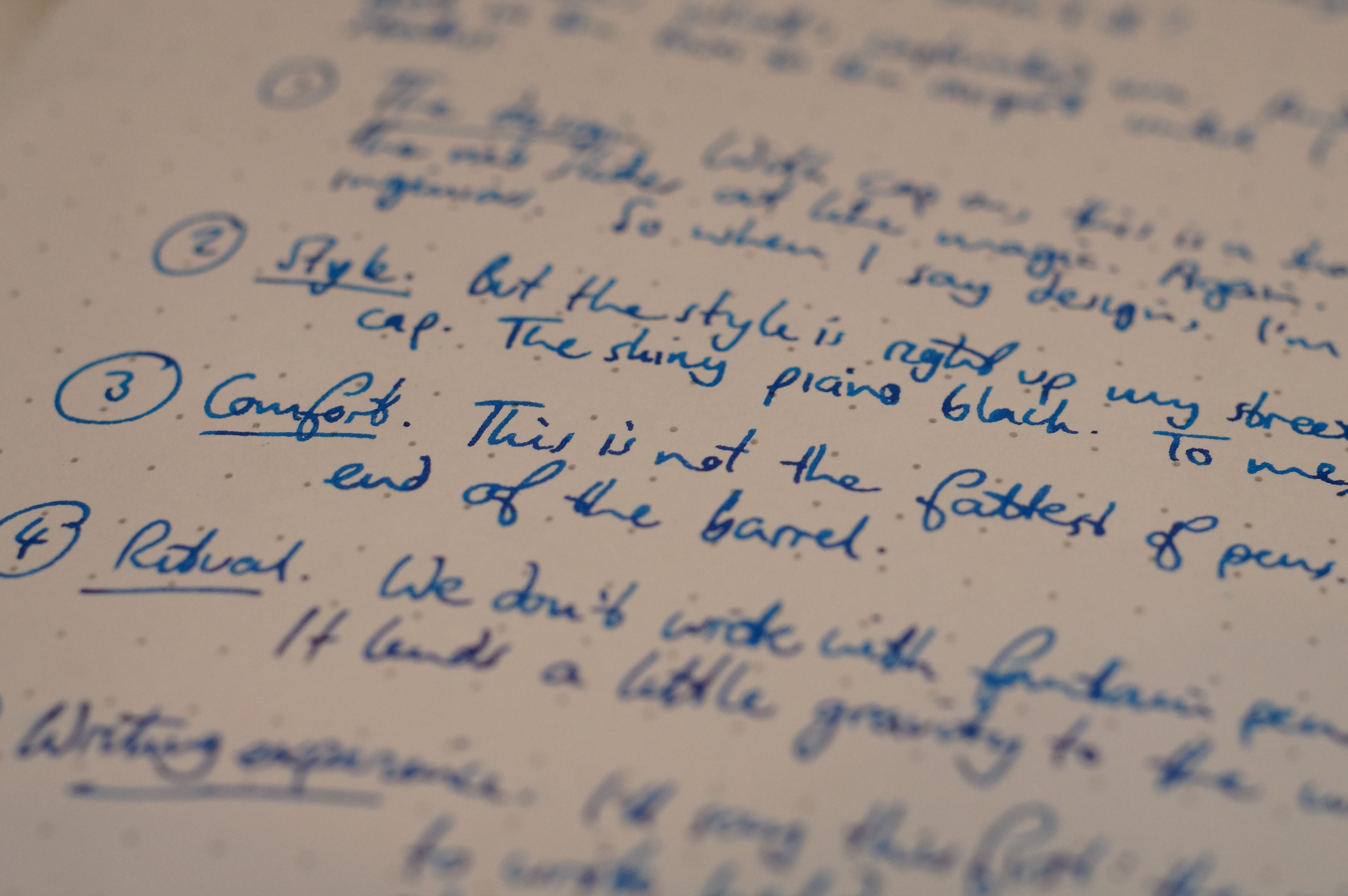
Classic styling
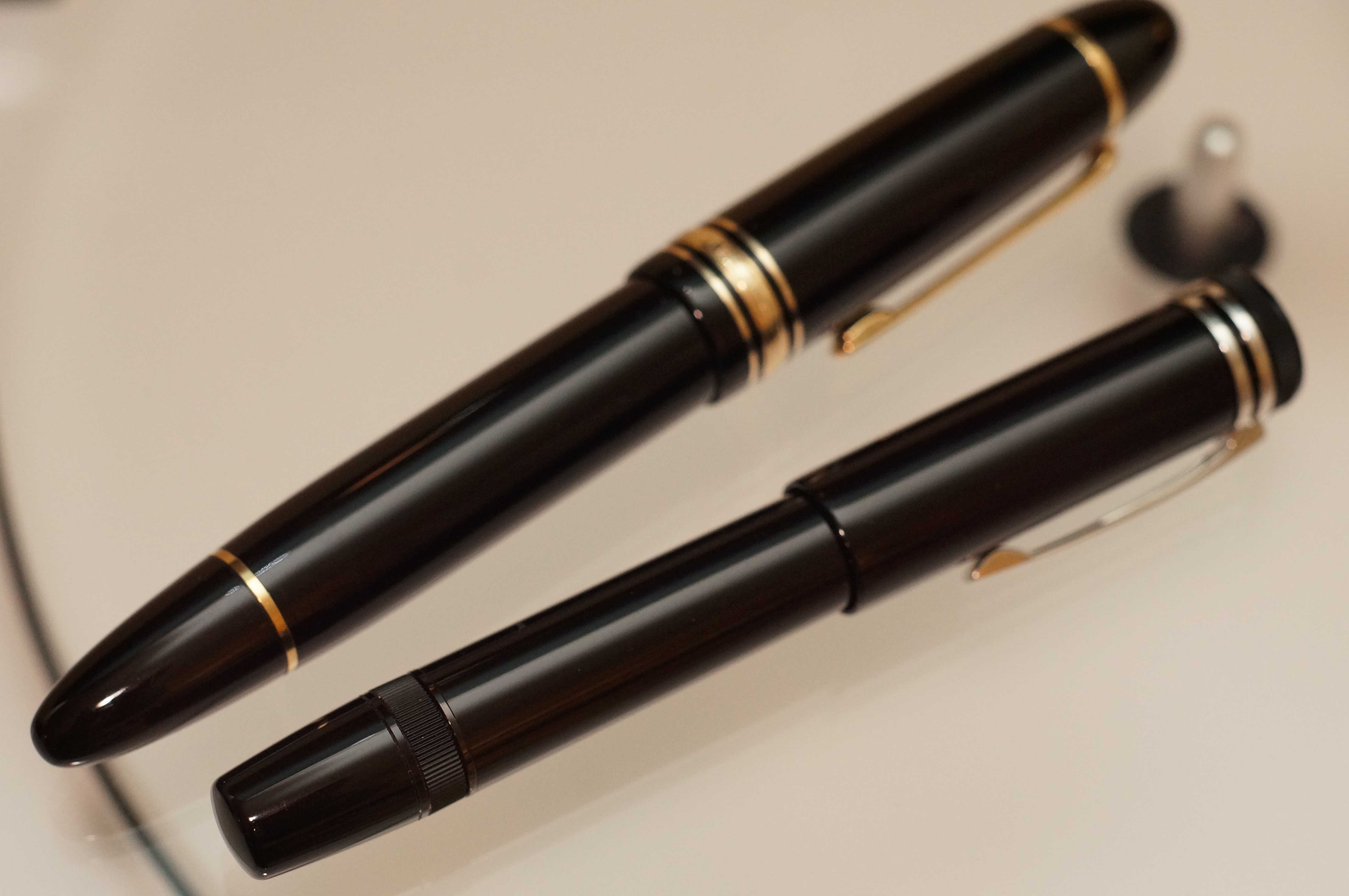
Some people say the 1912 is boring, apart from the huge domed snow peak on the cap, which others call vulgar. Sure, the pen is top to toe in black “precious resin”, over the top of weighty brass. It’s a minimal design: no cap band or finial.
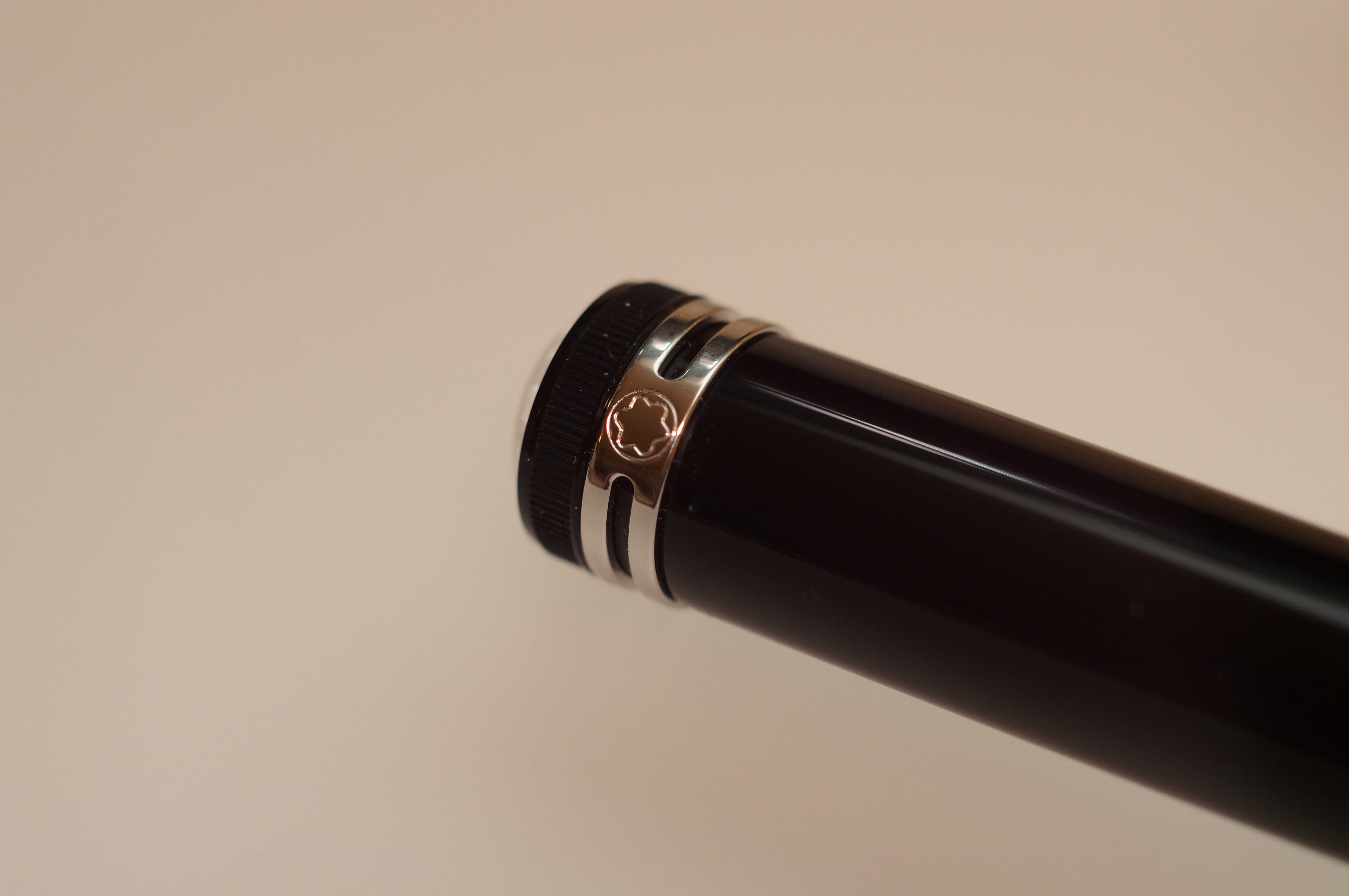
Two bling rings instead of five.
But the details are lovely. The bands of ribbing on the filler knob and around the head of the cap echo vintage pens like the Simplo. The twin silver rings that mount the clip look art deco to me, and the clip itself has subtle faceting and curves that elevate simplicity into grace.
I think the whole design of the clip is gorgeous.
Against the piano-black gloss finish, the snow peak shimmers. Under its clear dome it’s lacquered with mother of pearl.
I could look at this for hours.
To me, the styling is cohesive and beautifully understated.
Weighty comfort
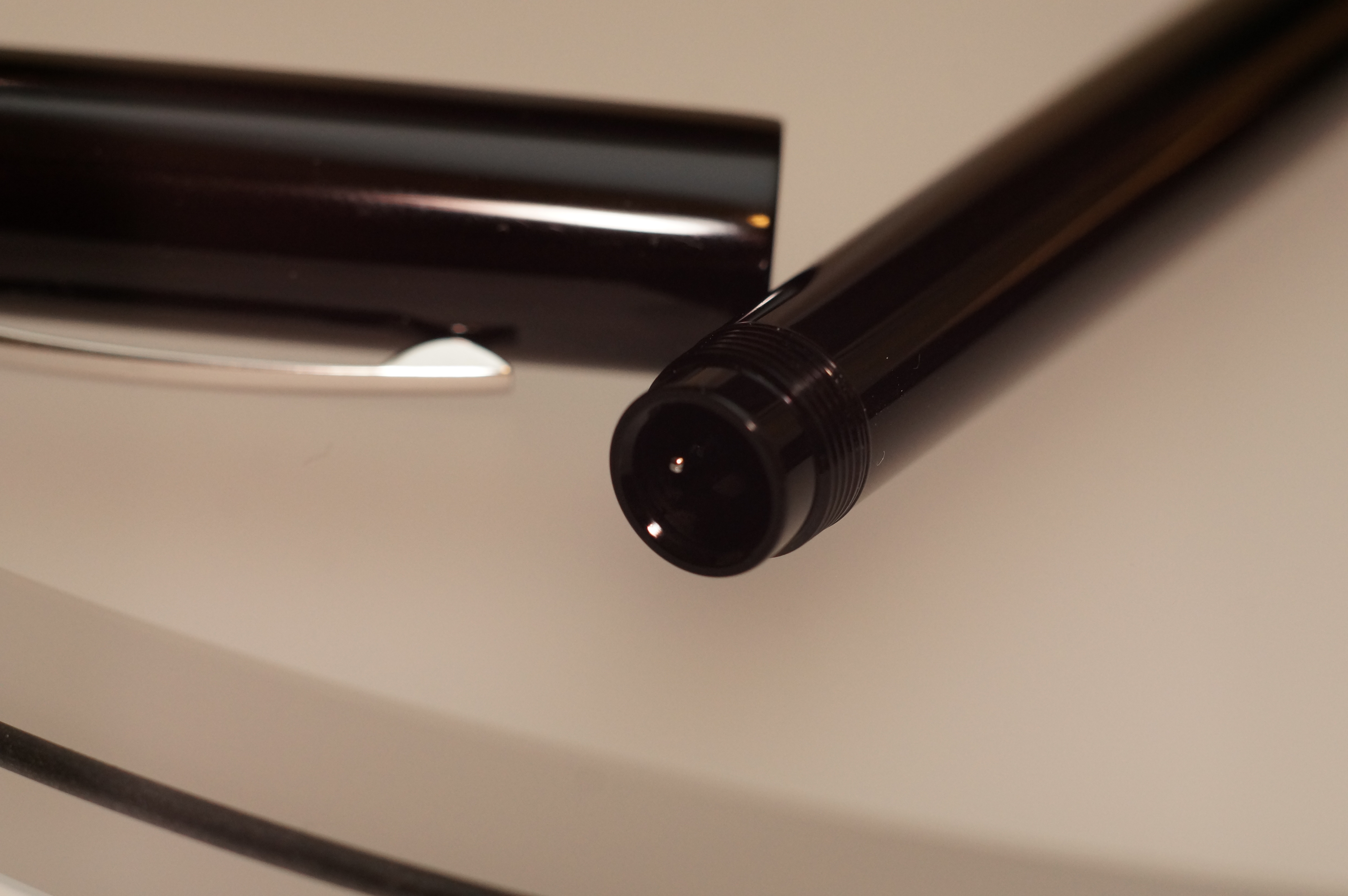
This is not the fattest of pens, or the most ergonomic. There’s no section to speak of; the barrel runs uninterrupted with a slight taper down to the nib end, where the cap threads sit. That actually works for me: I can hold the pen wherever I like. And the reassuring weight of the brass feels good. Uncapped the 1912 is more than 35g.
A barrel of laughs.
The ritual
We don’t write with fountain pens for the practicality, do we? We enjoy the experience, we appreciate the craftsmanship and artistry that our pens embody. I like the little ritual of extending the 1912’s nib before I put pen to paper. It lends a certain gravity to the written word. I hold the chunky cap in my off-hand and feel like all is right with the world.
It’s a nice feeling when this snicks into place.
Writing personality
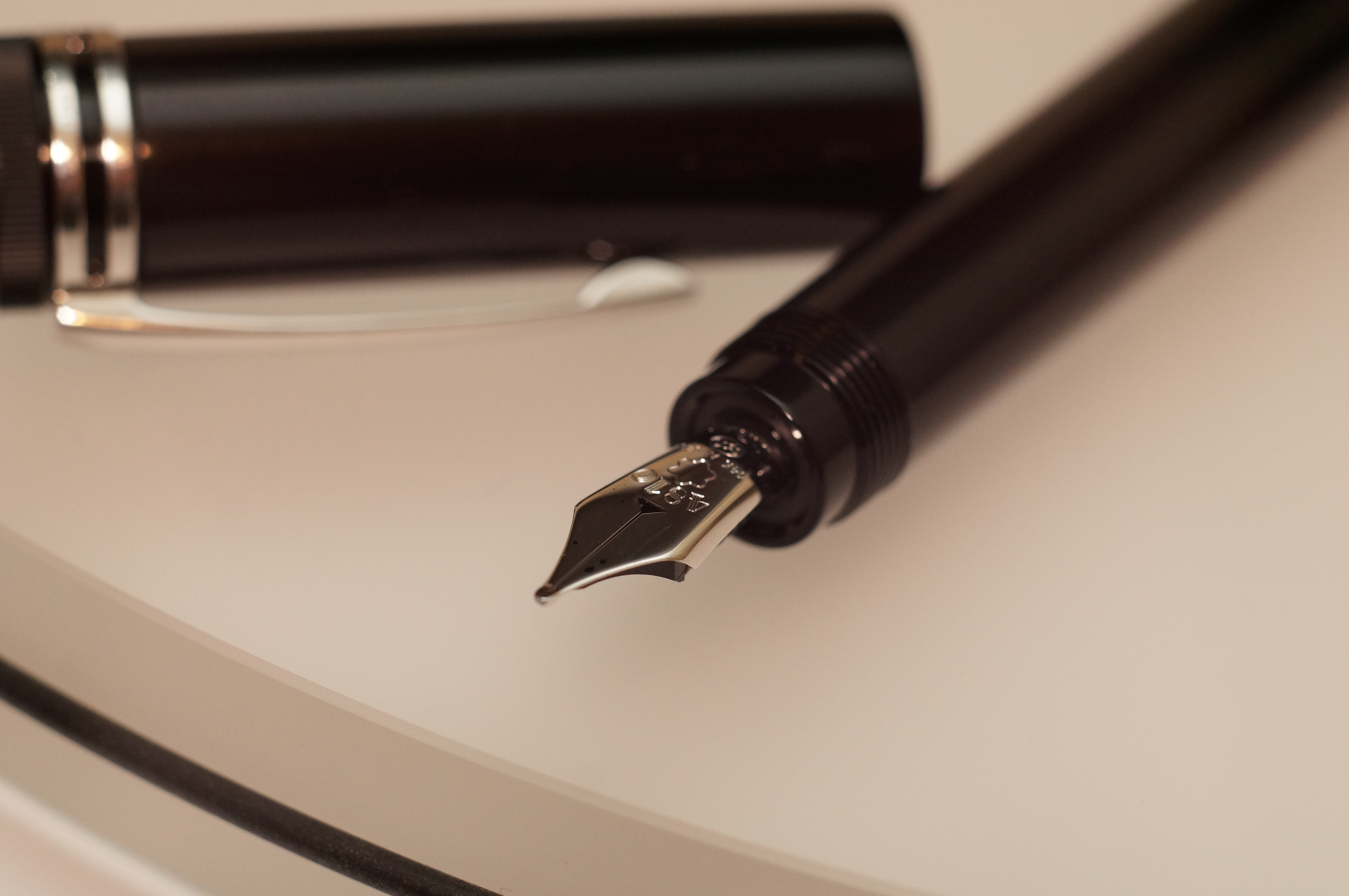
I’ll say this first: the medium nib on my 1912 is not 100% perfect. It often squeaks a little. It sometimes hesitates just a bit at the start of a stroke. And it definitely prefers to write held more upright — it has a clear sweet-spot.
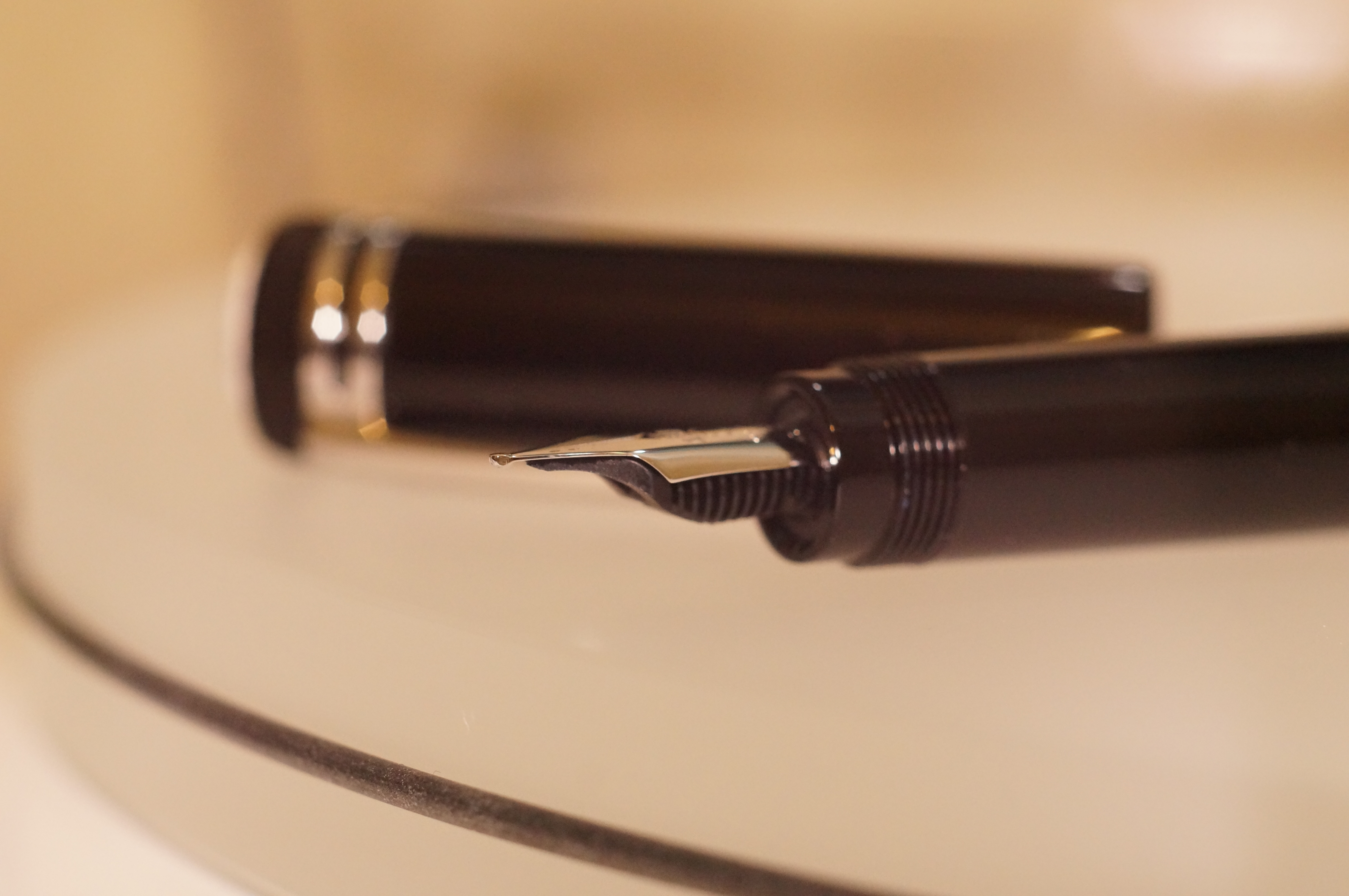
The nib is dead flat and thin, so it bounces.
But this tiny, plain-looking nib has a lovely vintage-style bouncy personality to it. The flow is good (I’d like it a bit wetter), and the line width is a genuine medium, not too wide.
I feel like the 1912 gives my writing a bit of personality.
The vinyl word
This is a pen that surprises you. The retractable nib, of course; the unassuming nib that writes so well; the clever filling mechanism; the unexpected weight. So it’s certainly inconvenient, but also ingenious.
And while it’s expensive, for that you get (of course) the Montblanc prestige: the fancy packaging, the iconic snow cap, the heritage design. And a pen that’s great to write with.
So, like vinyl, I’ve fallen in love with the 1912, even though I know it’s irrational and despite the fact that I was half-expecting to hate it. Which is the best endorsement I can give.
I enjoyed this and can well understand that you would not wish to leave the country without it.
I’m in Amsterdam this week for another work trip… It’s in my pocket again!
This is truly a delight composed in words. I have read quite a number of reviews on the Heritage 1912 but none is as succinct or as elegant as this one here. This exquisite review ticks all the boxes of excellent–superlative–writing: engaging, insightful and most importantly, original; punctuations and humorous anecdotes are used like garnishes on an already tasty dish–just the right ones for the right places. In all, one could read the love for this pen in the words, if episodes of love are best perceived in the small but intimate glimpses of using this pen.
Thank you, Jeffrey! All I can say is that the 1912 is a very effective muse for a writer…