Indulge me.
I’m about to review a fountain pen that almost none of you will buy: the Montblanc Writer’s Edition Homer.
Why won’t you buy it? Well, it’s last year’s model, and a limited edition of 9,800. You still see them about in boutiques, but it’s not that easy to find. Oh, and it costs about a grand.
But I feel compelled to put something to paper for those of you out there intrigued by this most unusual pen, who may only have seen a few photos on forums. As far as I can tell, no other pen blogger has reviewed this pen.
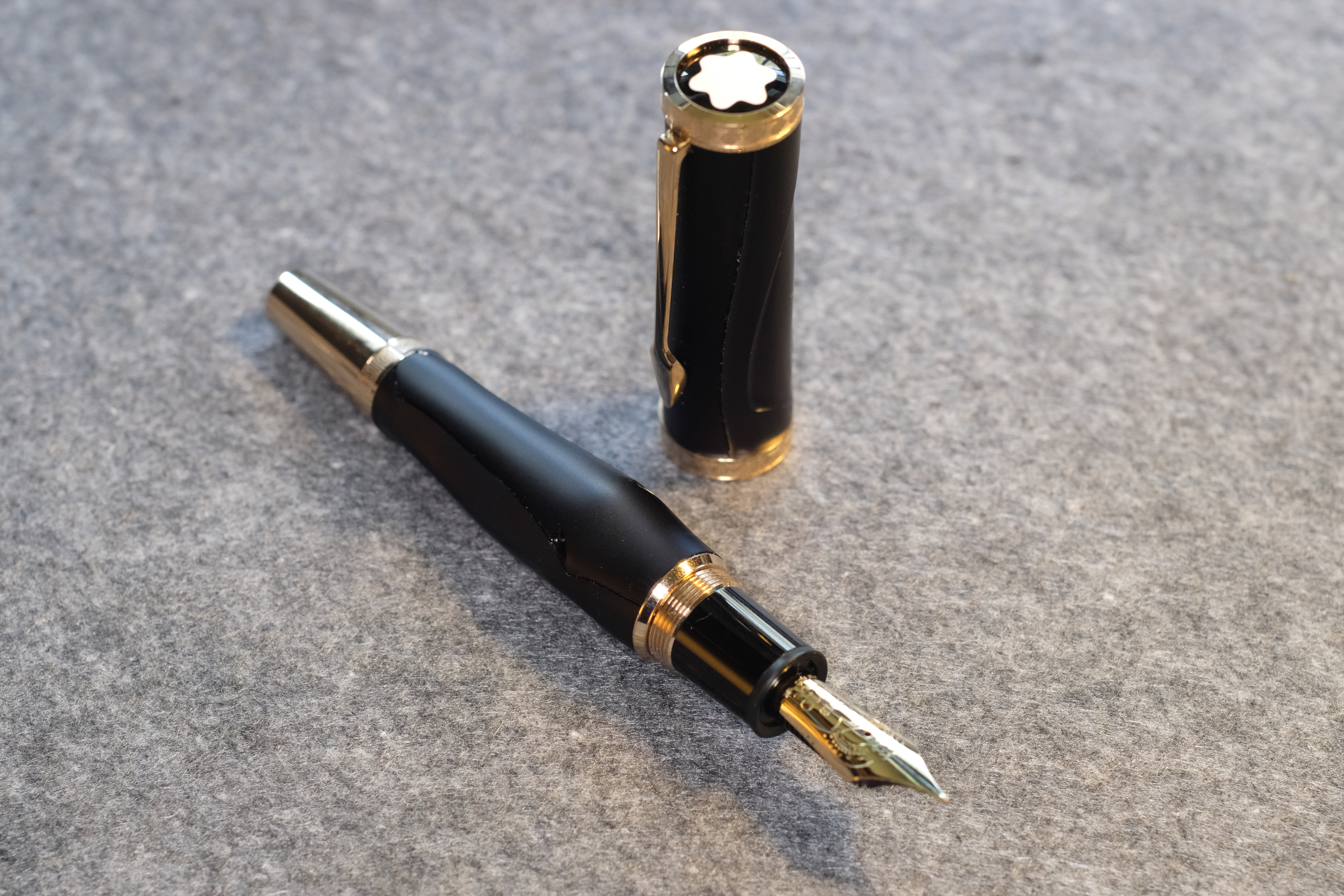
It’s unusual firstly because, along with Dumas and Hemingway, the Homer is the only Writer’s Edition built on a 149 chassis, with its big nib.
Mostly though it’s unusual because it’s in the abstracted shape of a goddamn horse’s head, in classical Greek style.

Why the long face?
The majority of the Writer’s Editions play with materials, colour and decoration, but fundamentally they’re still normal cylindrical pens. This one isn’t. The whole body and cap is shaped.
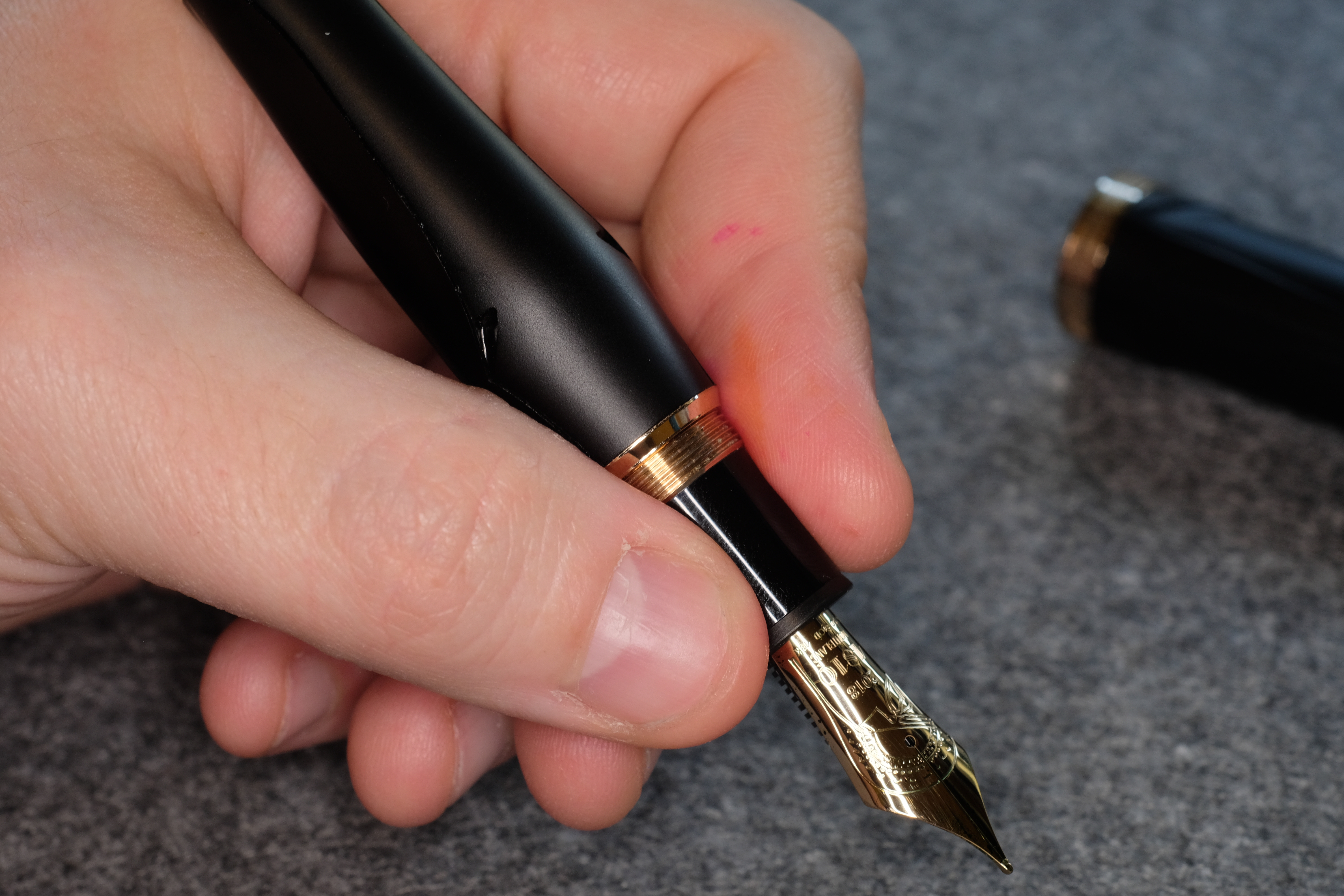
At first I thought the stylised horse shape was ridiculous, but it’s actually really well done, and not gaudy in the least (looking at you, Montegrappa). Most importantly, it doesn’t get in the way of actually using the pen: in the hand you feel it only as a swelling of the barrel where the horse’s cheekbones are.
The rest of the Greek motifs are relatively subtle, meaning the Homer has mercifully dodged Montblanc’s temptation to stuff recent Writer’s Editions with lines of poetry and dozens of little Easter eggs (cough Kipling cough).

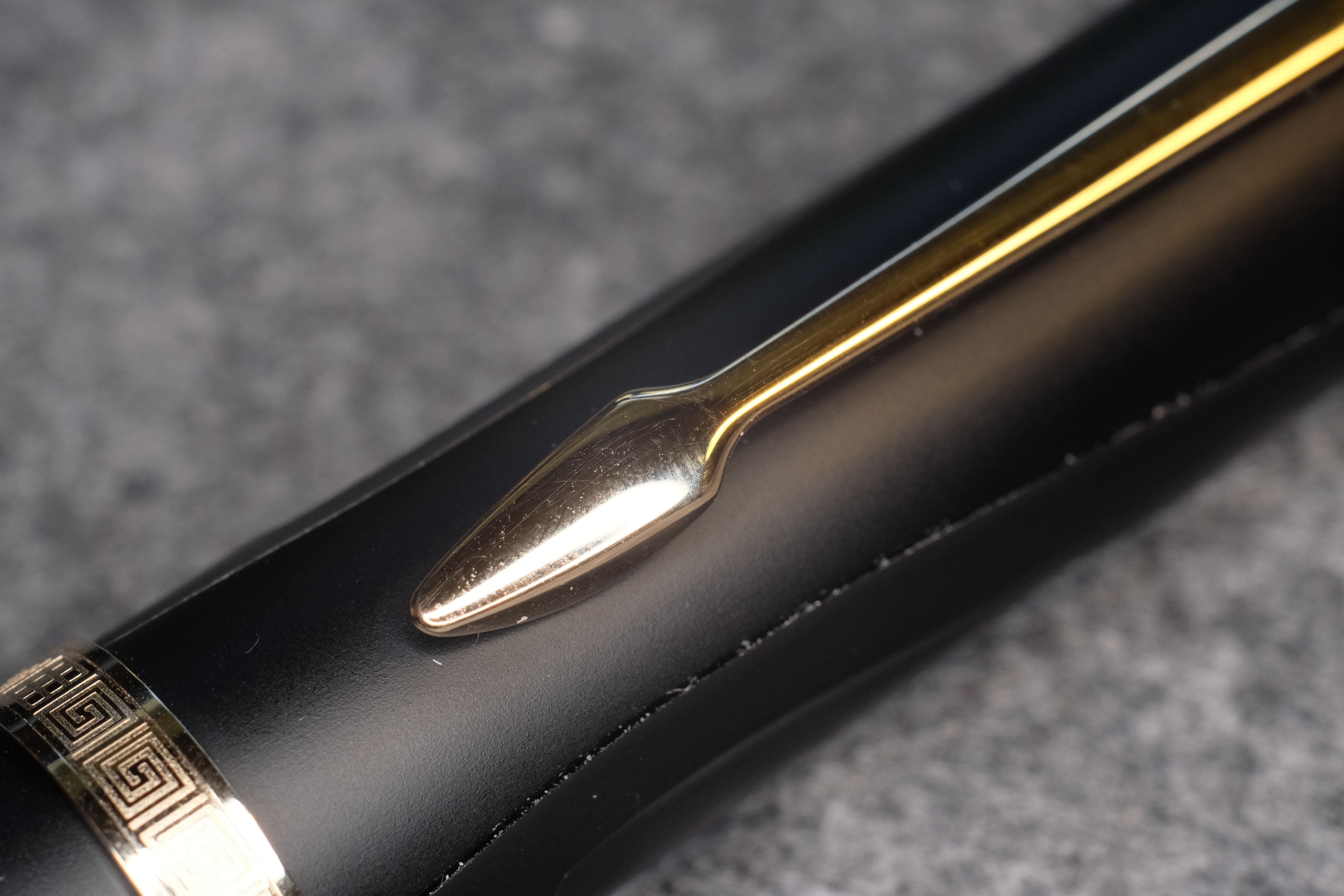
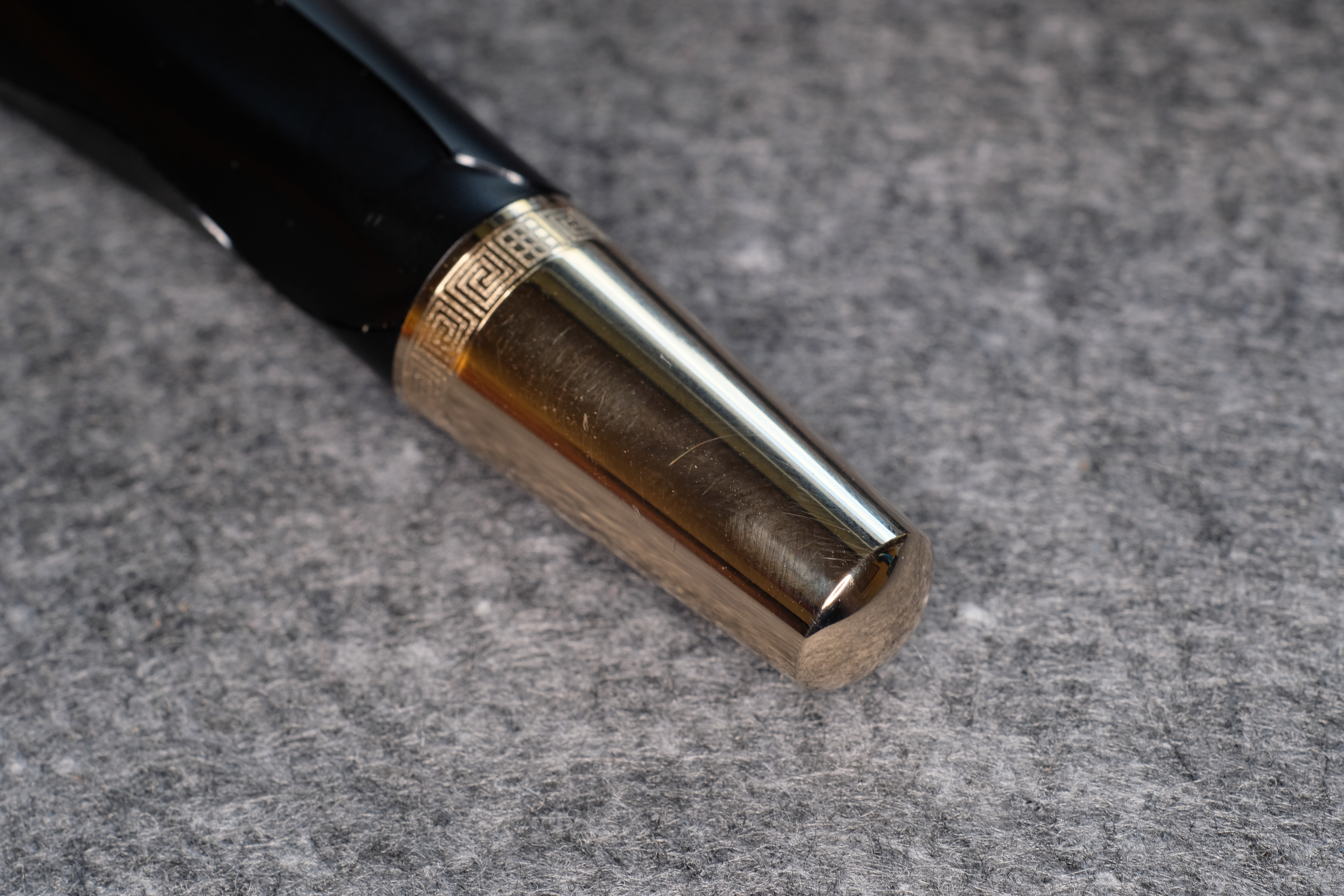
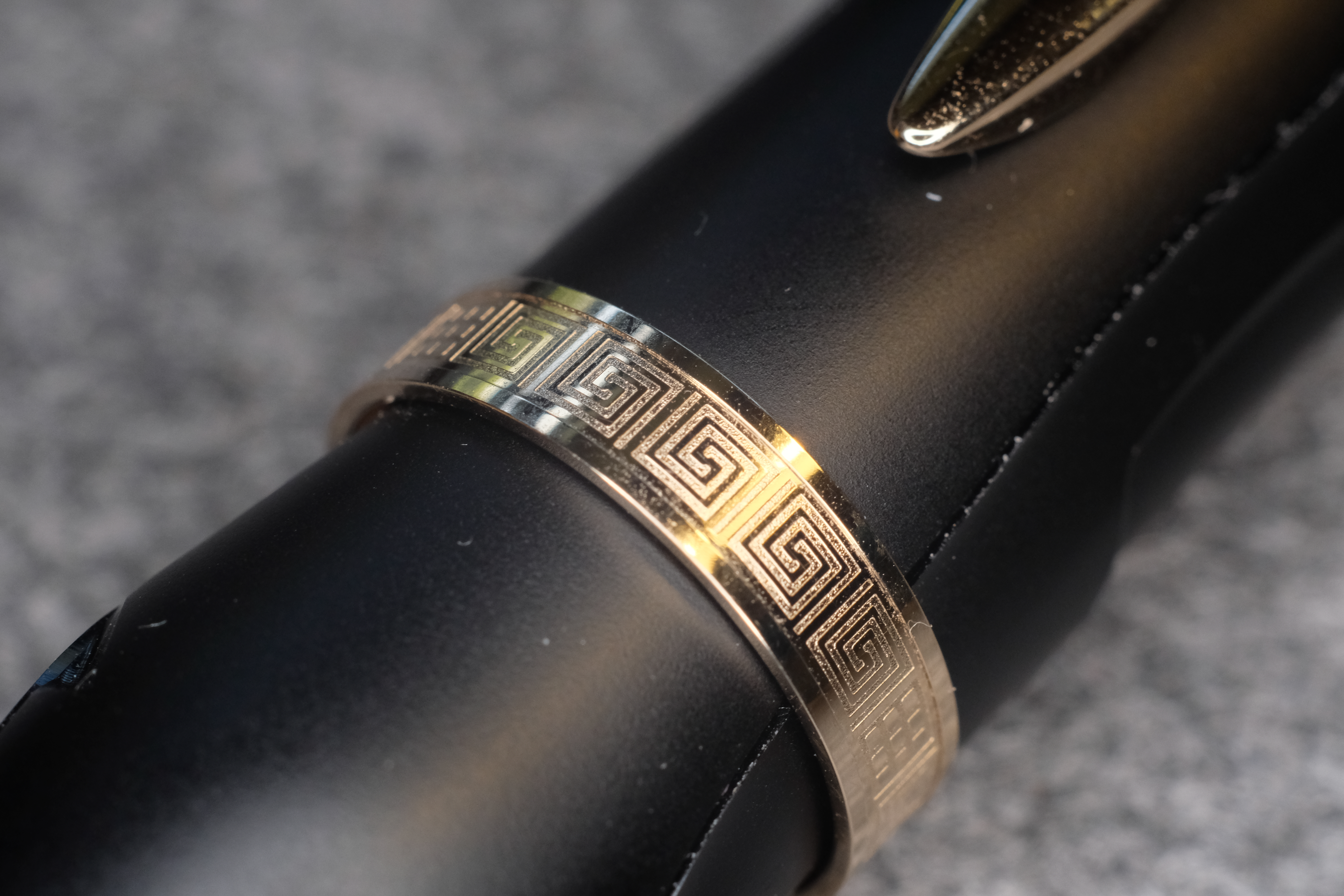
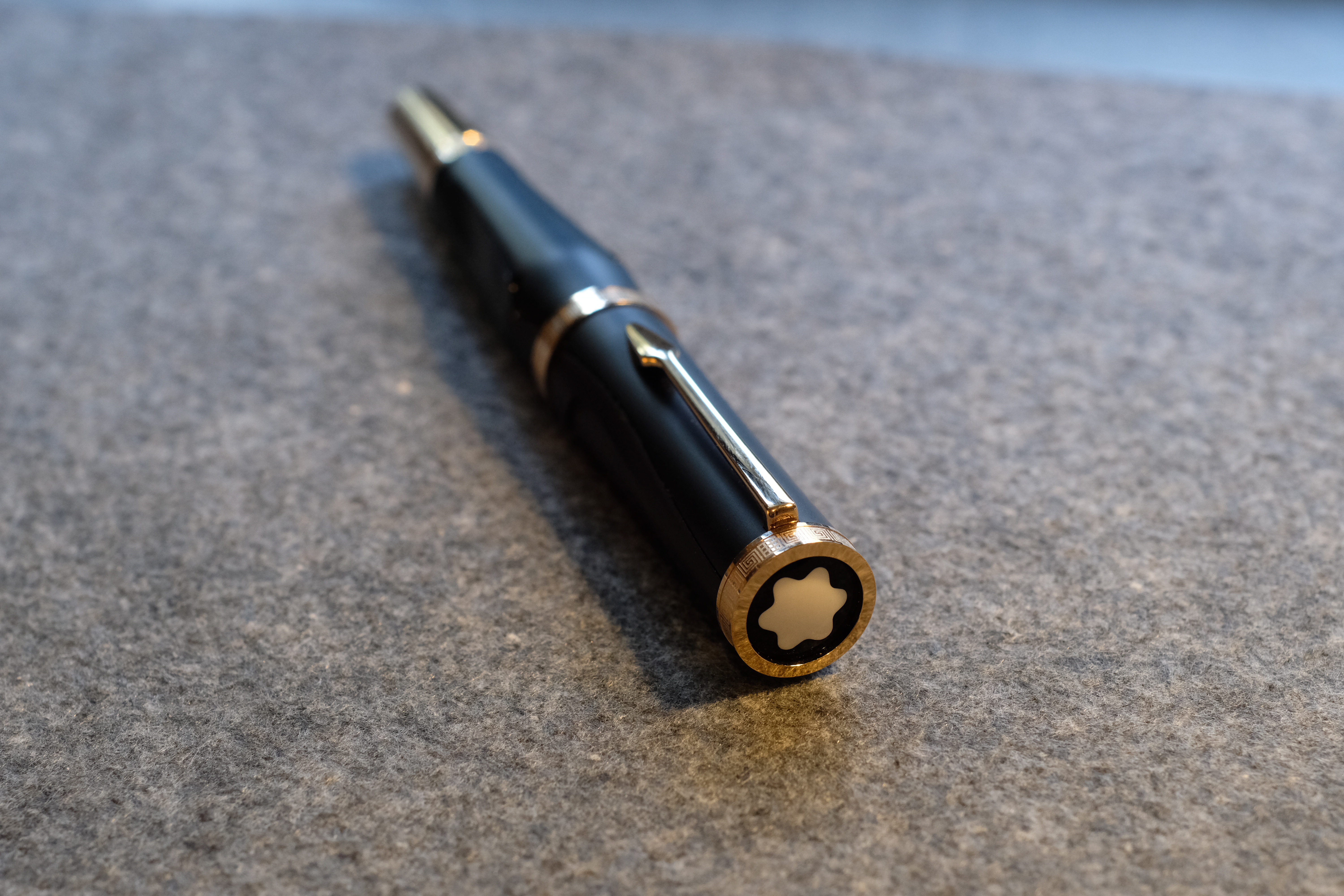
Here you’ll find the familiar Greek key pattern around the top and bottom of the cap, and the base of the piston knob. The clip is in the shape of a spearhead.
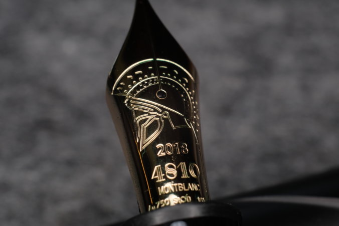
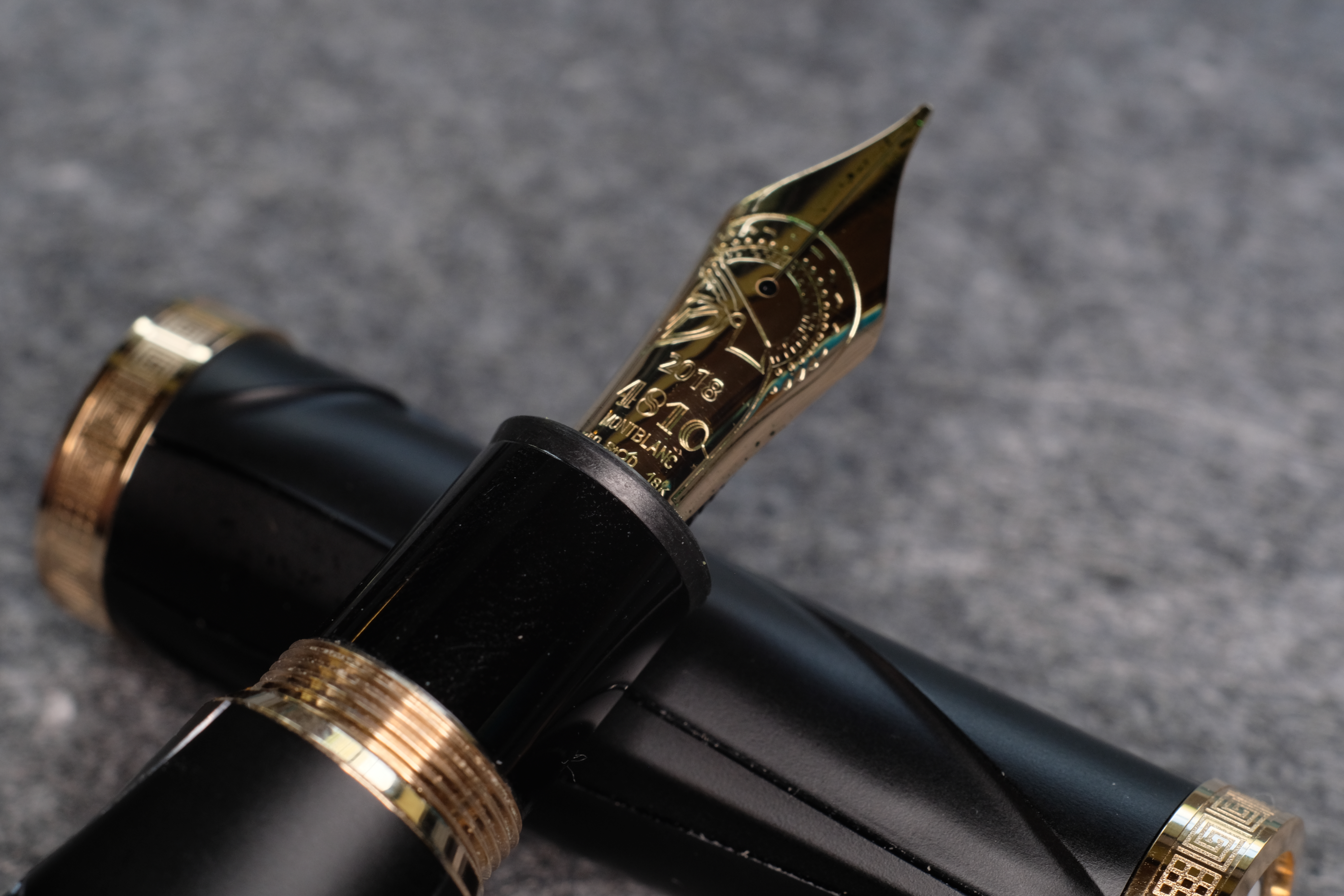
And best of all, on the nib is a stunning Greek warrior helmet in profile.
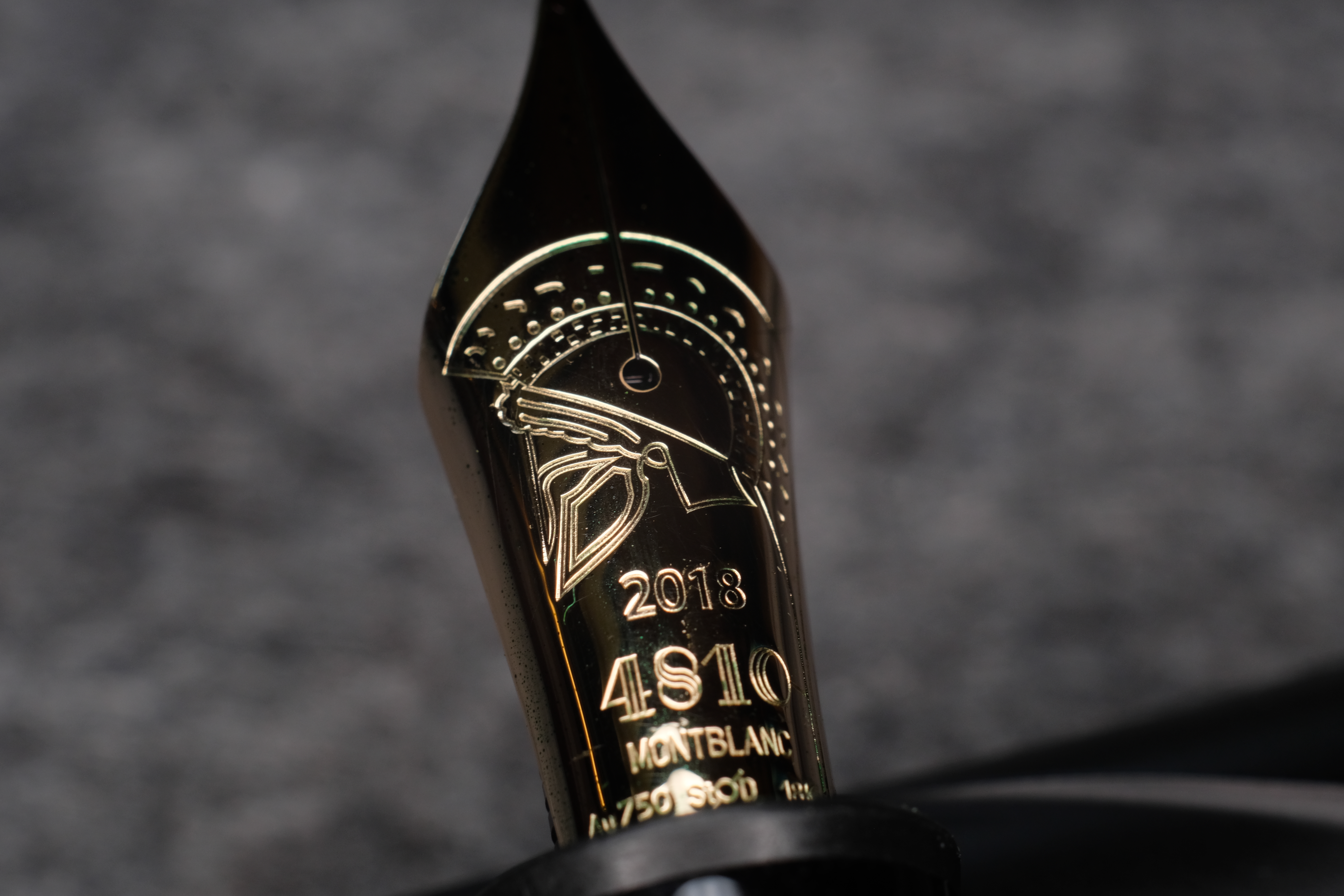
None of these elements are overdone with detail or materials — there’s no miniature rubies or different surface finishes or colours. It’s, well, classic.
The gold trim contrasts beautifully with the satin black barrel and cap, and for such a huge and unusual pen, it is far from the most ostentatious pen in my pen tray.
In fact, the only really odd design choice is the shiny black section.
In terms of comfort, I was very pleasantly surprised. The 149 is not a long pen, so even with the chonker of a metal piston knob, the Homer’s balance is good.
The pen sits really nicely in the hand, and even the step up to the barrel doesn’t bother me because it’s heavily ramped.
In terms of practicality, the Homer is a piston filler with a huge capacity, but that’s the only positive point. Like most Writer’s Editions, there’s no ink window. But also, the Homer is too big to fit in a lot of pen cases; the cap in particular is huge.
And speaking of the cap: to get the design to line up perfectly down the barrel and cap, Montblanc has engineered an internal stop on both sets of threads. They satisfyingly stop dead without any worrying about tightening and loosening.
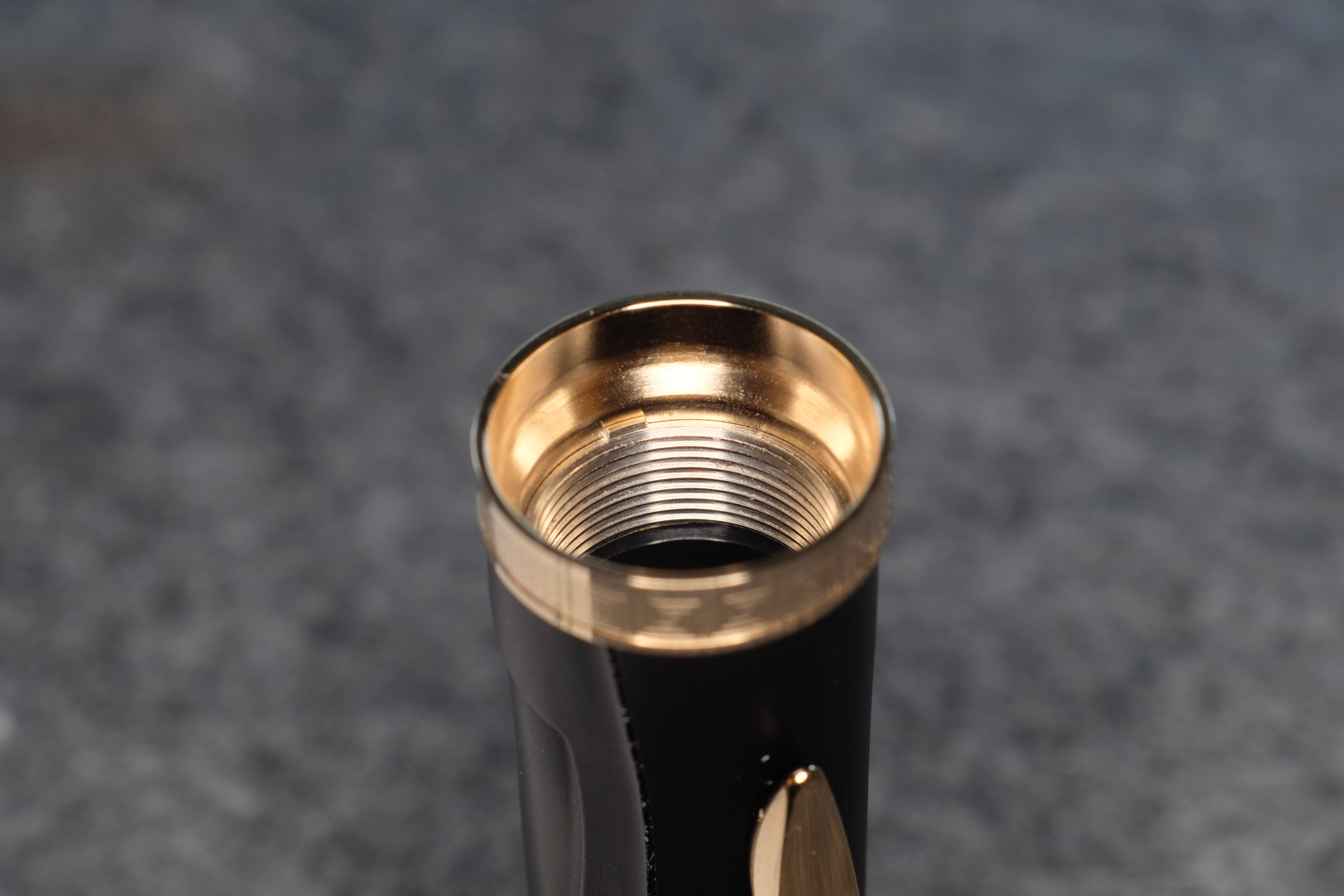
The internal block is on the sharp side, and one design flaw is that it can scratch the section as you move the cap back and forth. And the other implication of this design is that it takes three full turns to remove the cap. Not a pen for quick notes.
The other ding against practicality? As you’ll see from these photos, the etched lines that make up the outline of the horse gather dust and detritus like nobody’s business.
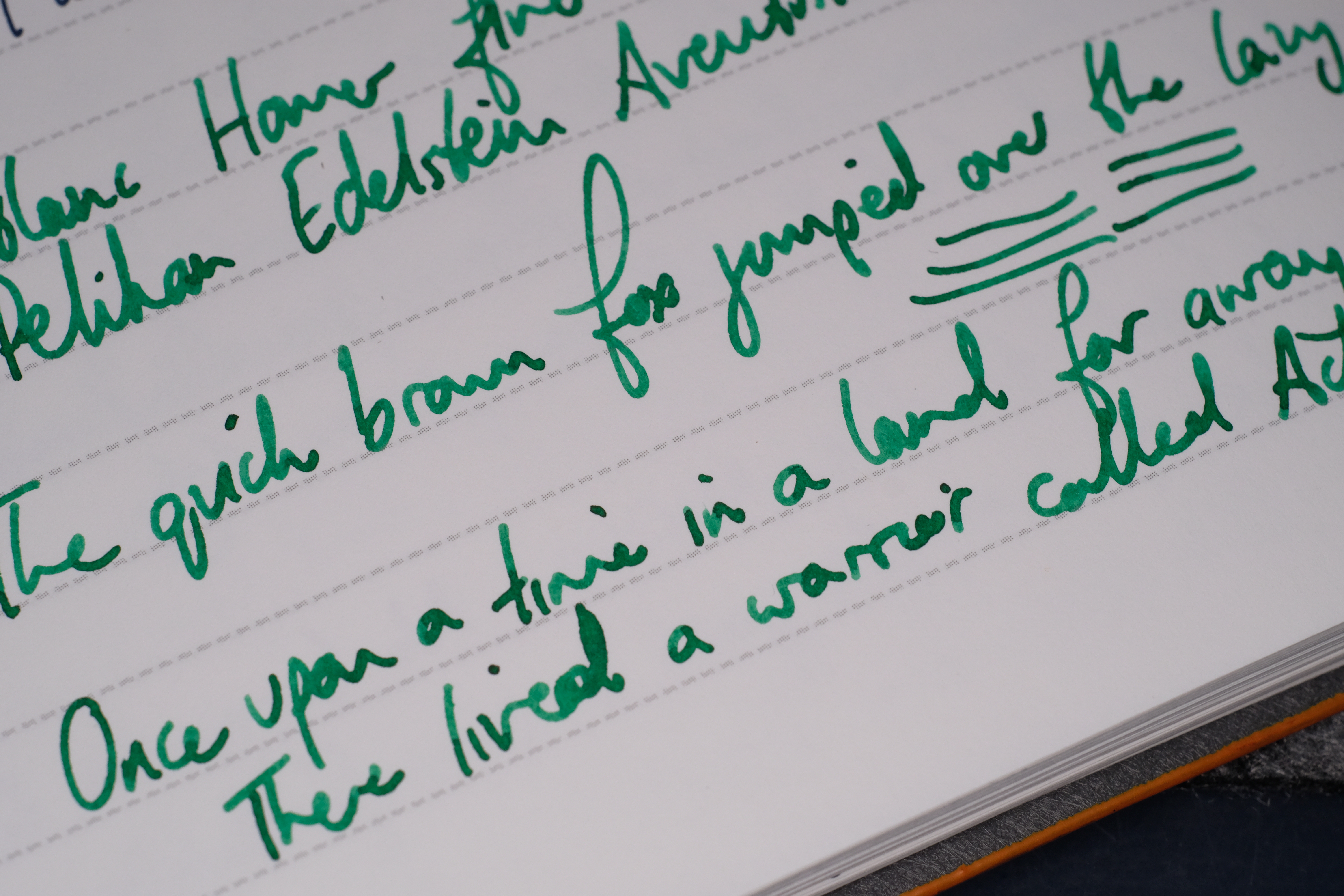
What about the nib? Well, I got a fine, and it wrote beautifully out of the box (Montblanc maintaining its perfect score there). It’s actually my first MB fine, and it’s exactly what I wanted: one step thinner than the mediums I’m used to, with good flow and on the smooth side. No complaints at all.
The Homer is truly unique in the storied line of Writer’s Editions. It’s hardly the most practical pen to take out an about, and I know that the design was polarising in the community. But I think it not only looks great, but in the hand feels so much better than some of the more conventional Writer’s Editions. I like it a lot.
That’s not a pen I was aware of but I think I rather like its slightly strange design aesthetic. Certainly more appealing and simple than many of the other Writers Editions I have seen.
That’s not a pen I was aware of but I think I rather like its slightly strange design aesthetic. Certainly more appealing and simple than many of the other Writers Editions I have seen.
Hey! Congrats ..! Another Homer owner here!
The material is champagne gold, and the helmet and spear? Achilles. Its all from the illiad.
I remember that I didn’t like it at first when I saw a photo, but appreciated it a LOT more when I tried it in a MB boutique. I bought my F variant on eBay for a good (well, relatively!) price. Splendid, high character pen. Not gaudy as you state. I find it slightly better in the hand than a traditional 149.
I also have the Dumas, which is great too, but prefer the Homer in its singularity.
It may be dismissed now, but I can see a future cult classic.
Thanks Tom! Sounds like we had very similar experiences. I’ve never tried the Dumas — hope I have the privilege some time!
Thanks for your review, you made some good points. I laughed when I read “three full turns to remove the cap”! That’s true, & every time I twist it, I think “when is it finally coming off?” Like others here, I disliked it when I first saw it- it just looked bizarre to me. By February 2019, I kind of got used to its odd looks, & now it’s one of my favorites (I like big & heavy pens). Not at all showy, except for its size & shape. The complete opposite of their all shiny Leonardo da Vinci, which is a bit longer & much heavier & full of fascinating doo-dads.