Almost without planning it, I’ve ended up with five Viscontis — more than any other brand in my collection.
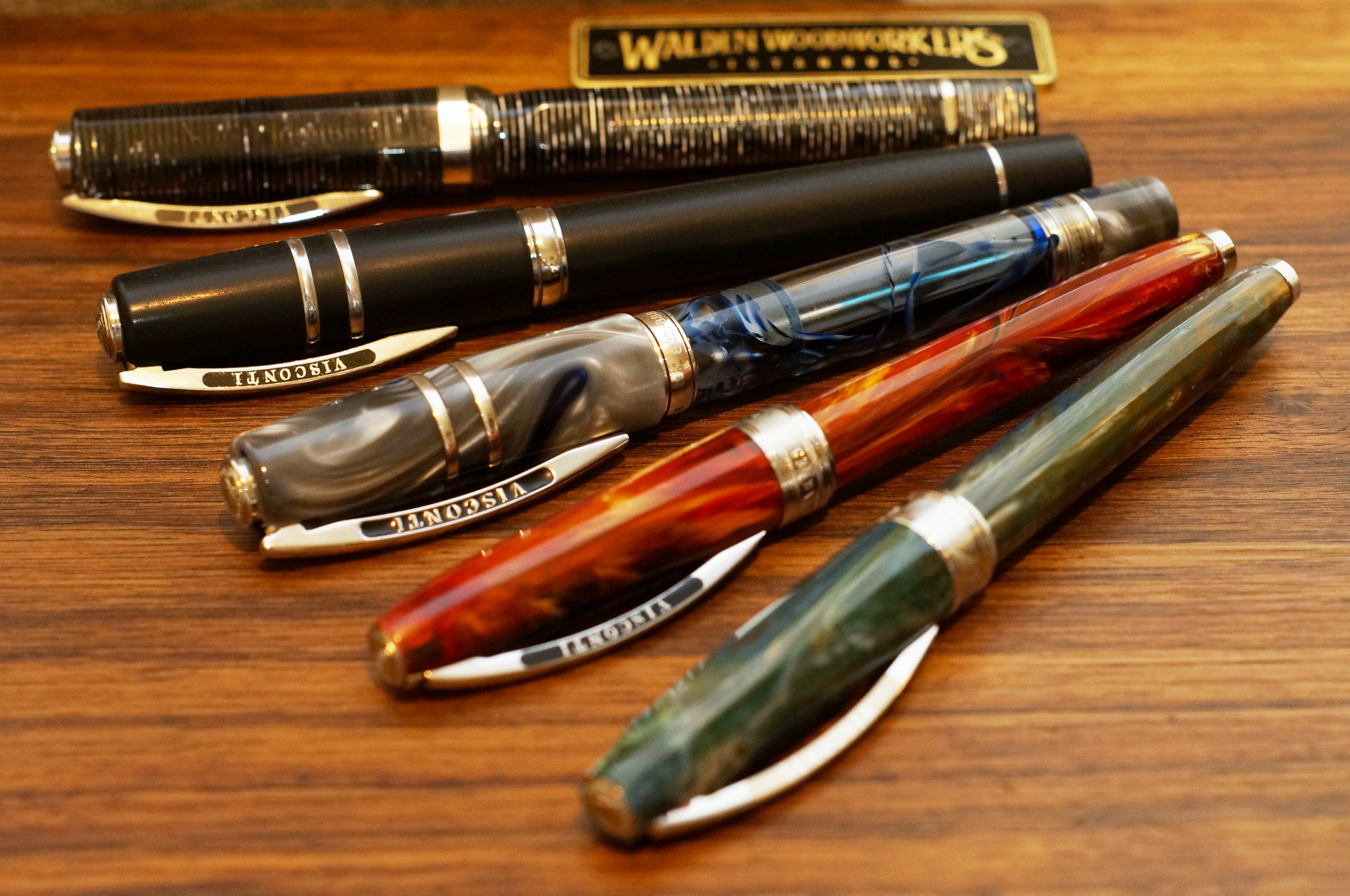
And two of those five are the “Van Gogh” model, Visconti’s relatively inexpensive steel-nibbed model (alongside the Rembrandt and the new Mirage, I guess).
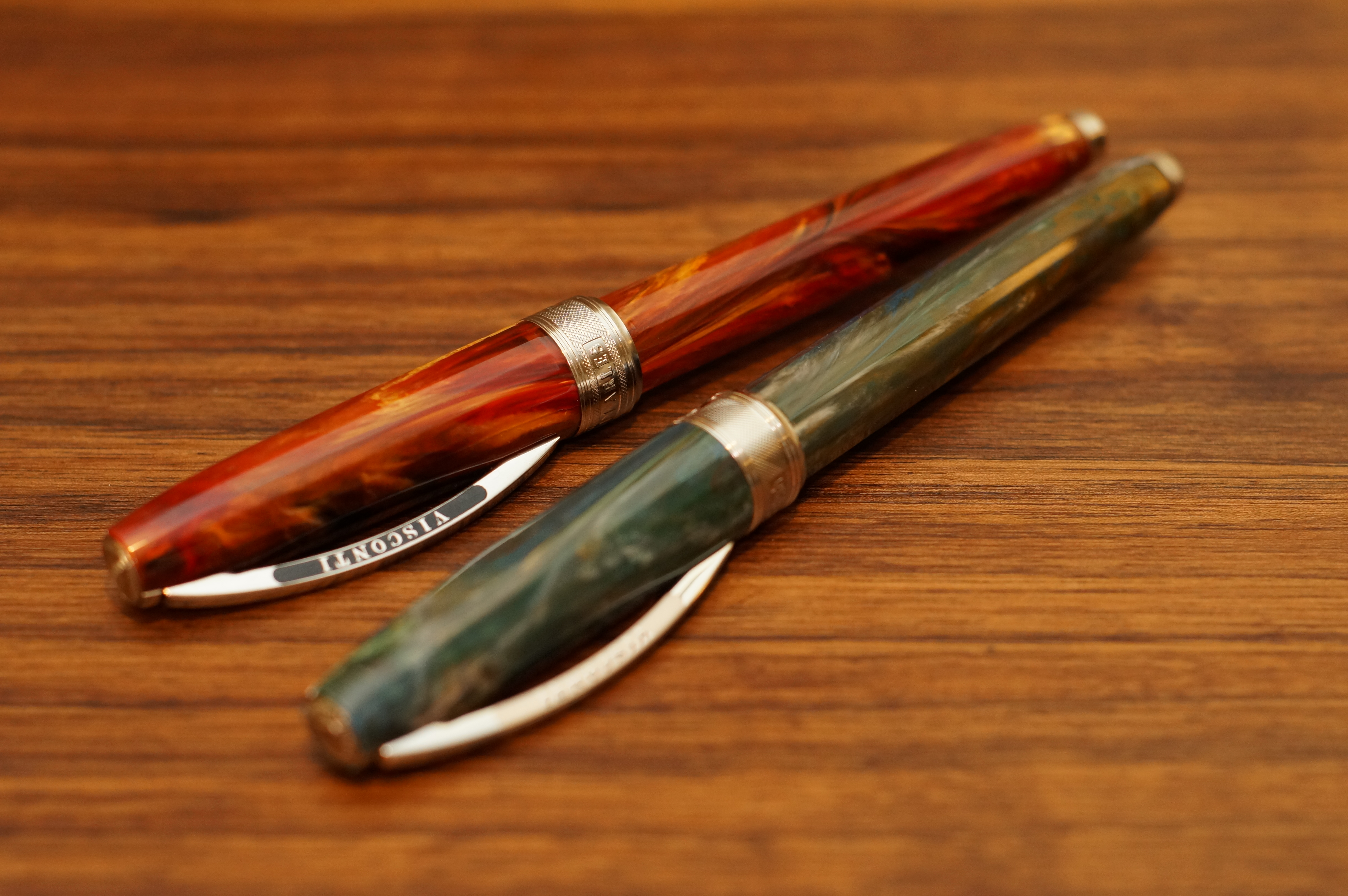
The Van Gogh isn’t perfect — in fact, it has some of the same flaws as the Pineider I just beat up — but it works very nicely as a whole, and I could almost see myself buying a third.
The most obvious attraction of the Van Gogh is the resin, which is mixed to resemble the palette of a particular Van Gogh painting. In my case, the reds and yellows of Room in Arles, and the blues and greens of Dr Gachet.
Both respond well to strong light and to close inspection, with swirls and depths appearing.
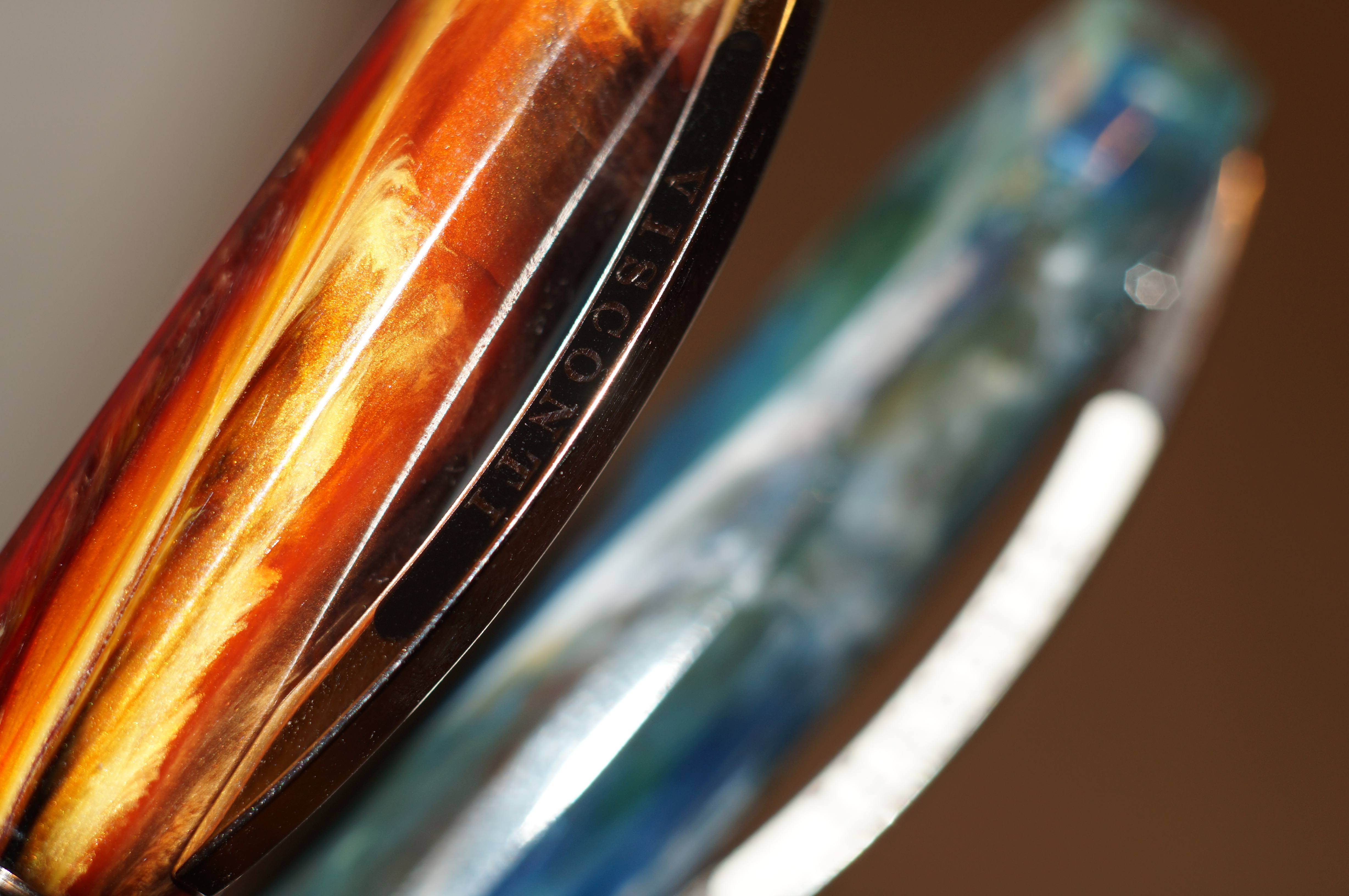
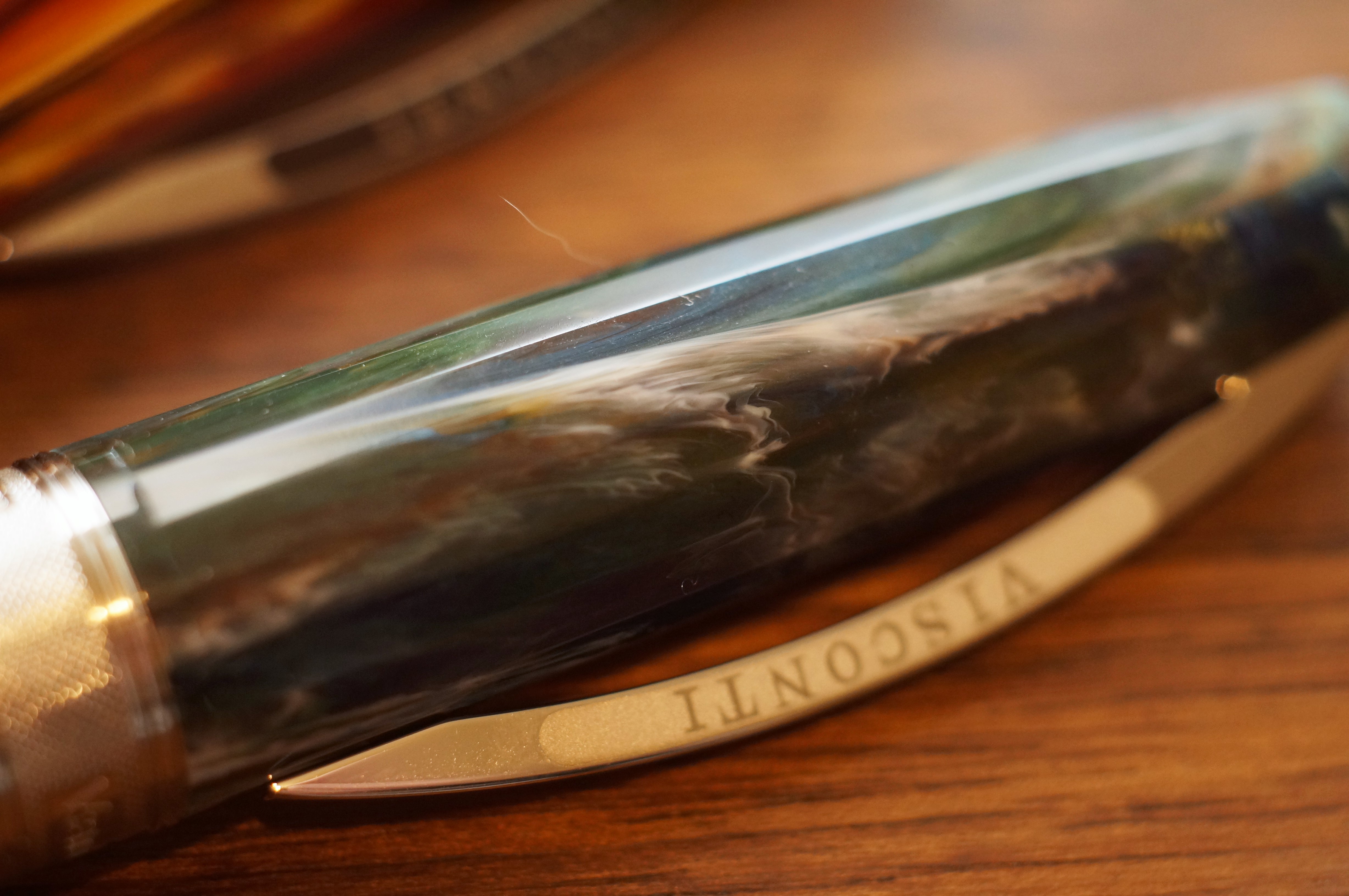
And the Van Gogh has a subtle faceted shape that catches the light as you rotate it in your hand. In other words, these are pretty pens. But you might want to buy them in person, because mine bear only a passing resemblance to some of the photos I’ve seen online. They’re difficult to photograph, for a start, but these are also the kinds of pens where there’s a lot of variation from sample to sample.
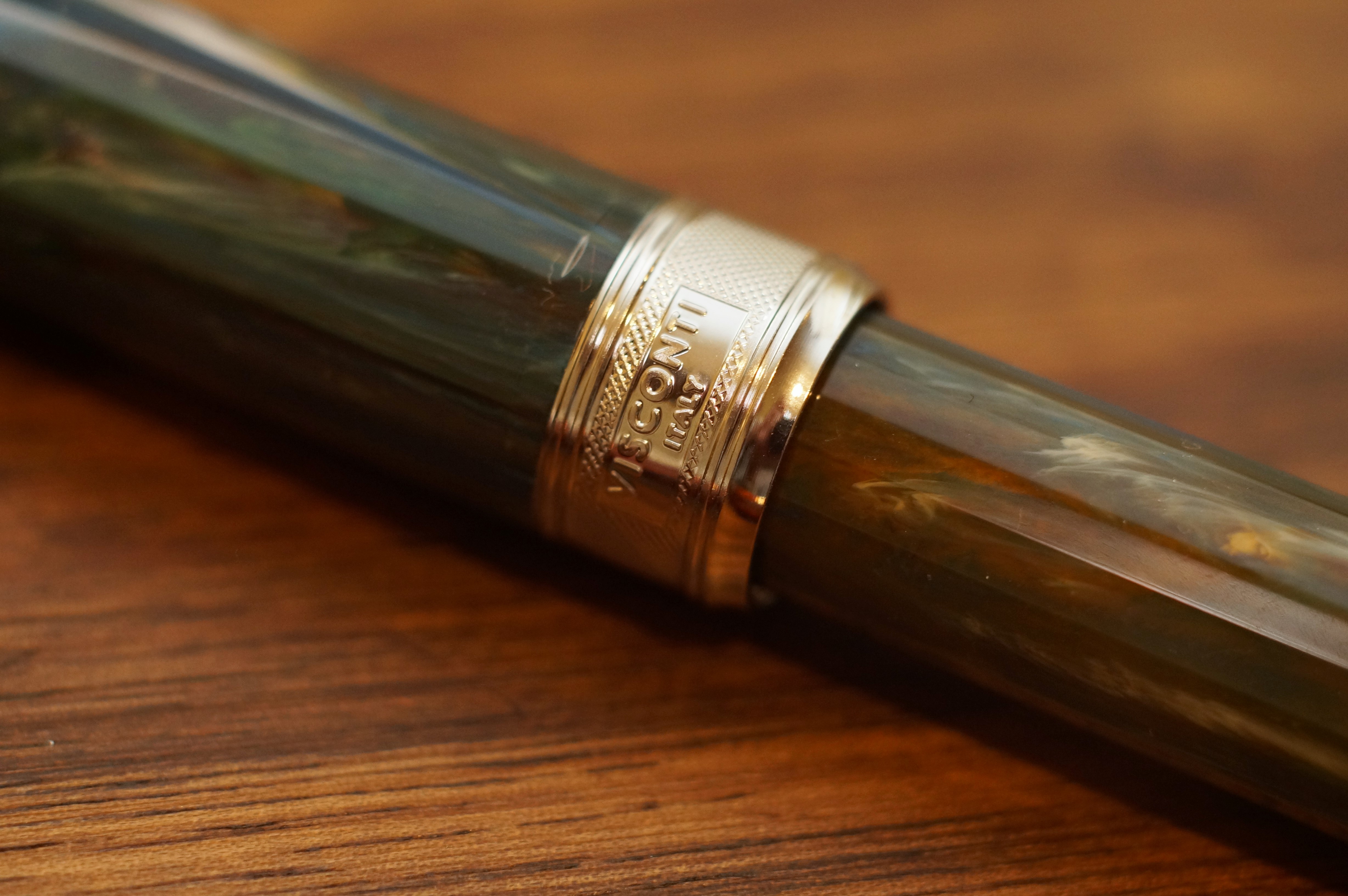
These are not big pens, but they feel solid and substantial. Part of that is down to the cap with its substantial clip, but it’s mainly due to the metal section. Regular readers will know that I apparently don’t like metal sections, but this one works well. It has a pronounced step before the nib, and its weight serves to pull the balance closer to the nib. The end result is that I love the way the Van Gogh handles.
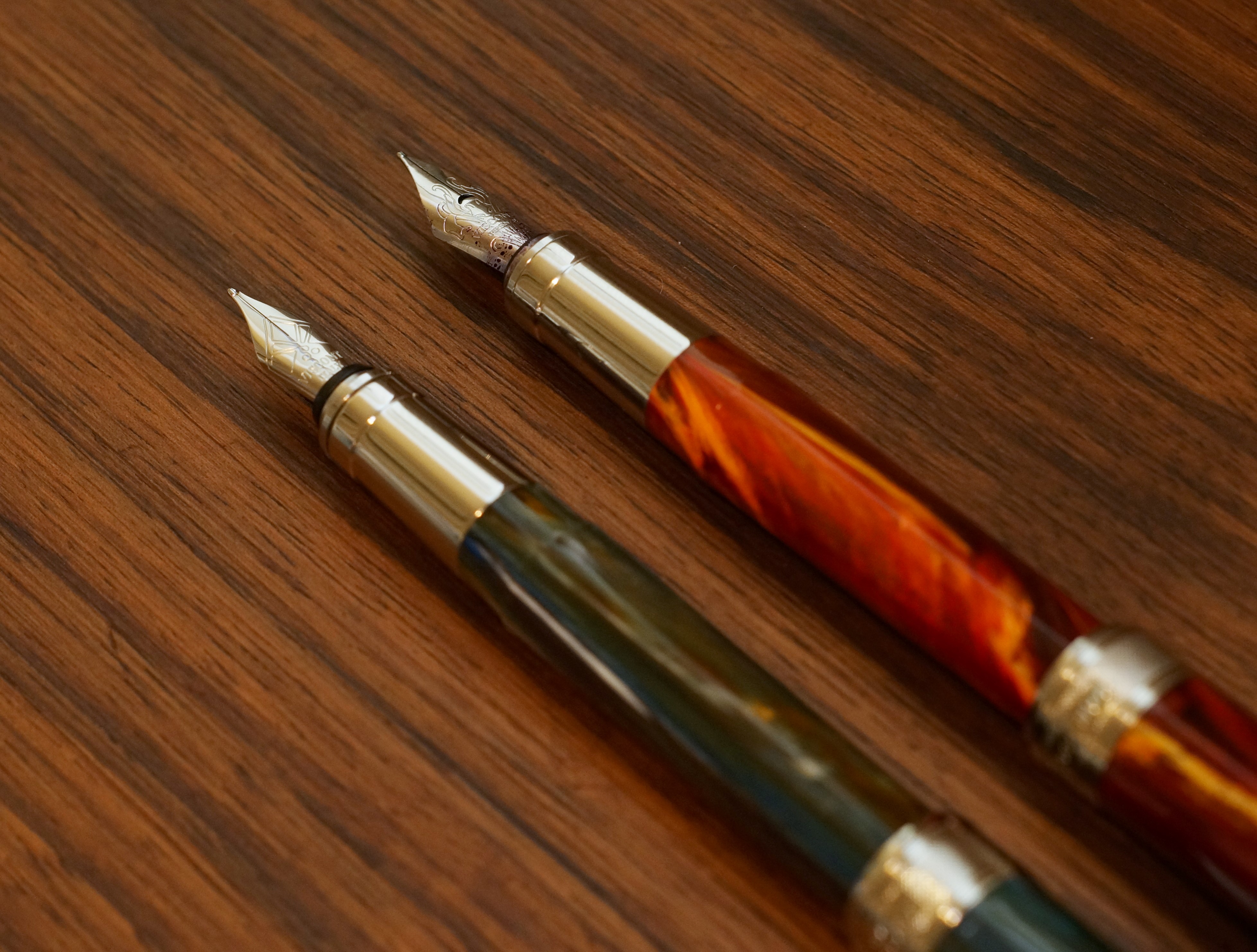
Like the Pineider, the Van Gogh has a rather glitzy cap band, but here it merely has branding, no naff pangram. It has a magnetic cap closure, which works in any orientation. It’s not too strong, and it also helps the cap post (although the end result doesn’t feel great).
You get a version of Visconti’s trademark bridge clip, which is sprung. It works OK and it’s sized appropriately to the rest of the pen.
Now here’s where I need to talk about the two Van Gogh pens separately, because there are a few differences between them. Some are cosmetic: the older (Room in Arles) has a painted clip and the name of the painting on the cap band; the newer (Dr Gachet) has a laser-etched clip and just the words ‘Van Gogh’ on the cap band (probably to reduce costs by allowing Visconti to use the same bands across all the different editions).
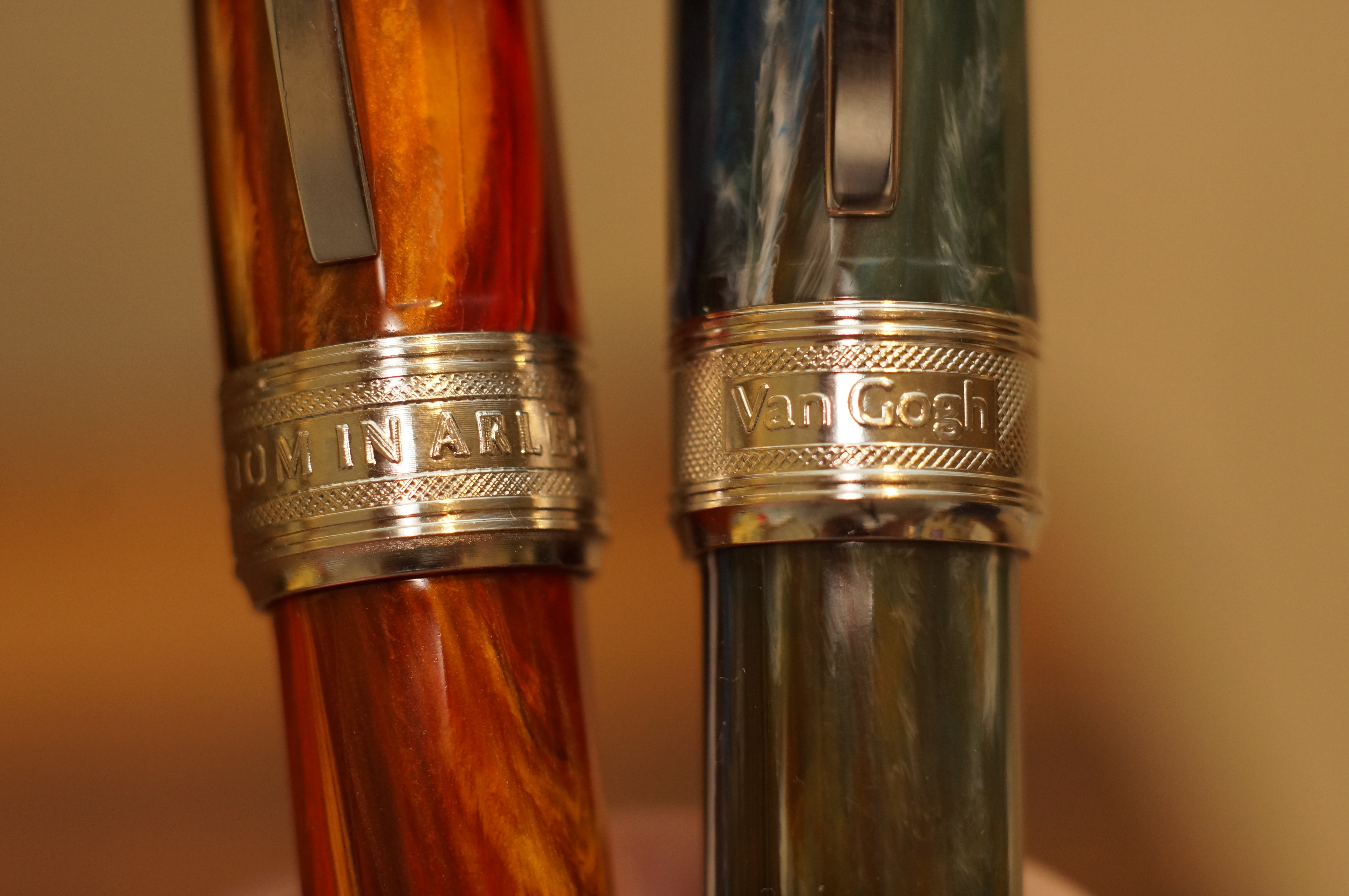
The two pens also have different finial branding, and different shaped housings inside the section.
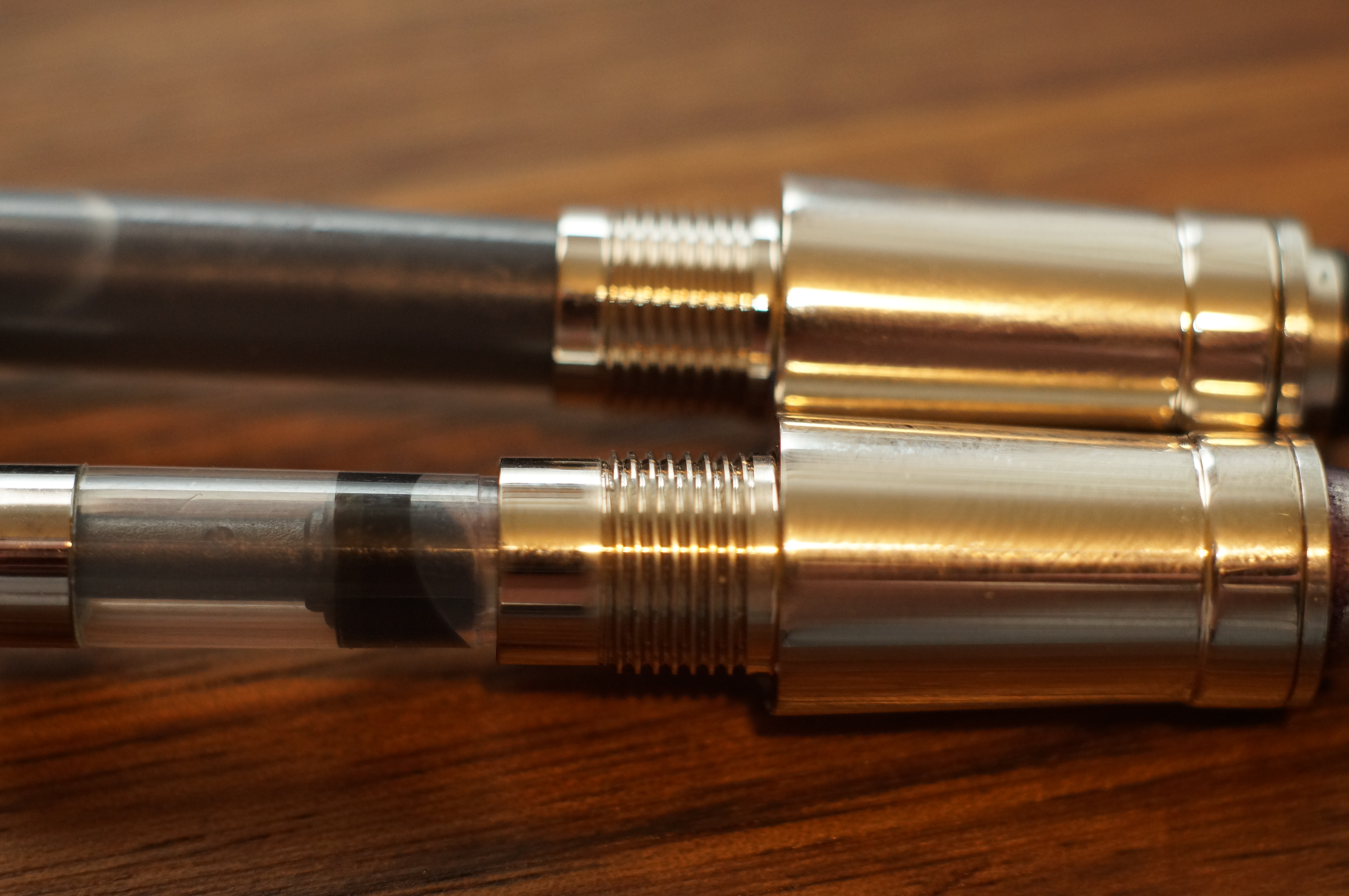
The biggest difference, though, is the nib. The older nib is larger, 5.5 sized, with a crescent-shaped breather hole. The nib unscrews and (as I happily discovered) swaps perfectly with a Kaweco nib unit. The newer nib is smaller and has no breather hole at all, and it’s a proprietary fitment. The feeds are also of a different design between the pens. I like the look of the larger nib, both in terms of proportionality and visual appeal.
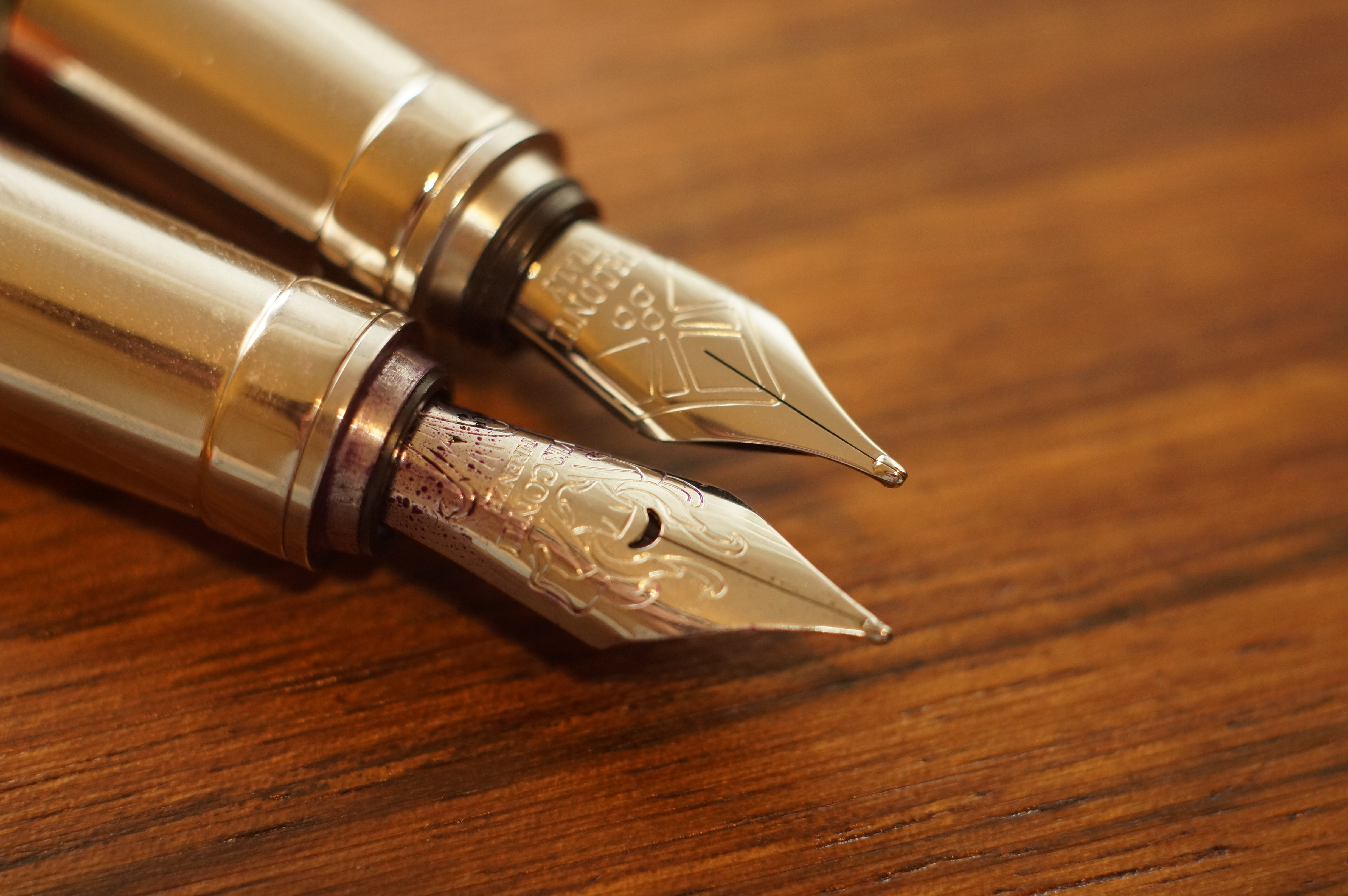
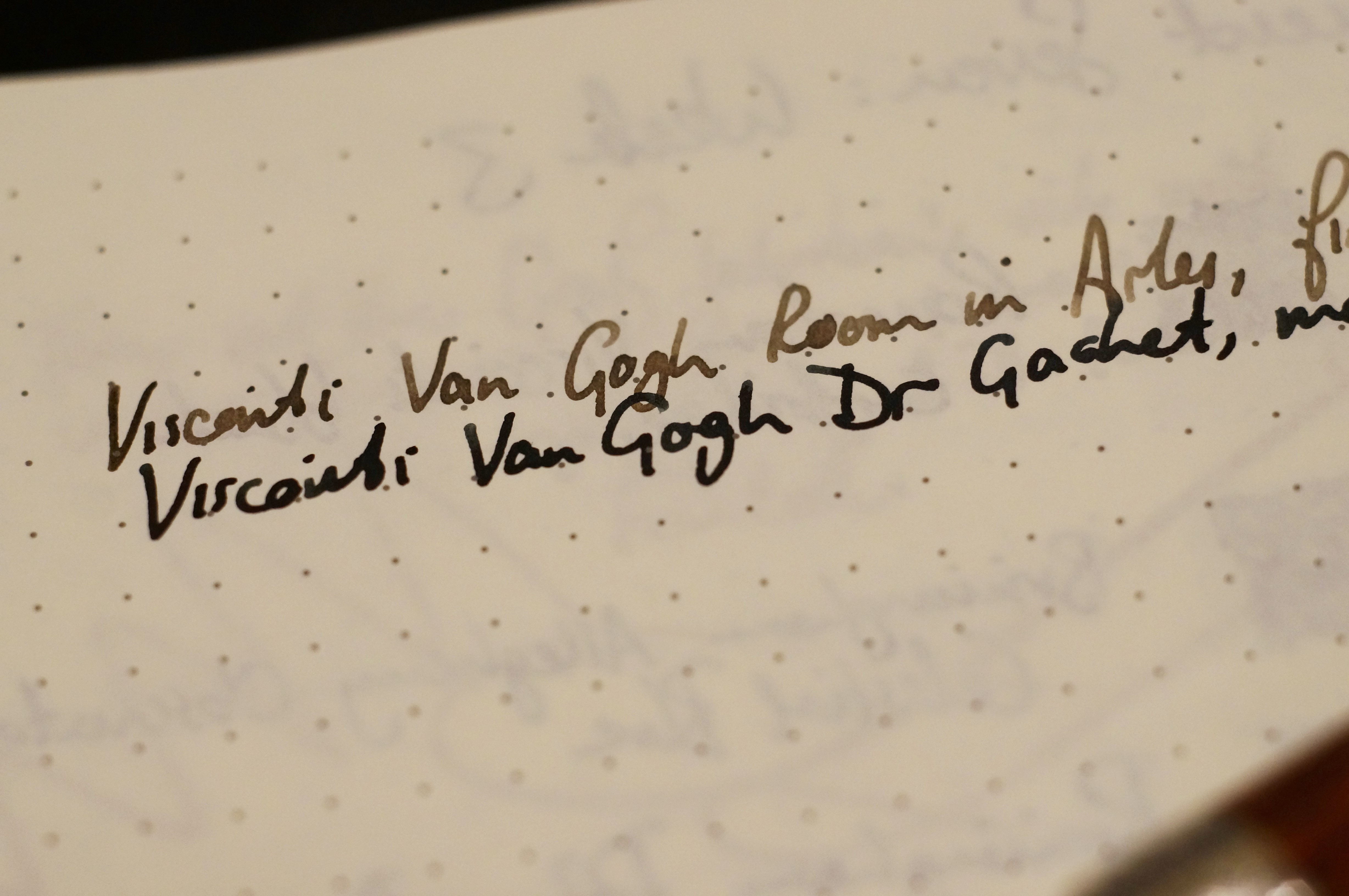
I’ve had mixed experiences when it comes to writing. The Room in Arles has a fine nib that needed work out of the box (not that it came in a box). After a lot of shimming and polishing I now have a smooth and moderately wet writer. The Dr Gachet is a medium, and it was beautiful from the first touch to paper: properly wet and very smooth. It’s immediately one of my favourite steel nibs.
[Correction: the Dr Gachet is a broad. The width isn’t marked on the nib and I forgot what I ordered!]
The packaging of the Dr Gachet is not quite as fancy as the older style Van Gogh boxes I’ve seen on the internet, but it’s at least pleasantly compact while still showing off some of the artist’s work.
Overall, I’m a fan of the Van Gogh range. I like the colours, I like the faceted design, I like the simplicity, I like the comfort, and I like the writing experience. If you can get them for under £150, I think that’s a good deal.
The big rival is of course the Leonardo Momento Zero, which feels like a more mature and more complete pen at a lower price point (and Leonardo at least includes a converter!). But funnily enough, the Van Gogh feels like a very different proposition, and is certainly worth a closer look.

Great review, thankyou. And title! I was not aware that there had been changes made to the van Gogh. I do not have one (yet), only a Rembrandt which also needed some nib tweaking initially but is now super smooth and wet. I agree that it is worth buying these in person if you can, to see the individual finish properly. I saw a good selection of them while in Cardiff recently in The Pen and Paper stationery shop.
When I was considering getting my first Van Gogh I asked a few people “doesn’t it have a smaller nib than the Rembrandt?” and everyone looked at me like I was crazy — I guess what I was noticing is that Visconti is switching over to smaller nibs for its steel-nibbed pens. I think I may have caught the bug for these pens now and I’ll be checking them out in person next time I make it to a proper pen shop in person!
Great reviews of these great pens – I have seven of them! I wish they’d kept the original cap band, I really liked that touch. But the fine nib on my Vincent’s Chair is one of the nicest I’ve got. These pens are under-rated, I reckon.