This is a review in three parts. It’s my first review of the Scribo Piuma pen, Scribo’s newer design with cartridge/converter filler. It’s also one of the first reviews out there of the ‘Impressione’ finish, paired with the ‘Levante’ (bright orange) to honour Monet’s painting Soleil Levant. And the third element is Scribo’s EEF nib, an unusual factory offering that’s worthy of examination in its own right.
Sleek and modern: the Piuma
So, first the Piuma itself. It couldn’t be more different to the Feel and the Write Here models. It’s sleek, flat-ended but only after a pronounced taper, which makes the design look smaller than it is. Actually it’s still one of the longer pens in a typical tray.

The cap and barrel sit flush when closed, which is always attractive, but also always results in a very pronounced step-down from barrel to section.

The section though, as on all Scribos, is exceedingly generous and I never found the step bothersome.


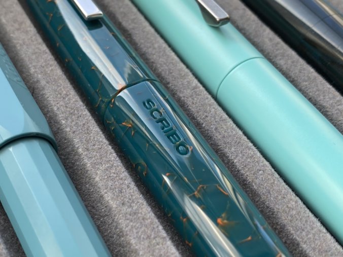
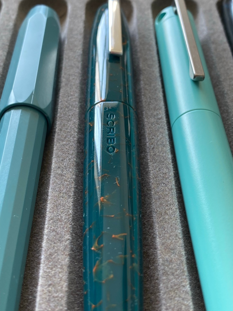
Except for the super-tight curved clip and tiny finial coin, the Piuma seems (from the outside) to be an all-resin affair.


There are no cap bands or trim rings to add clutter, which means whatever resin you choose is shown off to its best. Everything is sleeker, and the clip is a perfect example. Although it’s of two-part construction, it lacks the bends and prominence of the Feel’s clip.

That doesn’t mean the Piuma is without detail.
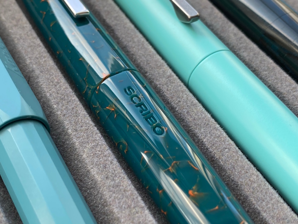
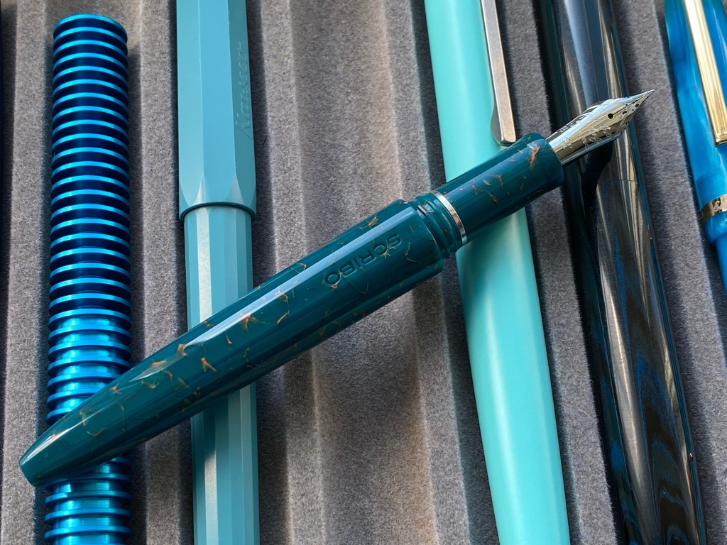
The SCRIBO name is engraved very deep into the barrel of the pen, and two flat facets run the full length of the pen too, serving for visual interest and as an additional rollstop when uncapped.
I like the effect, a lot actually, but I found that to fully align the facets I really had to put some muscle into closing the cap. I worried for the threads, which are excellent squared-off shapes and do their job in under two turns.
The Piuma is not short, narrow or excessively light, but it’s definitely more petite than the Feel. It’s under 30g capped. I found it very comfortable and well balanced, and definitely it’s more approachable than the swelling, ridged Feel. It may be my perception based on the tapered barrel shape, but having the C/C mechanism instead of a piston filler put the balance point closer to the nib end.

About that filling mechanism: the Piuma is a cheaper pen than the Feel, but I don’t see a C/C as an inferior choice nowadays. The push-fit converter is certainly plenty capable of saturating the Piuma’s ebonite feed and delivering a wet ride. And unlike the piston filler on the Feel, you can check the ink level any time you like.
Scribo haven’t compromised on the rest of the experience, either. The Piuma comes wrapped in a practical fabric pen sleeve secured by a leather thong, in a compact and handsome magnetic-closure branded box.


It feels like a premium product, but not decadent.
Sun on deep green sea: the Impressione
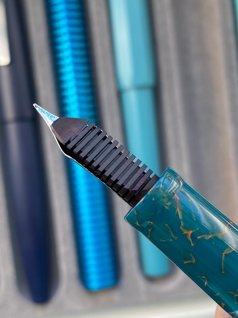
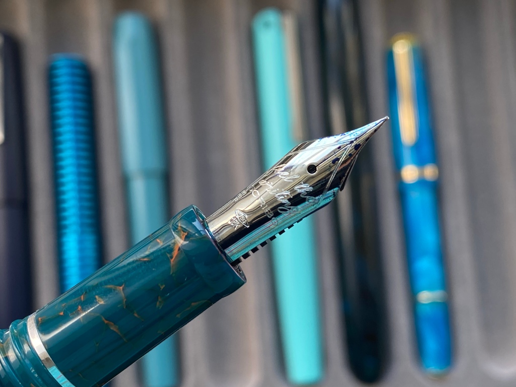
So what about the Impressione material? Well, it’s acrylic, in a very dark teal that leans towards the green side, flecked with orange, like the sun on the sea in Monet’s painting.

You can see that it’s very different to the other blues and greens I have in my pen tray at the moment.

The resin is far from translucent, but the orange flecks are visible running deep into the material as veins. It’s subtle — certainly moreso than the full orange version — but not boring.
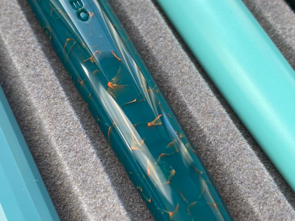
Incidentally, the polish across the pen is perfect and lets the material shine, literally and metaphorically.
Across the Piuma range, Scribo is doing a good job of offering a mix of solid, cracked ice and other colour schemes in pastel, dark and bright colours. And while the association to works of art feels a little forced (and certainly unoriginal after Visconti’s Van Gogh and Rembrandt series), it’s nice to have a story.
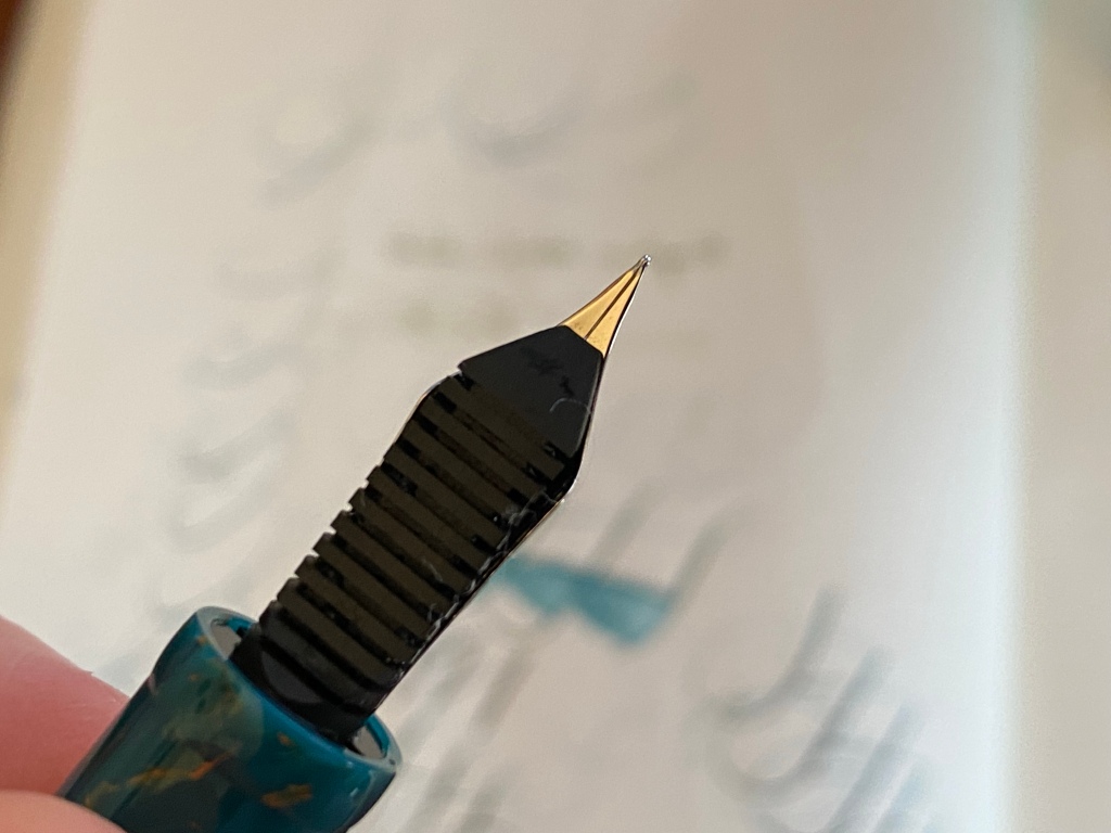
Patience needed: EEF nib
And what about the 18k ‘EEF’ nib? First, a few glamour shots. This is a beautiful nib from any angle, and very different to the normal Bock 250 or JoWo #6.


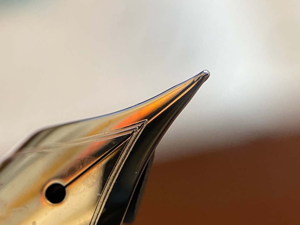


A nib may be beautiful, but more important is whether it writes well.
And here, a little background is in order. I am a fan of needlepoints. Aside from the usual EF nibs from multiple brands, I’ve owned Montblanc’s 149 Calligraphy, Platinum UEF, Sailor EF, XXF from FPnibs, Pilot PO, Masuyama needlepoints, Nagahara needlepoints… and probably more besides. I don’t at all mind a sharp, feedbacky nib that requires a light touch. I find needlepoints fun and relaxing to write with, partly because I have a consistent hand and write without pressure.

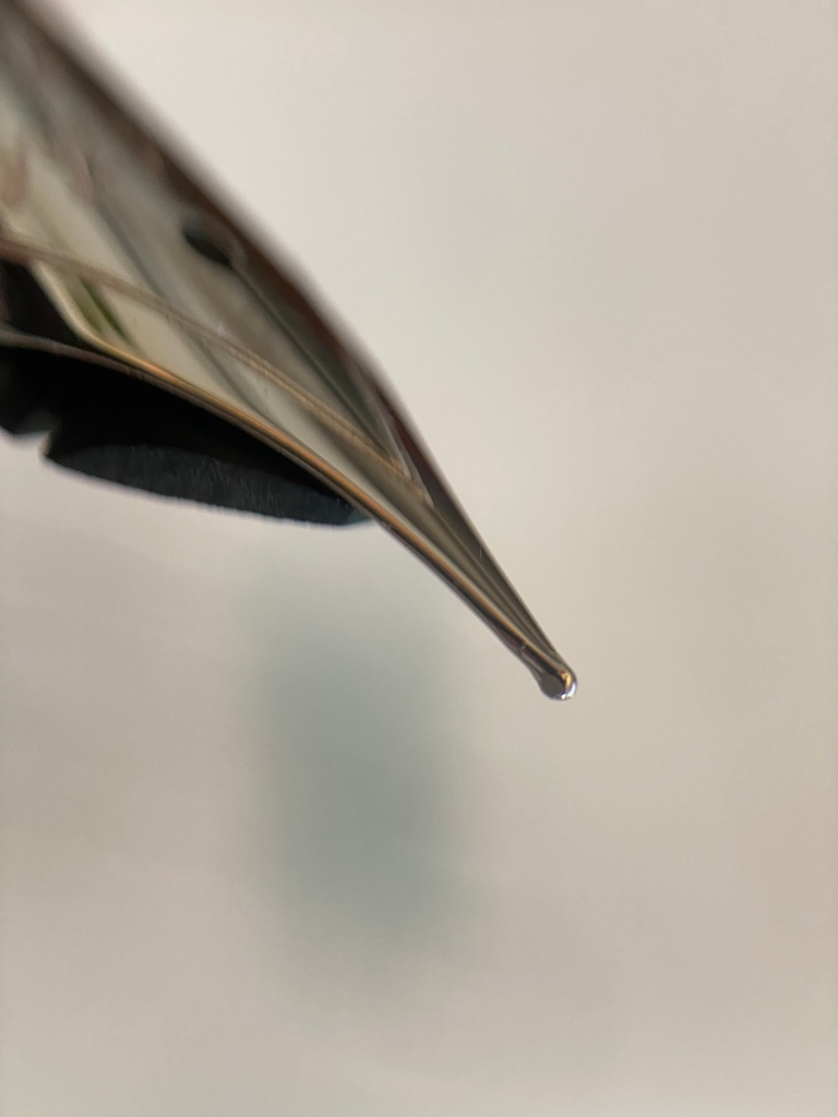
With all that said, I found the Scribo EEF initially quite confounding. With the weight of the pen suspended in my hand alone (about 6g of pressure on my kitchen scales), it simply would not write, at any angle.
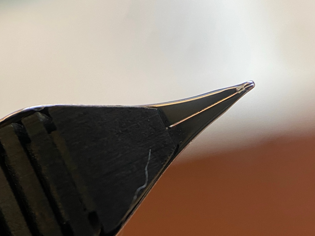
With my usual writing pressure (20-40g), it wouldn’t write either. It wasn’t scratchy at all; the tines and tipping looked perfect under a loupe. And it wasn’t a feed problem: I could see the feed was soaking wet. But the tines were pressed so tight at the tip that no ink would flow.
I had to apply 50g+ of pressure to visibly flex the tines, just as if I was writing with a flex nib, at which point a wet line gushed out, of M or B thickness (see the “0#” in the photo below). Let off pressure and the residual ink at the tip let a hairline write for a little while before the nib dried again.
I repeated this with multiple inks (wet Birmingham Riddle Green then Kobe #73). I flushed it extensively with warm water. I wrote pages with it to break it in. I scribbled swirls and figure-8s. I tried different angles. I checked I wasn’t rolling the nib (this one’s for you, Gary :)).

This is a loaner pen and I shouldn’t really be mucking about with it, but I couldn’t properly review it like this. It’s no exaggeration to say I found it frustrating and inconsistent to use to the point where I didn’t want to write with it.
So I very, very gently shimmed and flossed the nib just to get a very little ink flow when writing normally. No micromesh, no fiddling with the tipping at all. Here’s after attempt #1:
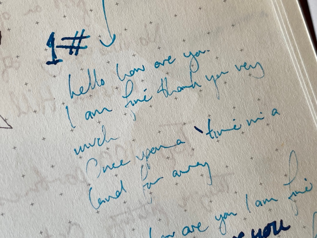
Hopefully Luca won’t shoot me when I return this loaner to its home. Attempt #2:

Attempt #3: Now the Piuma writes a line that’s definitely fine, although I have certainly used finer — this is not a Platinum UEF fine nib. It reminds me most of my old Pilot Murex F if anything. It’s still dry (compare the colour of the ink in the “3#” to the text), but much better. And remember I haven’t messed with the tip at all, and the tines still touch at the tip. Any additional perceived width to the line comes only from increased ink flow.

And here’s where I stopped, #4. Although it’s definitely usable now, it still writes a dry line and if you do a fast stroke (like on the ‘f’ in ‘fox’ or the ‘S’ in ‘Scribo’) it skips. You cannot write quickly.

Naturally I emailed Luca from Scribo during this process saying ‘help, this pen won’t write unless I press really hard’. Luca replied saying:
I normally have the same issue when the nib is brand new – after 2 pages it becomes more smooth and wet with no need to press too much.
I raised my eyebrows a little, I confess. Why are you sending out nibs that you know won’t write out of the box? We’ll come back to that in a moment.
But generally I was reassured. Things will get better. And indeed, Luca was right: although I stopped with my gentle tuning at a point where the nib was still a bit of a chore to write with, over the week that followed I perservered with using it, and today it is writing noticeably better. The line is no wider, but it skips less and just feels easier. There’s a pleasant bounce and access to that ‘flex style’ writing when you need it, but it’s usable with no pressure and still feels smooth and precise. I like it.
There are three schools of thought on nib break-in: one says that it’s actually you that breaks in, getting used to the nib and how to get the most of it. The second says that ‘break-in’ is basically a flush of the feed and nib’s manufacturing detritus that gets the pen writing better after a fill or two. The third says yes, nibs actually break in. After my experience with some Pelikans in particular, I already put myself in the third camp, and this experience with the Scribo EEF only confirms my beliefs.
But this is an extreme case of break-in for sure. I’ve had needlepoints from other brands like Platinum that write a calm, even flow out of the box and write the same on day 100 as on day 1. Frankly it freaked me out to have this nib just. not. write, even after flushing and reinking and scribbling for a good while, unless I wrote as if I was flexing the thing.
If I didn’t have the obligation of thoroughly testing the Piuma and writing this review, and if I wasn’t comfortable shimming rare and expensive gold nibs, I would probably have packed it up and sent it back as a lemon long before I got through the break-in period that Luca mentioned.
I will say that I checked with a couple of other EEF nib owners and the general consensus was that it’s a dry nib, but neither of them had such a tough out of the box experience as I did. I’m also sure that my normal lefty overwriter style minimises tine spread and results in me getting the worst possible experience. Your mileage may vary.
So don’t freak out: if you order an EEF it will probably be fine. If it’s not, it will likely break in if you give it a chance. And if it doesn’t, Scribo will look after you (I can testify that from previous experience as a paying customer).

So, let’s wrap up.
The Piuma is very different to the Feel and the Write Here Scribos. I really really like the clean, streamlined look with its twin facets. As well as being in my opinion the best looking Scribo design, it’s comfortable (despite the barrel step), a good size, and the C/C mechanism is fuss-free. The only negative for me is the force needed to get the facets to line up when capping.
The Impressione resin is a solid win. Its shade of deep sea green is lightened by the flashes of orange and it really does resemble the painting it was inspired by. Scribo has a bounty of beautiful resins in its library, some of which I prefer to this one, but I still like it a lot.
The EEF nib is beautiful like all Scribo nibs and looks great under a loupe. Today it writes a consistent Japanese F line for me, with a good amount of bounce available — but the experience out of the box was pretty bad and I needed patience and a steady hand to break it in and get the result I wanted.
And the last point: value. The Scribo Piuma Impressione EEF is available for £520 from Write Here in the UK, with the EEF representing a £50 premium over other 18k versions. Iguanasell has it for £479 after its 12% discount. This is pretty decent value considering the Feel weighs in over £600 now, and for a handmade pen with gold nib and ebonite feed I’m fairly comfortable with the price. If you’re a piston snob, you may wonder why the Piuma is as expensive as a Pelikan M1000 or an Aurora 88. If you’re not a gold snob, you may wonder what you get here that you don’t get from the £130 Gioia Alleria with an EF JoWo.
I was loaned my version by Scribo directly — I am not sure yet whether I’ll make a Piuma a permanent part of my pen tray, but I’m sorely tempted! If you want one, you may have to hurry: the Impressione is an unnumbered limited edition of 219, and deliveries start today, 24th September 2021.
Thanks for this, Anthony – first “proper” review I’ve seen of the Piuma. I have one – in the Altrove finish (dark pinky purple marbling) – and it was the styling which first attracted me. I had tried the Feel but really didn’t like the waisted look; I then found that the step down on the Piuma seemed (to me) less intrusive – it certainly doesn’t bother me. I started off with the medium flex nib, which was beautiful but impossible to write with unless you had enormous handwriting, so dropped down to a fine. I still find the flex quite difficult to control (I’m a lefty too, albeit an underwriter) but it is a stunning pen. Couldn’t cope with an EEF, I’m sure, although I still love my 3776 with the UEF nib – which I only got because you were such an enthusiast.
I recently purchased the Utopia in ef and the flow has been generous but the tines seemed to go out of alignment making it a bit scratchy. As I’ve continued writing with it it may be working itself out. Not sure yet. Sometimes I find a skippy or starved pen writes better the day after filling. I’m hoping that as the ef “breaks in” that the tines soften as they are much tighter for flexing than my Feel fine nib.