John Garnham’s pens (previously reviewed here) are difficult to get hold of. You can still only buy them through the Fountain Pens UK Facebook group, and he makes them only in limited quantities. He’s not interested in building a business around pens, so he doesn’t even have a website. But that doesn’t mean he avoids R&D!
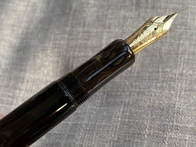
This is John’s new model, the JG8. As the name suggests, it’s designed around a #8 nib, specifically the Bock 380. John sells the JG8 without a nib, or rather with a 3D-printed plastic nib shape to help you try out the size in hand. He sells the pen for £80, and you can then source a nib of your own choice.
Most people in the UK would head straight to Beaufort and pick up either a Ti nib for £120, or a gold for £200. That means you can get yourself a big and beautiful #8-equipped pen for £200 dead — certainly not a bad value proposition.
I’ve been lightly involved in prototyping the pen, and I can vouch that John takes his design and production seriously. He’s open to suggestions and is thoughtful about the implications of implementing them.
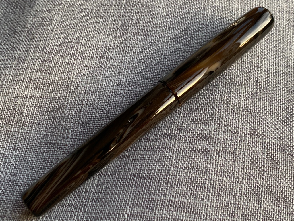
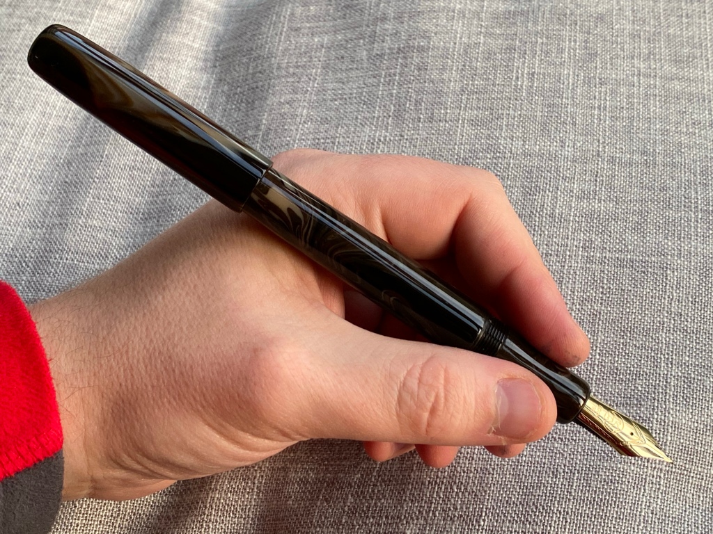
So here in front of me today I have two JG8s: a prototype in Venom with removable clip, and one of the first production samples, clipless in a resin that seems identical to the one Leonardo calls ‘Horn’. The main difference between the two versions is a 5mm-longer section.

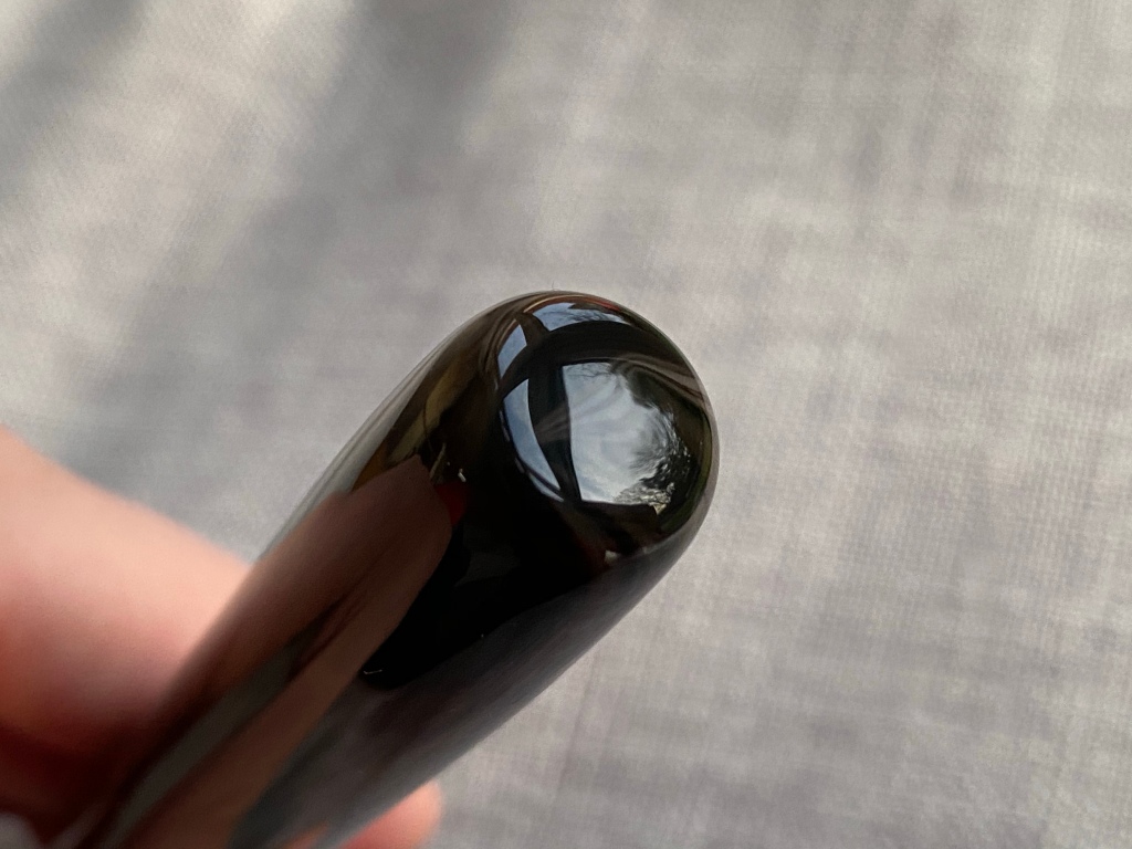
The resin wouldn’t be my first choice, but it’s inoffensive. It has some translucency and swirls between cream and brown.
The design is clean and simple. It has flat but rounded ends, no trim at all (apart from the clip, should you choose one), and a very slight barrel taper so the cap just posts.
There’s a small barrel step, and the cap does not sit flush with the barrel when capped.
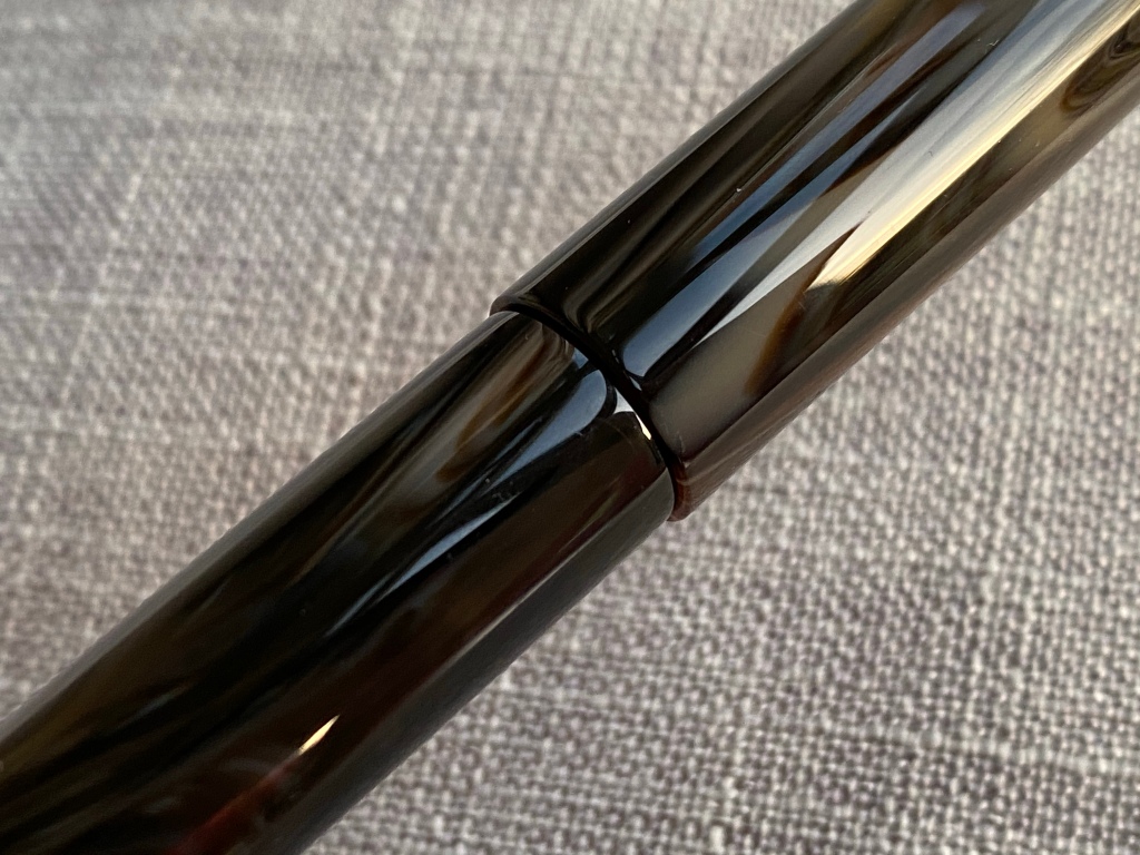
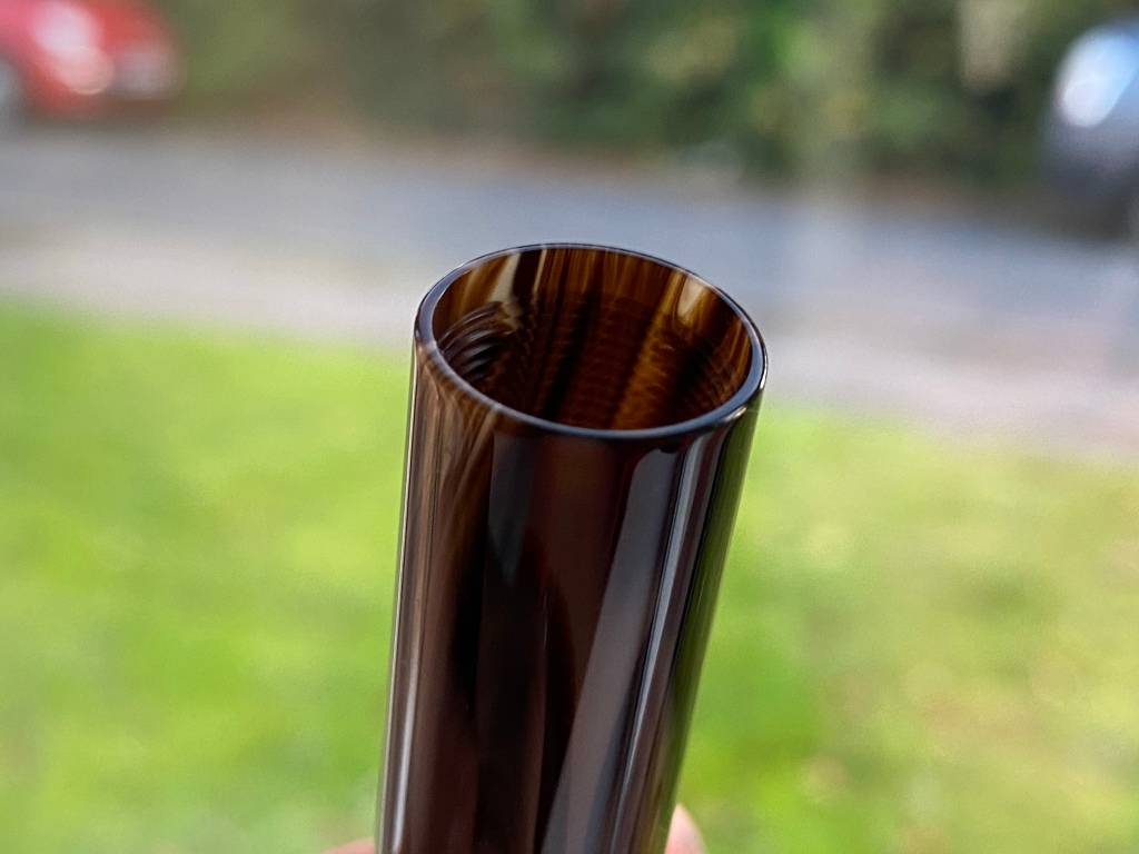
The cap spins off in 1.25 turns on conventional threads, revealing a very spacious section that is shaped slightly for comfort.

The overall size is large but not gigantic. Plenty of #6 pens, like the Leonardo Furore Grande, are bigger than the JG8.
Seen here against the smaller JG6 and the ubiquitous Studio and Eco:


And here nibless as you would receive it, against the Onoto #8 and Montblanc 149:

As always John has prioritised lightness for long writing comfort. There’s no metal piston mechanism or other weight inside, like say on a Pelikan M1000. If you like heavy pens, the JG8 is not for you.
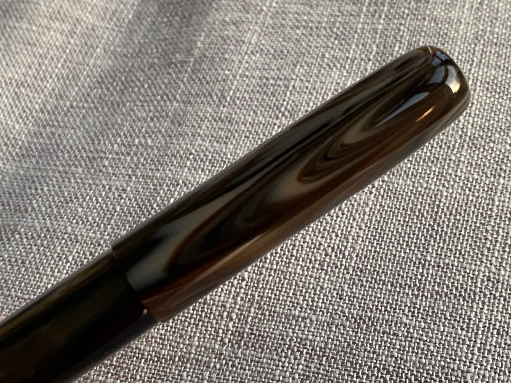
Build quality is, as I’d expect from John, obsessive. The polish is superb, the threads run wonderfully smoothly.
The only flaw to call out is a couple of chips at the end of the threads and around the rim of the section, which don’t affect function or aesthetics unless you really look for them. But if I’d paid for this pen (instead of receiving it as a review sample) I would ask John to make me another section — probably from another material not so brittle.

Hand comfort is outstanding. The revised longer section and light weight make the pen feel very natural.


In fact, my only real complaint about the JG8 has nothing to do with the pen itself. The £200 nib I ordered is nothing to write home about.

It’s a little rough, has zero bounce (it might as well be steel) and the flow is on the dry side, despite an ebonite feed.
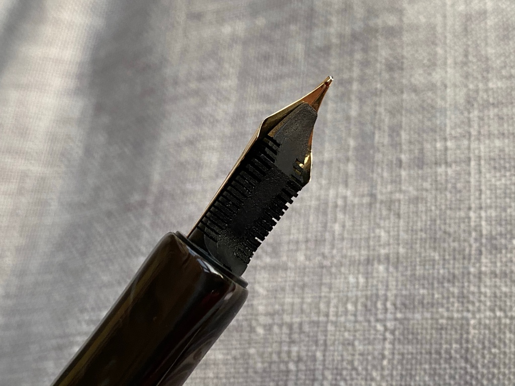
Last night I pulled the nib and feed from the unit and the tines were so tight that they crossed, hard, when I deliberately misaligned them. I’ve improved it with a little fettling, but it’s still a chore to write with… which means I need to push harder and grip tighter, and that gives me hand cramp. Next time I’d save the money and get the cheaper Ti nib — I’ve had good luck with those in the past on my Conids.
Nib aside — which is none of John’s fault — this really is your best way in to trying a ‘kingsize’ nib. The pen itself is under £100, well made, exceedingly comfortable, and surprisingly exclusive.
If you’re interested, join the Fountain Pens UK group and look out for posts from John.
Great review of an obviously lovely pen.
The only problem I have is that I don’t have Facebook so it’s an impossibility for me.
A really beautiful, elegantly minimal looking pen. Close to perfect in my eyes!
I am slowly converting to non-fussy looks on pens. Although, when the trim is done well I do like some nice metalwork. I find the shape of this ever so pleasing!
I’ve always enjoyed your honest reviews. I’ve been interested in John’s pens since your last review and this makes it even more so. I think the quality looks great, price is good, but most importantly the size and shape of the section looks like my cup of tea. Comfort is important for me in choosing a pen. I actually like this resin too since I love a good brown with depth. Too bad I can only enjoy John’s pens on your site since I’m not on Facebook. Thanks for sharing!
That pen is a beauty!