Sailor’s so-called Special Nibs — ranging from the subtle Naginata-Togi to the absurd King Eagle — have a storied history. They were unavailable for a few years, and relaunched just a couple of years ago with much higher prices and a new pen body format. Only recently has it been possible to buy one online; Sailor previously restricted sales to bricks and mortar stores. Stock is generally low.
So while I’ve had several 1911s, Pro Gears and even a King of Pen, I have never seriously considered owning a Sailor Special nib. I was put off by the high price and the confusing range of Japanese names describing the different nib styles, saw the limited body styles, and then the final nail in the coffin was the fact that I couldn’t actually buy one even if I wanted to.
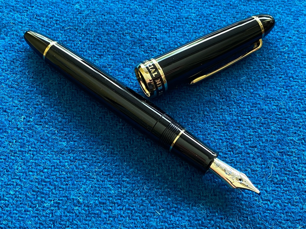
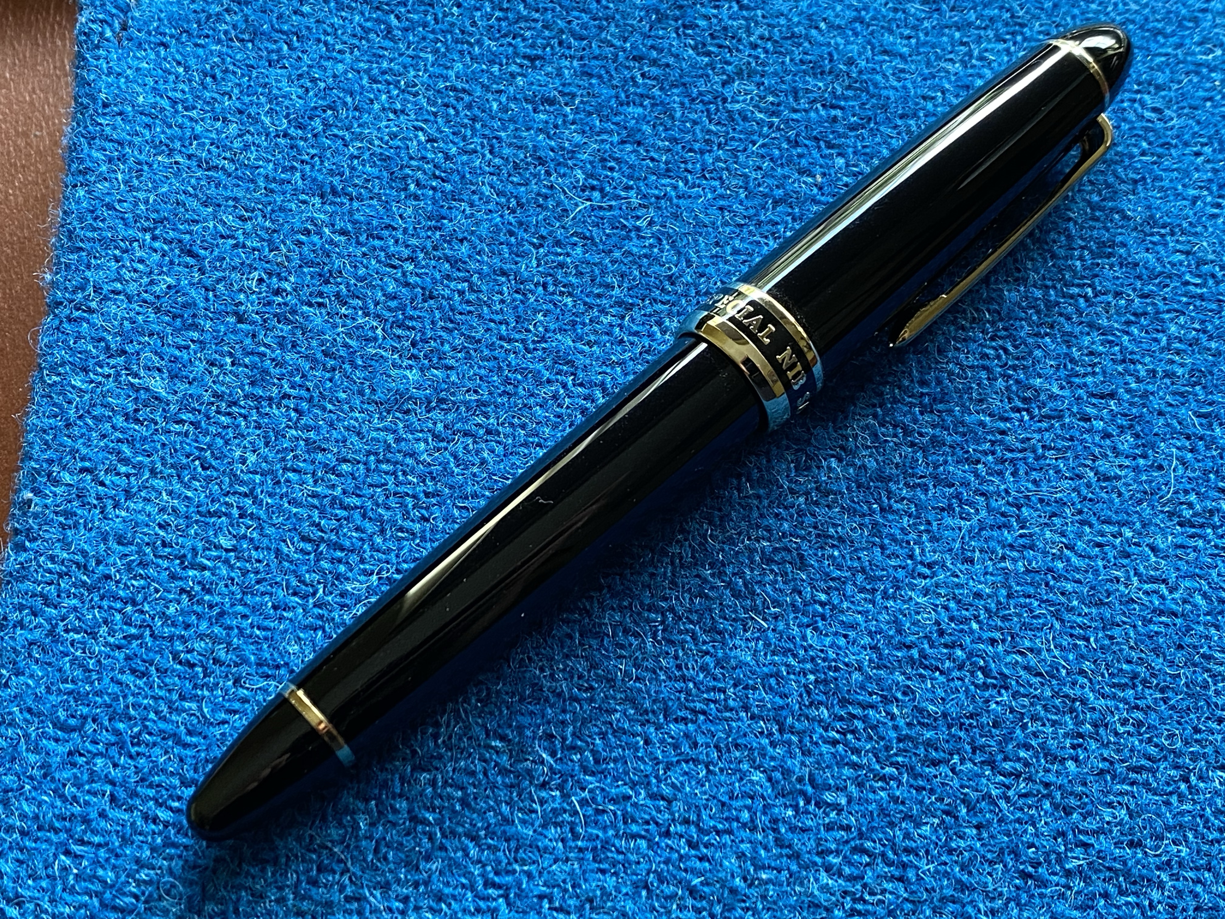
But. Here we are, and here is a Cross Concord 1911L. I’m here to tell you what’s different about it and whether it’s worth buying.
Price. Around £600-700. That means you’re paying about triple the price of a normal black Sailor 1911. What’s different?
Packaging. Slightly fancier than the usual Sailor, but not amazing.
Body. This is nearly but not exactly the same as a normal 1911. The barrel has a threaded brass insert to take the section, rather than the plastic of a normal 1911.

This means the section is not interchangeable with other Sailors! It also means the pen is heavier than a normal Sailor.

Filling mechanism. Still the usual Sailor cartridge or converter, both supplied.
Cap. The cap band is different, with the text filled in with black enamel. I don’t much like it. I’m not a fan of gold trim.

Otherwise the usual 1911 cap, clip and threads. The threads in particular always feel cheap to me on a Sailor, and that’s true here too.
In short, this is a perfectly normal Sailor 1911, for three times the price. Which brings me to the only significant difference: the nib.
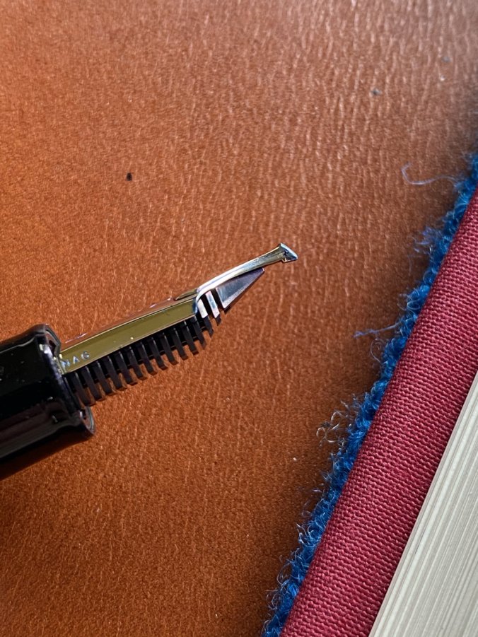
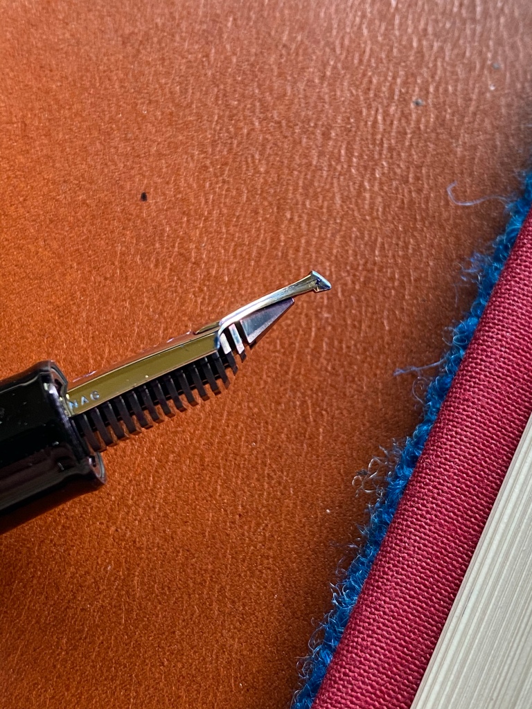
From the whole range of Special Nibs, I chose the Cross Concord, which is a reversible nib. Right way up it’s an EF. Flip it over and it’s like the world’s fattest, wettest architect nib. It’s normal Sailor 21k size, monotone gold, normal looking feed, but it is more than just a grind. This is a dual-layered nib, meaning if you look at the end of the tipping the slit is cross-shaped.
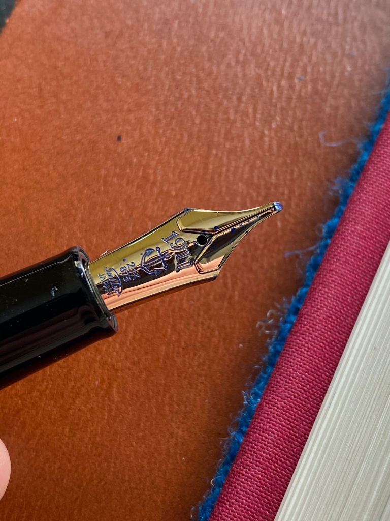
This is of course extremely difficult to create reliably, and in a real sense you get two totally different nibs in one.
The Cross Concord nib in my pen is perfect in every way. Under the loupe it’s a masterpiece of even grinds and alignment. The EF is crisp and precise, hooked down like a posting nib.
It has even flow and just the right feedback.

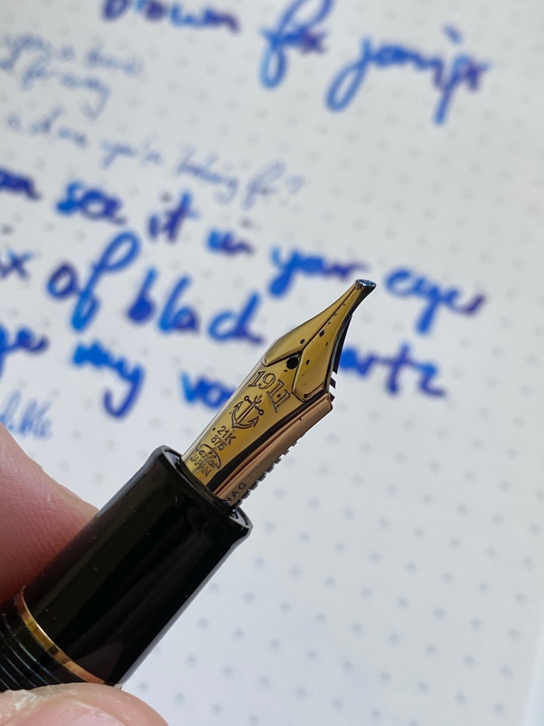
The architect on the reverse is super smooth and juicy, a big wet brush. Flipping between them takes a moment and had brought a new joy to meeting notes.


Naturally this is not a flexible nib. Stacking two nibs means a thick profile.
Very few nibs now have the power to surprise me and delight me. But the Cross Concord made me alternate giggling and saying ‘woah’ every time I picked it up, which has been often. It’s both fun and practical, the nib equivalent of the 80s mullet, business in the front and party in the back.
It’s all sober black pen, but uncap it and there’s a secret weapon.
If you want a similar experience but don’t have this kind of budget to fling around, there are nibmeisters who will grind nibs into reversible architects (I have one from JC Ament, the ArchitectRT). There are crazy people like Ralph from Regalia Writing Labs who are hacking at JoWo nibs to create their own stacked designs.
But Sailor did it first, and the quality and refinement of the Cross Concord is unimpeachable. It is clearly a work of a master-craftsman, but with the consistency and polish of a factory product. You could use the Cross Concord as your everyday work pen — there are no compromises in usability or robustness. It’s not an experiment or a toy.
So while the pen itself is very pedestrian, this is a truly special nib for me. I wish I’d tried it sooner. It’s expensive, but some experiences are worth a premium.
Congrats! The nib sounds quite extraordinary!
Intriguing. That looks a lot of fun. I loved the “giggling”and “woah!” description.
I’ve seen many of these “special nibs” in my pen groups, and like you, never understood the appeal. (I don’t have much use for the broad side or an architect grind.) But this review was thoroughly enjoyable and made me want to take another look at them. I own three Sailors, which I love dearly. The thought of having one with a “mullet” just makes my day!
Nothing absurd about a King Eagle nib! Well, except for the amount of ink it goes through. I wish they made a bigger ink tank for the King of Pen with the King Eagle Nib, then it would be perfect but it is a superb nib, nothing I know of can match it for smoothness and variable line width.
Thank you for the great visual review! What ink did you use here—it looks so good.
Might have been Sailor’s Sailor — long time ago!