The Esterbrook Estie was one of my surprise hits of 2018. Now, the reborn, Kenro-owned Esterbrook is back with the Phaeton 300R, a $68, slim, metal-capped pen with a hooded nib.

Mine arrived (sent to me for free) in a stately navy blue colour, with a brushed steel cap and gold trim. There’s a disc of navy plastic on the end of the cap for colour-coordination, and the only branding is the name ‘Esterbrook’ imprinted into the metal of the (long) clip.
First impressions are that the Phaeton looks good, in a retro kind of way. The kind of pen you’d find in your mum’s old sideboard.
The cap is slip-fit, using three sprung prongs inside the cap, and once it’s off you can see the section is the same colour as the barrel, tapering down to the hooded steel nib. In the hand the plastic feels surprisingly solid. There’s no creaking at all, despite the low weight. And it’s actually not a tiny pen — longer than the Van Gogh.

Unscrew the section on nice smooth threads and there’s a very simple push-pull plunger converter, absolutely slathered at both ends in a truly nasty-smelling grease. It stinks like rancid fat. It smells so bad that I didn’t try to remove the converter or disassemble the pen any further. I just held my breath and filled up, with Birmingham Cathedral of Learning Panther Blue — a nice classic blue for a retro pen.

Inked up and the nib wrote immediately, despite the feed being misaligned.

I think mine’s a medium nib (it’s unmarked), but it runs a little on the fine side. It has some tooth, but is actually quite a pleasant writer. Neither wet nor dry.

I found the Phaeton quite slim, but because the barrel is stepless, it’s comfortable.

The light weight meant I had no bother with longer writing sessions, and the slip cap is good for quick notes — although I’m a little concerned that its grip on the pen is too loose for pocket clipping. The cap posts deeply, although because the cap is so long, it still adds quite a bit of length to the pen.
And now we get to the problems.
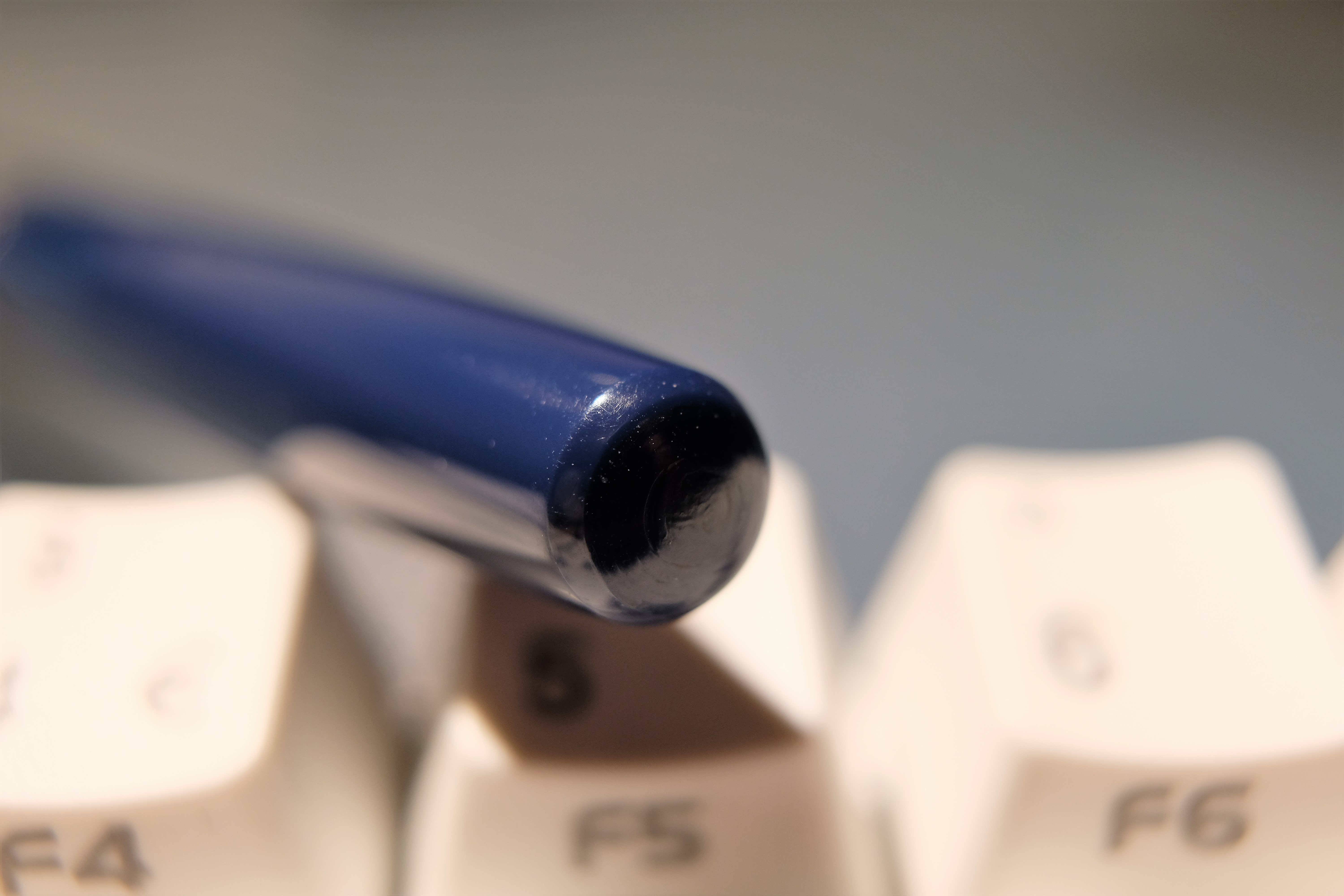
I’ve rarely seen a worse finish on plastic than the Phaeton. It is covered in so many scratches and dings that it looks like it’s been rattling around at the bottom of a handbag for six months, despite being fresh from its box. They’re difficult to photograph, but they’re there.

The end of the pen has swirls and mould lines.
The metal edges of the cap and clip are sharp and unfinished — the clip audibly sawed away at my shirt when I tried to clip it.

And the alignment of small components — like the section band and plastic finial — is poor and uneven. The band in the photo below is recessed on one side, and proud on the other.

Along with the stone-age converter and stinky grease, this really put me off.
I won’t lie: I’m generally disappointed with the Phaeton, mainly because I think it’s hugely overpriced. You shouldn’t have these kinds of basic issues with a $68 pen, especially one that has no excuse in terms of expensive materials or complex construction. There’s no piston filler here, no gold nib (and Platinum will sell you a gold-nibbed PTL5000a for $64 from Goulet!!!).
I’ve had my hands on a lot of pens at half the price or less that simply destroy the Phaeton for quality of finish and complexity of design, not least the £15 Wing Sung 601 with its vac filler (also a retro hooded-nib design). If you wanted to have a fair fight and avoid direct imports from China via eBay, consider the Lamy Al Star or piston TWSBI Eco, each of which runs under £30. Or various WH Smith-style pens like the Parker Vector and Sheaffer VFM, at under £15 in a bricks and mortar shop. Hell, $68 (53 quid) will get you a variety of Kawecos, Crosses, Conklins, Caran d’Aches, Diplomats, Faber-Castells, even the Lamy Aion. This is such a competitive market segment and there are so many great pens to choose from!
There’s a lot of discussion on the forums about the Phaeton being a rebadged Kanwrite or other Indian school pen. I have absolutely nothing against Indian-made pens, but the Kanwrites seem to run at $15 or less. At that price, they get the job done and you can’t expect a perfect finish. It’s this theory that leads me to believe I haven’t got a duff sample — this is just what Indian school pens are like.
Unfortunately, at $68, there are much better pens. The Esterbrook brand simply isn’t worth the premium, and I’d go so far as to say that the Phaeton undermines the brand that the Estie has been building.
I don’t hate the Phaeton. It has a retro charm, it writes just fine and it’s a practical, comfortable pen. If it was 20 quid, I’d still be annoyed at the poor level of finish, but I’d be willing to overlook them. But in today’s market, at this price, the Phaeton doesn’t stand a chance. Which is a shame. I know Esterbrook can do better.
I agree completely! Sadly, I presumed that this vintage looking pen would equal the quality of the reintroduced Estie. Simply put this is a cheap pen–not inexpensive-cheap. I could easily get a similar pen for less than $10. The converter is such poor quality and is difficult to replace with anything better. Fortunately I purchased this pen from a reputable source and they graciously accepted my return. Based on this I will be unlikely to consider purchasing anything else from the re-branded Esterbrook line. Thank you for your honest assessment.
Oh this doesn’t look good… Thanks for sharing and saving my wallet!
For once I help you guys actually avoid spending money! 😂
I typically scan the images before reading anything to get a feel for what I’m about to read. From the get-go, I thought I would be reading about a vintage pen you picked up on ebay and would restore to its original beauty. But was shocked to read that it was a new pen. Thanks for your efforts, they are always appreciated.
Cheers
I had already decided to pass on the Phaeton, as the only nib option (at least at this time) is medium. I’m saddened to read that they followed the Estie – a quality pen – with something so poor. Thank you for your review.
I just realized that the Phaeton looks identical to the 2016 M2 that was released. Same color plastics. The only real difference is that they screwed on a hooded nib and changed the clip to gold. Capped, you wouldn’t be able to tell the difference.
Glad I stumbled upon this blog as I thought I was the only one that had this pen with it’s rancid smell! I don’t think it will go away and therefore the pen sits in the box….stinking. Yuck. I also have found the yucky stuff has gravitated towards the nib and now there is sticky stuff there as well.