Inks may have become an overwhelming torrent in 2021, but Wearingeul are proving that if you do something really, really well, there’s still room to stand out and delight.
This Korean brand has come out of nowhere and hit with a bang. What do I mean? Well.
Here’s just one example. They’ve created a boxed set of four inks inspired by the characters of the Wizard of Oz. Each comes with a vial of potion that represents their missing ingredient — brain, heart etc — turning the ink shimmery when you add it.
Another set, one that I purchased, features two identical bottles of red ink labelled Dr Henry Jekyll.
Syringe in a mysterious transformation fluid into one bottle, peel off the label, and suddenly you have the dark purple sheening Edward Hyde ink.
Other sets are more conventional, or at least free of party tricks: one represents the three works of Japanese author Soseki; another is based on works of Korean female authors; another the character development in Hesse’s Demian. It’s like Wearingeul wants to give us a reading list as well as some ink.
I had already bought the Jekyll and Hyde and Demian inks when Wearingeul reached out and offered to send me some more to review. I spent a good hour scrolling through the glossy brochure PDF they sent over — I found it incredibly difficult to choose.
Each set included not only an interesting theme, but the colours themselves were interesting: individually, as a palette, and in their properties. Each set generally includes a couple of shimmering inks, others with colour-changing properties or high shading.
Ultimately I picked two sets:
03 Korean Female modern writer ink set 30ml
05 Kim So Wol Literature Ink 30ml Set
Eight inks duly turned up, adding to the four Wearingeul inks I already own. Oops, now I have my work cut out for me.

Let’s start with the packaging. No expense is spared: paper boxes printed for each ink, comprehensively labelled. Restrained typography.

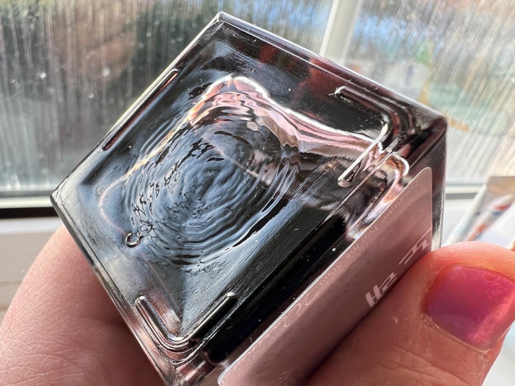
Inside, square glass bottles with full-colour, foiled labels, and card inserts printed with the colour’s pantone shade and RGB values. It’s a premium experience. The bottles are 30ml, which isn’t huge, but plenty big enough for today’s ink addicts. Only my longest nibs struggled. I did however have a problem with the caps: I found them slippery and sometimes struggled to get a grip to unscrew them! I must be getting weak in my old age.

More importantly, the square bottles nestle in drawers easily, and when boxed they stack well too. I just wish the bottles themselves all had the English name of the ink on them instead of just a suggestive colour.
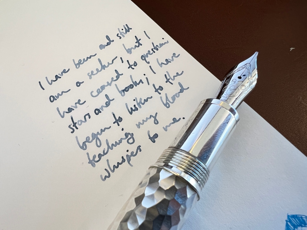
I’ve stuck these inks in all kinds of pens and nibs over the past few weeks. Overall, they have performed well. Some of the shimmer inks have a pretty heavy particle load so I’d be nervous putting them in anything beyond a TWSBI Eco. There are some searingly saturated inks like the blood red ‘Human Problem’. But most of the inks I tried were delicate with their dye load, light coloured and big on shading. These inks feel loose and watery from the nib, flowing moderately fast but with little lubrication — there’s none of the sumptuous oiliness of a KWZ or Sailor.
Let’s run through a few highlights.
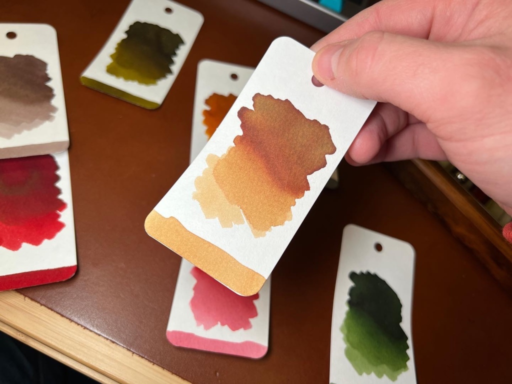
Half-moon dimmed light and Path

These are the two big shimmer inks, and they are both big hits in my opinion. Half moon is a grey, essentially, but smashed with blue shimmer. In pools and wet nibs it’s incredible, and turning it in a demonstrator is addictive.


Path is a yellow-tone green, leaning towards olive and khaki, and shot through with bags of gold shimmer. The result is gorgeous. It can look dark and dull, then you hit it with light and it comes alive.


Flowing Leaves is another glistening green, a more bright grass green, with silver shimmer. The shimmer load is lighter, or maybe I haven’t managed to get a full fill in the converter. To me it’s a distant second to Path.


Demian Lost and Mature
Lost is a silvery blue, with Mature a darker dusty blue-black. Both of them absolutely grab me — I really enjoy the subtlety and the way the colour shifts slightly as it dries. These inks are keepers for sure.

Human Problem
This is the big-hitting red I mentioned above. It’s a blood red but catch it in the right light and it leans a little towards pink — it reminded me of Scribo Rosso Melograno.
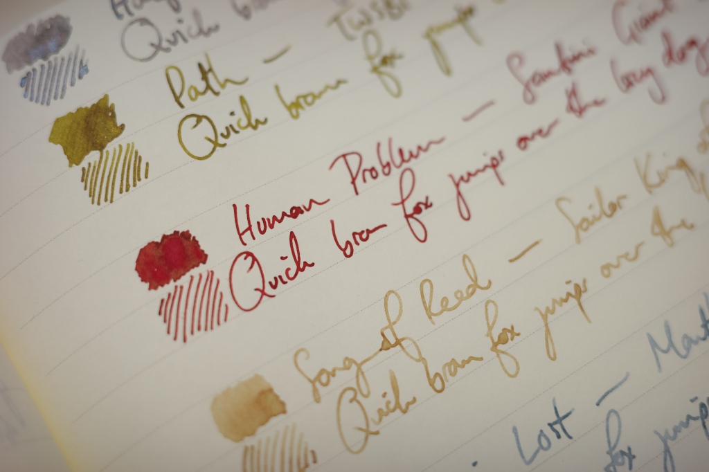
Song of Reed and Mason’s Song
These are the softest inks in the set.
Song of Reed is a soft straw-coloured ink, somewhere around yellow, tan, green and brown.

It shades superbly and is a real chameleon in different lights and on different papers.

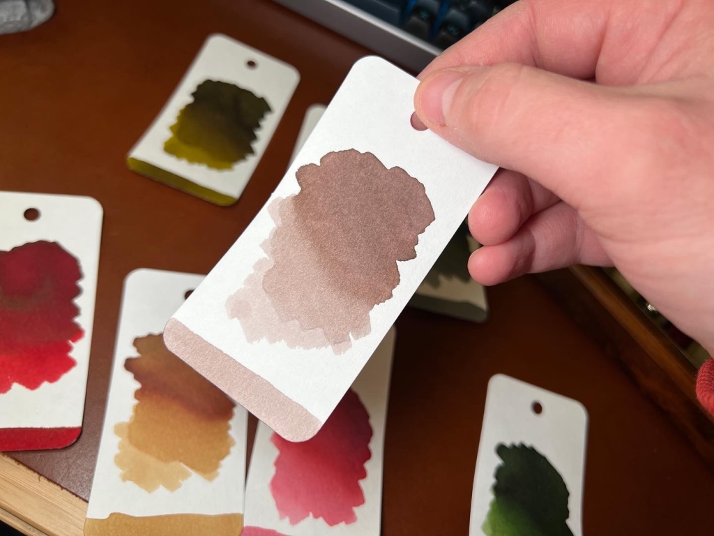
Mason’s Song is the same but for greys. It’s a soft grey with warm undertones and excellent shading.


Kyonghui and Flowers on the way
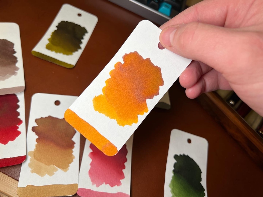
These are cheerful, non-shimmer inks. Kyonghui is a burnt orange, nicely saturated with some good shading.

Flowers on the way is a pretty blossom pink, also with strong shading.

Honestly I’m not big on pink inks, after years of trying. I like the colour and appreciate them, but they never stick with me in use.
Wearingeul’s inks are currently on sale on Amazon, with individual bottles priced at $20. Obviously for the moment that means paying international shipping and import duties too, so that may price these inks out of your comfort zone.
Personally I’ve found a few favourites here: Lost and Mature, Path, Song of Reed, Mason’s Song and Human Problem have all got that special something that makes you go ‘ooh’.
There’s obviously something in the water in Korea at the moment, because Dominant Industry have also blasted on to the international market with some killer colours and professional packaging. Long may it continue. (And with multiple seasons of literature inks announced, I don’t think we have much to worry about…!)
Nice to see a review on a brands other than the normal ones, however what do these inks offer that is not currently available from Robert Oster, Diamine or other inks that are readily available in the UK, at a lower cost?
I hoped that would come across in the review 😂. I rather liked the creative concepts and overall execution. And it’s always interesting to discover a new brand, from a new land. But if you read the end of year wrap-up that I linked to in the first paragraph, I am well aware of the problem you bring up. RO and Diamine each has hundreds of inks. How many different greys are there already? I’m sure there’s one that’s a perfect match for Mason’s Song.
I have used both Mature and Lost and they are amongst my favorite inks. They are both drier inks particularly Lost and thus work best to tame pens like my Pelikans. Mature has a beautiful ashen grey (Blue-Black seems a bit of a stretch) and is water resistant. Lost is the only ink I’ve encountered that looks Grey and then lightens to a blue-grey color. It is the opposite of a blue-black! I think Lost initially looks very similar to Mature and then changes color. In my opinion they should have flipped the names.
There are many beautiful blues and greys in Diamine. I don’t have much experience w/ RO. I may not get another bottle of Mature, but I will certainly keep “Lost” stocked up. In my opinion their “reading list” is a gimmick but I feel it’s worth a change of pace.