As we head towards November, and Remembrance Sunday, for many of us the two World Wars will be on our minds, and the familiar poppy symbol will start to appear on the lapels of our winter coats.
Despite this, the events of World War I in particular can seem a little unreal, barely more than facts from a school syllabus. After all, the war ended more than a century ago; no soldier still lives who fought in it. For many of you reading, it won’t be your parents that fought in WWI, but your grandparents or great grandparents.
So it’s good to see Onoto bring to life this pen, the Flanders, as a way of keeping the memory alive and viscerally real in our hands.

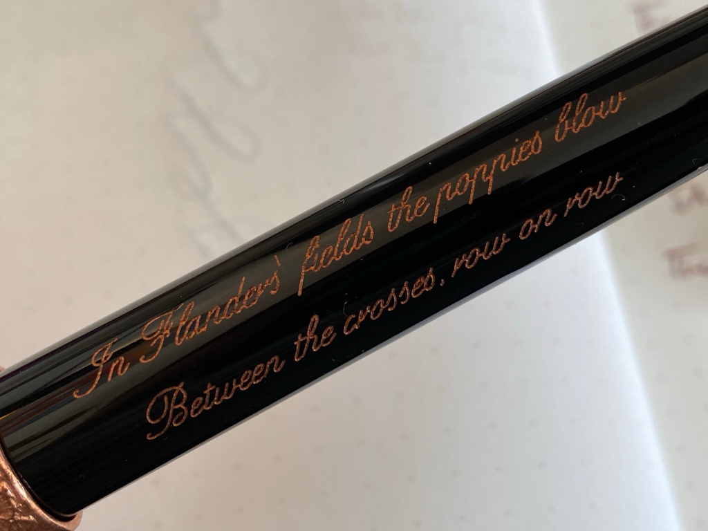
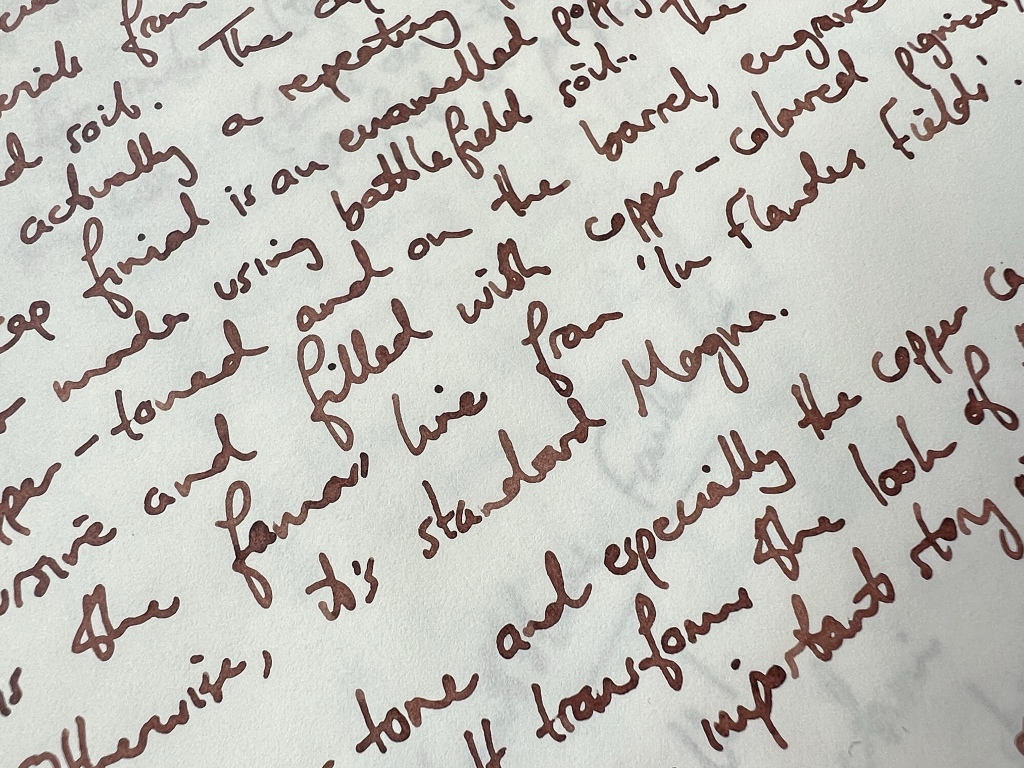
The Flanders design is centred on the oft-quoted poem ‘In Flanders Fields’, with its lines about red poppies that grow from the churned mud of the battlefields and the graveyards filled with war dead. The opening lines of the poem are engraved and filled with copper-coloured pigment on the barrel itself, but in typical Onoto fashion, the link to World War I is more than just skin deep.
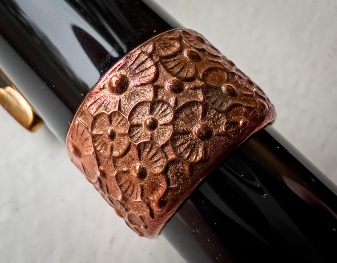
Onoto has worked again with TMB Art Metal, its partner in producing the Spitfire pen (which if you remember, is made from actual Spitfire wing spar). The cap band of the Flanders is made from copper sourced directly from World War I battlefields in the Somme and Ypres, and forged into what at first glance looks like a random hammered finish, but on closer inspection is a sea of poppies.

The finial is also made from copper, in the shape of a poppy, filled with red enamel. The enamel contains soil from the same churned Flanders Fields referenced in the poem.

So that’s the concept: a tribute to WWI that puts some of that torn landscape directly into your hand.
Does it work? Yes, it does.
My biggest fear with ‘tribute’ pens is that they’re gaudy and heavy-handed, lacking dignity. Imagine if some other manufacturer had designed this pen: it would have red poppies all over the barrel, or a tank-track clip, or a gravestone cross on the nib. It’s enough to make you shudder. But the Flanders pen is broadly speaking subtle and feels very authentic.
The cap and barrel are plain black, and although the clip is bronze and therefore not quite a colour match, all the other hardware you see on the exterior of the pen is copper.

It makes for a simple and subdued colour scheme, one I like a lot. In particular, the cap band is surprisingly subtle, and incredibly tactile under the fingers. I found myself rubbing it, and every time it got me thinking about the War. It’s almost totemic.

The poppy on the finial is very pretty, simple and well-executed. Using the pigment of the soil is also just a beautifully clever idea, and at the risk of overanalysing, I like how the copper comes from the weapons of man, while the soil and the poppy come from the landscape — almost showing the cycle of life recovering after war.

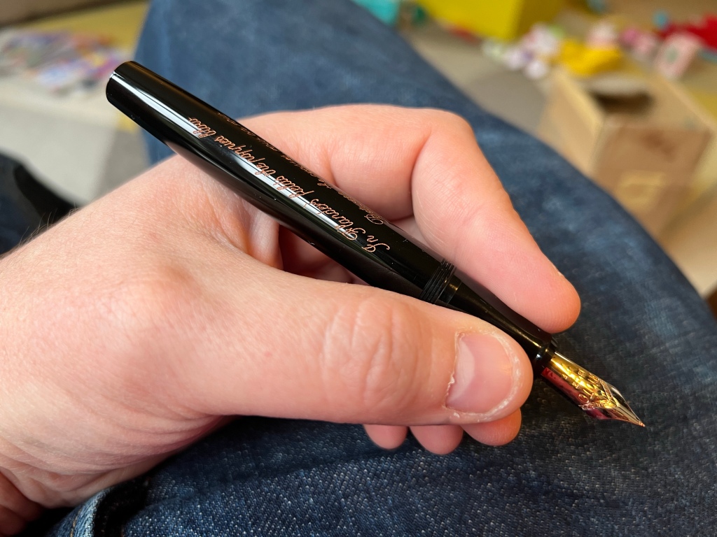
For me, the lines of poetry on the barrel are the only misstep. They take up a huge amount of barrel space, they’re almost illegible in sparkly cursive copper, and in my left-handed grip they’re upside-down, too. The poetry is just unnecessary — let the poppy and the memory do the work. I have spoken to Onoto and they may be able to do a plain barrel if you ask.

As a pen, this is classic Onoto Magna, which should be familiar to any regular reader. It’s a good, solid-sized and well-built pen, with excellent ergonomics.
The nib, in this case an 18k Fine, is absolutely superb.

For the purposes of this review I inked the pen with DeAtramentis Document Red Grey, an earthy ink the colour of churned red-brown clay, with archival properties — it seemed fitting for a pen about memory, and the nib loved it. I can’t imagine a better writing experience.
The internals are still a cartridge-converter, and there’s still the one problem for my taste, which is that the cap takes more than three full turns to unscrew. Not a pen for quick notes.

Onotos are not cheap pens, but considering the very special material and a true limited edition of 200, there’s little premium on this edition over a normal Magna. With a steel nib it’s £500, or £633 with a gold nib as reviewed. You can also add Onoto’s plunger filler mechanism and upgrade to a #8 size nib, which brings the price to over £1,000… but honestly, the #7 nib is a brilliant writer and looks in proportion to the pen, and the CC works plenty well, so the £633 version would be my pick.
Bottom line for me: this is a very special and exclusive pen that’s also eminently usable (as all Onoto’s are). If you have any interest in, or connection to, World War I, I can’t imagine a more fitting and lasting tribute than these copper and enamel poppies. This is a tribute you can hold, use, run your fingers over. It keeps memory alive. Yes, it’s expensive, but the price and limitation are for genuinely special reasons — this is not a random swirly plastic limited to 200 units just to trigger FOMO. I respect that.
I was loaned this pen by Onoto for review. You can buy yours here.
I agree the pen doesn’t look too cheap or tacky and paste almost to World War I appropriately.
However, I would’ve designed it with the poem possibly on the cap ring? Or on the bottom finial if there was room. But I do love the detailing aspects with the enamelling of the poppy.
Although in hindsight maybe pen made from the brass casings of shells could have been a nice touch too?
One of the things I like about this edition is that it doesn’t lose the comfortable weight and warm feel of the normal plastic Magna — it would be quite a different beast in all brass, and probably much much more expensive too.
Shame they’re making profit from all those deaths and injury without making a donation to the Royal British Legion for each pen sold. The RBL has enough of a problem raising fund to help injured service men and their families without commercial organisation profiteering from the Remembrance Poppy.
I think this pen is raising awareness and doing good regardless of a donation — but I agree with you that it would be the right thing for Onoto and their metal partner to donate a portion of proceeds.
We absolutely feel it’s right and proper to make a donation and decided, perhaps unusually, to benefit the Memorial Museum Passchendaele 1917 at Zonnebeke near Ypres. It’s a fantastic museum doing a lot to help keep alive the memory of those soldiers who died on the fields of Flanders in the most horrendous conditions over one hundred years ago, and has been struggling recently due to covid lack of tourism. Bearing in mind some of the copper artillery shell ‘drive bands’ used in the creation of the pens came from the Passchendaele area we feel this to be quite appropriate.
The Museum can be found here: https://www.passchendaele.be/en
I really liked your ink choice for the review. Can you let me know where I can find that here in the UK?
I also really like what Onoto has done with this. I think the only downside I can see of this pen is that the script is not right for a lefty (as you pointed out). Maybe Onoto could offer to reverse the script as an option. To me, it adds to the overall Asterix of the pen (rather than a black barrel) but that is very subjective.
Great review, as always.
Hey Charles! Cult Pens stocks the ink — that’s where I got my bottle. They stock Onoto too, as it happens.
Thanks for reading and for your comment.
Hello Charles. Please email [email protected] and we will get your left-handed engraving sorted.
So maybe we will get a Montblanc Anne Frank pen after all.