TL;DR: watch the video
Prefer to read? Here’s the written review
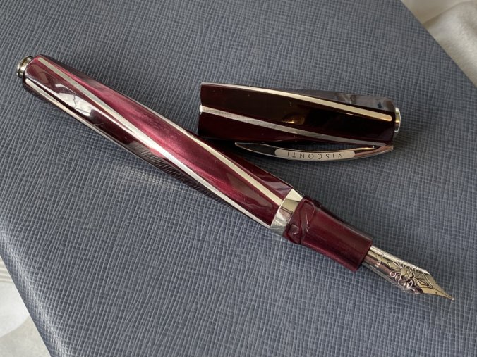
If there’s been any doubt in your mind that Visconti can make beautiful pens, the Divina Bordeaux should lay it firmly to rest. The Divina is gorgeous in photos, but in person it is utterly stunning.

The wine-red resin is interesting and swirly, but not in a crass or busy way. It’s polished to liquid appearance, shaped into a soft, curved pentagon in profile, and spirals along its length, with a thin rod of silver inlaid at each vertex, seamlessly.

The result is a pen that is most captivating when it moves, like a kind of luxury barber’s pole glimmering in the light.

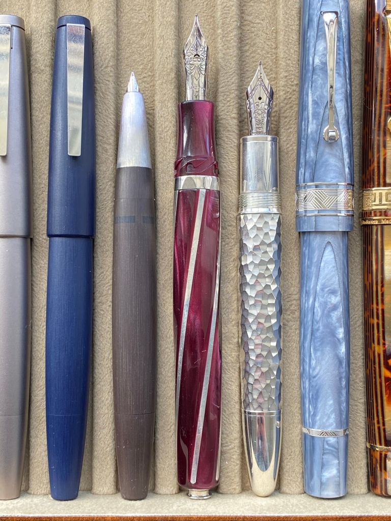
The proportions of cap to barrel are supposedly laid out in accordance with the ‘divine ratio’, hence the name, but the proportions are unremarkable; perhaps a shorter cap relative to barrel length than most pens. This is one of Visconti’s ‘oversized’ creations, but don’t let that alarm you: it’s longer than most of the pens in my tray, but it’s no Namiki Emperor. It’s more or less the same size as a Homo Sapiens.

Faceted pens like this tend to struggle with alignment with cap threads. But here Visconti’s Hooksafe bayonet-closure is a genius move.

Not only is it gloriously quick and easy to cap and uncap, but every time the spiral on the cap and on the barrel align perfectly. The Hooksafe also keeps the cap nicely airtight and I never found the Divina dried out even slightly.

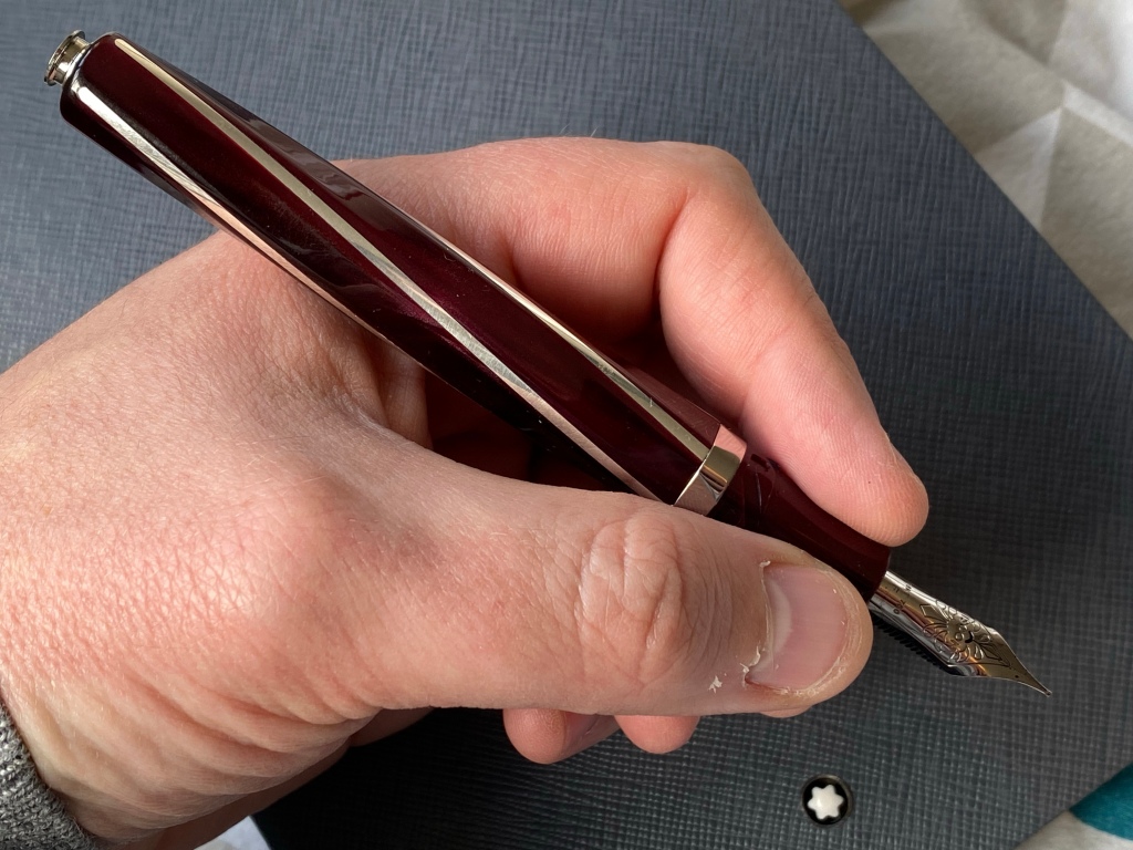
Take off the cap and you’ll see the usual Visconti section, which is a good size, not too large or small, and gently concave. Depending on your grip you’ll feel the Hooksafe shape under your fingers, but it’s not sharp. Beyond the section is Visconti’s in-house made 18k nib, rhodium plated, backed with a plastic feed. More on the nib later.

At the other end of the pen is an unusual little metal nipple, which operates the filling mechanism.

Unlike Visconti’s usual vacuum Power Filler, the Divina is essentially a captive converter filler.

You can’t access the converter, so instead you pull out this little knob and twist it to fill, then simply push it back down inside the barrel when you’re done. It’s easy to use and reliable, but has two downsides: the visible nipple is a bit clunky on what’s otherwise a very clean design, and the capacity is low for such a large pen. I don’t much mind either, although note that the Divina is also a mystery filler: there’s no way to check the ink level.
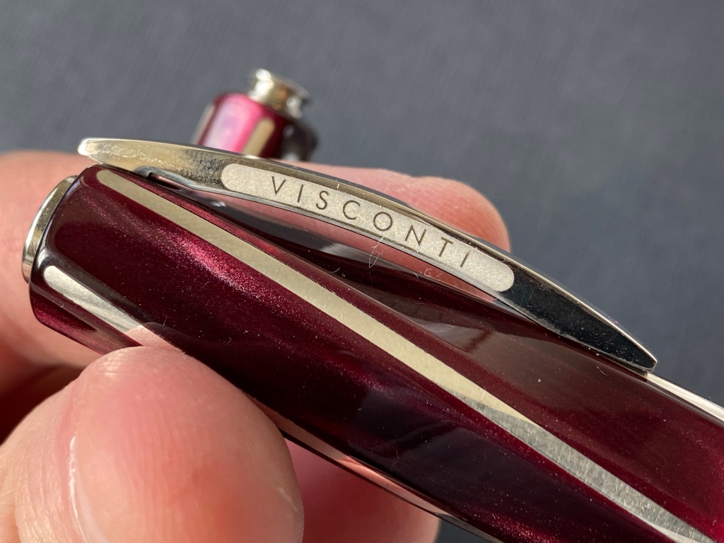
The cap features Visconti’s magnetic badge system, which I’ve never had any desire to use, and the usual arched bridge clip, which is stiffer than on many Viscontis I’ve owned in the past. Here the Visconti logo is laser-etched into the side of the clip, rather than being engraved and filled with enamel. I would have liked the enamel on such a premium pen.
One nice feature is that the cap posts perfectly on the end of the barrel and seamlessly continues the spiral of the silver rods. I’d never do it myself, because the Divina winds up being about three feet long when posted.
Unposted, the Divina sits beautifully in the hand. It has a little extra length compared to a Homo Sapiens, but it’s not heavy or back-weighted. In fact, after using a lot of metal pens recently the Divina feels surprisingly light.
Putting pen to paper
How does it write? Well, sit back and I’ll tell you.
When I get a Visconti, the first thing I do is look at the tip under a loupe. I’ve been burned before by Visconti’s nib QC, and I figure I might as well get the pain out of the way.

Well, the Divina was not a pretty sight. The tines were misaligned, and the two lobes of tipping were vastly different sizes. I later checked with some nibmeisters I know, and they said it was poor but par for the course for Visconti’s in-house nibs.
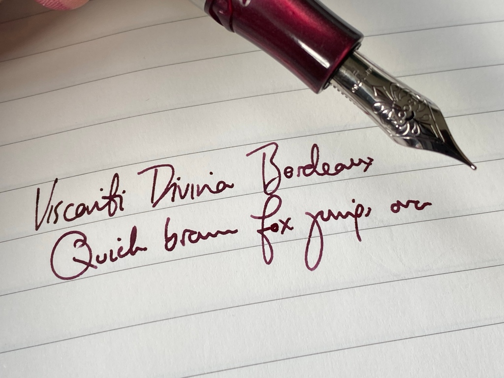
I inked the Divina up first with Montblanc Encre du Desert, a wine burgundy that perfectly matched the resin.
The first page was a cacophony of squeaking and rasping and clicking.
This is a noisy nib — saying it ‘sang’ on that first page would be putting it kindly. And it wasn’t particularly smooth. But Visconti’s 18k nibs have long, soft tines, and this allowed the uneven tipping to align just from normal writing pressure. So despite the car crash of the tipping, the damned thing actually wrote OK.
I picked an F nib, and I guess it’s not far off — but the more I write with it, the wetter it gets, and it’s a soft nib, so the line often falls into M or even B grade on Tomoe. It’s definitely much, much wider than say a steel JoWo F. Most recently I’ve inked it with Dominant Industry Leaf Green, a moderately wet ink, and the line is lush and full. Over usage it’s quietened down and actually, it’s a pretty pleasant experience to write with the Divina.
The price of beauty
And now the last word: price. This pen lists at £925, which puts it way beyond the reach of 90% of penthusiasts, according to my data. There’s no fancy packaging or accessories, either: what you’re paying for is the pen (as it should be). And I think a lot of the money goes on the truly incredible body. The faceted, spiraling, inlaid barrel and cap, the engineering of the Hooksafe, the sprung clip, the flawless polishing… this is how a pen should be, and it takes a lot of hours of work to get it there.
In theory, you’re also paying for that long, in-house 18k nib. It’s pretty and an OK writer; with decent tipping, I think it would be an awesome writer, actually. Iguanasell loaned me this Divina to review, and if I’d bought it I would have asked them to check and test the nib before shipping to make sure I got a good example. Having ordered from Iguanasell dozens of times over the years I know they’d look after me, so I would order with confidence — good thing too, since I apparently can’t trust Visconti to make a nib, still.
To me £925 is too high even for this beautiful pen. But luckily, Iguanasell is offering a 20% discount just for UK Fountain Pens readers in the UK and US. Use the code UKFOUNTAINPENS at checkout following these links:
https://www.iguanasell.com/collections/ukfountainpens
https://www.iguanasell.co.uk/collections/ukfountainpens
At £740, with no worry about customs or shipping, the Divina Bordeaux is a much more compelling value proposition. And you’ll never tire of spinning it in the sunshine.
Don’t worry, I’m not getting paid to write this review, nor will I get any kickback or affiliate pay if you buy from Iguanasell. Thanks to Iguanasell for supporting the blog with the loan!
“Luxury barber’s pole”????
That’s on a par with Reggie Perrin seeing a hippopotamus every time anyone mentioned his mother-in-law.
Watch nerds love to come up with nicknames. I suspect this pen will now forever be known as the barber’s pole.
I do like the look of Visconti pens but because of their QC I just can’t bring myself to buy one.
It’s amazing, and I guess to be admired, that Visconti can continue to flog this pen, and the viral variants of the Homo Sapiens, year after year after year after….
Don’t recall: did Visconti remedy the “Hooksafe” problems with coming unhooked and thus unsafe? Lord knows they’ve had enough time to do that, old as the system is.
I agree that the ciip is not the highest and best example of this style. The question should be “Why not?”
Sigh. Then there’s the nib. Misaligned, misshapen, the same engraved design for years without the grace of being two toned. “Par for the course” meaning routinely slovenly.
Is that thing supposed to stick out of the end of the barrel? Really? Why would you have something that looks like it’s intended to catch on anything that comes near it?
It is a pretty thing, an object to ponder and worship as it reclines safely on a desk. And then use a fountain pen that actually writes.
Wilde said, “There are only two tragedies in life: one is not getting what one wants, and the other is getting it.” The swirl of this Visconti drew my imagination into images of DNA helical twists or the spiral of Nautilus shells and far from the mundane. Only with the careful review here of the positives and negatives have I averted the purchase of a marvelously beautiful pen that writes tolerably and with its own chirp.
At the same time my fixation on the Divina Bourdeaux ebbed with its negatives, the discovery of Iguanasell opened. Thank you, as always for sharing your thinking and testing process to clarify and refine my own.
The duality of this pen is the reason I’ve never bought a Visconti.