Isn’t it great when a new pen maker appears on the scene, with a design you’ve never seen before?
The Good Blue is a young venture by a chap called Sunil, who I met at the London Pen Show. He has plunged into the world of pens with a combination of infectious enthusiasm and engineering background.
The company’s first offering is this, the R615 fountain pen. It’s not the usual stick of plastic or machined metal design, and that in itself is refreshing.

Hunting the white whale
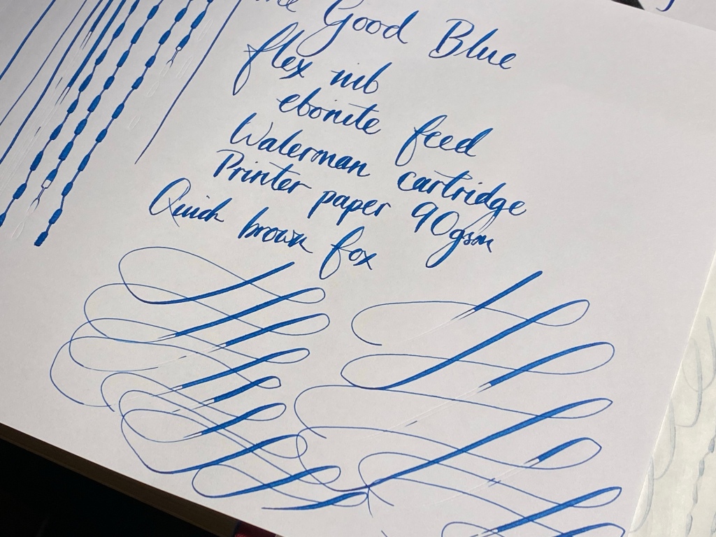
There’s a lot to cover in this review, but the main thing you need to know right now is that this pen retails at about a hundred quid with an ebonite feed, and it aims to tackle that perennial question: how do you make a modern flex-nib fountain pen?
Of course, if you’re interested in trying flex you could spend £200+ on a Pilot 912 FA, £250+ on a Pilot 823 FA, £500+ on a Scribo 14k, or £800+ on a Montblanc 149 Calligraphy. You could import a Desiderata with Zebra G dip nibs and replace them every couple of weeks when they rust. (I’ve done all of these options myself…)
None of those options appeal? Well, there are steel nib flex pens on the market, such as from FPR in India, or Noodlers, but after reading a few reviews you’ll find none of them offers foolproof performance out of the box. Whether it’s leaks, hard-starting, railroading or just general poor finish, there always seems to be some compromise.
See, Sunil has taken on a huge challenge, especially at this price point, trying to get the bounce and flow of flex from a steel nib and with a cartridge/converter mechanism to feed it, with production-grade scale and consistency. If people still grumble about a fancy Pilot 823 FA railroading, what possible chance could this pen have? Has the Good Blue succeeded where others have failed?
I would like to say ‘yes’, but it’s not a totally unqualified yes.
Feed the insanity
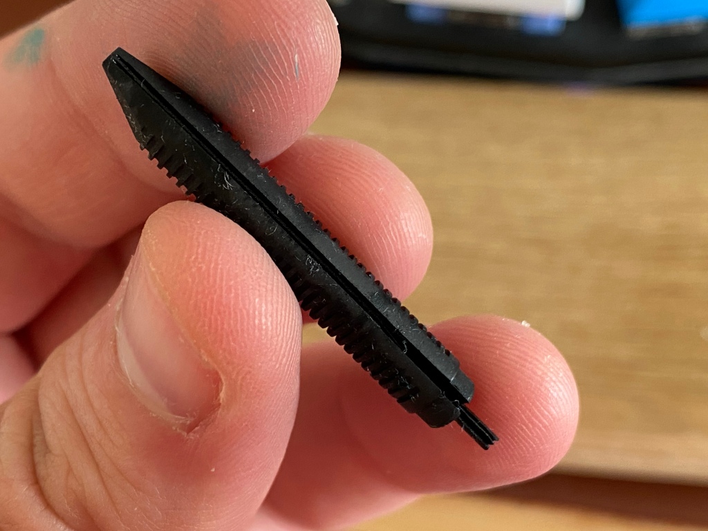
I tried out an R615 with two separate nib units, both with heat-set ebonite feeds, and the flex performance I experienced has been a little inconsistent. It’s got to the point where I’ve started to think I’m going crazy.

Sometimes I’ll pick up the R615 and write a page and the flow is wet, with hardly any railroading. Snapback is good.


The range of flex is impressive, ranging from about 0.3mm to 1.5mm or even more without feeling like I’m risking springing the nib.


Note that quite a lot of pressure is needed to get this nib to perform, and it will score its way through three sheets of Tomoe.

While some modern flex nibs get their range from cutting out the shoulders of the nib or thinning the metal, The Good Blue’s nib has a standard profile, but the slit runs almost all the way up to the section. So there’s plenty of flex but a lot of steel to move.

An hour later I’ll try again and have massive skipping, railroading and flow issues, even when moving slowly on the page.

Sometimes it’s at the start of a stroke when I first press to flex, sometimes the flow stops mid cursive shape.

Sometimes it starts back up again almost immediately when I relax the pressure, sometimes it needs some encouragement or rest time.

Just when I think I’ve bedded the nib in and all is well for a page, I’ll get a random streak of bad railroading. It’s maddening.
I’ve tried two nibs, different inks, different papers, different angles, both converter and long cartridge. I’ve double-checked that the paper is clean and fresh, no oils from my hands. I’m not rotating the nib. I’ve tried leaving the pen overnight to truly saturate the feed. I have reseated the cartridge and converter, flushed the nib and feed. I’ve checked the humidity near my desk!
I’ve filled page after page with swirls and dabs and my favourite flexy words. Overall I think it’s getting a little better, gradually, but there’s still enough regular skipping that it’s annoying me, unless I go unnaturally slow. I’ve given it a week and a half of mucking about and I think that’s enough.
User error?
I’ve seen The Good Blue post really impressive customer photos on Instagram and I’ve talked to Sunil about my experiences, and we can’t get to the bottom of why I’m having flow issues. Certainly the ebonite feed has plenty big channels.
I trust that he’s set the nib up well and is experiencing no problems at his end during testing, but I also trust that I’m not a complete numpty when it comes to using flex nibs.
Regular readers will know that I’m a lefty overwriter and I am certainly not one to make beautiful pages of lettering, or lettering-derived artwork. My flex writing is awkward at best, ugly at worst (the pictures in this review will testify to that). That doesn’t mean I’m without experience in this field. I have owned many of the contenders in the modern flex space, from Scribo’s 14k to the Montblanc 149 Calligraphy, and Pilot’s FA nib in various guises. I know how far to push a nib safely, what constitutes ‘too fast’ to maintain flow, what’s normal in terms of railroading, what good snap-back feels like. I’ve not had flow problems like this before.
So we’ll leave this aspect of the review here, with one final note: Sunil is always experimenting with the design of the nib and feed (we talked about lasers and 3D printing — this guy isn’t messing about) so I’m confident that the performance will improve. Fitting a new nib unit is just a case of unscrewing the old one, and since these nibs are steel, they’re not going to be crazy expensive.
Built differently
So what about the pen as a whole? It’s unusual, unconventional. It impresses me, but like the nib it too has a few little quirks that drive me mad.
The pen is built around a central brass section, with a thick knurled band in the middle.

In one end you stick a converter and screw the barrel on; on the other end there’s a long brass section with the nib unit screwed into it.

Screw on the cap and the knurled section remains visible as a centre band.

When the cap and barrel are screwed on, the three parts align a milled flat side that gives visual interest and acts as a roll stop. It’s impressive that the tolerances are as tight as they are.

The silhouette of the pen tapers to both ends, with smoothly rounded tips.

The cap is shorter than the barrel, so you won’t find yourself unscrewing the wrong end by mistake, but I did often find that the act of unscrewing the cap actually unscrewed the barrel instead. You have to make sure to hold the knurled band to prevent this.

This limited edition version is rendered in a beautiful mid blue, which constrasts wonderfully with the brass. The surface has visible machining marks, it’s not perfectly polished, but you can’t feel any texture under your fingertips.

One step at a time
With the cap removed, you can see a HUGE stepdown from barrel to section.

The barrel is around 15mm in diameter at the step, and the section ranges from 9.5-10.5mm. Thankfully there is a chamfer on the edge of the stepdown, so it’s not as painful on your fingers as you might expect.

I have no complaints about the section’s generous length, or the pen’s size and balance overall. It fits well in the hand and even when gripping hard to flex it doesn’t feel uncomfortable. But I would have appreciated another mm in diameter on the section.

Sunil has a laser engraver and he knows how to use it. As well as the charming inscription ‘for the love of flex’ running down the nib, THE GOOD BLUE runs around the end of the section. It’s subtle and unconventional branding and I like it a lot.

Ironically, it’s as a day-to-day pen that I think the R615 shines. Its metal construction and flat side mean it’s a handy desk and bag companion.
The pen is inexpensive, the nib is steel, it uses an easy-to-flush converter — all stuff that makes for a fuss-free daily writer. The cap spins off incredibly quickly. And the nib is smooth and controlled when used unflexed for general writing.


In fact, The Good Blue offers the R615 with a non-flex nib called ‘the happy medium’. If you’re a lefty non-flexer like me, this might be the best choice.
A responsible choice
When I chatted to Sunil about the pen, his excitement about innovation was clear: hence the talk about lasers and 3D printers. But he also showed a real attentiveness to sustainability. The R615 comes in a reusable metal tin, packed with recycled fabric wadding. The raw metal that forms the pen he sources from western Europe, which not only reduces route-miles and ensures cleaner production, but assures a higher-quality product.

This kind of stuff may not matter to you, but it certainly matters to me. If you’re going to contribute to consumption and the accelerating climate crisis by buying stuff, the least you can do is minimise your impact.
The last word
I’ll be sending this loaner pen back to Sunil soon. I’m not a flex-pen kinda guy, my tiny pen tray is full, and the raison d’etre of this model, the flex nib, apparently doesn’t get on with me. So I don’t think I’ll be buying one for my personal use (not that I could — this special edition blue sold out fast).
But overall I was impressed by the R615. It has good bones, with that distinctive flat side and knurled band. With a tweak to the section, it could be very comfortable indeed. The flex nib didn’t flow predictably for me, but it has real potential — at a fraction of the cost of alternatives from Scribo and Montblanc.
Thank you for the enjoyable review. I am curious as to your thoughts of the R615 nib compared to the steel JoWo flex nib offered through Franklin Christoph or Montegrappa’s flex nib (which I understand is JoWo’s gold flex nib.)
I’ve been waiting for your review on this pen. It really appeals to me but that step down was a particular worry, let alone the flexy properties of the nib, but I also like supporting pen makers where I can. I think I shall wait to see what Sunil does next before buying one, but it is still on my radar.
Thanks, Jo. At the moment we are working on further nib improvements – specifically softening the flex and further improving snap back. We’re also working on an untipped fine flex calligraphy style nib (also stainless steel) and finally feed development – looking for ebonite replacements. Sounds cheesy, but for now it’s all about the line. Getting ink on paper perfectly for sketching, lettering and everyday writing.
That looks an awful lot like the Kanwrite flex nib that FPR, Noodlers, Ranga etc use.
I have the ‘ultra-flex’ version (with the side cutouts) on a Ranga, and the long slit, two tone design and scrollwork are identical.
Performance of the nib seems pretty similar to yours also. It’s great when it works, up until the point it randomly stars railroading.
You should review the pen with the new polymer feed. It is excellent IMHO
I’ve bought two The Good Blue R615’s in 2024 one with the titanium ultra flex nib, the other with the steel ultraflex nib. Both have the polymer feeds. I fell in love with the first one immediately. It fitted my (medium sized womens) hands beautifully and had a nice weight and feel about it, it also looked, to my eyes, beatiful and solidly machined.
However the highlight for me was the amazing flex nib and feed. It appears that Sunil has cracked it, they both write like a dream – very rare hard starts (when they occur it seems to be rushed user error) and so little railroading I can ‘t believe it! I find Im using the two pens for most tasks now as they are pretty easy to flex for flex writing, but firm enough to use for everyday ‘note taking’ writing. Im now ‘head over heels’ in love with them (I only have two so that I can have two contrasting inks in them). They have amost made my other pens redundant.
Its so good to have a British manufactured product of such high quality and innovation I hope Sunil continues to go from strength to strength, he really is a great innovator in the tradition of our best victorian inventors.