

It’s been a while since I’ve done one of these. And since my last post showed off my new Galen pen trays, now seems like a good time to take a scoot through what’s actually in them…!
How much change has there been since my last post?
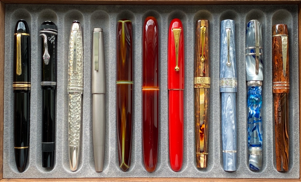
Well, here’s how the tray looked in January:
Six of those pens have gone, or are for sale:
- Pilot Murex
- Montblanc Geometry
- Smythson Viceroy Grand (for sale)
- Scribo 3
- Desiderata Soubriquet
- ST Dupont Elysee (for sale)
Why? Well, they’re all great pens. I’m just so convinced that the tighter my collection gets, the happier I am. The Murex went because I didn’t find myself using it; the Geometry’s BB nib meant it often sat unused; and so on.
That leaves a ‘main tray’ looking like this:
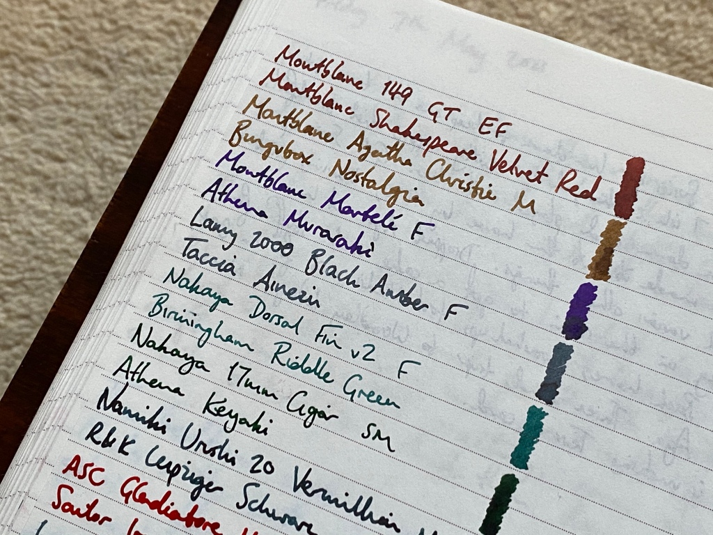
We start with the Montblanc 149. I’ve come to realise I’ll never be without a 149 — it’s as close to the perfect pen as I can imagine. And although I normally prefer silver-tone trim, this beaten-up model that’s older than I am definitely carries off the gold trim. I have it perma-inked with Montblanc Velvet Red.
Next is the Montblanc Agatha Christie. I have this inked with the new Bungubox Nostalgia at the moment, but not for long — I really don’t like the colour. But one of the benefits of slimming down my pen tray has been that I’ve spent more time writing with this pen. It’s beautifully balanced.
Third up, the Montblanc Martele, inked with Athena Murasaki purple. This pen has been getting a lot of use recently, especially since I sorted out a slight misalignment in the nib.
I saved the Lamy 2000 Black Amber from the for sale pile, and I’m glad I did. Again, a little work turned the nib from ‘OK’ to ‘amazing’, and I gave it a fresh lease of life with Taccia Ainezu, a grey-blue with real depth. It’s back in my good books.
Now here’s a new(ish) arrival: the Nakaya Dorsal Fin v2 Heki-Tamenuri. This is as good and grail-worthy as I might have hoped. The urushi is magnificent, the shape graceful, and its character is very different from the 17mm Cigar it sits next to. I have it inked with Birmingham Riddle Green, which lubricates the nib well.
And then the aforementioned Nakaya 17mm Cigar Toki-Tamenuri. With a soft medium nib this is a fun and relaxed writer, and the toki finish is probably my favourite of all the basic Nakaya urushi colours. I still have it inked with Athena Keyaki green, but it’s coming up time for a change.
The Namiki Urushi 20 Vermillion is the one I bought visiting Tokyo two years ago. It’s not been getting a lot of use recently, because the medium nib is a little wider than I’d like, especially when loaded with a wet ink like Herbin Bleu Austral. I recently swapped it out for R&K Leipziger Schwarz, which has tightened up the line and given it a fresh feel.
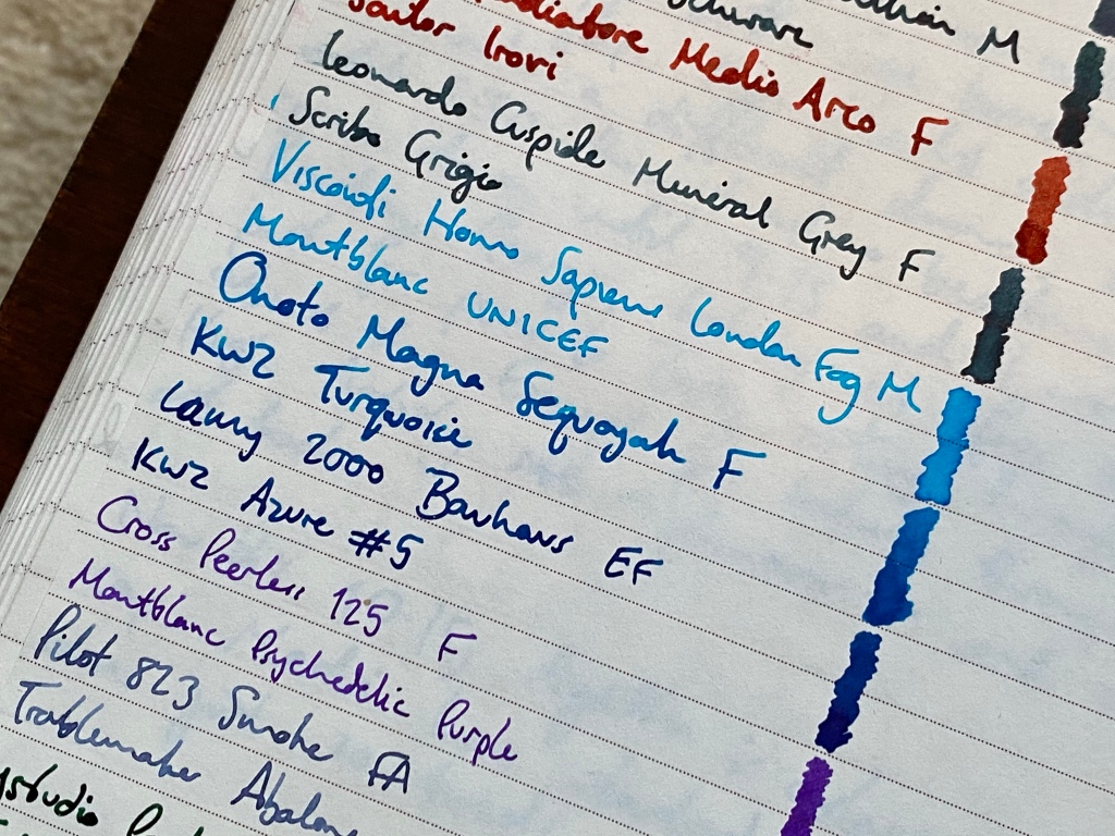
The ASC Gladiatore Medio is my ink-demonstrator. Although it’s nominally a fine nib, it lays a wide and wet line. Today I have it inked with the positively fluorescent Sailor Irori.
A good candidate for ‘most comfortable pen’ is the Leonardo Cuspide Mineral Grey, a limited edition that I’m so glad I invested in. Since new it has been inked with Scribo Grigio, and I feel no need to change it.
I’d had Sailor Studio 123 in my Visconti Homo Sapiens London Fog for the longest time, and although it’s a beautiful ink and a perfect match, this week I flushed it out and reinked with Montblanc UNICEF, an eye-searing turquoise. It’s transformed the appearance of the barrel and the character of the pen on the page.
And lastly — for this tray, anyway — the Onoto Magna Sequoyah, inked with KWZ Turquoise. This pen remains a firm favourite, with full marks for comfort and writing performance even if the cap threads are longer than I’d like.
So there you go: 11 pens from eight manufacturers and five countries (if you count ASC as a US company). Looking at them like this, I am really incredibly proud and satisfied, and spoiled for choice when it comes to writing my nightly journal entry or work notes.
But there’s more.

On this second tray I have some extras that, annoyingly, don’t fit into the first.
The Lamy 2000 Bauhaus, with its architect-style EF nib, is easily the equal of the Black Amber, and due to its lighter weight and grippier body, is actually a more comfortable pen to hold. But I didn’t want to stick two of the same pen model in the main tray, so here it goes. It practically drips with KWZ Azure #5, a good match for the colour of the body.
The Cross Peerless 125 I have come to love dearly. If I were still going to pen meets, I would be raving about it. Up until last week the Peerless here would have been the brown/green/grey ‘titanium’ finish, which is lovely. But I’ve always liked the barleycorn ‘medalist’ finish, which is almost always only available in two-tone, with the clip and trim in gold. Yuck. Finally I thought what the hell, I love the Peerless so much I should have it in the finish I really want, so I tracked down an all-silver medalist from the US, for twice the price I paid for the titanium version. When it arrived I sold the titanium, and here I am with one Peerless again. It is an absolutely blinding pen, despite a crazy gemstone in the cap, odd-looking clip, and general weirdness. It is SO comfortable, and the perfect vehicle for Sailor’s exquisite fine nib. Basically, if you like Sailor pens but can’t get on with their small size and crappy plastic feeling (especially the threads), take a look at the Peerless. For now you can pick one up for about £210 and that is a certified BARGAIN.
The Pilot 823 Smoke here has the desirable FA nib and a gushing wet ebonite feed. It writes a glorious fine line (currently of Troublemaker Abalone), flexes well, is really comfortable, has cavernous capacity and never dries out. But still it’s close to being on my for-sale list. It’s one of those pens that’s superb on paper but has never grabbed my heart. I really enjoy writing with it, but I still hardly ever grab it. Tellingly, the main reason I haven’t sold it yet is how impossible it would be to buy another one if I changed my mind.
The ystudio Portable Copper is a cracking pen. I’ve written before about how I reviewed it in 2017 and rebought it years later, having got over my snobbery about its Schmidt nib. I still love it to bits and use it regularly for work. It never lets me down and is a great fidget toy during meetings. Funnily enough I am waiting for the arrival of an Otto Hutt Design 03 primarily because Brad compared it to the ystudio in size and proportions. I like it that much.
My third Lamy 2000? Yes, this was the first one I bought, back in 2016. It’s currently inked with Ryuno Black, but really I consider this pen still in a graceful state of semi-retirement. One of my good friends has just bought a 2000 based on my recommendation, after just getting into fountain pens with a Namisu and Gravitas (again on my recommendation). His last message to me? “Yeeesssss. This thing beats every pen. Just a different league. Was not expecting this…”. Another convert!
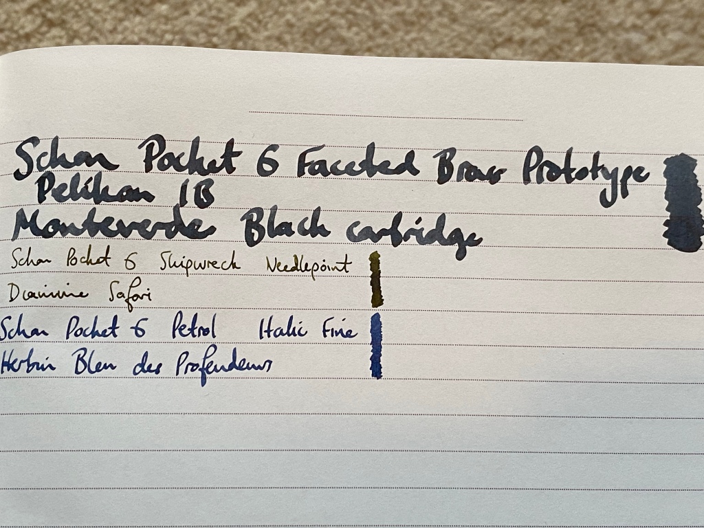
And then, lastly, my three Schon Pocket Sixes. No change there, except I went crazy and decided to stuff my old Pelikan Italic Broad nib into a JoWo nib unit to see how it went. In the blue light of evening it’s quite a looker against the brass, and it writes an absurd line for a pocket pen. It’s nice to experiment every now and again, isn’t it?


Read all the way to the end? Then you might see ‘Venvstas Magna CC’ on the ‘currently inked’ sheet there. Yep, I have another Venvstas pen in for review (with an ink, too!). Stay tuned.

What a beautiful assortment! I especially love the Nakaya Dorsal Fin; the fins really do look authentically natural. My grail pen is one of the smallest Nakaya models. I swear, I’m going to get one someday soon. And the Schon Pocket Six is outrageous with the Pelikan Italic nib in it! I love an incongruous combo. It’s ridiculously luxurious. Love that.
Amazing collection! 🤩
If you do decide to sell that Pilot 823, I’d love to buy it!
A great read – it is fascinating to see where this journey of discovery and process of honing of your collection, has taken you (so far!).
The Cross Peerless 125, in your platinum barleycorn chasing finish, is a rare and handsome beast. Now I realise why you were able to let the transclucent titanium verson go. Also the Galen pen trays look very practical and attractive. Plenty of space for growth there. You look well set now for any writing occasion!
Does your vintage 149 have the 14K or the 14C inscription on the nib? They feel different fyi.
You sold the striped silver 146… One pen I hope to add one day.
It’s 14C on the nib — thanks for the heads up, I wasn’t aware of that particular difference!
Most penaholics will prefer the springy 14C Feel, more recent 149 nibs are still great but firmer.