This past week I’ve just been enjoying getting on and using my pens. It’s been relaxing to not think about reviewing even the new arrivals, liberating, even.
A rose gold shimmer ink?
The kind folks at Izumi sent me over a sample of their new exclusive ink made with de Atramentis. It’s called “Pink Rose Gold” and it’s a shimmer ink, pink with gold particles. Shimmer inks are not normally my cup of tea, but I’ve really come around to rose gold (thanks in part to TWSBI’s recent releases), so I was curious to try it out. It’s not a hot pink, more of a blush — the shimmer takes some of the vibrancy out and makes the ink look a little dusky.

It performs well, with decent flow from the relatively dry Lamy Nexx I inked, although note that the particulate load is high and you may want to watch out for clogging! But with a TWSBI Eco, which never dries out and is easy to clean, this would be a perfect match. Nice shading, too.
Parker’s new 51 isn’t bad
I ordered one of the new Parker 51s from Cult Pens, and it arrived about a week ago. I went for the rather pretty teal. Having never used an original 51, I didn’t have much in the way of expectations, so it was interesting to observe my reactions and how they’ve changed over the past week.
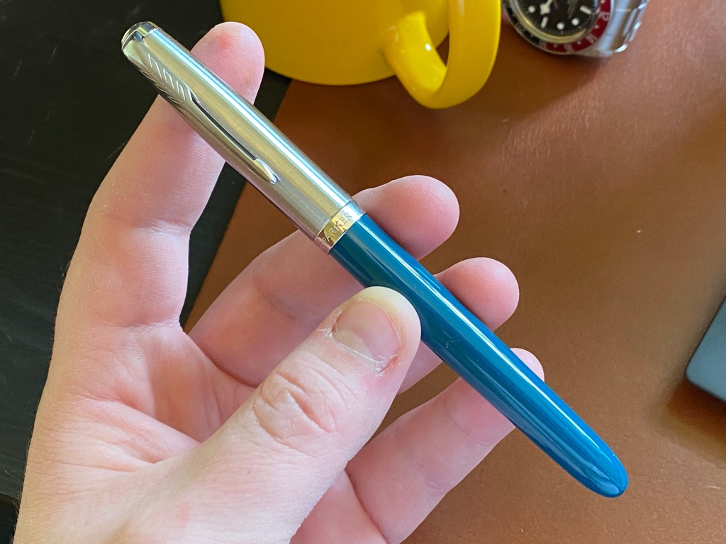
Without going into a full review, it’s not a bad pen. What’s good? The colour’s nice. The cap may not be a pull-off, but the threads are fast. It feels generally solid. Made in France. The steel nib wrote smoothly out of the box, if a little on the dry side, and responded well to a bit of shimming to increase wetness despite how little of the nib was exposed to work on (thanks to the hooded design). The nib doesn’t dry out when capped — so far.
What am I less thrilled with? There doesn’t seem to be any way to disassemble the nib unit. No converter was included, which for a £75 pen with a proprietary cartridge design is a bit of a cheap shot. The sizing is distinctly vintage, so it feels very small to me.

Despite these issues I’m finding myself using it often, just because it’s so no-nonsense.
Taccia ink (and a cheap surprise)
I finally succumbed to Taccia’s beautiful inks, inspired by famous Japanese artwork, and ordered four from Sakura Fountain Pen Gallery, along with a cheap bottle of R&K Leipziger Schwarz because I’d seen a review of it recently and liked the idea of it as a blue-black.
The first I tried was Sabimidori, a chameleon of an ink that goes down bold blue and dries to a faded green (the only other ink I’ve used that does this so dramatically is Birmingham Riddle Green). I like it, but the prominent sheen runs counter to my tastes.
Next I tried Ainezu, a lovely subtle ink that straddles the line between blue and grey. I have no shortage of inks in this colour space, but I really enjoy the shading and flow of this one.
Third was Fukaki hanada, a dusty sky blue with excellent shading. I’m not sure it’ll compete for a place in my collection, but the more I used it the more I appreciated its subtlety.
Lastly, Koiame, an orange ink that manages to avoid looking peachy, or pink, or too hot, without being boring. I’ve not used it much yet but I’m looking forward to it.

Each of the small 40ml bottles comes in a huge paper box covered in the artwork that inspired each ink. I normally throw boxes, but these are too pretty to trash.

So a good haul. But the real surprise was just how much I enjoyed the 5-euro bottle of R&K Leipziger Schwarz. It is wet, saturated, with sudden shading that reveals it as a blue-black. I haven’t smiled so much at a new ink in a long time.
Musubi Cosmo Air Light
Many of you may have got the email from Musubi this weekend about their new range of notebooks with Cosmo Air Light paper. I have been impressed with Musubi’s products before, and I liked Cosmo when I recently tried it, so I immediately ordered four. In for a penny, in for a pound.
Hello.
Reading the name “Pink Rose Gold” caused me to subconsciously raise my eyebrows a bit, but I do like how it looks on paper. Maybe I’ll become more adventurous and step away from blue and blue-black in the future. I have a hard time resisting shiny new things, but I might have to pass on the new Parker, £75 sounds ok, but conversion to $105 somehow seems a bit expensive.
BTW, nice post.
i’ll have to give my leipziger schwarz a more extensive try on neutrally-coloured paper. i’m mainly using it on some old leftover moleskine (i know, i know) and in my leuchtturm, and it registers more as a low-saturation green hue than a blue for me. but i agree, it’s really well behaved and works well as a black-but-not-quite, or black-with-personality. and at the price, it feels like finding a mint condition vintage item for pocket change in a second hand store. if you haven’t tried it, their verdigris is lovely as well. (a stealth teal, in the sense that when it’s all by itself, it can acclimatise to look deceivingly blue. and then you put something blue next to it, and it’s suddenly so distinctive)
while it’s good to hear from pretty much everyone that the new 51 is a good pen, i can’t help but feel a bit sad that it is not for me.