It’s been going on a while, but Joost from Appelboom’s ‘top 3 fountain pen’ video series has just landed on my radar.
The premise is simple: ask pen-celebrities like Figboot, Azizah, SBRE Brown, Scrively and Brad Dowdy to record videos talking for about 15 minutes about their top three pens.
I wasn’t invited to participate (I’ll get over it, eventually…) but I could not resist this opportunity to play along. And boy, if anyone can overthink a ‘personal top 3 fountain pens’ challenge, it’s me.
What does ‘top 3’ pens even mean?
Am I supposed to pick three pens that work well together as a trio?
Should I stick to pens that are readily available now, so people watching or reading can go out and buy them?
Should I try to pick pens that are rare or unusual or lesser-known, so my list stands out from others doing the same challenge, and so readers are exposed to something new and interesting?
Should I stick to a single price category, so the comparison is easier?
Should I pick the pens that are objectively the ‘best’ all round, or spotlight the pens that truly excel in one or two areas — perhaps the best writer, the most beautiful, the most well engineered?
Or should I pick the ones that are most sentimental to me — the ones with a story around it — even if they’re not objectively great pens?
I’m not the only one of the interviewees to spot these questions and choose an approach.
Figboot, after much thought, went with the story approach for his first choice and picked an Omas Milord in Arco Bronze, his true grail pen, which had quite the journey over the years. His second choice was a pen from Yoshi Nakama at 18111, which are truly unique designs and that he picked at a pen show; and his third was a King of Pen, just a general high end pen.
SBRE Brown said that he didn’t have to think hard to make his choice — how I envy his decisiveness! His first choice is a set of his grandfather’s Parker pens, which he inherited. Definitely a sentimental choice, and a beautiful story. His second choice was also a sentimental purchase, made with inheritance money, and it’s a Visconti Opera Elements. His third was the Classic Pens LB5, a gift, a beautiful pen and a special nib — a Nagahara. Fine choices indeed.
As for me, I’ll have a go. Eventually you have to stop ‘admiring the problem’ and try to actually solve it.
Pen one
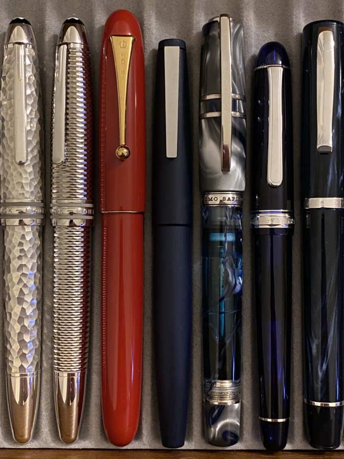
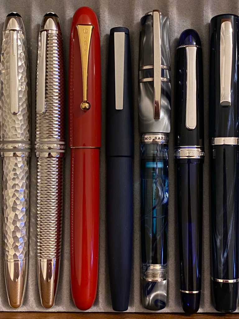
My first choice is the Namiki Yukari Royale Urushi 20 Vermillion.
I bought this pen in a huge rush of adrenaline in Itoya in Tokyo, on my trip to Japan almost a year ago to the day. I had this pen on my wishlist as a kind of idle dream, but I was so intoxicated by Japan and the incredible environment of Itoya that one evening I just bought the damned thing, money be damned. My heart was in my mouth, my pulse was racing, I practically ran back from the store, the world feeling unreal around me.
I sat in my hotel room overlooking the city, drinking sake in a robe while I just looked at it, its huge box, the opulent packaging.

I felt a bit sick, to be honest. It was a lot of money to spend on a pen — it still is. But then and now I feel that the Urushi 20 is as good a nomination as any for the perfect pen in many respects.
The vermillion urushi is just perfect, almost uninterrupted by seams or bands. And the size, weight, balance, section are so proportionate, so comfortable in every way. This is a good-looking pen that is simply timeless. It helps that the nib is great and the writing experience is smooth and flowing.
So that’s my first choice: a piece of unparalleled Japanese craftsmanship that’s also a great writer. But the real reason I chose it is as a symbol of my love for Japan, and my memories of my trip there.
(I hope those feelings came across in my travelogue posts)
Pen two
My second choice is the Lamy 2000 Bauhaus.
The Lamy 2000 was one of my first deliberate, ‘proper’ pen purchase, and I still own it. In fact, now I own three.

It would be easy for me to wax lyrical about the 2000’s functionality and engineering. Its sublime slip-cap and sprung clip. Its clever ability to give any writer the section diameter that’s most comfortable for them. The way it integrates a piston knob and ink window without interrupting the swooping form, carrying that curve relentlessly down to the hooded nib. But I’ve done that already.
Actually what I like most about the 2000 is its symbolism of German modernist design, that engineered, materials-centric, minimalist aesthetic summed up by words like ‘Bauhaus’ (‘Ulm school’ doesn’t have quite the same ring).
But it’s the same philosophy that attracts me to Braun calculators and Junghans watches, and has me forcing my daughter to sit through documentaries about Dieter Rams.
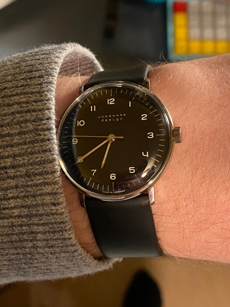
The 2000 somehow still looks radical, modern, space age, even though it’s 50+ years old. And despite being so cold and modern, it’s astonishing how human and tactile and ergonomic it is, from the brushed warm finish to the curves. The 2000 is perfection in balance.
While the Namiki makes me hold my breath like I’m in a Japanese shrine, the 2000 makes me feel like a minimalist product designer or a writer from the 60s, sat at a typewriter in tortoiseshell specs on an Eames chair, with a cigarette in hand.
The version I picked is the limited edition ‘Bauhaus Blue’, which not only has a great architect EF nib and that pretty dark blue material, but retains the tactile Makrolon and ink window missing from the Black Amber.
Pen three
And so for my third choice. Here I really got stuck. I felt like I should represent the third part of my pen personality and go for something Italian (I still have six Italian pens). My ASC with its juicy nib and Arco resin (and its stiff piston and tendency to dry out). The Scribo with its 14k EF joy of a nib, perhaps my favourite pen to write with. The Aurora 88, which is perhaps the most comfortable and practical pen design out there, and all in-house. Or the opulent Montegrappa Extra with its sterling silver and celluloid and its giant wide nib. They all move me in their own ways.
Germany made a strong showing, too, and unsurprisingly, since I have six Montblancs. There’s the iconic 149, truly a great pen, a milestone of design and in my opinion the most beautiful nib ever made. The 1912, a deco beauty and a masterpiece of engineering. Or the Agatha Christie, a sentimental classic to me, but perhaps a bit of a cliche choice.
In the end I narrowed it down to two: the hammered-silver Montblanc Martele, and the Visconti London Fog. Both visually stunning pens. Both I considered to be stupidly expensive when I bought them. Both I’d go so far as to call grail pens.
And the pen I’m picking to talk about here? The Visconti London Fog. For all their excesses and poor quality control reputation, I’ve had good experiences with my Homo Sapiens over the years. But it’s not the QC I want to tell you about.
I love the innovation and experimentation that Visconti brings to the table, the novelty and variety.

A quick tour of the London Fog brings out a host of features worthy of discussion: the enamelled bridge clip, the hooksafe capping mechanism, the Palladium nib with its moon-shaped breather hole, the vac filling mechanism, the celluloid swirls in the demonstrator acrylic barrel (every one unique), the sterling silver trim, the replaceable magnetic finial.
Crazy features, but with a very practical result. The barrel holds a ton of ink. The cap comes off quickly yet seals perfectly. You can check your ink level. The clip works (sort of).
Visually, it’s a pen where there’s a lot going on, yet it coheres, and it’s comfortable too. Other Viscontis are overdone, or back-heavy, or slippery, or have numerous other flaws where style compromises comfort. But to me the London Fog is perfect.
I remember I ordered it from Australia long after it sold out in Europe. I ordered it in a fit of FOMO, then I waited with bated breath for it, expecting to be disappointed. But I wasn’t. I loved it. It’s a crazy experiment that’s a million miles away from the black-pen-with-gold-trim default, yet you can use it every day.
To me, the London Fog symbolises the creativity, flamboyance and personality that this hobby harbours. Pens can be as personal as a tattoo; they can be a mad scientist’s laboratory; they can be a piece of artwork in your pocket. The London Fog is all three.
And there we go. My top three pens. The Namiki Yukari Royale as a symbol of perfect Japanese craft. The Lamy 2000 as a symbol of German Bauhaus functional modernism. The Visconti London Fog as a symbol of Italian verve and experimentation. All three great pens, all three surprisingly personal to me (which I was not expecting when I started this piece).
I’m happy with that. How about you?
Interesting that your top 3 pens all come from the Axis (Rome-Berlin-Tokyo) Powers…
Anyway, my current top 3, as these “top” lists, be it movies, music, books, shoes, or whatever, do change over time, is somewhat comparable:
1. Namiki Urushi #20 Vermillion
2. Montblanc Meisterstück Martelé
3. Sailor KoP Ebonite RT
The design/look of all three have the understated perfection I like so much, and are in order of preference. They all write perfectly, although there I would reverse the order – I kinda like the little tooth/feedback that Sailor gives over the Namiki.
But it is a nice exercise, and you learn something from all entries. For me it means a closer look on the Lamy 2000 (although in my eyes form does not follow function, form trumps function, I mean, if it doesn’t look good, what is the point? and the clean looks of the Lamy do speak to me) and, in sync with your WWII defeatees’ trio, I will buy an Italian pen. The Leonardo Furore. In purple. With silver trim.
I’ve truly enjoyed reading your blogs and have learned much about myself as a pen user/ collector. It’s uncanny knowing there’s another person with the same taste as I. The difference only that I would have is that my Lamy 2000 would be rendered to just being the standard makrolon as I couldn’t justify the Bauhaus edition. Having also seen your pen journey, it also seems like we’re walking the same path except I’m a few hundred kilometres behind you. Thanks for shining my path!
My top three doesn’t contain any super expensive pens, though there’s always the hope that one day I will own an urushi pen, as they are so beautiful and I am in awe of the craftsmanship and time taken to make them.
1. Lamy 2000 – not so much because it’s such an iconic design but because I just love the feel of the macrolon and it is a super attractive pen and it writes very nicely.
2. Parker Frontier (red & black) – this is purely sentimental, as it’s my husband’s Dad’s pen, which he and his mum and sister gifted me when I first started collecting fountain pens and it’s a really nice little writer.
3. Diplomat Aero (orange) – fell in love with this pen when I first saw it. Beautiful design, very tactile and lovely to write with.
Ooh. Tricky one — I’m with you on the need to stop “admiring the problem” and just get on with it! I’d have to say, as it stands right now…
1) Platinum 3776. I’m still not certain if we totally get along, but never has a more perfect nib existed. That thing is a joy to use, whether or not I like the feedback.
2) Opus 88 Omar. I feel almost guilty how much I love this pen when I’ve got a Pilot 823 a couple slots down. It’s not the best writer I have or the most practical, but damn if it isn’t the most comfortable pen I’ve ever held.
3) Pilot E95S. I’m a sucker for an inlaid nib, and the thing writes beautifully. The long section doesn’t hurt, either.
I’m sure I’ll change my mind thirty seconds after hitting the post button, but c’est la vie!
As a keen amateur photographer I keep reminding myself of a famous quote; ‘you haven’t taken your best photo yet’. It may well be true of fountain pens as well. My best one is yet to come? To date I’d go for my Waterman Le Man 100 9medium nib) which has the perfect poise in my hand and spreads so evenly and smoothly. Another large pen favourite would be my Conway Stewart Wellington (Waterloo in Prussian Blue). Finally and for sentimental reasons – isn’t that why like them anyway – one of my Dads Parker Slimfolds recently lovingly refurbished by Simon Grey. Who knows – next year it might be a completely different 3 – all of my pens have some sentimental significance to me.
You and your co-contributors in comments carry me along such grand pathways that I am ever grateful for the fun and the contemplative insights. My heart and soul trembled when seeing the London Fog Visconti. The list of “fountain pen intention” grows with every posting and the comments.
I may even trade-in my halloween Zorro costume and sword for a Hollywood mask of Dieter Rams followed by a year as Gearoge Kovacs and then Charles Rennie Mackintosh.