You ever had a situation where you knew you were making a really stupid decision, but you did it anyway out of fatalism, or curiosity?
Well, that’s me with buying the Montblanc M.
This is not some never-before-seen pen, bought as a brave experiment to satisfy your curiosity, dear reader.
The M has been out for years. I’ve held it (briefly) in airport boutiques. I’ve read all the forum threads. I’ve read plenty of well-regarded reviews. And it’s clear that this is not a popular pen in our community. Montblanc fans don’t like it because it’s an outlier in the portfolio, driven by a designer’s vanity to look good instead of writing well. Montblanc haters don’t like it because it’s covered in snowcaps, and is £500. Lots of other people don’t like it because, well, it probably isn’t that great a pen to use (spoiler alert).
In other words, I knew what I was getting myself into.
I still went ahead and bought one anyway. I figured that any pen that stuck in my mind for two years is probably worth owning once, and I wanted to see whether the criticism was justified.
None more black
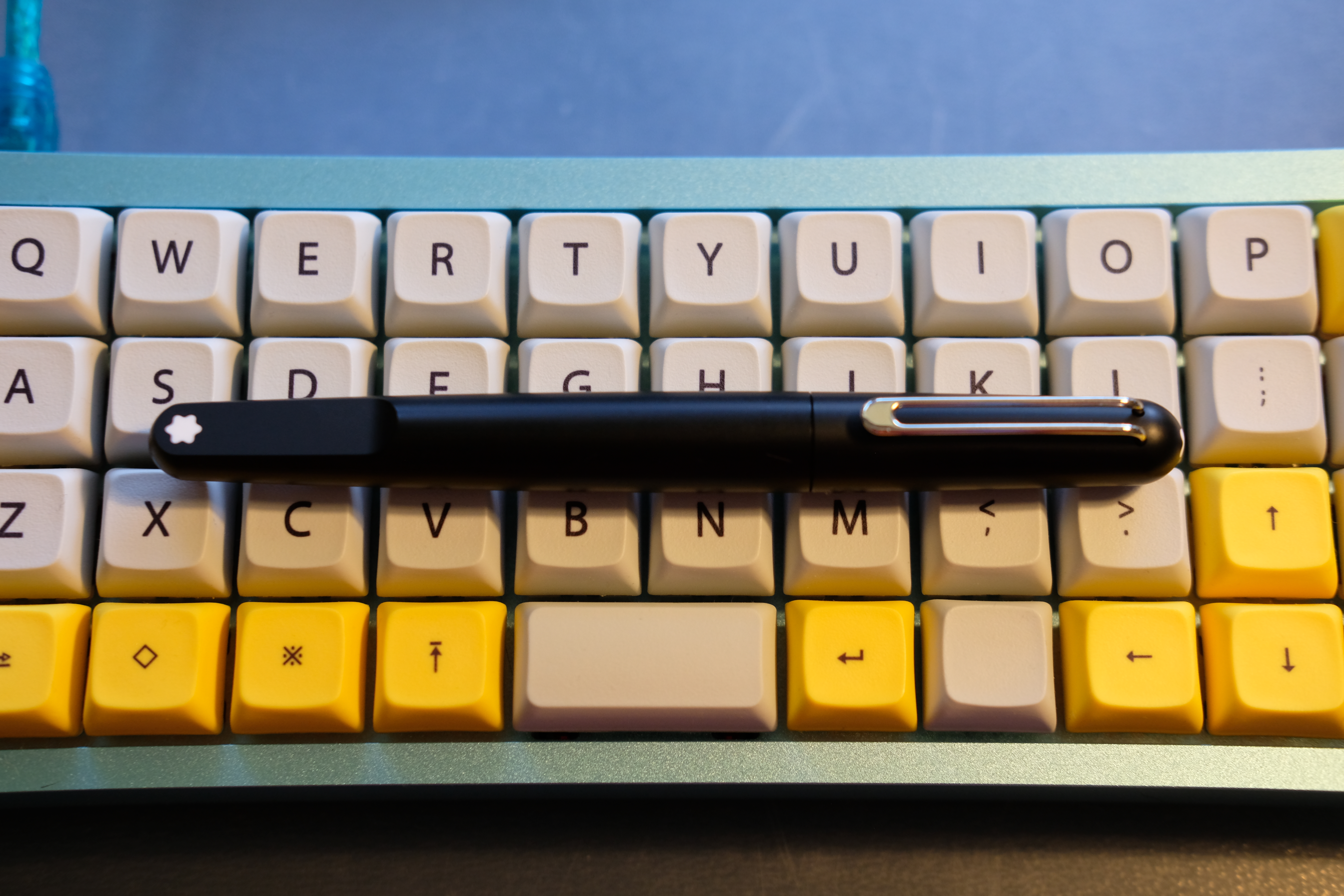
I ordered the Ultra Black version, which seems to be discontinued, and therefore automatically became more desirable to me. Shout out to The Pen Shop for super speedy service, both in answering my questions and getting the pen to me next day.
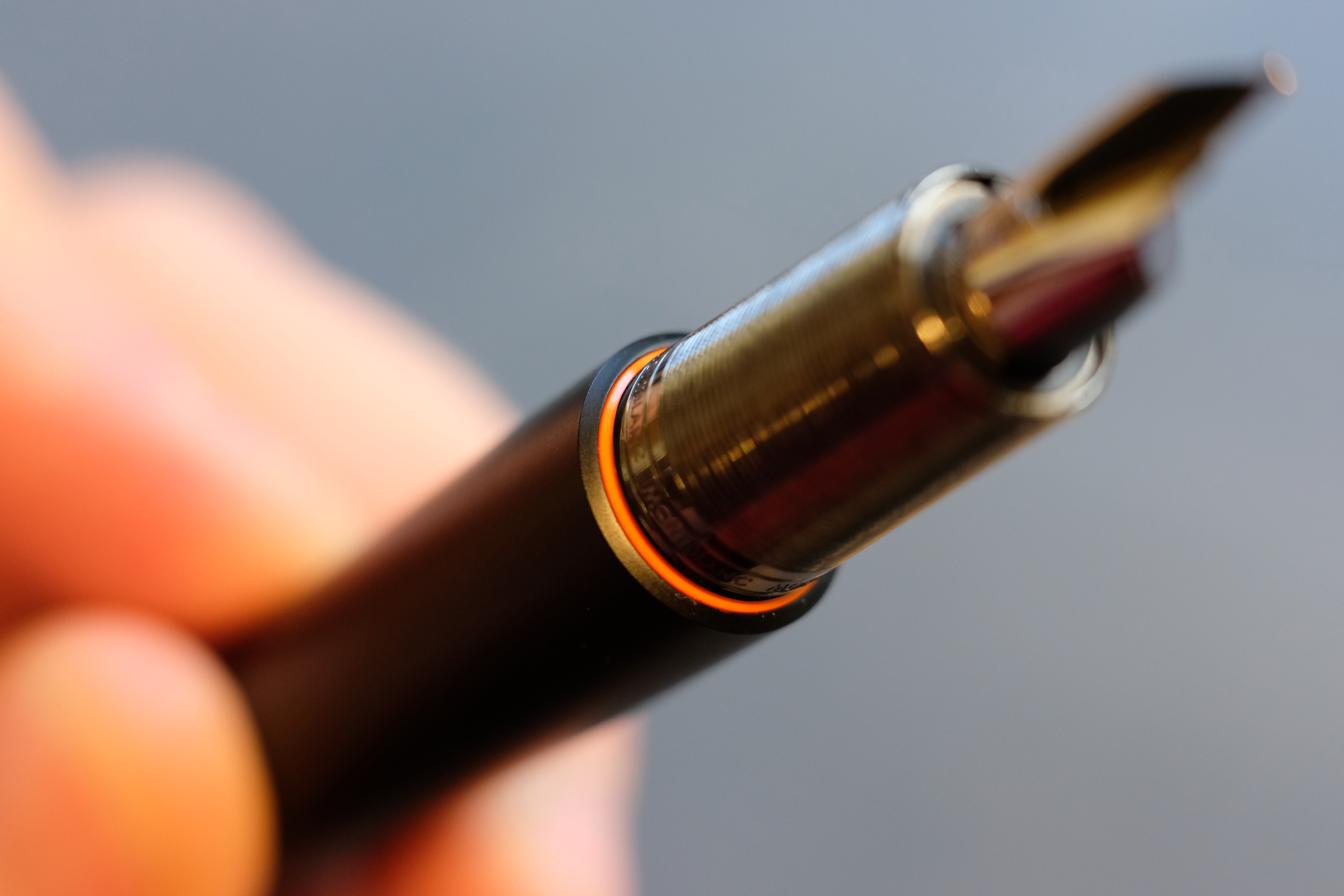
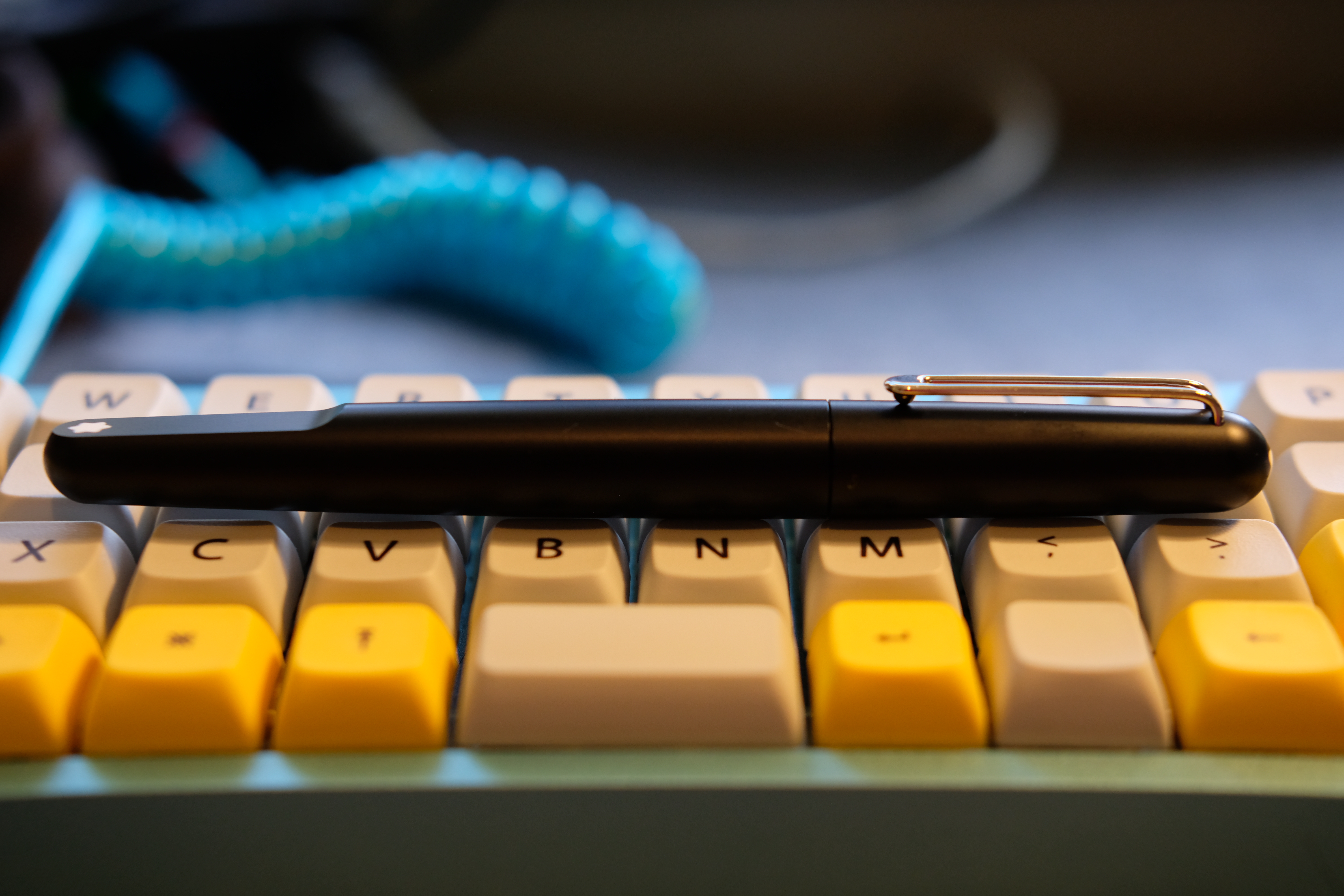
I liked the Ultra Black’s matte finish, which fits with the modernist lines of the pen. And I liked the pop of orange around the base of the section, which gives some life to a very stern design.
The eyes have it
Visually, there’s a lot to like about the M. It almost seems like an alternative take on the Lamy 2000 design brief:
- Perfectly average size for universal appeal
- Gold nib, hidden feed
- Metal section and clip
- Textured black everything else
- Keep it really simple
And to an extent this approach works. The Montblanc snow caps look great on such a stripped-back canvas.
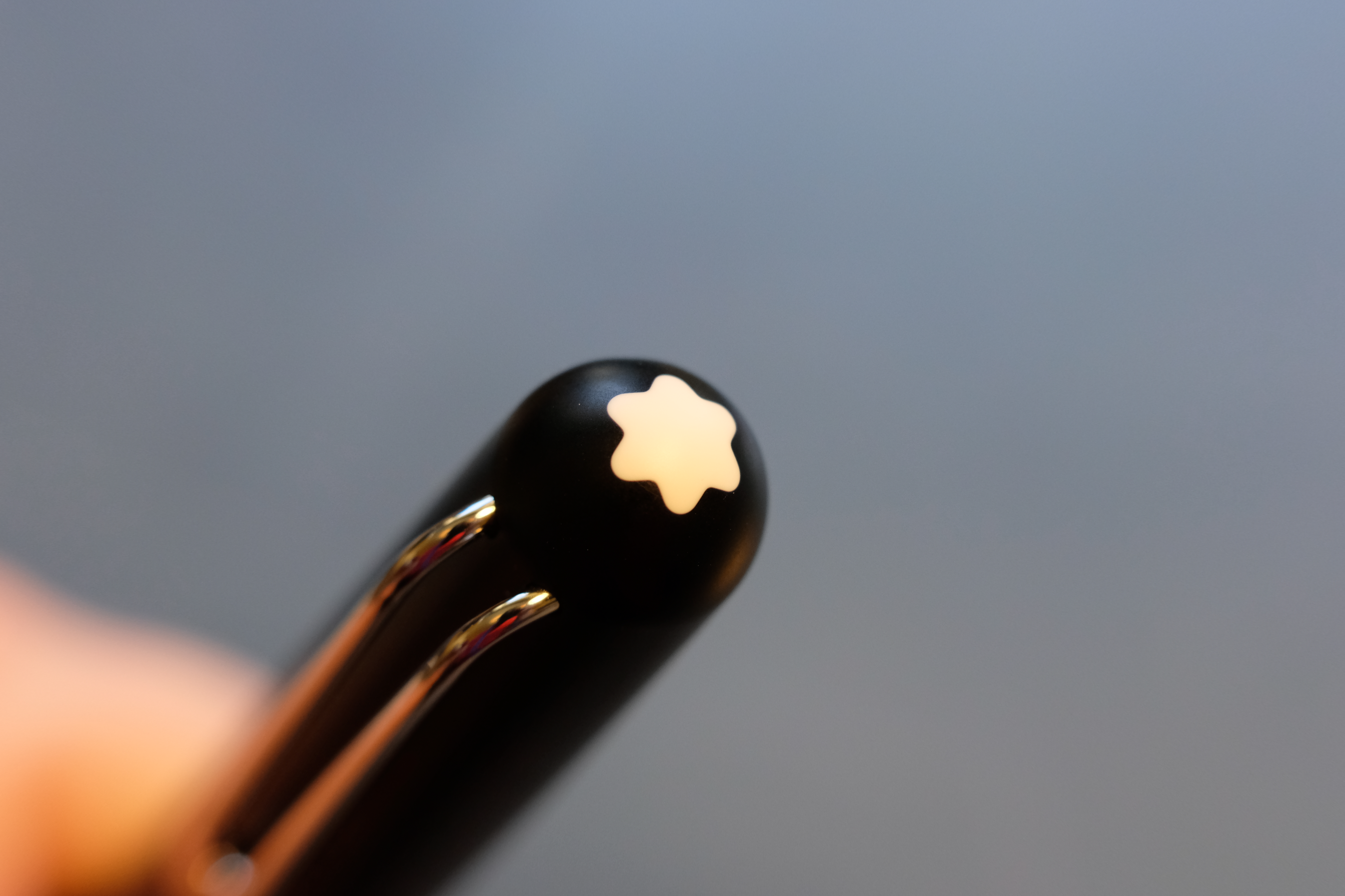
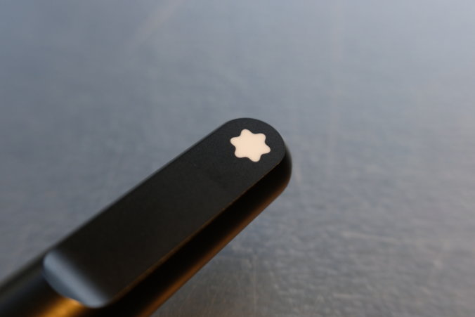
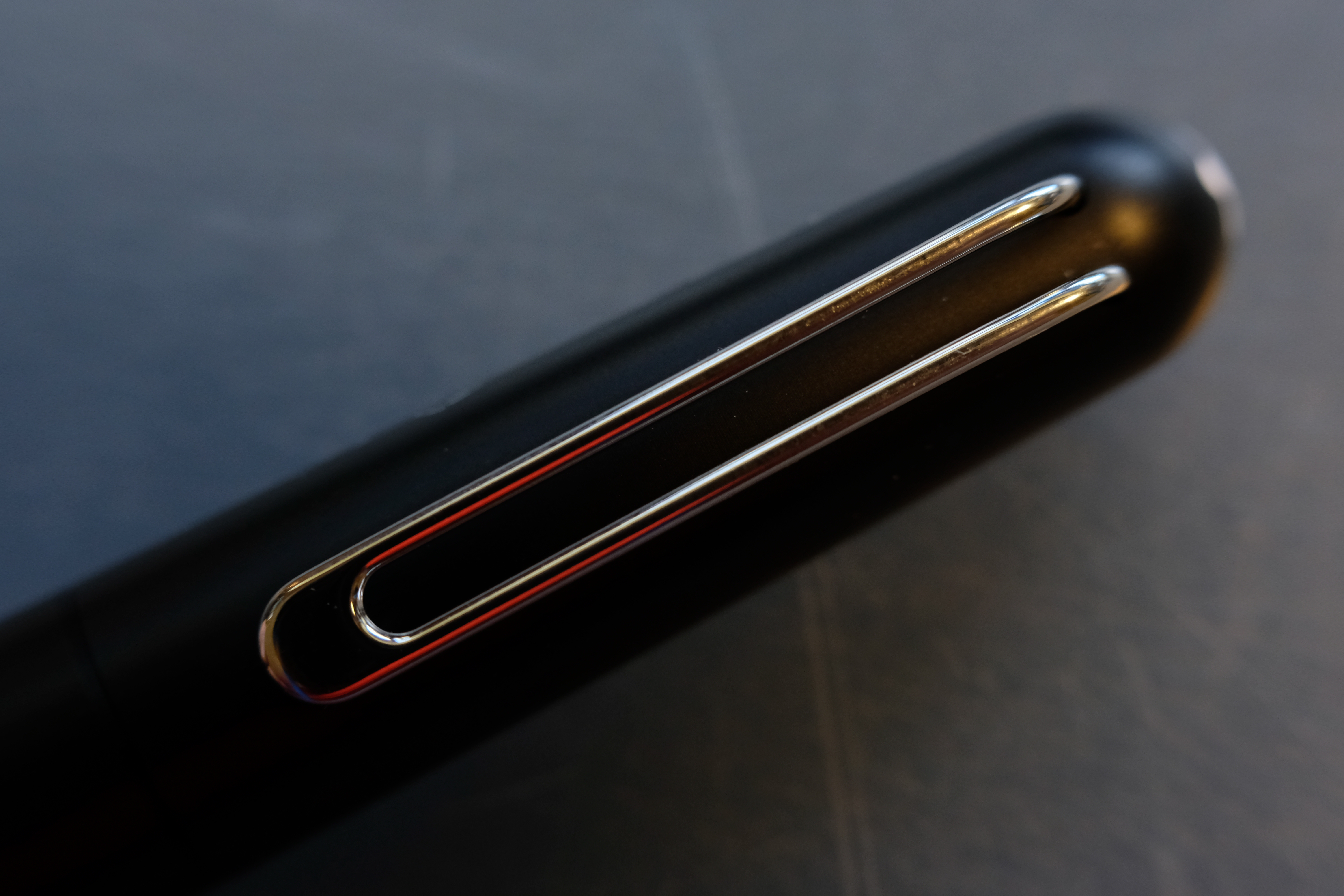
And the much-hated “plateau” really succeeds.

The plateau is a truly unusual design feature that is executed through taking away, instead of bolting on — how minimal. It makes the pen edgy through asymmetry, something that is a break from the turned past of pens.
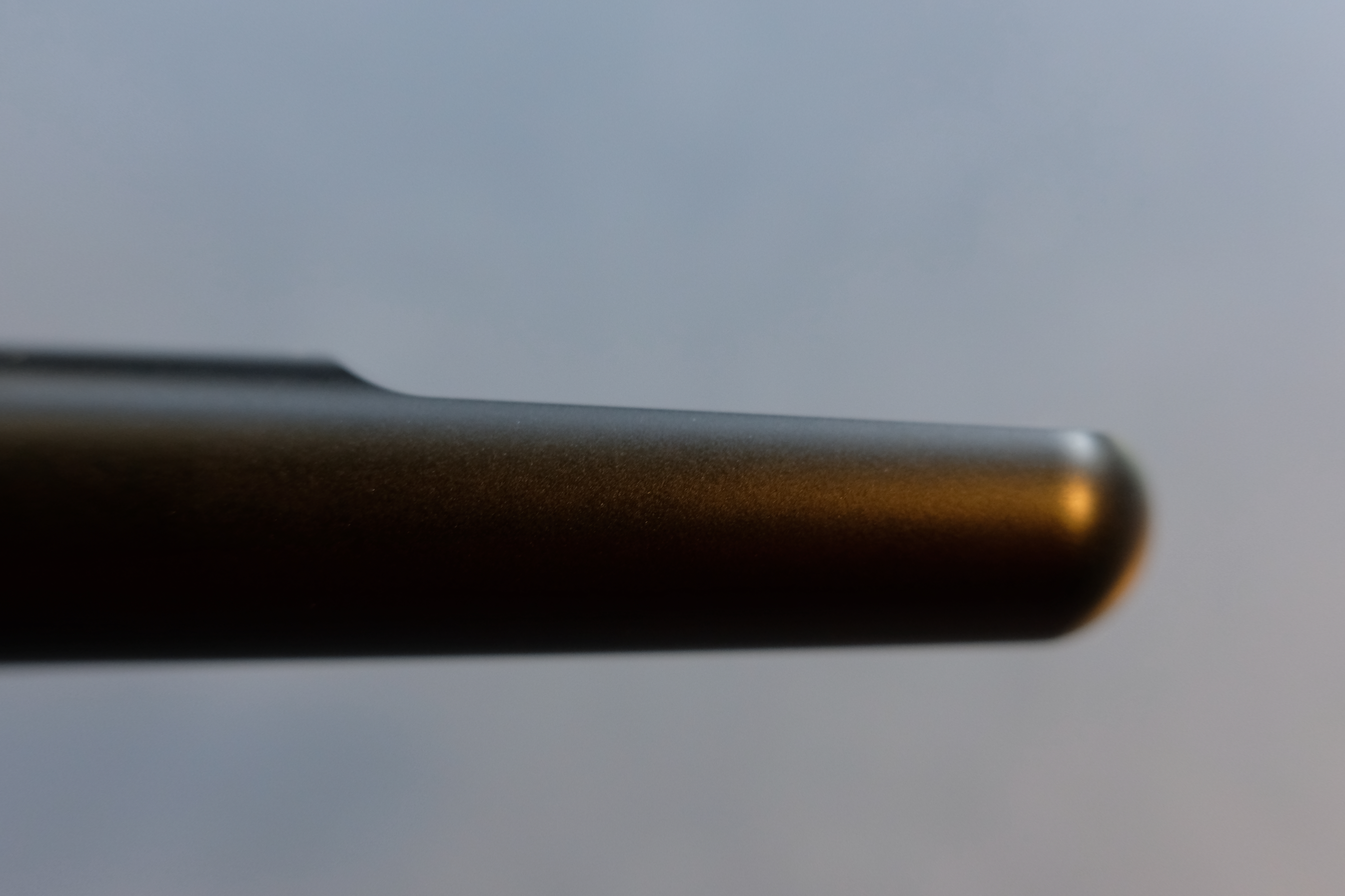
And it gives me a view of the snowcap when I’m writing, in a really neat way.

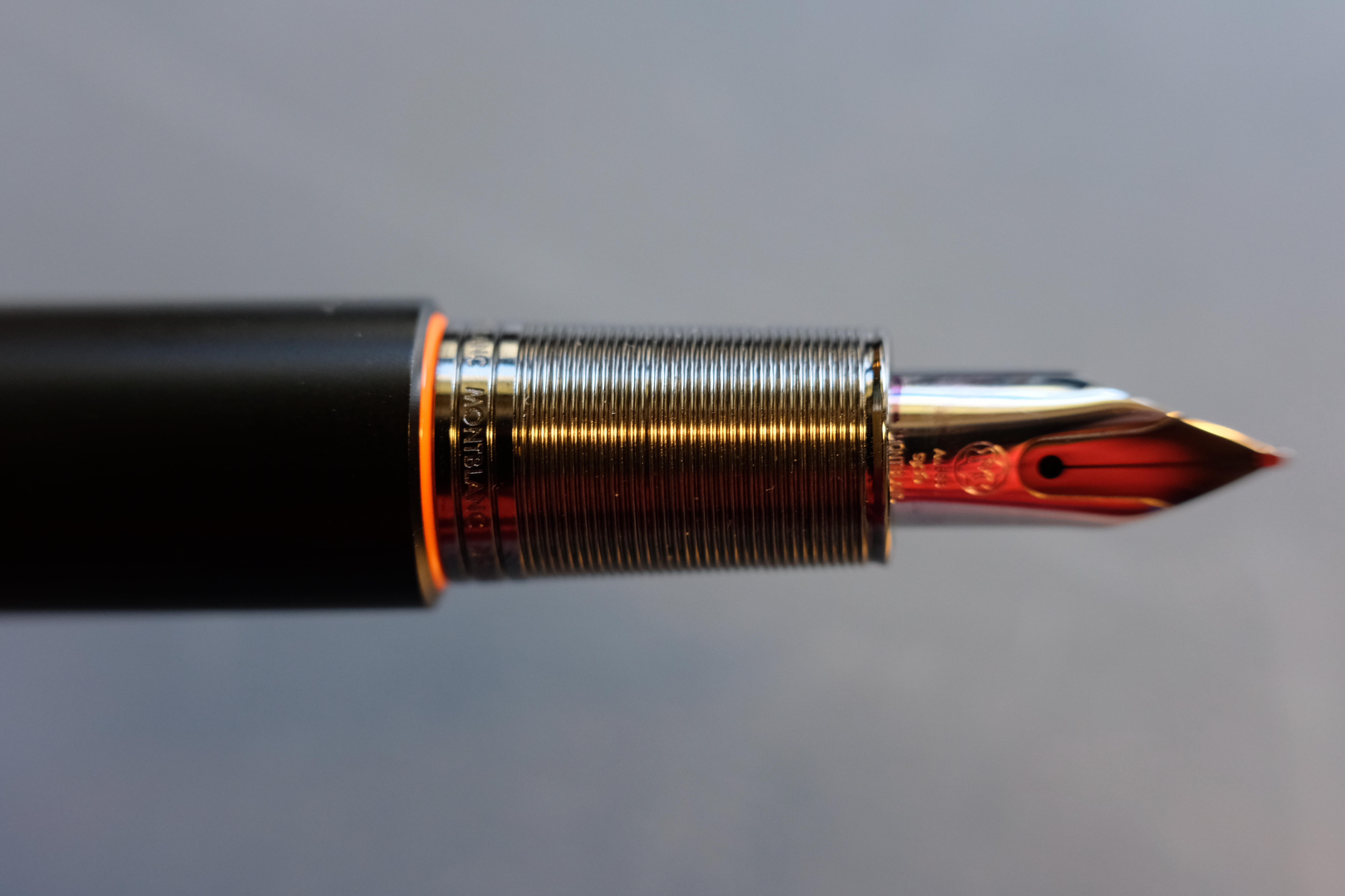
I’m a fan too of the two-tone rhodium and ruthenium nib, which has a Lamy Aion vibe to it (another pen designed by a famous name: Jasper Morrison instead of Marc Newson).
I even quite like the look of the ribbed ruthenium section, which catches the light (and fluff).
A proportional reaction?
But the design isn’t that visually pleasing when you physically take a step back. It’s something about the proportions when capped… the barrel is too long or the cap too short.
The clip looks cheap, although I think it’s a bit unfair to call it a Safari rip-off, as some do.
And the section looks squat and graceless, too short for the pen.
Uncapping the pen you can feel the M’s signature magnetic closure, which keeps the nib, clip and plateau aligned for maximum Brand Aesthetics(TM). I wish the magnets were stronger; half the time I have to click the cap fully on manually anyway. But I like the concept. It’s a hidden bit of playfulness in a dry design, and it furthers the minimalist agenda.
Of posting and plateaus
Pitchforks were waved when it was discovered that the M can’t post. It does seem a bizarre decision, but the pen is long enough and I never post my pens, so screw you guys that do.
Many people blame the plateau for the lack of posting; I don’t. By many accounts, the rollerball and ballpoint versions do post.
But the plateau definitely limits the filling options. The M, like the Starwalker, is not a piston filler. In fact, it’s a cartridge-only pen by design; the indented plateau gets in the way of many converter knobs.
Perversely, that was one of the things that attracted me to this pen. It’s no-nonsense. It limits you, it’s ascetic. And that seems to be a principle that pops up everywhere in the M’s design.
M or F nib only, boy. No fancy filling mechanism to get you obsessed with inks and that you have to flush. No double vac power filler with reserve. No fancy design to ogle. No flex nib, no threads, no ink window, no colours, no gold, no patterns, nothing to distract. Everything is taken away.
Cold comfort
In the hand, the M gets more criticism than is fair, I think. The ribbed section is slippery, but only in one direction, namely rotation of the pen. Your fingers do not slide down toward the nib.
The section and nib are indeed short, leaving your fingers butting up against the barrel step, which is sharp and huge in order to make the cap sit flush with the barrel.
But it’s a very light pen with all the weight biased toward the nib. If the nib is writing right, you barely need to grip it at all. I found that, when I relaxed, the M became a lot more pleasurable to use.
Writing experience
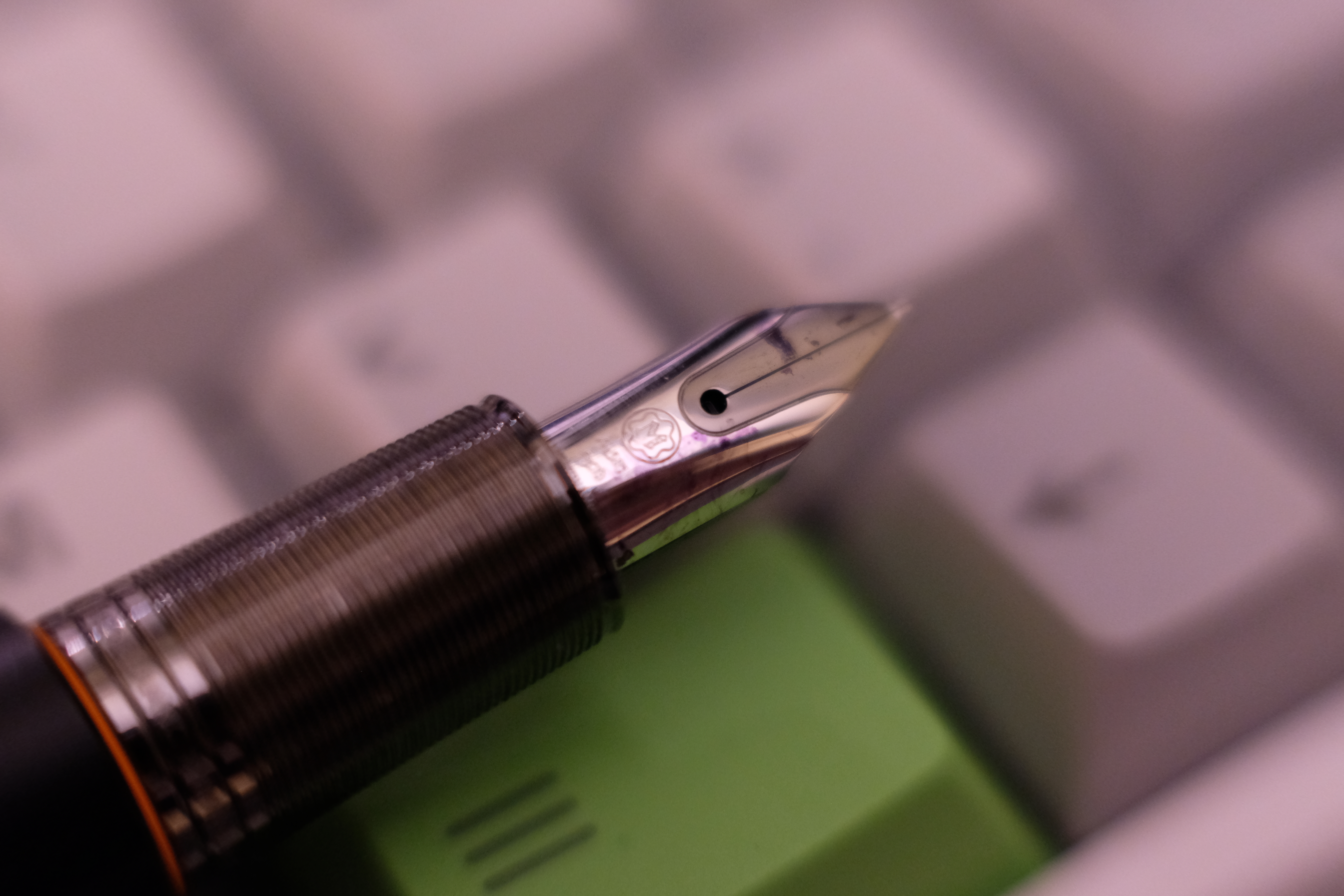
The 14k nib writes a true Montblanc medium.
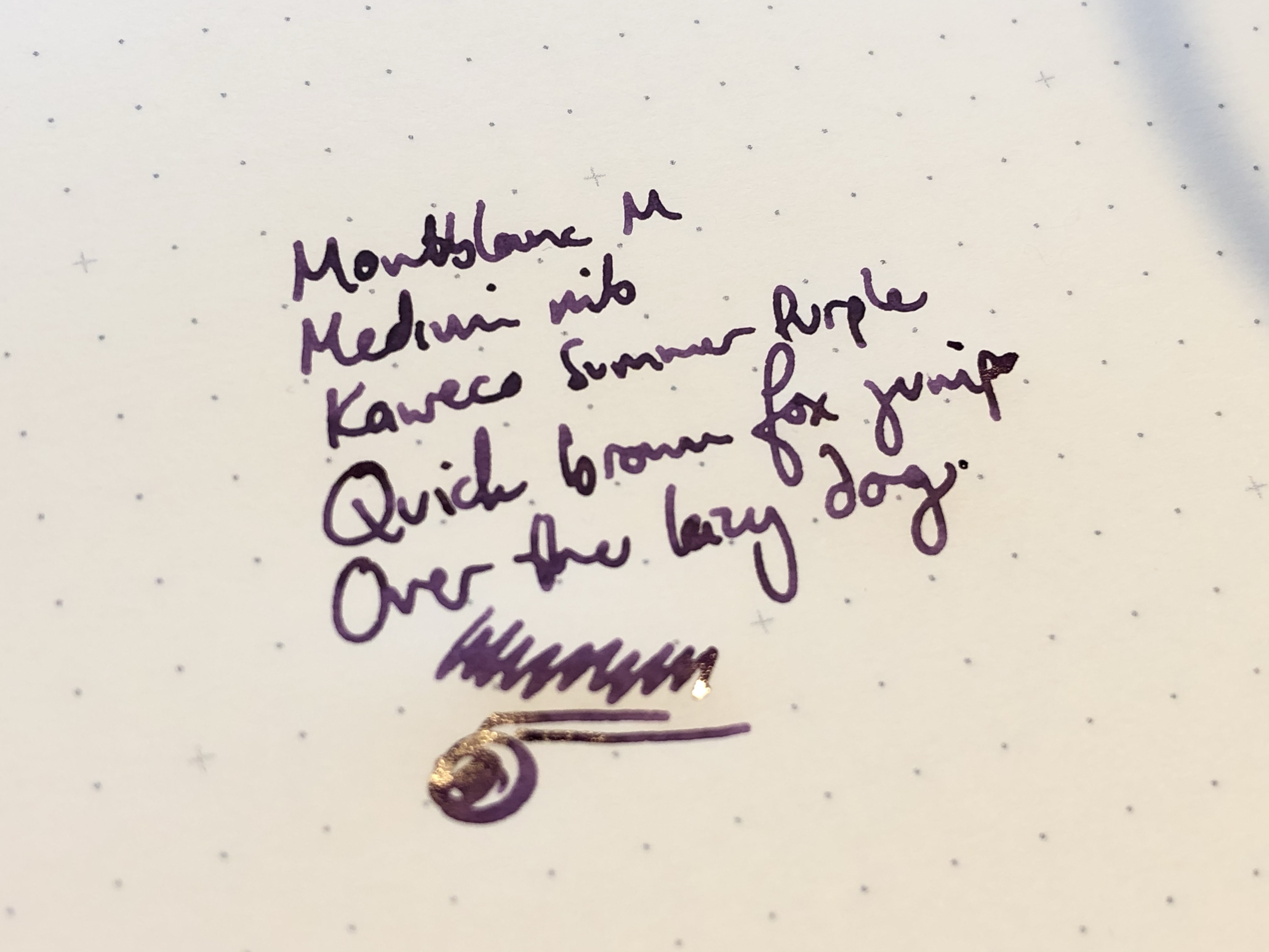
It’s very firm, and has just a little light feedback. It wrote on the supplied black cartridge straight away, no skipping or hard starting. The feed is finless and steeply sloped, and the nib is almost tubular.
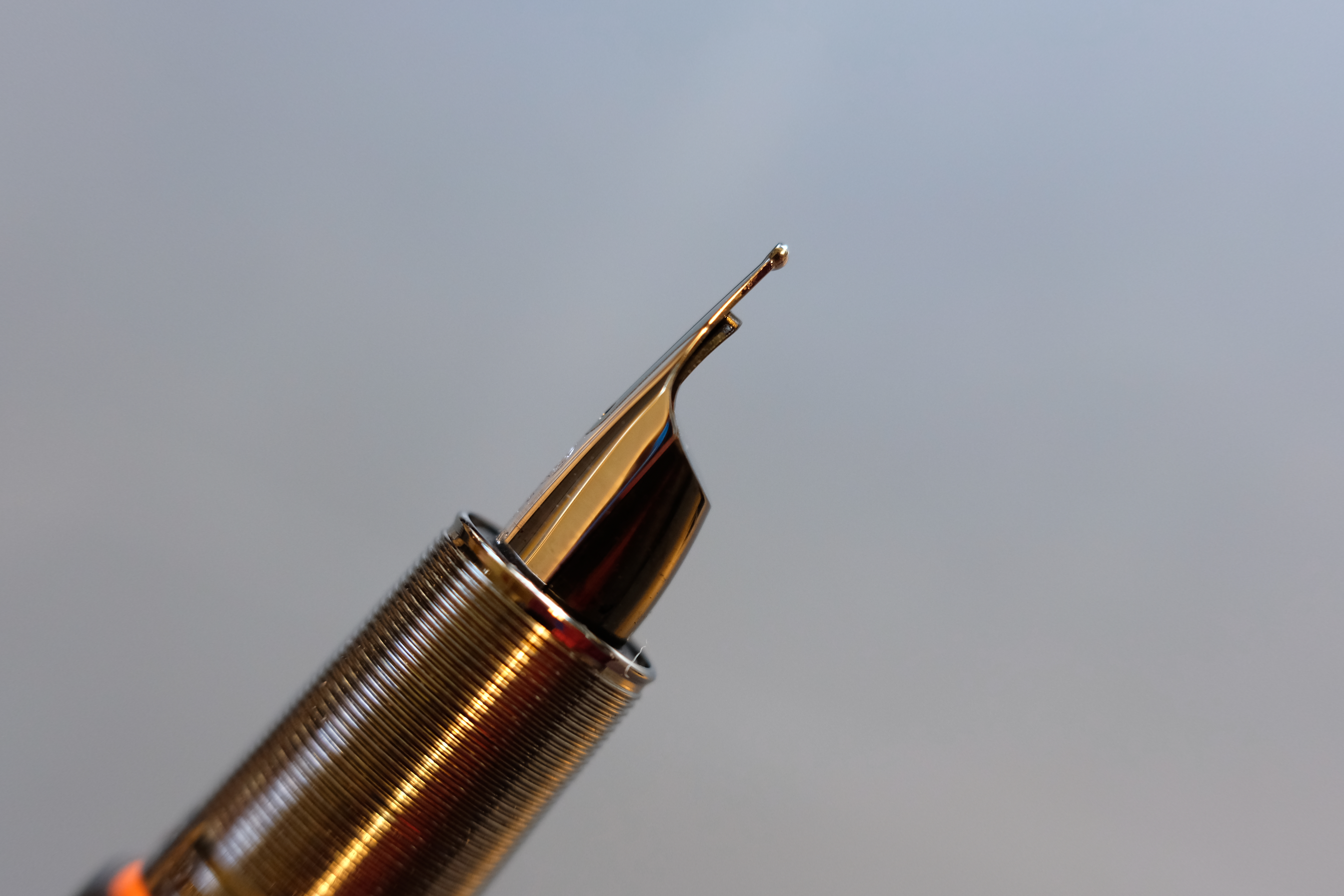
It couldn’t look any less like the 149’s nib, could it?
Mine is writing a moderately wet line. I may try to shim it to loosen it up a little, but actually it’s a good little writer. I could see myself scribbling through a day of meetings without even noticing the nib was there.
[wpvideo qRBKD4QW]
A thought experiment: what makes a Montblanc a Montblanc?
The M really doesn’t feel like a Montblanc. No piston, no scrollwork, no cap bands, no gold. No homages to great people, no harking back to Heritage, no Meisterstuck. Barring the snow cap, there is not a single design element in common with other Montblancs. That is weird, plain and simple.
As we’ve seen, the M is not a completely successful pen, and I think a large part of the blame rests with the deliberate rebellion against tradition.
The proportions are unconventional and that makes them feel somehow off. The fancy magnetic mechanism only half works, and is probably no better than traditional threads. The filling mechanism is unusually limited, dubiously trading the capacity of Montblanc’s usual piston filler for the disposable convenience of cartridges. Eliminating cap threads is an opportunity to improve comfort, but it’s sacrificed here for the aesthetics of a cap that’s flush with the barrel. And the writing experience is short on personality.
At £500, the M is cheap by Montblanc standards, but it would be fair to say you get less for your money than with a 146. Then again, people pay for minimalism, right? (And for luxury branding, of course.)
A lesson in fresh perspectives
For all its faults, this is not the awful abomination that many believe it to be. I actually like the M as a pen. I like how simple it is, how it gets completely out of the way, forcing you to write when we so often treat our pens as toys (ironically, the magnetic cap can be a fidget spinner).
I can see how all the stereotyped “millennials” who dislike the pomp and splendour of Meisterstuck can look at the M and say that’s a pen for the iPhone generation. They’ll stick a black cartridge in it and use it every day in the office and never think about a new pen again, because this M will literally never let them down. There are no threads to strip, no piston to stick, no flex nib to spring. They can get on with their lives. More power to them.
And it may be a silly thing to say, but I also like the idea of the M independent of the execution; I like the thought experiment behind it. I like how Montblanc was brave enough to throw away all but one piece of its brand language, reinvent itself, and then stay committed: since the initial black and matte black, it has released the (RED) and platinum versions. After the internet feedback, I thought it would be quietly discontinued.
I’m not sure I’ll keep the M, but I like it more than I thought I would, and I’m glad I’ve tried it. Critics dismiss it as a pet project by a celebrity designer who never used a fountain pen for a day in his life, but to me it shows the purpose of all product design: to relentlessly pursue the essential, to find a fresh way of looking at a familiar tool, fighting against the tide of “we’ve always done it this way”.
Those new ways of doing things aren’t always better than the traditional ones, but it’s a good thing to test the boundaries of the past, lest they become a prison for us.
A great read, thank you! Personally I have never overcome the aversion to the plateau for long enough to handle one and therefore did not even know it has a magnetic cap. Thanks for such a thorough and thoughtful review.
Thank you – a very thoughtful review. Am I a contrarian? I think a strong point of view can be very compelling and I now want to own one.
I hate pens that I can’t post. Also, I think it’s ugly. Great review.
I have been tempted by the red one. I wonder, can it handle international standard cartridges or are these MB-specific?
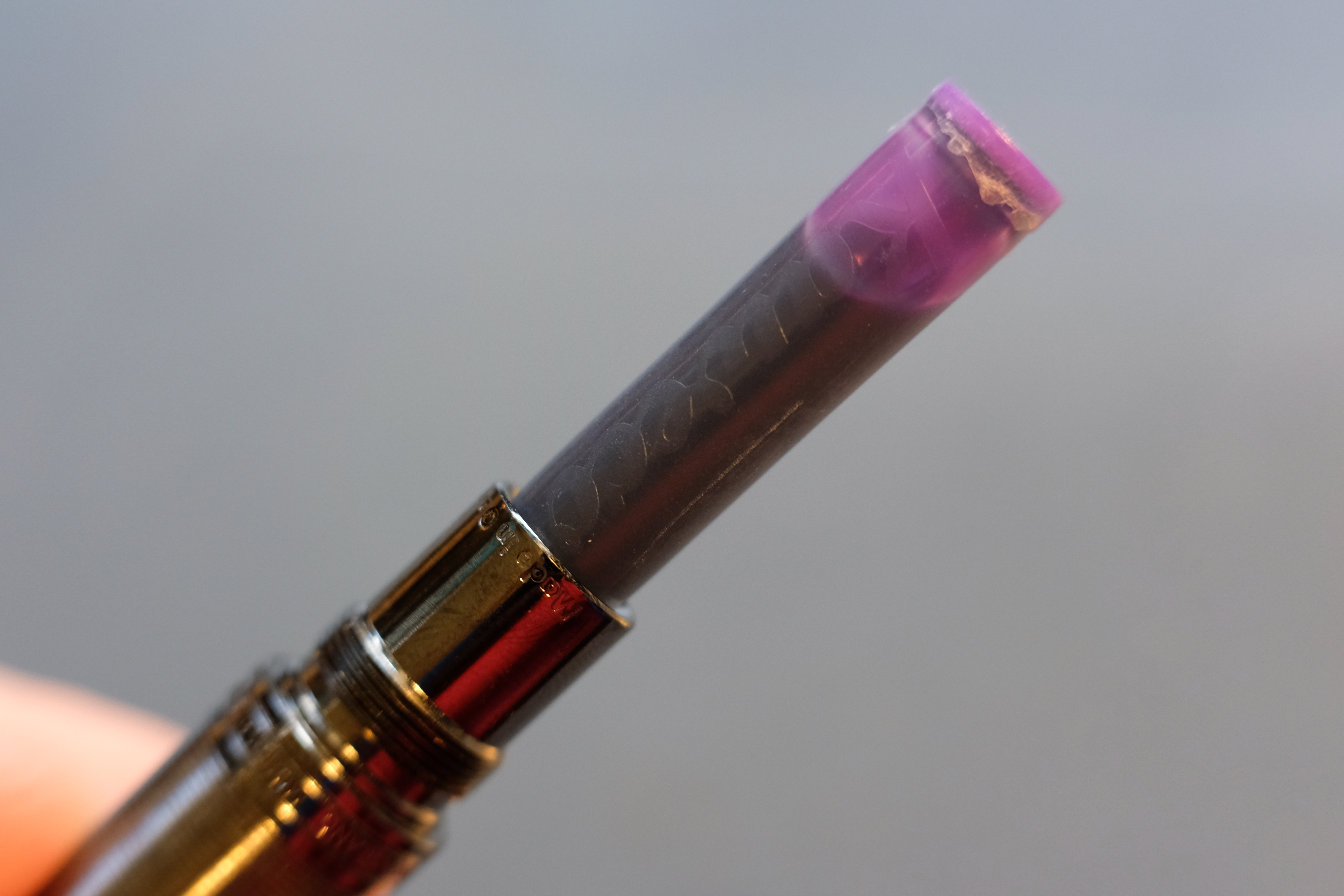
It takes international cartridges, but the collar is quite narrow — the Kaweco cartridge in the photo was a tight fit. Montblanc cartridges have a narrower section near the nipple.
You have extremely small hands!
Erm… men’s size large? That’s why I always have a problem with small pens.
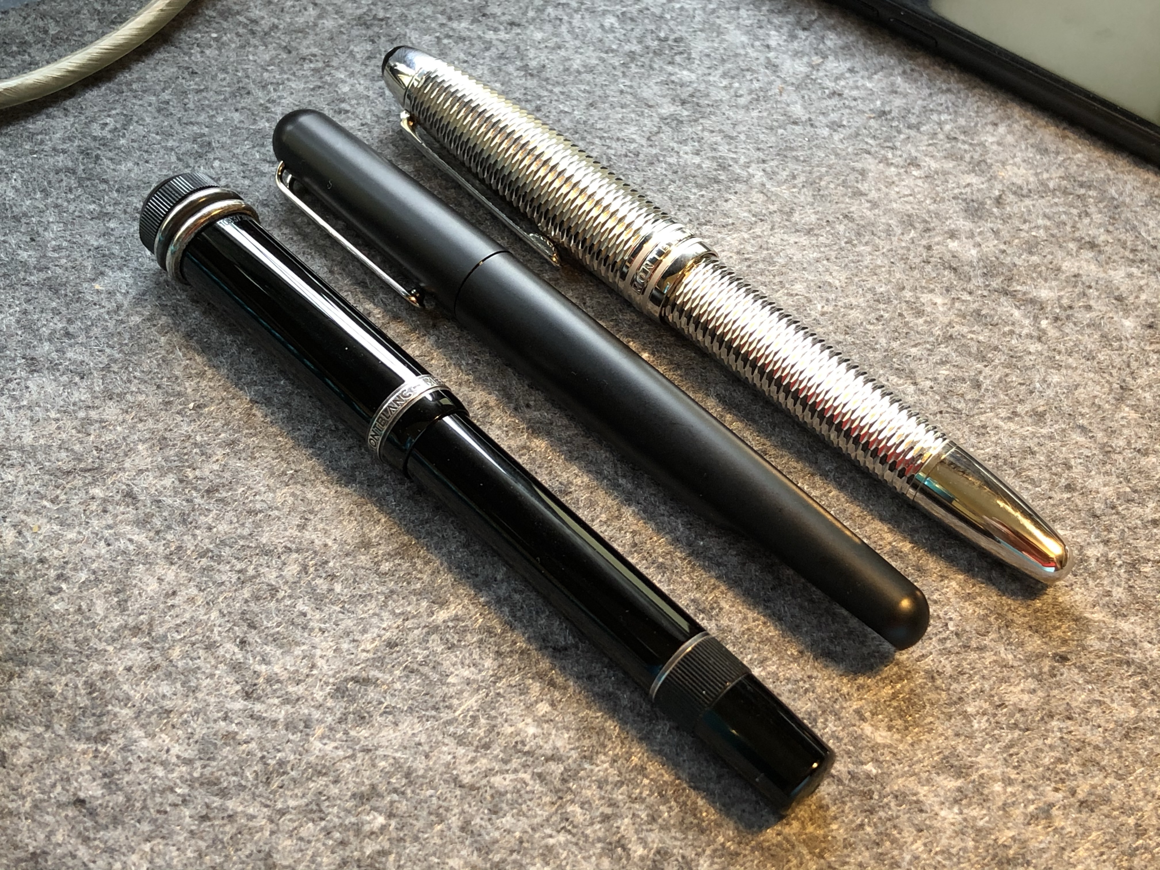
What is that silver, ringed Montblanc? It’s very cool looking!
The pen on the left is the Agatha Christie, the one on the right is the Geometry. Reviews of both are on the site!
Like, that’s just your opinion, man
Thank you for the great review. I bought my M back in 2018 and thought I was the only one in the world to like it!
Me parece que es una reseña fantástica.
¡Has hablado con gallardía y franqueza! Felicitaciones. La hé encontrado similar a la Pelikan Epoch, a la que solamente se le puede colocar cartuchos ( grandes o pequeños “internacionales” jamás un convertidor). Ansío tener una Montblanc 146 Caligráfica. Aunque la que tengo tampoco “llena los estándares usualmente aceptados” pues es una “Slimeline” de la década de los ´70, en punto fino a medio, que escribe fenomenal, la que utiliza cartucho ó convertidor.
También es de resaltar tu magnífica redacción animada, franca y jocosa. Resulta placentero leer.
Aunque la que tampoco tengo “llena los estándares usualmente aceptados…
fué invertido el comentario:
– “Aunque la que tengo, tampoco “llena los estándares usualmente aceptados” …