It’s always exciting to try a new pen, and doubly so to try an entirely new brand for the first time. So when Hahnemühle reached out to me to review its new FineNotes range, how could I refuse?

Essential background: who on earth are Hahnemühle, and why are they suddenly making pens?
Hahnemühle might not be a name you’ve heard of — I confess I hadn’t. But if you’re an artist, you’ll know it as a nearly 450 year old, well-respected German brand that makes all kinds of high-end paper. So ironically this is about as far from a ‘new’ brand as you can get.
And now Hahnemühle has created FineNotes, a stationery sub-brand that initially includes two kinds of writing notebooks (review to follow) — and a few different models of pens, not just rollerballs and ballpoints, but also gold-nibbed fountain pens that retail over £400.
A daunting challenge
Diversifying from making art and printing paper into making fountain pens is already a big leap. Literally nothing carries across: machinery, tooling, customer insight, distribution and storage, packaging, brand, suppliers, retailers, PR and marketing investments, cost structure…
Jumping straight in with high-end, gold-nibbed pens seems like an incredible additional risk. Why would anyone spend £400+ on a pen from a brand that has no track record and brand recognition in writing, when they could choose a Graf, Pelikan, Lamy or Montblanc instead? Hahnemühle is also up against a host of smaller German pen brands like Otto Hutt, Waldmann and Cleo Skribent. The competition is fierce, and this is all happening in a market where traditional retail has been turned upside-down by Covid.
It all started with paper
Hahnemühle’s strategy makes more sense when you discover that it all started with the idea of creating the world’s best, no-compromise writing notebook (recalling its history in writing paper). Premium leather, traditional bookbinding techniques, a new and unique ‘inkproof’ paper… the company pulled out all the stops to create the top-end FineNotes notebook (which costs over £100), pitching it against luxury companies like Smythson. If Hahnemühle wanted to create a pen line to go with a notebook like this, it had to be equally premium. Imagine buying a £100 notebook bundled with a £100 steel-nibbed pen!
And speaking to people at Hahnemühle, they went in prepared for the challenge. They hired experts with experience working at brands like Lamy. They worked with the best German contract manufacturers to bring the pen designs to life (nobody builds pens at scale in-house from a standing start). And they are reasonable in their expectations: they plan for these models to sell in their hundreds, not tens of thousands, appealing first to Hahnemühle loyalists shopping in art retailers (exploiting the overlap between art and writing) then to penthusiast folks like me, who are excited to try something new.
A serious commitment to excellence
And as to the question of why to choose Hahnemühle over any other German brand… well, that’s down to the pens themselves, and we’ll come to that shortly. But it’s worth saying first that Hahnemühle backs the FineNotes pens with a pretty unheard-of 30-year warranty. The retail models (not my review samples) come in a very handsome wooden box designed to live on your desk. The gold nibs, which are from JoWo with a unique shape and imprint, are run-in by hand just like Graf does. These are all good indicators that Hahnemühle is taking this enterprise with serious commitment to building a trusted reputation. I guess you don’t build a 450-year brand by cutting corners.
Taking a tour of the Bold and Slim
I have two pens in front of me here, and I’ve been putting them through their paces for a couple of weeks.

The first is the Bold, a minimalist design made from matte stainless steel.

It has an articulated machined clip, a very fast screw cap (three quarters of a turn), flat ends, a curvaceous section, and a standard converter hidden inside.

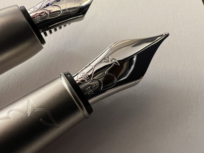
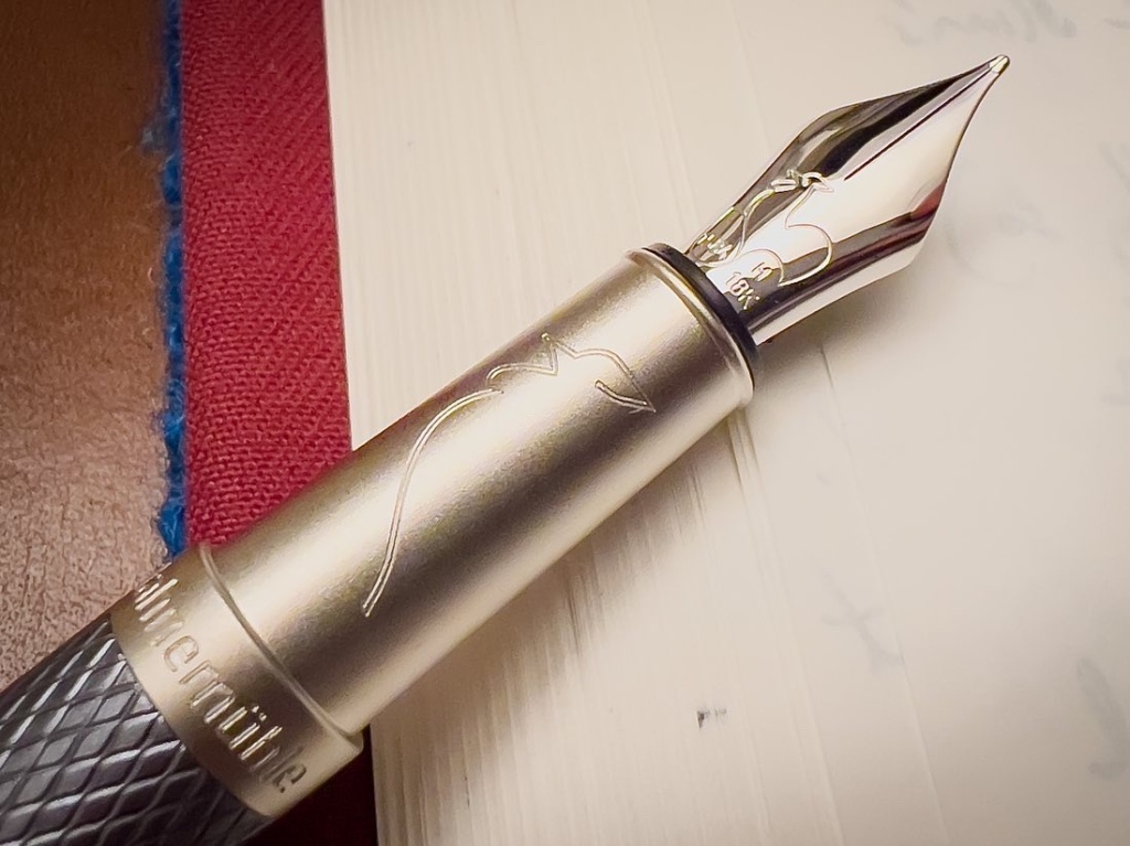
On the end is a rhodium-plated #5 gold nib, with a plastic feed. It’s stamped with the outline of Hahnemühle’s rooster logo, and it has no breather hole.

The end of the cap also has the rooster logo, laser engraved, and around the circumference of the cap lip the Hahnemühle name is laser engraved.
For a pen made from stainless steel, it’s not that heavy. And for a pen called the ‘Bold’, it’s not that big in any dimension. Think Lamy 2000.

Aesthetically, Hahnemühle tell me the pen is modelled after the various steel rollers in a paper mill, and that it will appeal to minimalist Bauhaus sorts of people. I can see that. And it does work: it’s a handsome sort of pen, very well engineered, with only the nib looking vaguely undersized (Hahnemühle chose to use the same nib as on the smaller Slim, for efficiency).
I found the Bold to be comfortable, particularly its unusual curving section.

And it’s functional. The nib doesn’t dry out when capped. The cap action is good. The clip is strong.

On the page, the M nib (F and B are available too) writes very smoothly and with moderate wetness, with some softness readily available.

The line is a true European medium. My review sample arrived inked and clearly had been previously used, but the nib wrote very well out of the box nevertheless.

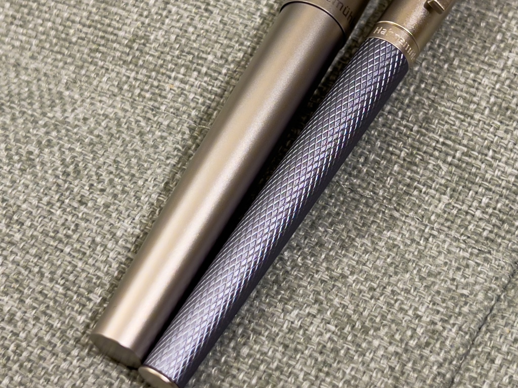
Moving on to the Slim. This is a much smaller and lighter pen. The section is under 8mm across, and it’s made from aluminium instead of steel, so although it’s a solid metal pen, it’s a featherweight.


What leapt out to me was just how different the Slim is from the bold, in almost every respect beyond the nib and filling mechanism. The cap pulls off instead of unscrewing (with a very solid action). The section is straight instead of curved.

The clip has a totally different shape and design, even though it’s basically the same size.

The Hahnemühle name is machine engraved instead of laser engraved, as is the rooster on the finial — and the Slim also has the rooster outline engraved down the length of the section.


While the Bold is featureless, the Slim is busy: the barrel has an icy blue guilloche pattern, there are domed end caps on the barrel and cap, little steps and ridges. It’s a totally different look. I was told that the difference is to appeal to different audiences — but I don’t understand why every design element has to change. Colour me confused.
I found the Slim much too short and skinny to write with for any length of time, despite the temptations of the excellent nib.
It too is a Medium and it performs exactly the same as the one on the Bold. I’m pleased to see this level of consistency. The imprint too is one of my all-time faves. So clean.

Great pens, but something’s missing…
Overall, these two pens are very well done. The machining and finishing are flawless: clean engraving, no sharp cap lips. Although I find them both on the small side and the Slim positively tiny, they are in their ways exceptionally usable: quick caps, solid clips and build, decent at posting, no drying out… the list goes on. They also, thanks to this little gem of a gold nib, write really well, with a good balance of practicality and personality.
What I’m missing though is a coherent aesthetic personality. Hahnemühle tells a convincing story about how each pen is inspired by parts of a paper mill, but what I see is the Bold looks a bit like a Staedtler Premium or something Lamy would make, while the Slim looks like a mini ST Dupont or something Otto Hutt or Waldmann would release.

Finding (or actually inventing) distinctive features or an overall design language to apply across a portfolio is hard, and I don’t think Hahnemühle have quite cracked it yet in the way that say Cleo Skribent has. The Bold and Slim are very competent pens, but from across a desk I’m not sure I’d know they were from the same company without seeing the logo. Perhaps the matte finish on both pens is a start — it makes for a more utilitarian vibe than say a polished Graf — but that is a pretty subtle point.
Value for money?
The Hahnemühle 2022 price list puts these pens at £440 RRP each. That undercuts the Graf Classic (for example) considerably. But you can get an Otto Hutt design04 with 18k gold nib for €285, which is also a slim, German-made metal pen with machined clip, CC mechanism, small nib and lesser-known but long-established brand. Of course, Lamy offers the 2000 in steel, as well as the Scala and various others with gold nibs, all in metal and made in Germany. And if you were unconcerned about a metal pen, you can pick up a Pelikan, or stretch the budget and get the Montblanc status symbol.
Whether this competition is compelling or not depends entirely on your attitude towards the Hahnemühle approach and brand.
I like the commitment to ‘doing it right’ that Hahnemühle shows with the FineNotes pens. With the exception of the shared nib, there are no design compromises visible here, and both the Slim and Bold are well executed too. It’s a very firm foundation for the future, and when I spoke to Hahnemühle they were excited about the potential of drawing on their 450- year history to create limited editions, bundling their notebooks and pens together. I can’t wait to see what 2022 holds.
For now you can buy Hahnemühle’s FineNotes range directly from its online store, but I am reliably informed that you can expect to see them stocked by some familiar stores soon…
Well, #5 nib on a £440 pen is a bit of a non-starter, is it? Put it against a, say, MZG Golden Rule with #8 14k Jowo nib and a piston filler for €450 — does it make you scratch your head a little bit of why the price point is where it is? It would take a lot of loyalty to bridge the gap; I think I’ll pass, thanks.
It’s all about what you’re looking for. A big flamboyant plastic pen with a huge nib is at the opposite end of the spectrum from what Hahnemuhle and I think a lot of the German manufacturers tend to go for.
I personally like larger nibs, but that doesn’t mean a #8 is always the right fit. The Bold could do with a #6 but it would look wrong with a #8. The Slim certainly belongs with the #5. A larger nib literally wouldn’t fit in the cap aperture.
Same with the materials. Not everyone wants a colourful plastic pen made from Brooks resin; some people prefer the aesthetics and feel of a metal pen, whether it’s a Lamy Imporium, Otto Hutt design07, or a Matthew Martin OG1.
I tried to pick like-for-like comparisons, and there are a few obvious ones out there. The Graf Classic also has a small nib, metal construction and CC filler, made in Germany; it’s also RRP around £500, and plenty of people (me included) think it’s great. There are Montblanc pens like the Rouge et Noir and 1912 that have small nibs that write wonderfully, better than the larger MB nibs. Of course as I point out in the article there are plenty of Otto Hutts, Lamys and the like that will give you the same specs as the Hahnemuhle for a lot less money too.
In the hand, the Hahnemuhle pens feel like quality pieces of kit, and they’re backed by the long warranty and other indicators of quality. So I don’t believe nib size alone is a good measure of value for money.
All that said, I agree with you that the price is high for a brand that has no equity or recognition in the pen market. I have a feeling that just like when Herbin introduced its Caravelle this may be too much too soon, and these pens may sell slowly and end up being heavily discounted, at least in the UK.
I did not mean to disregard the whole segment of metallic pens (though I prefer a lightweight pen any day of the week). Rather I was trying to speculate along the lines of how much pen does one get for the money paid. In this vein things like size of the nib and filling system used tend to push the price in one direction or another. A pen with #8 is generally more expensive than the one with #6 (definitely true with Leonardos); a pen with piston filler tends to be more expensive than the one with c/c. Exceptions — like the Graf you mentioned — do exist, but tend to have some sort of differentiator to justify the stance. Graf does not come to the party with an engraved JoWo nib.
Then you argue that an unassuming metal pen can be seen as a thing in its own league — I agree, but this league is rather populated, too (may I throw in S.T. Dupont and Yard-o-Led for good measure?). And within this league at this price point one can get a pen that is _somewhat_ (if not “a lot”) better.
In the end, it seems that almost regardless of what one looks for there is always a better alternative to the Bold at the price point. Which is a shame as it does not look like a bad product at all. I agree it’s likely for these to sell slowly and end up getting heavily discounted.
With the Slim there is some German heritage here: 45 or so years ago the German-made PaperMate fountain pen had a section that tapered from 8.5 to 7.5mm, the barrel was 9mm and it was 108mm long, 138mm capped and 158mm posted. Not directly comparable design-wise nor in nib, but long, slim pens aren’t new!
I do like the style of the Slim and I don’t doubt the quality of its manufacture but I baulk at the price for an aluminium pen, gold nib or not – £10 will buy a somewhat similarly machined Al pen of the same size from Muji: add a gold nib and you’re £250 or more better off.
Oh of course, slim pens aren’t new. And I know that many people like them. For me I prefer a section about 11mm though!
Having owned one of the Muji pens (I believe I published a review), there’s really no comparison. If we’re looking for slim machined pens from aluminium that still feel solid, maybe the Gravitas Entry? But to me the Slim is of a family with the Otto Hutt design03.