Reviewing a pen is one thing: you look at the object and evaluate it in the cold light of day. You might speculate about the decisions that led to this pen being exactly this way.
But interviewing the person who designed it? That’s a special treat, a unique insight into the months of creativity, refinement and manufacturing that lead to the product on the desk in front of you.
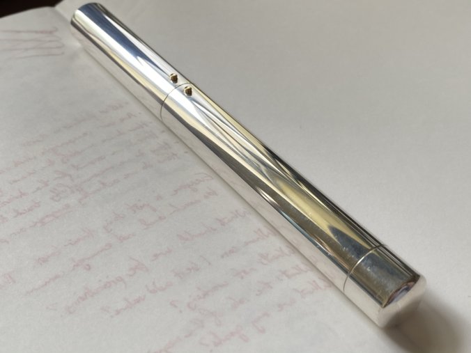
So I’m pleased to present here the write-up of my interview with Mark Braun, the award-winning designer behind Otto Hutt’s centenary pen, the designC (reviewed previously here).
It was a truly enjoyable conversation, and not what I expected. I can honestly say I left with a greater appreciation of the designC. Anyway, let’s dive in. This is a long interview, but it’s worth it. Grab a drink and settle down.
UKFP: Before we talk about you as a designer, let’s talk about you as a user. Everyone uses pens, but do you use fountain pens? Which pens do you particularly feel are beautiful pieces of design?
Mark: I was actually travelling to Beijing about ten years ago and I came across a pen; I think it was a socialistic mass product, a fountain pen, and I really liked it.
The socialistic approach is that you don’t have so many choices, but you have one that really works well. It’s the supernormal fountain pen.
I also use the Otto Hutt number 1, the very simple one, I use that personally a lot because it’s also supernormal, and high quality.
That’s a Jasper Morrison term, isn’t it, ‘supernormal’? Is that a similar thought process that you go down when designing, of the pen getting out of the way, being so unobtrusive?
Supernormal for an anniversary pen like the designC doesn’t work, and we’re not in a socialistic system any more where consumers can be provided with one lasting choice.
In our world, we need trigger points to attract people to products that have longevity. I follow the concept of ‘democratic luxury’. If you buy a pen like the designC every year, of course it’s too expensive, but if you only buy one product that’s well designed, super functional, then even though it’s for a higher price then it’s not expensive — it’s more a mindset thing. If you don’t consume so much in your life, a single object like this is not expensive.
A democratic luxury product should have high quality, so that it doesn’t break. You should be able to service and repair it. Then the price is still high, but it’s more… relative.
So the idea is that you don’t need a tray of fountain pens, you only need the one really good fountain pen? And that one pen may be expensive, but it costs less than all those other pens combined would have.
I would love this pen to be at another price level, maybe a thousand euros. But it’s a limited edition, it’s for the anniversary, and I’m very happy that it is at this price point. This pen will sell out: there are 500 fans of it out there. It creates a brand and shifts mindsets. Because there’s this important discussion to have about perspectives on value.
We’re so destroyed by these cheap products, we don’t respect products at all because they cost nothing. But they cost our future, even if we don’t realise it.
So maybe this is a good discussion to have, even though the product is still for the elite, the upper class, for those that have this “slow design” mindset.
So who would you say this pen, the designC, is for?
My father-in-law writes books, lyrics, and he is really into fountain pens. He always had this one pen that he used. He is an essential handwriter, he thinks while handwriting. And now I have given him one of the designC, and for this kind of person the designC is super good. It’s essential, always with him.
For me as a designer, I use the Apple Pen, I use a propelling pencil that I found at a flea market, and of course I use the designC a lot, for writing my notes. I have to use my products, otherwise I can’t deal with critics on function.
So I use it, and although I’m in front of the computer a lot, my notes I write with the designC. I don’t write postcards, but I write a lot of notes during the day.
Do you feel it helps your creative process to do things on paper?
Sketching is very important for a designer — thoughts on paper are much quicker than thoughts in the 3D program, and more imperfect — and more imperfect creates some gaps for new ideas. So sketching is interesting.
The designC is not a pen to do sketches with. But for writing notes I appreciate it. It’s kind of heavy, which was not so easy to be comfortable with. But when you become familiar with it, it’s fine. Just like a phone, if it’s too light you don’t feel the value — the weight is the quality.
In the hierarchy of aspects you need to create value; the weight is important to create this value, because it’s sterling silver, and you want to feel this material also.
The weight could be a bit lighter if it was really for everyday use, but this is an anniversary pen, and it’s also a pen that’s a bit… in another league, for people who have this pen maybe they have it to write letters with, they don’t carry it around so much, so maybe it’s the pen on the desk.
So we’re getting now into the question of who you’re designing for and what the brief was for this pen. We’ve covered that it’s a pen for the desk, not for carrying around, then it doesn’t matter that it doesn’t have a clip; it’s an anniversary pen so it’s sterling silver, high price point and for people who appreciate that quality. Was there anything else in the brief that you were working towards?
There was this heritage aspect, where Otto Hutt came from. It was a maker of silver accessories for gentleman: cufflinks, silver toothpicks, all these funny accessories in silver, and of course very nice silver pens. And when they went to reestablish Otto Hutt they went 100% to silver. So for the anniversary pen, silver was a must-have, let’s say, to go to this material and reflect on this heritage: what would a gentleman be nowadays?
I had a similar experience when I designed a set of shaving tools. Razors are also a traditional accessory for men, to feel good, to express yourself, and I think it’s a question of how much “vintage” can you have, and how “progressive” can you be? If it’s “Back to the future”, how much future and how much back? And this was a nice challenge.

So in terms of that working relationship, how did that get started? They approached you, right? What was it about your previous work that made Otto Hutt feel that you were right for this anniversary pen?
I have to say, I was really skeptical about it. Because in their past, Otto Hutt was really “more is more”, let’s say. It’s all about new technologies or innovations. And I told them, for me, I try to highlight one detail, or to be simple but not boring — and do you really want this?
At first I think they wanted to work with me because they saw me as a Bauhaus designer, and Bauhaus is such a big thing. But I’m very good at bringing high quality to a pure level, and being progressive with respect for heritage. I think they saw this in my work for Nomos and other companies like Mono, the cutlery brand, and my razor set. Also I have worked a lot for family businesses with heritage.

So you’ve mentioned the razor, cutlery… these kinds of things are essential objects that have been done a thousand times by every designer. How do you keep true to the essence of that product and its refined functionality, while also putting your own stamp on it, and while not being gimmicky? How did you go about designing a pen for the first time when there are thousands of designs already in that category? Did that terrify you?
A good mentor told me once “Mark, it’s so good that you don’t know anything”. Because I somehow think I’m the first guy who’s ever designing it! Another friend of mine who is big into fashion says it’s a big freedom that everything has been done already, because it means you can do anything.
I don’t feel stressed because it will be special if I stick to my inner roadmap and the client’s roadmap. Of course we do a lot of research, and it’s not only me in the studio, we always work paired with another designer on each product, so they bring ideas into the project and we discuss it. And you have to know your enemy, you can’t do the same as the big classics.
Did that come up with Otto Hutt? For example when they raise the idea of Bauhaus, and the 100th anniversary edition, well, last year Lamy did the 2000 Bauhaus edition. It’s another minimalist design for a fountain pen. Were you trying to skirt around any of those kinds of landmark pen designs when you were creating the C?
To be honest I tried to bring my DNA of quality, longevity, good design, and I don’t really care if it’s Bauhaus or not. But people care! They need to put things into a category. Of course, you can say that they are right, but I just try to bring good quality, longevity and functionality.
The product has to tie in to the heritage of the company. Zeitgeist, but also heritage. Looking at the designC, you can say it’s “so 2020s”, but you can also say it’s 1920s. It’s very interesting to find a design that stays fresh. What stays fresh over the years? Simple objects are much less in danger than “more is more” objects. Because they are so into trends, while simple objects are more into essentials. And essentials don’t change.

I’m a filter of everything I like. Of course I like some Bauhaus designers, I like Brutalism architecture, Dieter Rams, Jasper Morrison, but it’s a big mix. I’m a filter of certain designer mindsets and I try to understand the company DNA. I don’t want to be 100% egoistic, so I try to be a good translator of the company DNA with my quality rules.
So let’s talk more about the actual process of designing the pen. How did the design evolve?
Otto Hutt is from their background an independent company with their own DNA, but they are also used to working with very talented individual designers. I felt a lot of respect, which is so much appreciated.
I offered them three designs, they had a discussion about all of them, and designC as it is now came through. Of the other two designs, my personal favourite didn’t make it, but if you offer three designs you don’t offer anything you don’t like. I really thought that the designC was so radical that they wouldn’t take it. But they took it!
My favourite was a bit more complex in shape, but somehow it was not enough an “anniversary pen”, it was more future than past. So it was the wrong approach. And the designC is really the right mix.
At that point in the process the details in the section were not there. You wrote in your review that people either love it or hate it, and also that there’s a material change.

But I thought that if I kept the section as simple as the outside, there’s no surprise. People really expect something different: they think it’s very pure, then they open it — and I thought let’s do something with functional complexity. This wave pattern is very good to grab, and I was very happy to design the nib imprint too.

If Otto Hutt had used their existing nib design, it would have been a big compromise. It’s too ornamented. People love it, but it would have been too much of a mix.
So big congratulations to the leaders at Otto Hutt that they said OK, we’ll do it, we’ll make a new nib. Somehow we were not too radical for Otto Hutt, they always loved what we did. They trusted us.
What Otto Hutt really brought in was the filling mechanism, and the whole knowledge of technical innovation, which is so them and not me. For me this is a perfect match.
So you talked about Otto Hutt handling the engineering and you handling the aesthetics and form. Did you find the two went together easily?
That was one difficult part in the project. Otto Hutt took the design and went to their factory and created all the internal parts. And suddenly the end part, the filling knob, was a centimeter longer.
I said, well, if you do this, it doesn’t look good. I’m sometimes in danger of holding aesthetics higher than function — although I know it’s my personal weakness so I always take care to look out for it! But the discussion was really productive. The engineers didn’t realise the proportions were important. They were just focused on making it easy to produce, they had a different view. But they rose to the challenge to make it smaller, it was really a good mix.
I wrote in a previous review that Otto Hutt has a boldness about them right now, that they want to shape their future. And going for your more radical design is the start of that future. Their new identity.
When they approached me I really thought it’s super interesting to work with this brand because I learn a lot, but I don’t know where it goes. And now I see that they can drive in this direction; they’re very open and future-focused. It feels very interesting.
Do you think we’re going to see another pen design from you, either for Otto Hutt or from another brand?
I am very sure that I will do something else for Otto Hutt. If you have a good collaboration with one client, it’s not so good to jump to the next.
I am working on another pen… I don’t know when it’s going to come out, but I am sure it’s at a price level which is still democratic luxury, but not an anniversary pen.
This project brought me back to handwriting, and that’s very good. I had that Chinese socialist fountain pen perhaps ten years ago, and I lost connection to it; it’s just this one pen and you have to always take care of it. After a while I lost it. And now I have the design01, and the designC, I’m very close to handwriting again. It makes me more aware of daily things. I think it makes me… happy.
My thanks to Mark Braun for participating in this interview. You can find out more about his studio and its work here. Discover the Otto Hutt designC here.
Is this password protected?
Regards,
Liston
Sorry for the confusion, readers! I published this post in draft form trying to give Herr Braun an opportunity to fact-check it before I published it. I unpublished it, but the new post notifications had already gone out automatically to you all.
Thank you very much for a really interesting article. It was a very good read. I never knew he designed the Neomatik as well.
A fantastic read and really interesting conversation, very well covered. Thank you for this Anthony.
I really enjoy this type of read, it reminds me of some of my favourite journalism from the ever evolving team at Motorsport magazine who also think to seek out the minds behind designs and concepts as part of a series called ‘Lunch with…’
I’ve learned a new expression too: Democratic luxury. I’ll have to find a way to use that in future.