In the UK we’re blessed with a number of wonderful stationery shops. Pure Pens, based in Wales, is one of them. They’re a fixture at pen shows and a stockist of unusual Noodler’s inks (I bought my bottle of Tianenmen from them back at the LWES). And, like me, they’re Pelikan addicts.
Pure Pens has just taken the huge step of launching its own line of inks, and I approached them for samples to try out, which they kindly supplied (you might want to check out my ethics statement here.)
The first thing to strike me is that this is a very well thought-through range. There are six inks at time of launch, and every single one is both interesting and usable, with not a single duff or dull colour, and no confusing overlap. A dark blue, a mid blue, a blood red, a dark grey, an orange/brown, and a turquoise. Perhaps the only colour really missing is a purple and you’d have a great starter ink set.
Each ink is shipped in a functional (albeit clear) glass bottle, with 60ml setting you back a keen £6.99, especially since the bottles are hand-labelled on front and on the cap, and bottled in Wales to boot.
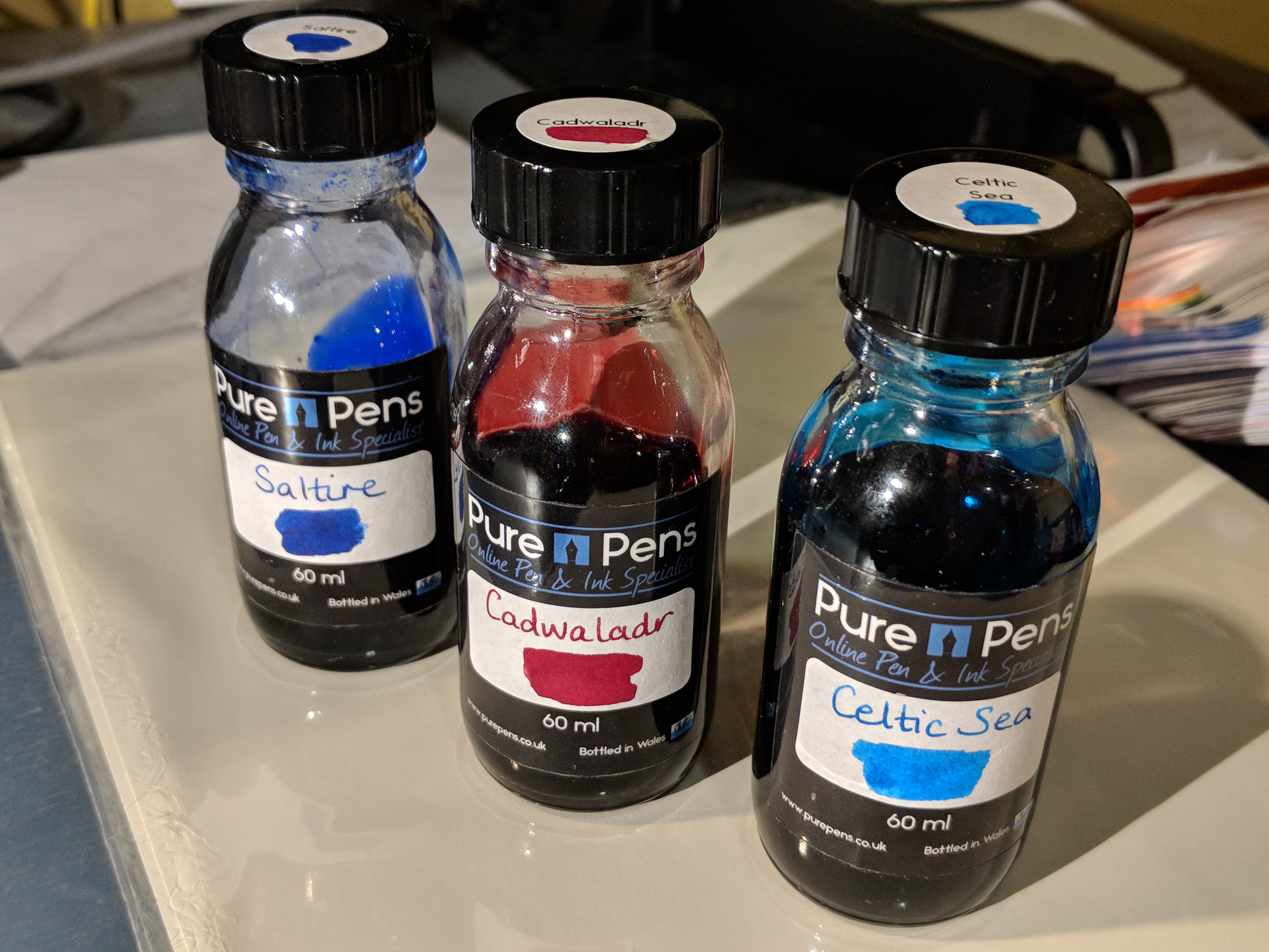
Pretty good bottles as they go. I like the extra label on the cap.
What tickled me the most was that each ink is aptly named after a landmark of Celtic British nature, from the Saltire Blue of the Scottish flag to the grey of Llanberis Slate. I love this kind of stuff.
So how do they perform? I inked up six of my favourite pens with these beauties for a week of work, as well as making my usual swatch cards and test scribbles with glass pens and q-tips on Tomoe and other paper.
Real life, man. Can you handle it?
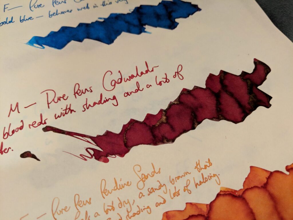
Cadwaladr
First up is Cadwaladr, a gorgeous blood red that somehow isn’t a doppelganger for Diamine Oxblood or Ancient Copper. Named after a Welsh King, I believe.

It’s not blood spatter, honestly.
It’s a really saturated ink that smells a bit sweet, like a KWZ ink. Unlike some heavy reds that I’ve tried — Colorverse Andromeda, or Noodler’s Tianenmen — it doesn’t smear, and my Lamy 2000 is so far free of nib crud, too.
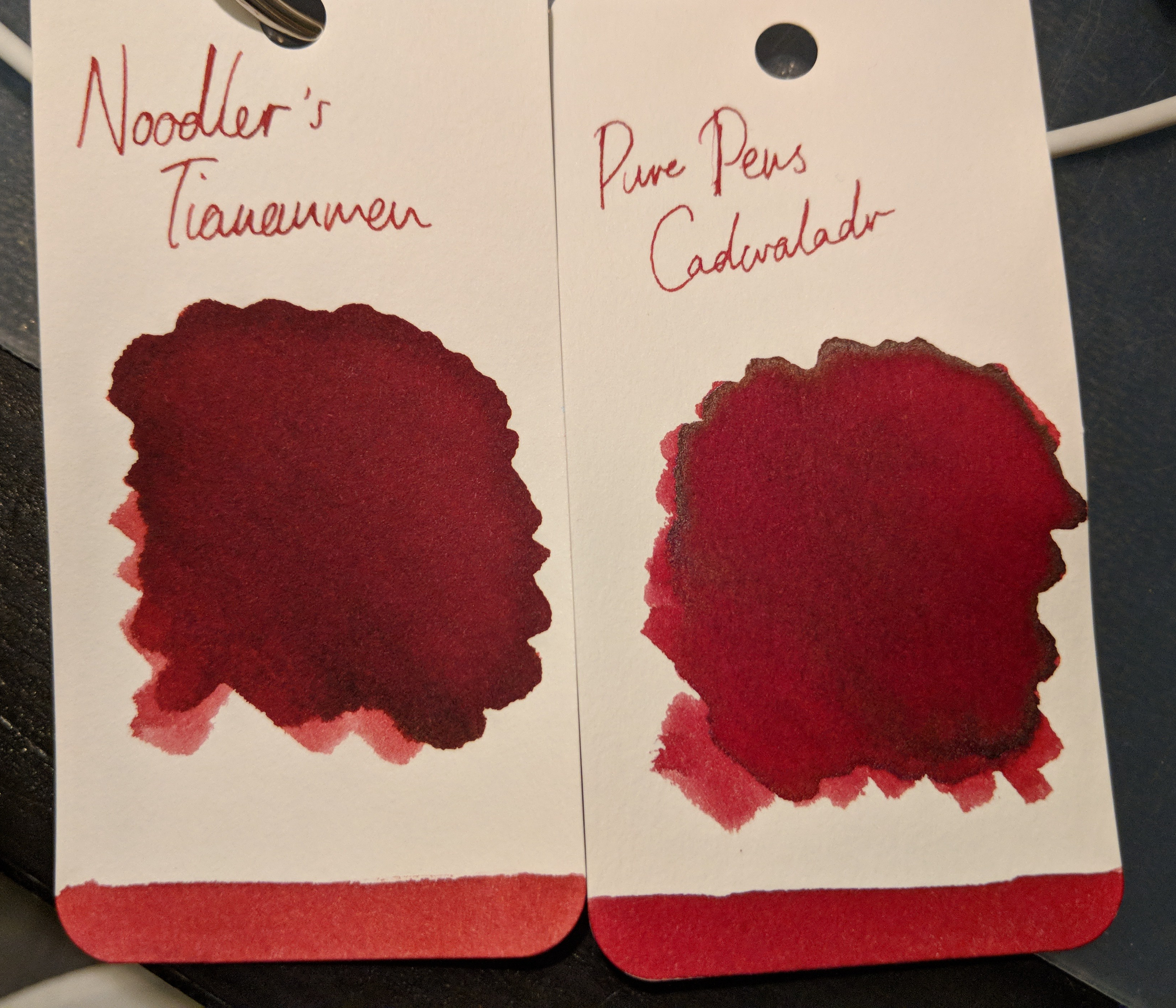
Closest I’ve got. But better behaved than the Noodlers.
Cadwaladr shows shading on Tomoe but not much sheen. And to be honest that’s no bad thing: I’m a bit sheened out. Cadwaladr is probably my favourite of the six inks and will go straight into my regular rotation.
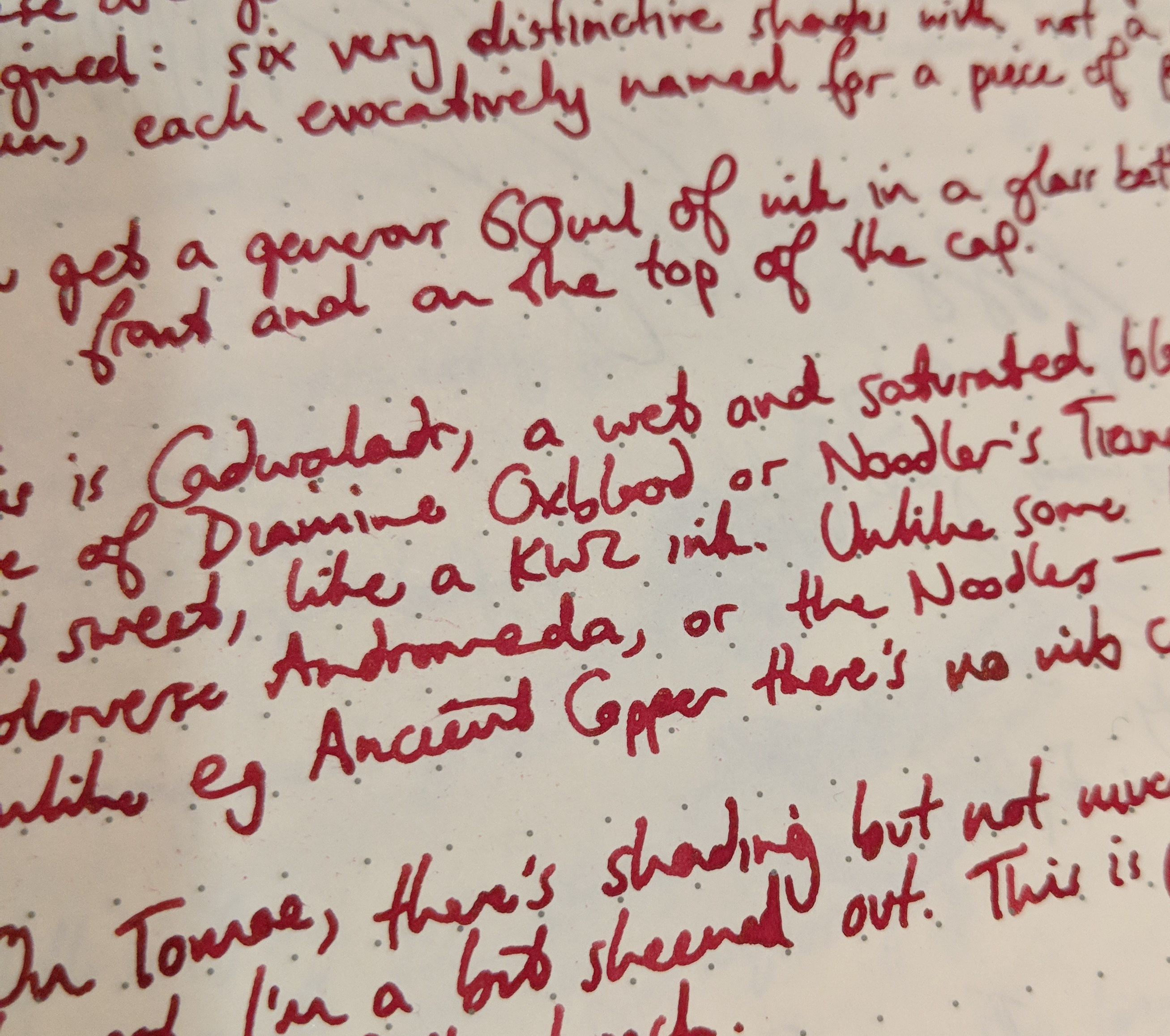
My fave ink from the set.
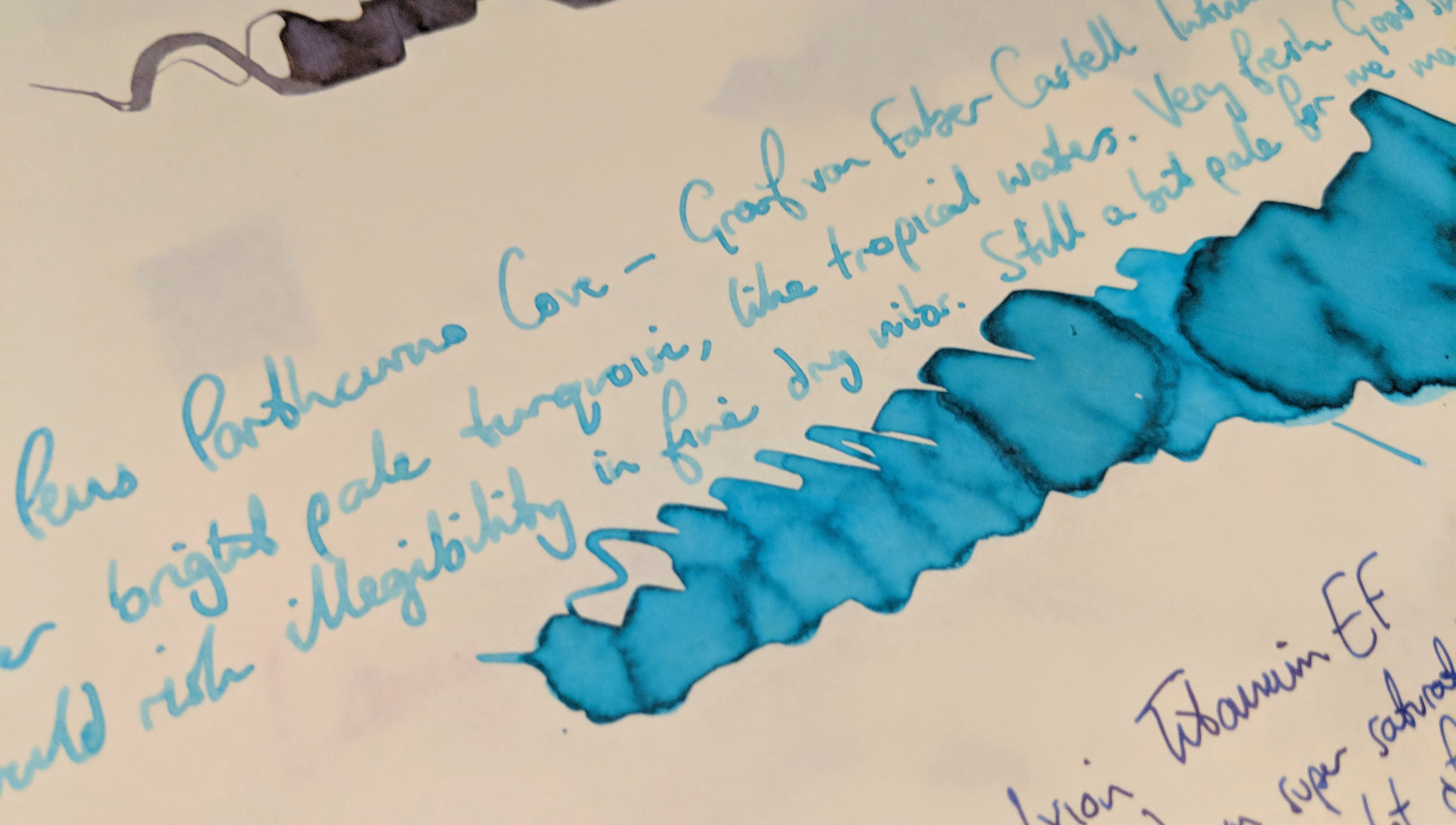
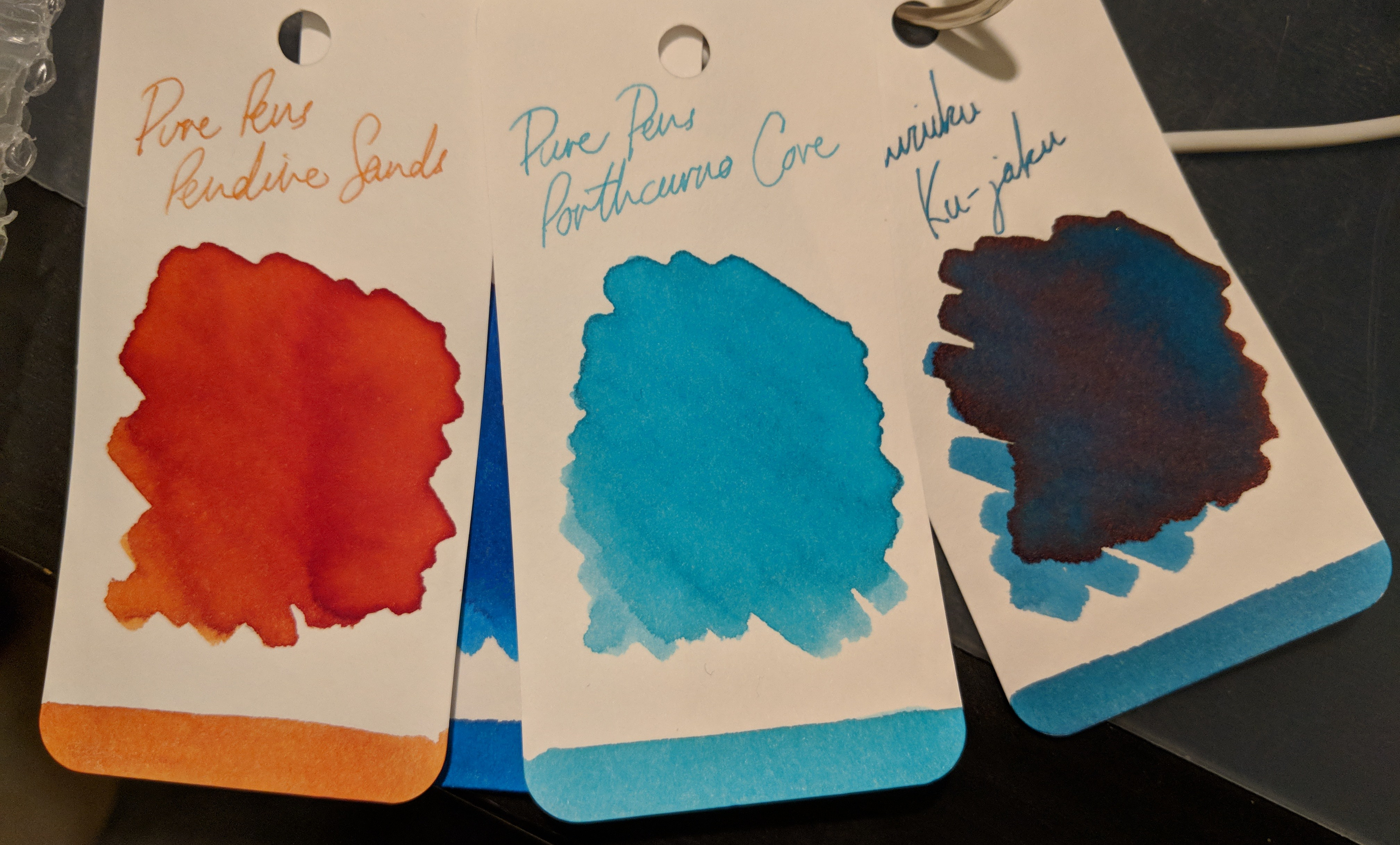
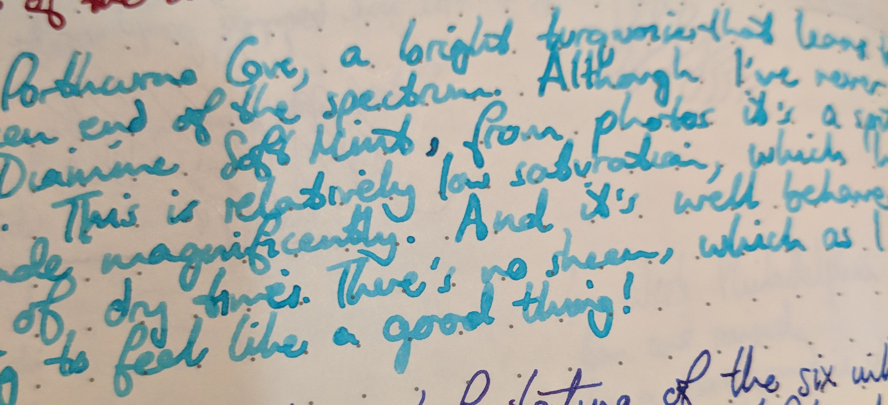
Porthcurno Cove
I put Porthcurno Cove into my broad, wet, Intuition Platino. This was a very difficult ink to photograph — my cameras kept losing the distinct green tint in the turquoise. Although I’ve never used Diamine Soft Mint, from photos it’s a spitting image for Porthcurno. So just ignore every shot below.
It’s more green than this, damnit.
I have to say, this is not my usual colour preference (hence why I don’t have anything to compare it directly to), but I really enjoy the shading.
More green than this, too. I promise you it’s not just turquoise.
Probably best in broad nibs like this one.
Ignore these colours. Cameras lie.
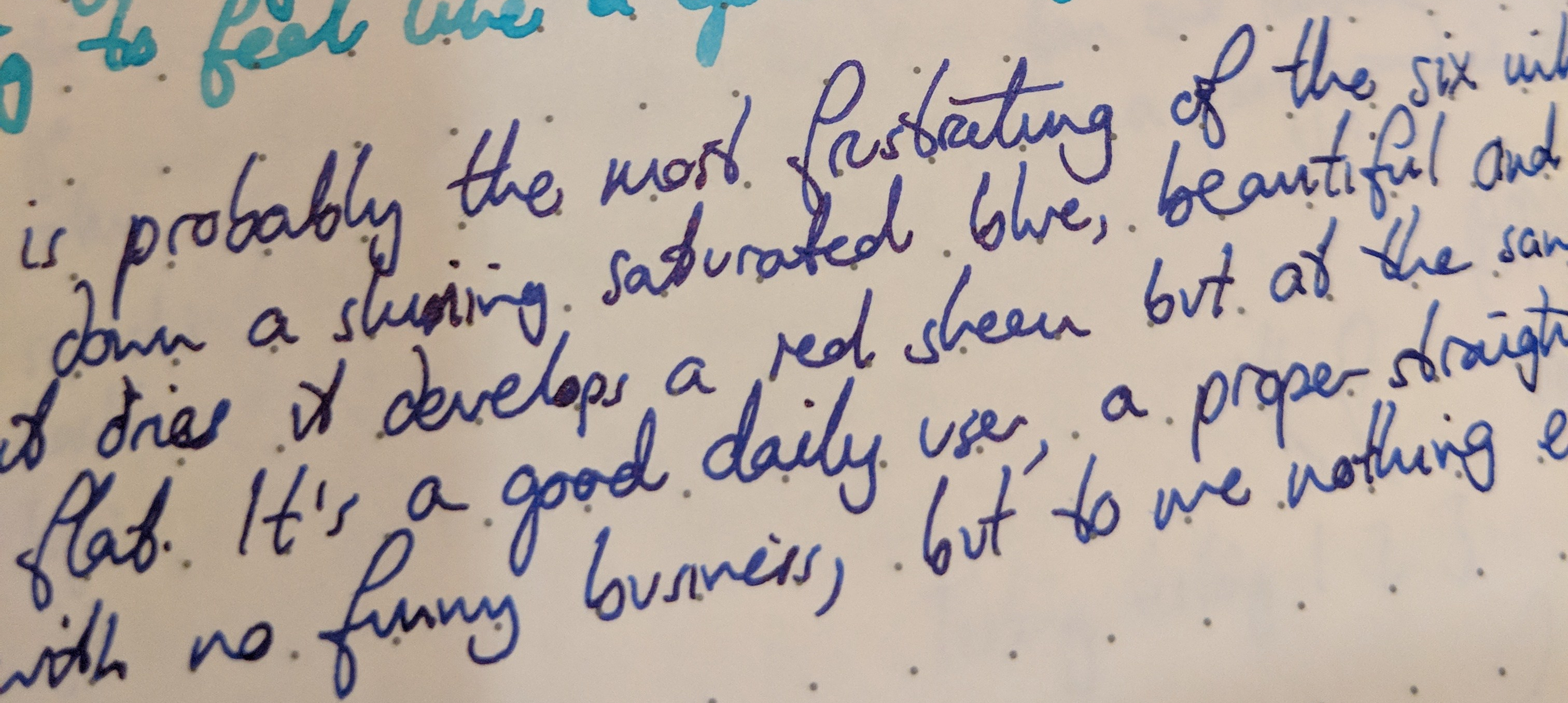
Saltire Blue
How could I not put Saltire into my Scottish Namisu Ixion? This ink led me on a rollercoaster of emotion. It goes down super-saturated, like a blue oil slick. It’s gorgeous. Then it dries to a satin sheen and seems to lose its colour.
Hashtag blue.
It’s a good daily user, a proper, straight-up dark blue with no funny business (apart from the sheen), but to me it’s nothing exceptional.

Hashtag HOLY SHEEN BATMAN
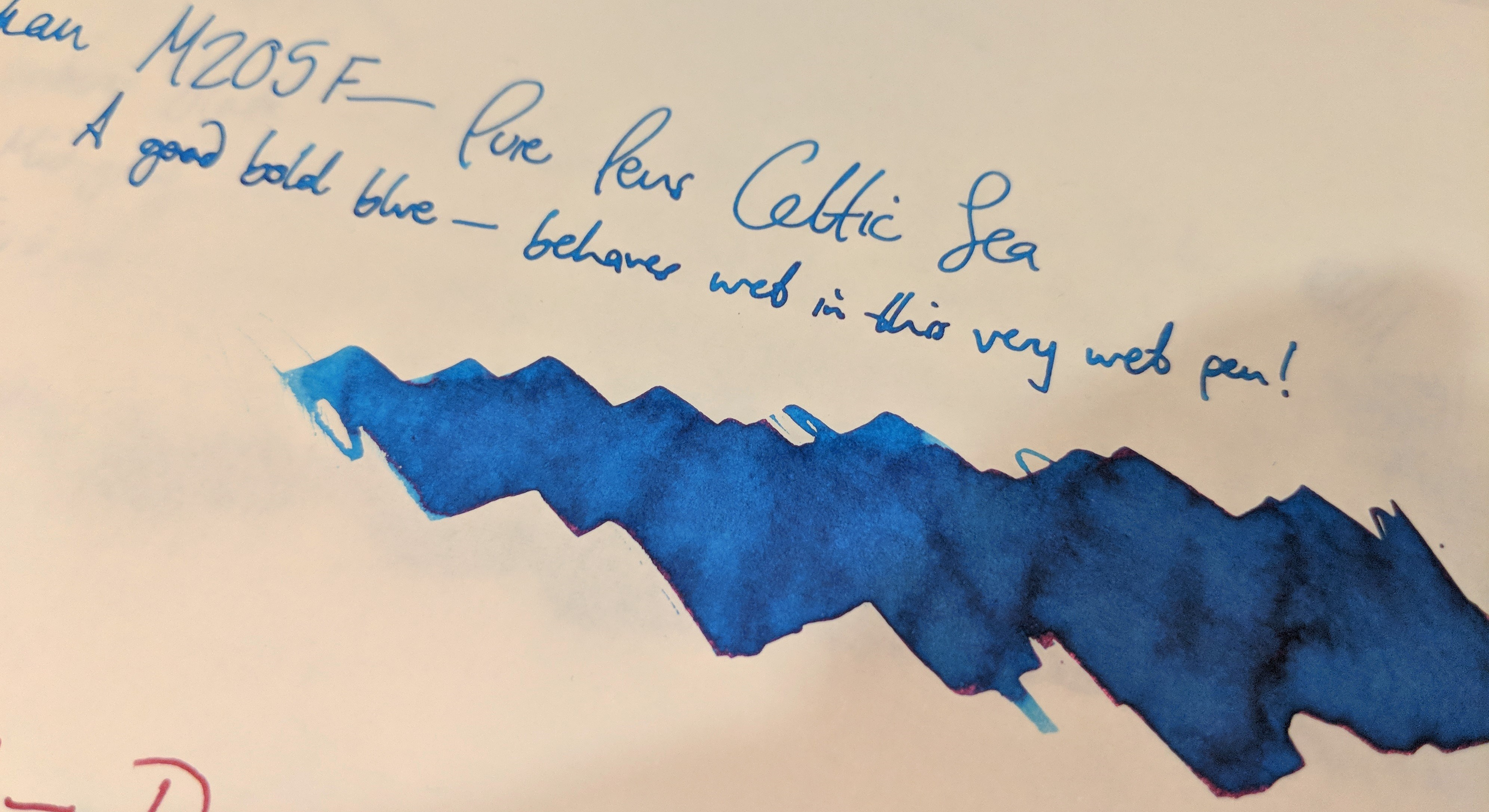
Celtic Sea
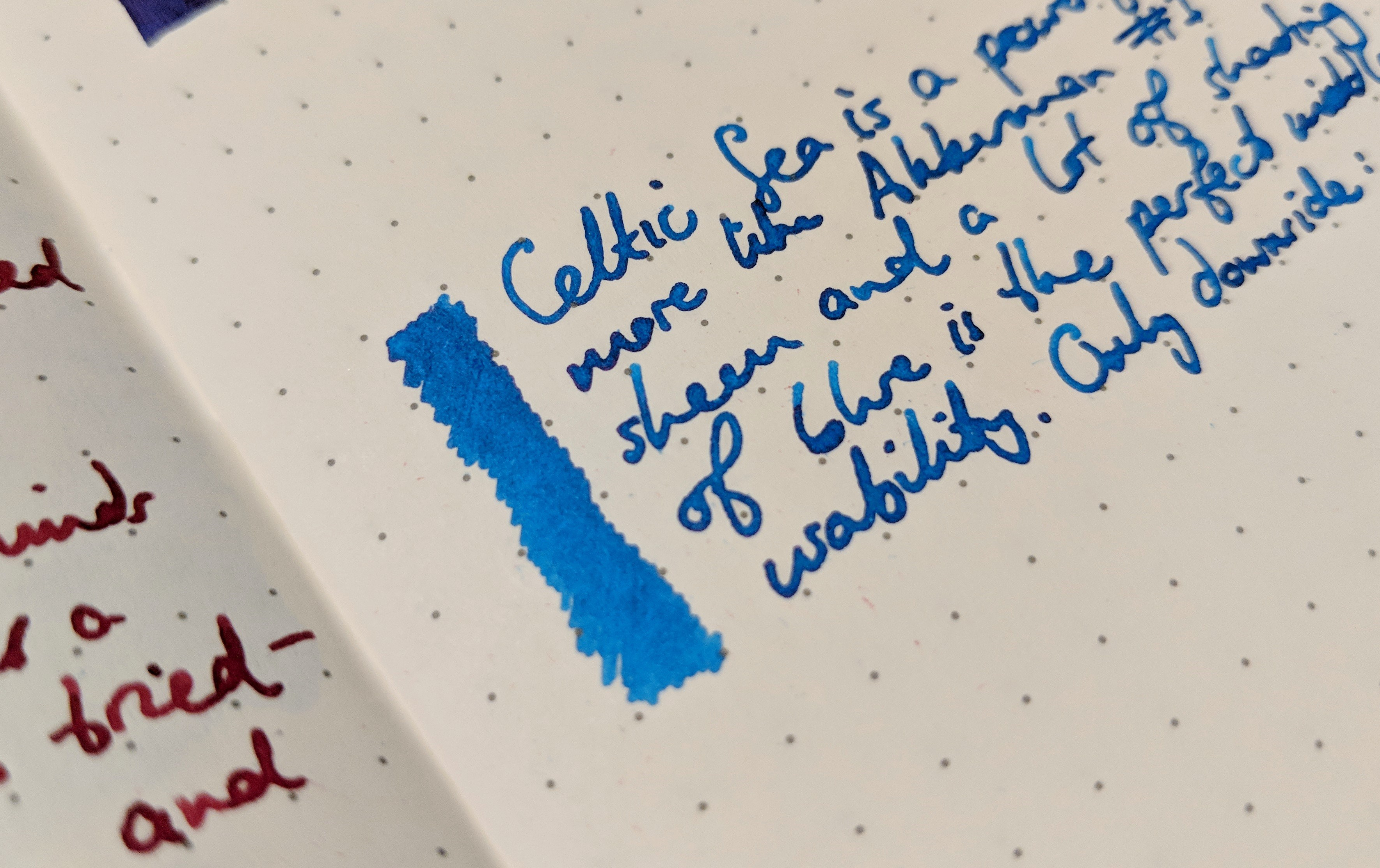
Celtic Sea is a powerful bright blue that is darker than most turquoises.
Did you hear they have a new ink out called North Sea? It’s always cold! HAHAHAHA
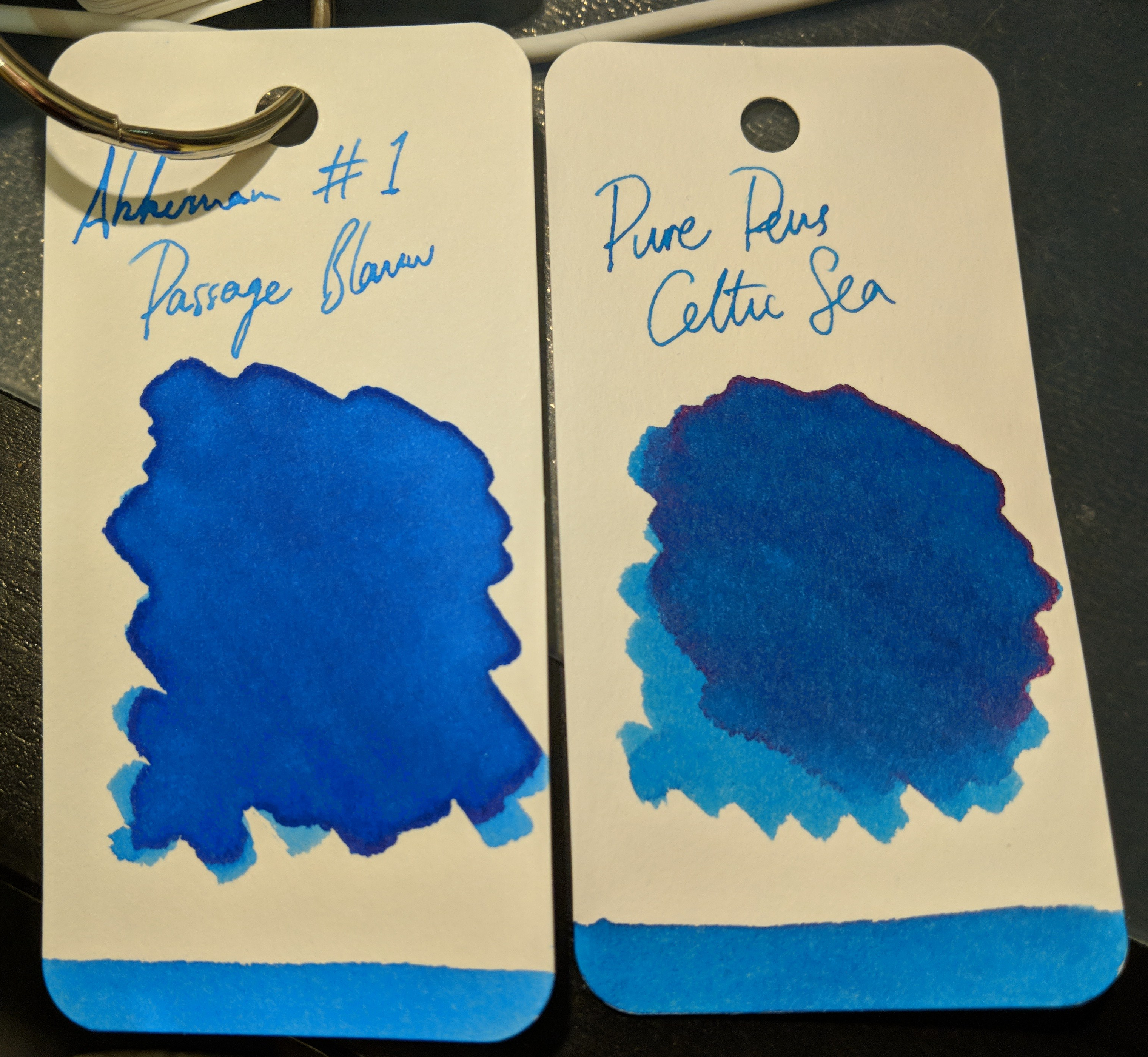
It reminded me of Akkerman #1 or Edelstein Topaz; maybe Blackstone Barrier Reef Blue. There’s some sheen and a lot of shading and haloing.
I love this sort of blue.
To me this kind of blue is the perfect middle-ground between personality and usability; bright but not as eye-searing as a turquoise.
Nearly…
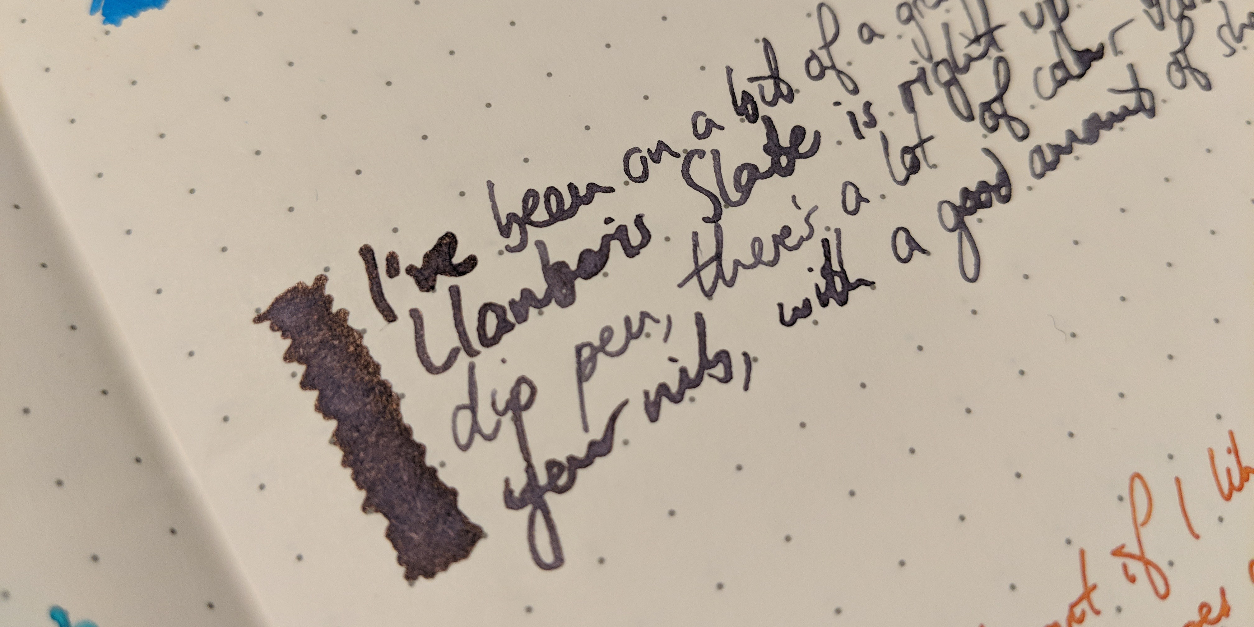
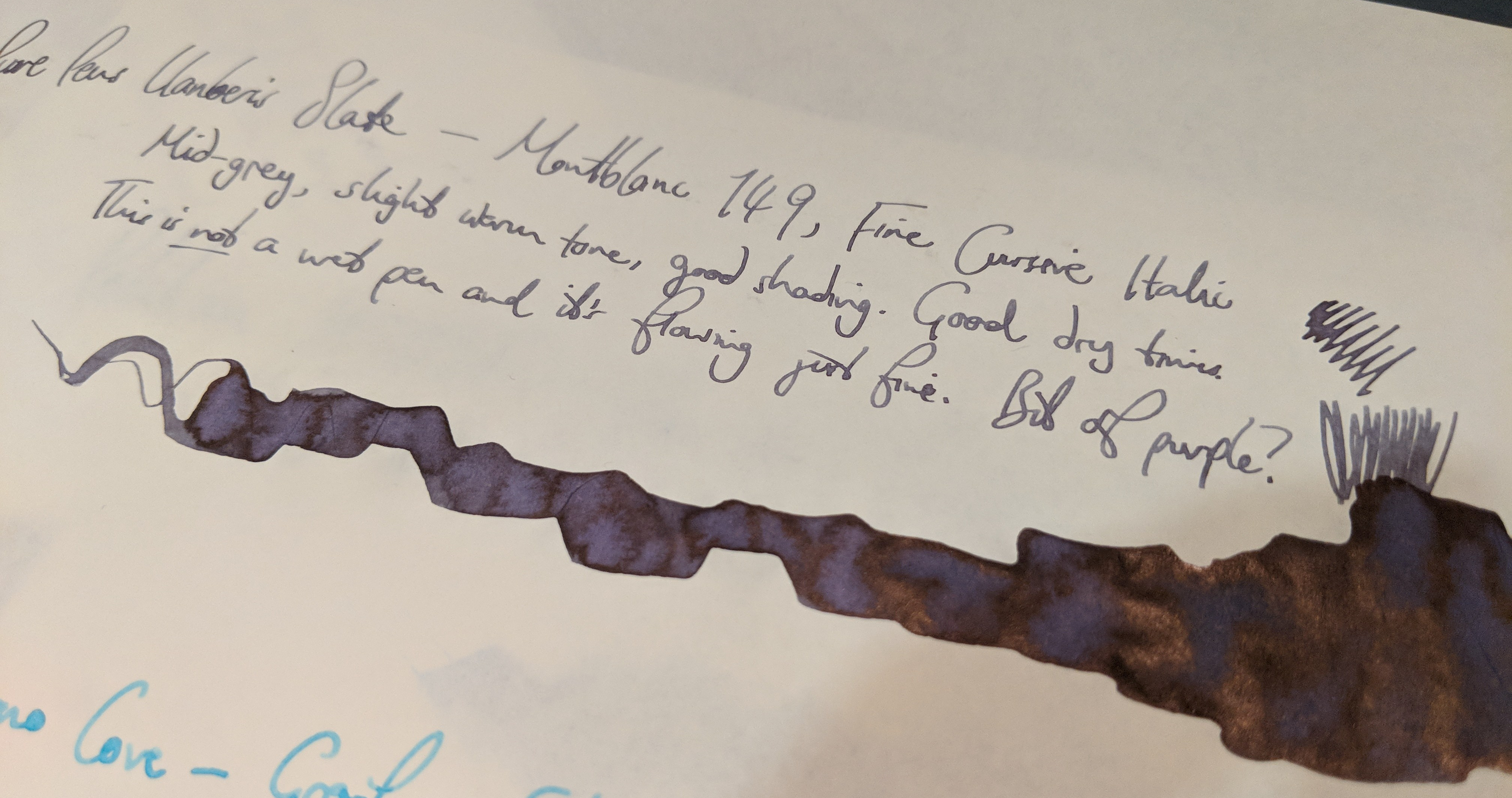
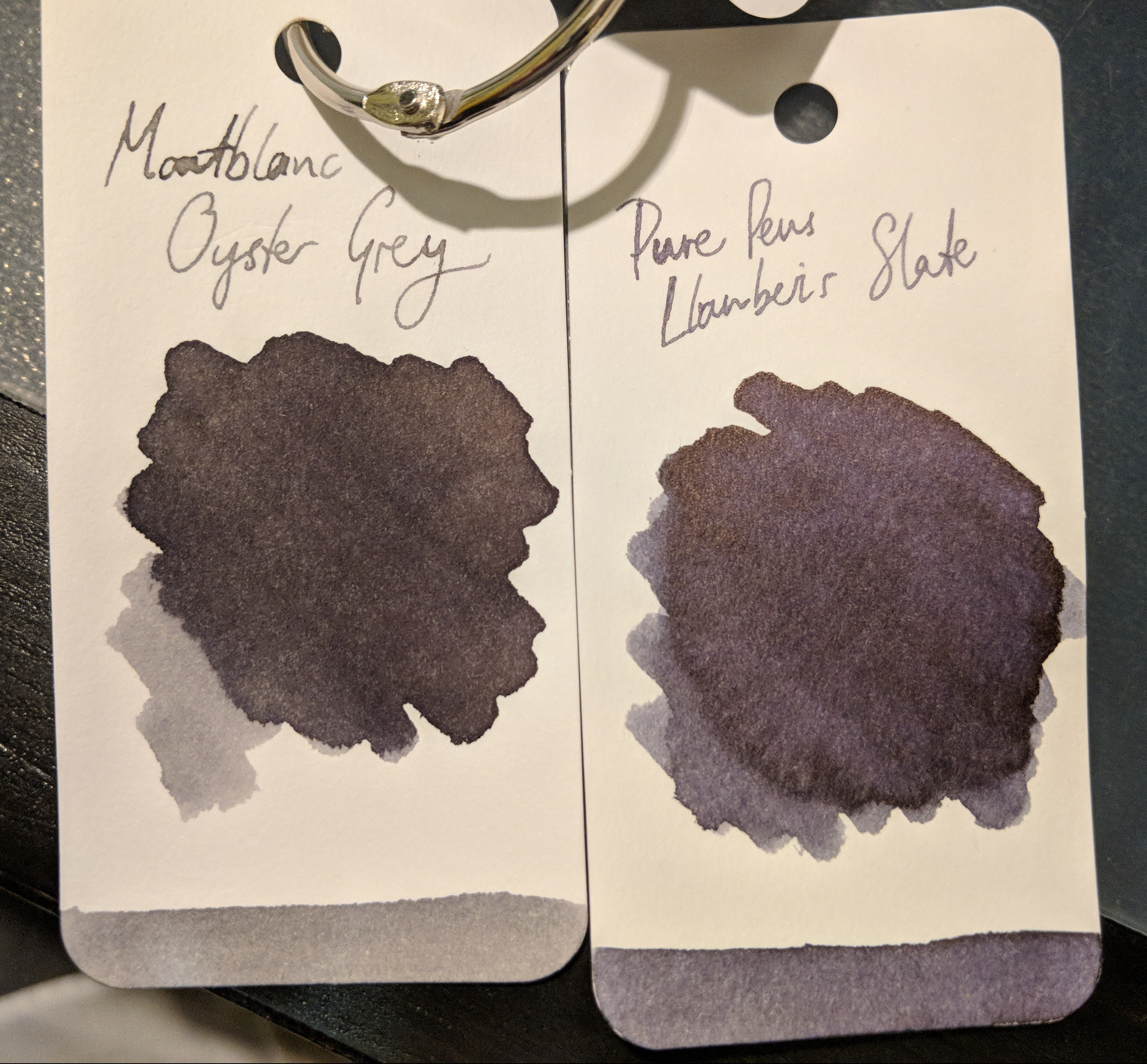
Llanberis Slate
I’ve been on a grey kick recently, so the beautifully named Llanberis Slate is right up my street. There’s a lot of colour variation depending on how wet your nib is, with plenty of shading and a pretty purple undertone.
Did I mention that my daughter snapped the end off ANOTHER glass pen?
More proof that grey ink is a million times better than boring old black.
Beautiful bit of sheen.
Darker…
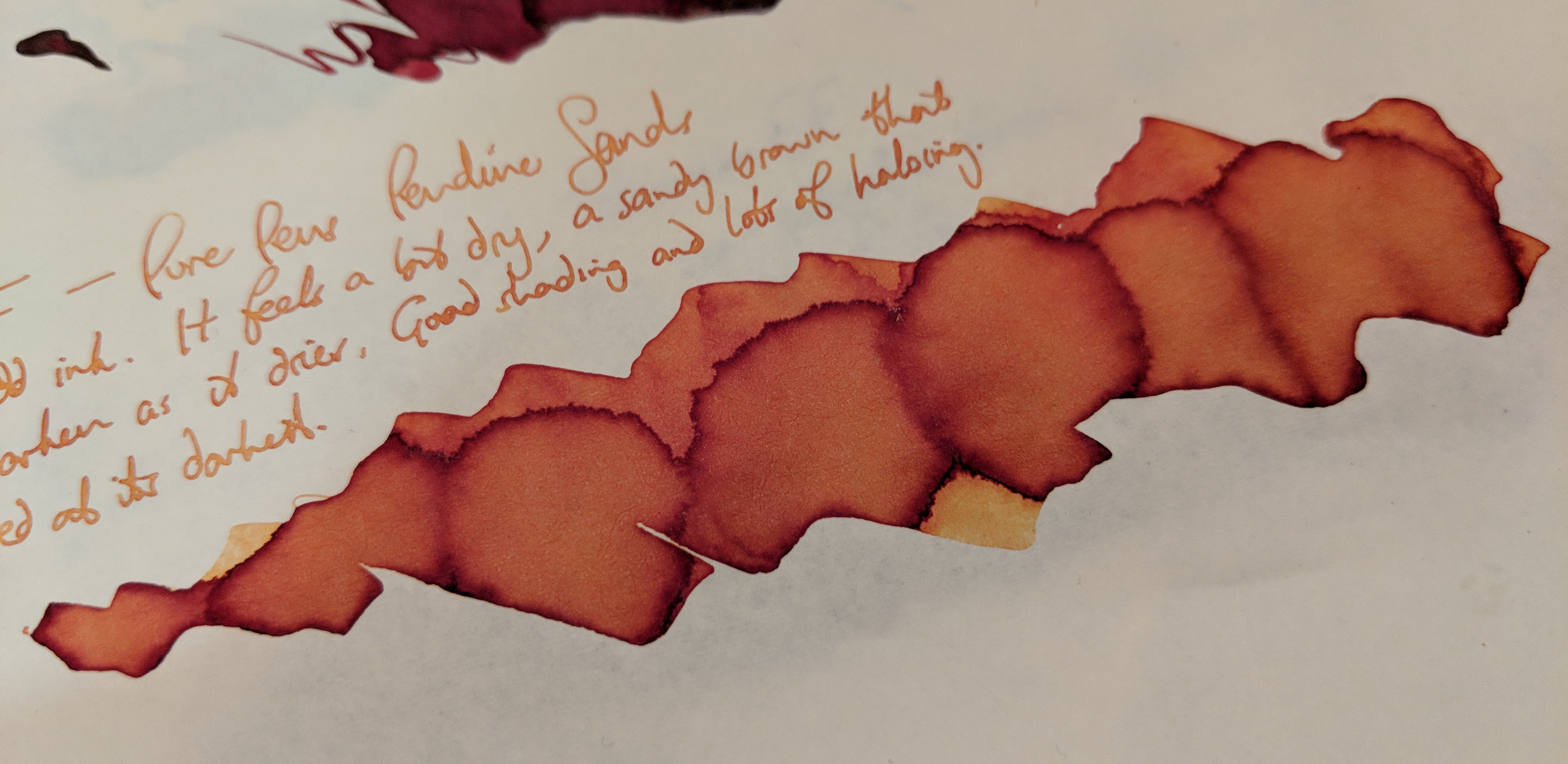
Pendine Sands
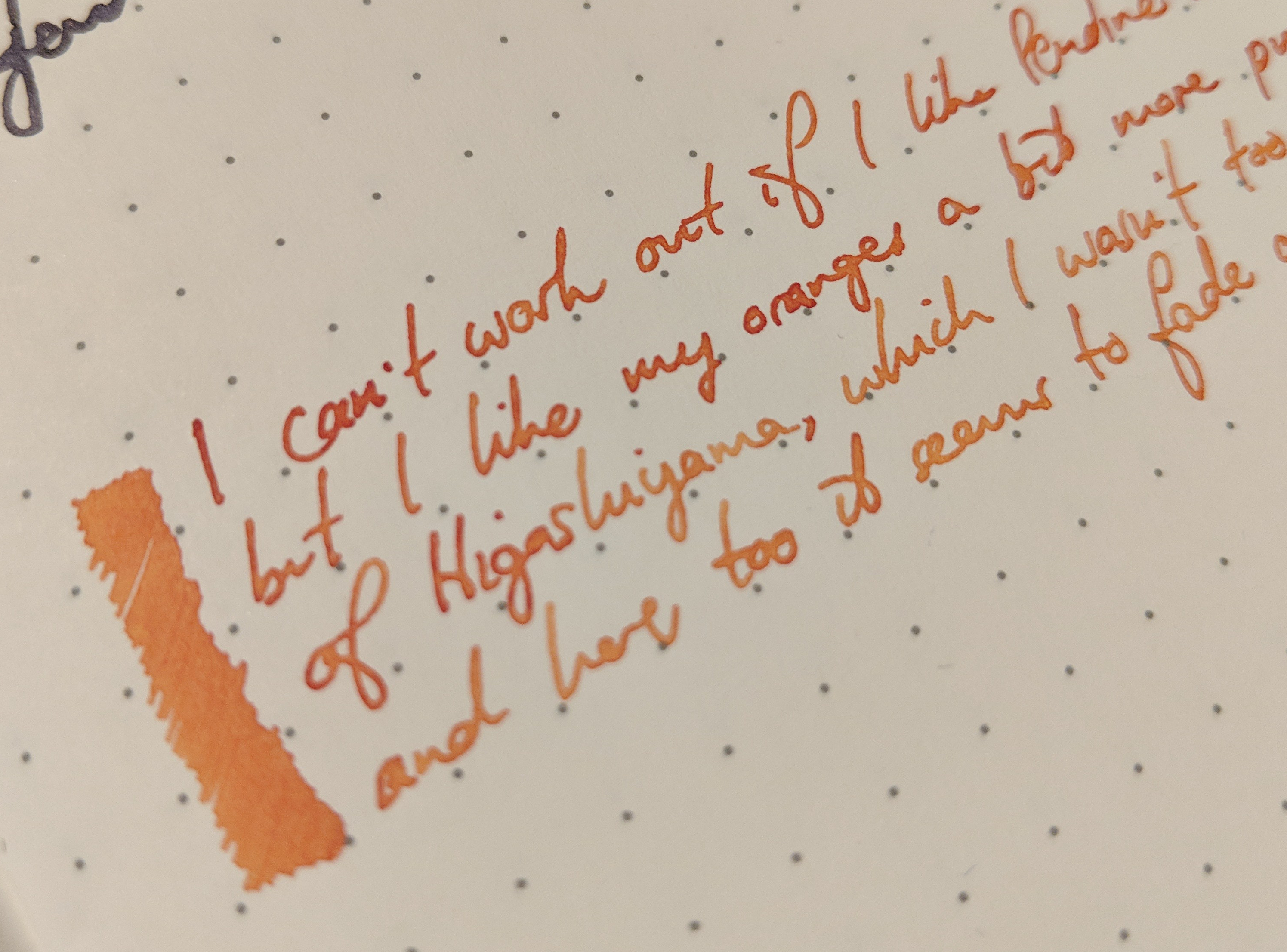
Finally, Pendine Sands. I honestly can’t work out whether I like this ink. It’s very close to Kyo-iro’s Moonlight of Higashiyama (at nearly a third of the price), and I wasn’t sure about that one either.

Erm why yes officer I had just made the swatch card and it was still wet when I took the photo.
It’s more orange than brown, kinda sandy (hence the name), with a load of shading.
How’s that for colour variation?
It’s really interesting, but I found it a bit dry and I like my oranges more orange!
Looks like sand. Not moonlight. We Brits know how to name inks.
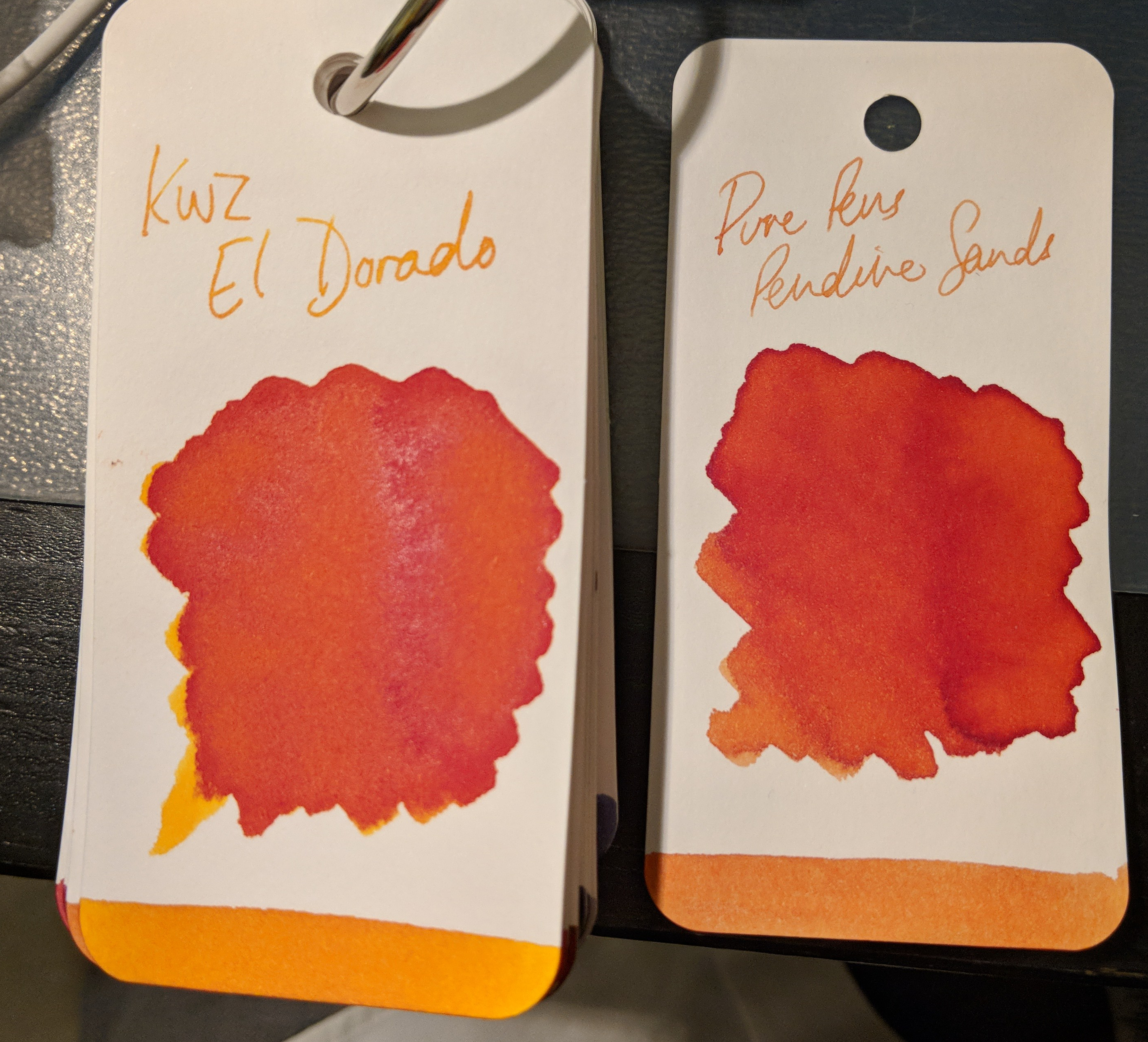
Not as orange as El Dorado in real life.
The final word
I had a good time trying these inks out. Each performed well, no problems apart from a couple being slightly drier than I like. With the exception of Saltire there’s no extravagant sheen; instead a joyous shading across the range. And great colours: you are guaranteed to find one that floats your boat here. For the price, you really can’t go wrong. Cadwaladr and Celtic Sea are definitely in my rotation now, and that’s high praise indeed.
You can pick up your own bottles here.
Thanks for the round-up. I shelled out for some Celtic Sea, which I’m really liking so far. Despite being a crowded field, it has slotted into a niche that doesn’t quite match any of my other inks. Of the others, Cadwaladr and Llanberis Slate look really interesting. I’d dismissed Saltire Blue, but the sheen may persuade me to take a punt on that too!
Like I said, there’s not really a duff one in the range 😁. Comparing against 90+ swatch cards I didn’t find a perfect match for any of them.