I read a lot of pen blogs. And one of my favourite types of post is the “currently inked” series. It’s a great way to get an almost voyeuristic insight into another writer’s daily life, to see how combos of pens, nibs and inks go together, and which pens survive in the rotation once the novelty wears off.
So here’s mine.
At one point in December I had something like 13 pens inked. Too much. So I flushed a few, ran a few dry, and ended up with just three inked. Writing Christmas cards helped!
Now I’m up to five — just the right amount to fill my Nock Sinclair to the gills.
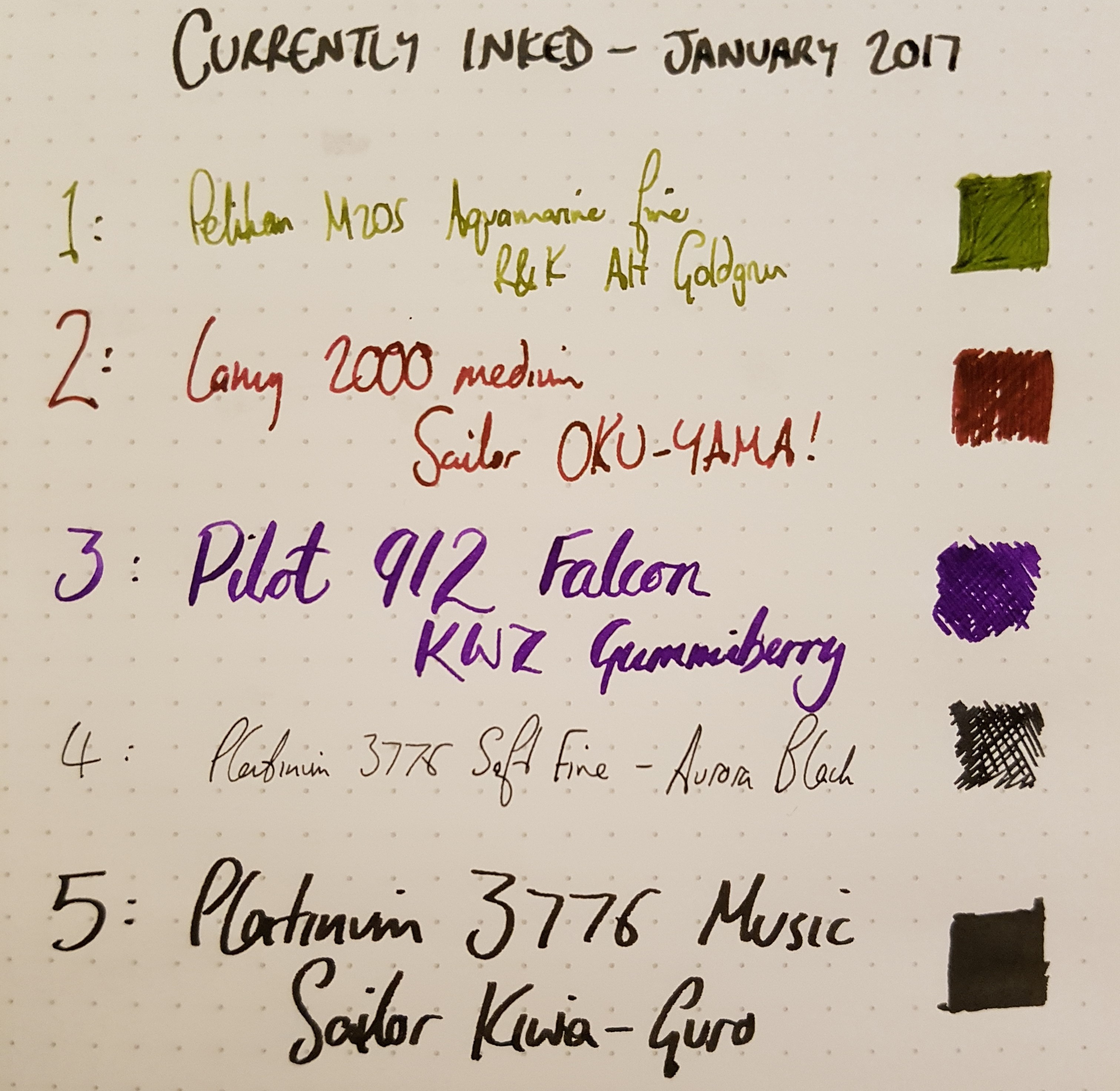
Pelikan M205 Aquamarine — R&K Alt Goldgrun
I’ve had the M205 inked with its matching Edelstein ink of the year for the past few months; it’s a great combination. I’m a sucker for teal inks, and the flow really suits the wet nib of the M205.
Alt Goldgrun is one of my all-time fave inks. It goes down wet with a rather unpleasant cast, but dries beautifully with a halo around the edges of the line. I’m not normally into greens at all (I’ve got three others, and they very rarely see rotation), but I keep coming back to this.
Lamy 2000 — Sailor Oku-Yama
The Lamy 2000 is unlike any pen I own. It’s a veritable design icon, a sleek spaceship of a pen and it makes me smile every time I pick it up. The warm textured Makrolon, the seamless piston knob, the smooth hooded nib, the machined sprung clip — it positively reeks of quality.
I own three Sailor inks: Yama-Dori, perhaps my all-time favourite ink, and the only ink of which I have a backup bottle; Kiwa-Guro, the kind of impenetrable black that you feel you could drown in; and this, Oku-Yama. It’s a rich red/pink/purple that, like Yama-Dori, has epic sheen and flows super wet. I’m not convinced it’s a match for the 2000 — for some reason, I feel the sleek design merits a modernist electric blue or a classy silvery grey. But I’m enjoying it nonetheless.
Pilot Custom Heritage 912 Falcon — KWZ Gummiberry
The 912 is a superb pen, but the Falcon nib is the real star. In normal use it’s a delightfully smooth and wet fine, which lets me journal in my Hobonichi’s 4mm grid with no problems. When flexed it goes easily to 1.5mm for real character and flair. Sure, as the reviews say, if you go too fast it will railroad, and it is sensitive to oil on the paper, and will skip. But if you treat it right, it’s wonderful. There are precious few modern pens — certainly under $500 — that will give you a Japanese fine and instantly transition to flex like this. I’m addicted.
KWZ hit the ink scene in 2016 like no other maker. The hysteria over colours like Honey was extreme. I’ve got three bottles: Azure #5, Honey, and Gummiberry. All flow beautifully with excellent lubrication, have a unique scent, are super-saturated, and fill a gap in the colour wheel. In other words, it’s safe to say that I will be buying more KWZ inks in the future. Gummiberry is a bright, cheerful mid purple that in a very wet nib goes on slightly darker. I’ve got a few purples in my collection, and it’s probably most similar to Montblanc Lavender Purple, another great ink.
Platinum 3776 Chartres Blue, soft fine — Aurora Black
I bought the 3776 for a few reasons: partly curiosity to see how Platinum compares to Pilot; partly because the nib is gorgeous; and partly because the Chartres Blue colour got such a raving writeup. At first I was underwhelmed (more on that when I review the pen). But now I love it, and the nib is one of my favourites. It’s super fine — I can write microscopically. And it has so much bounce, without much in the way of line variation. There’s a little feedback, but no scratch. It’s just great. I keep it inked as my precision writer.
I spent a long time researching the perfect black ink, and settled on Aurora Black due to the preponderance of reviews citing it, and my unwillingness to go for a pigmented ink or a Noodler’s ink. I have tried Aurora Black in a few pens now and I’ve not been blown away. It doesn’t seem any darker than the Parker Quink I used to use back in the day; it’s not exceptionally wet or exceptionally smooth; in other words, I’m not sure what all the fuss was about. I’m giving it another chance.
Platinum 3776, music — Sailor Kiwa-Guro
So I got another 3776, this time with the music nib. Frankly, I fail to see how anyone who likes pens can read about a music nib and not want one. It has three tines, fer chrissakes! And indeed, it’s a glorious looking nib, strong and purposeful. The line it lays is fat — at least 1.5mm — but usable if you accept that you’re going to be writing big. It’s got a curious sweet spot, and sometimes I think that it writes best perpendicular to the page, as music nibs are supposed to be used (apparently). But it will write at nearly any angle. I was expecting it to be a gusher, but while it will keep up with me no matter how fast I write, the line is controlled, not that wet at all. Last thing to note: there is zero flex. This is a nail.
Kiwa-Guro is my most recent ink acquisition, imported direct from Japan. Platinum advertises that the slip and seal mechanism in the 3776 makes it safe for pigmented inks like Kiwa-Guro, so I gave it a shot (partly because I was disappointed by Aurora Black, above). This is the black I was looking for. Especially in the thick line laid by the music nib. It’s a matte finish, no shading, no grey. It’s just black. At the right angle there’s a reflective grey sheen, like the ink is made from stardust. But mostly it’s just pure black. And it seems very well behaved.
Leave a Reply