I’m always on the lookout for new ink brands. I’m secretly hoping to discover the next KWZ, Oster or Blackstone. So I was really pleased to stumble across the Birmingham Pen Co (indirectly after our Birmingham, but the store is in Pittsburgh!) some months ago, and to find that it makes its own line of inks, all named after Pittsburgh locations or characters, and with delightful back-stories.
Take this charming description for “Fred Rogers Cardigan Red“:
Whether you’re penning non-fiction or something more in the neighborhood of make-believe, Cardigan Red is a warm and inviting friend to your paper that says, “won’t you be my neighbor?”
Individually prepared by hand in 30ml glass bottles, Birmingham Writing Ink delivers an exquisite writing experience while each bottle shares a unique part of our Pittsburgh history.
I kept the tab open, torn between wanting to try the inks and the punitive cost of international shipping, but after a while the inks disappeared from the store. I emailed the owner to find that the inks were being reformulated with ingredients from a new supplier, and would launch again soon. Lo and behold, they did, and I placed an order for four of the ten colours on offer:
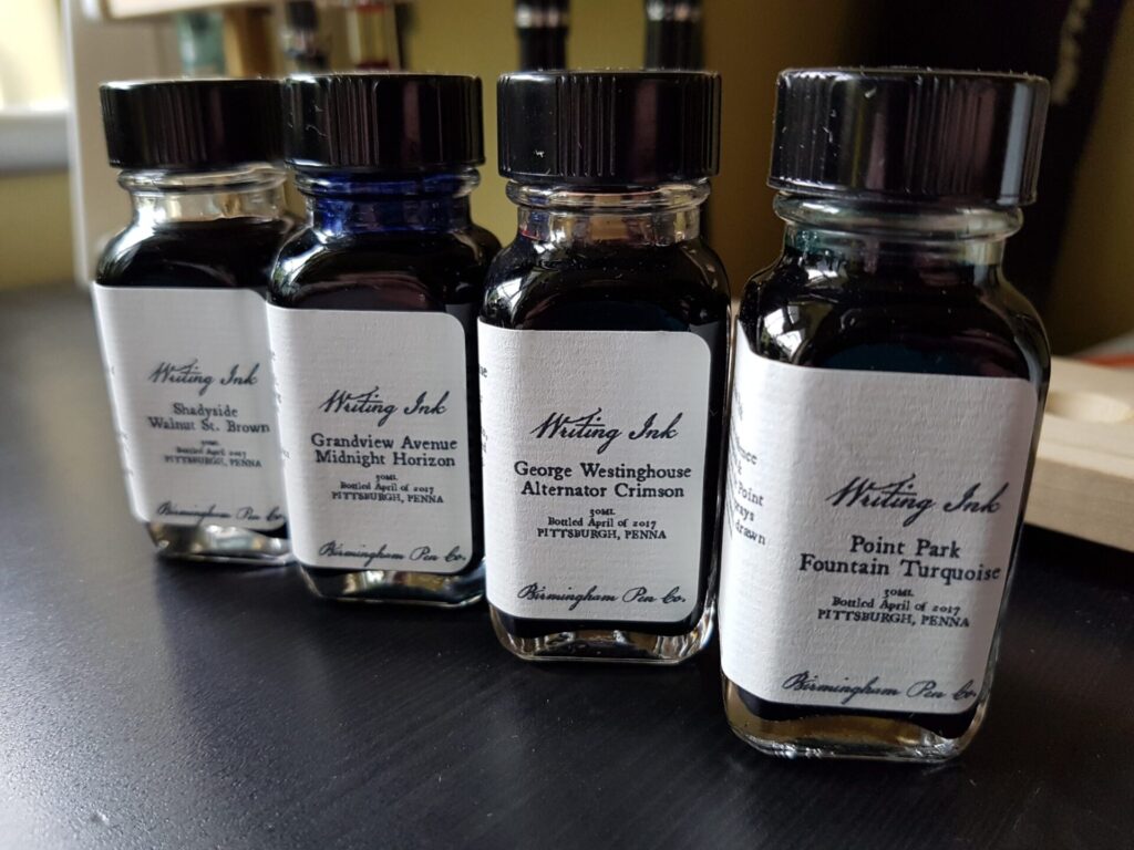
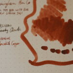
- Shadyside Walnut St. Brown
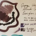
- George Westinghouse Alternator Crimson
- Point Park Fountain Turquoise
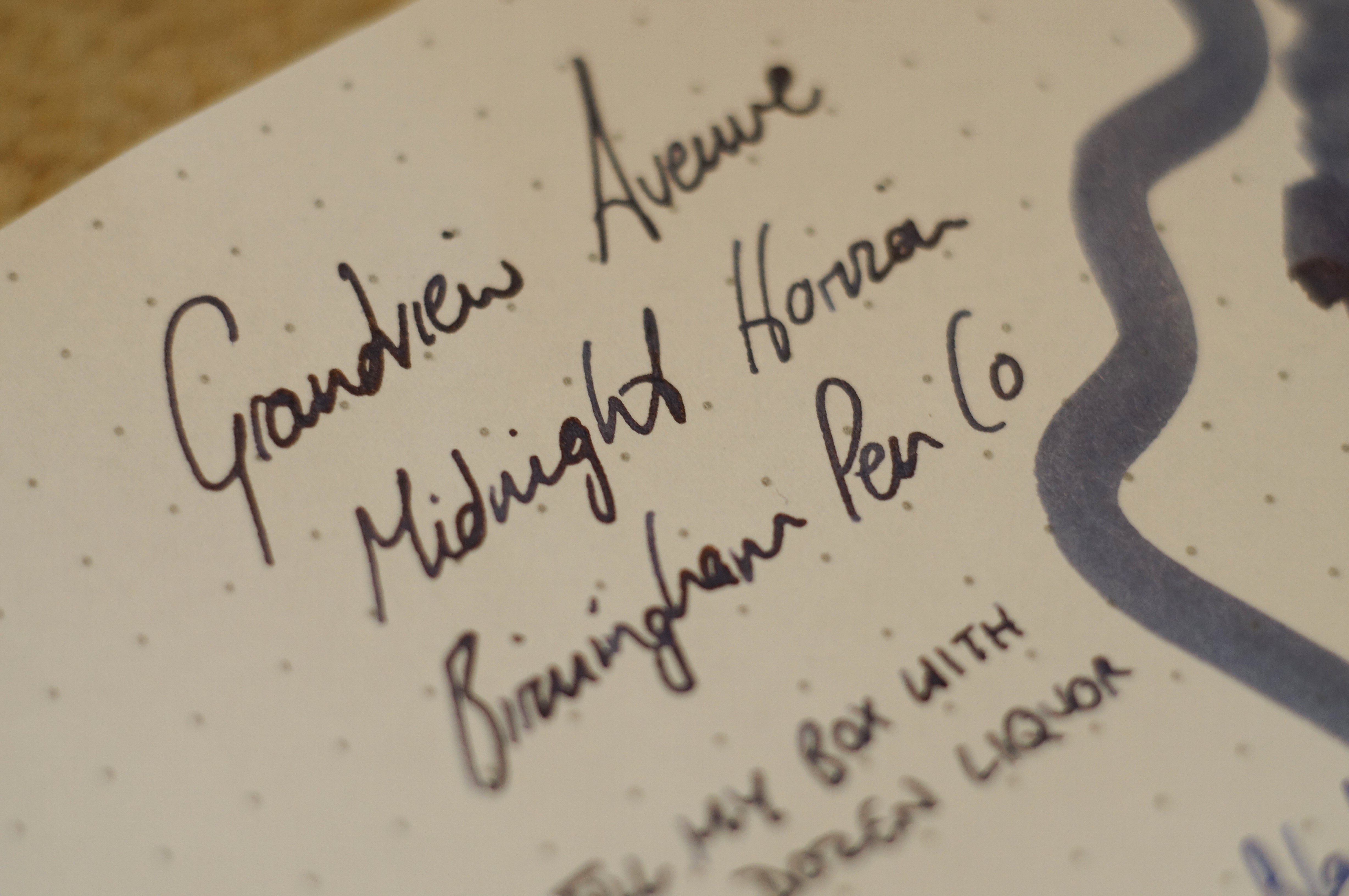
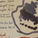
- Grandview Avenue Midnight Horizon

I’m a complete sucker for the heritage look and feel.
My lovely brother brought them over with him from the States, and I wasted no time in trying them out.
Each comes in a square, dainty little bottle, which is neatly labelled in script and a traditional serif font, on textured paper. The story behind the ink’s name is printed on the label, too, meaning these inks would be a great souvenir from a visit to the city. The bottles are also surprisingly functional, with a silicone seal inside the lid. At $8 for 30ml these are not cheap inks — here in the UK Diamine’s own 30ml bottles (admittedly, much less impressive plastic) are about £2.50.
So what about the inks inside? They’re interesting colours. What they have in common is a slightly faded, muted look, like a city’s past glories. These are not inks that punch you in the face with bright colours or gaudy sheens.
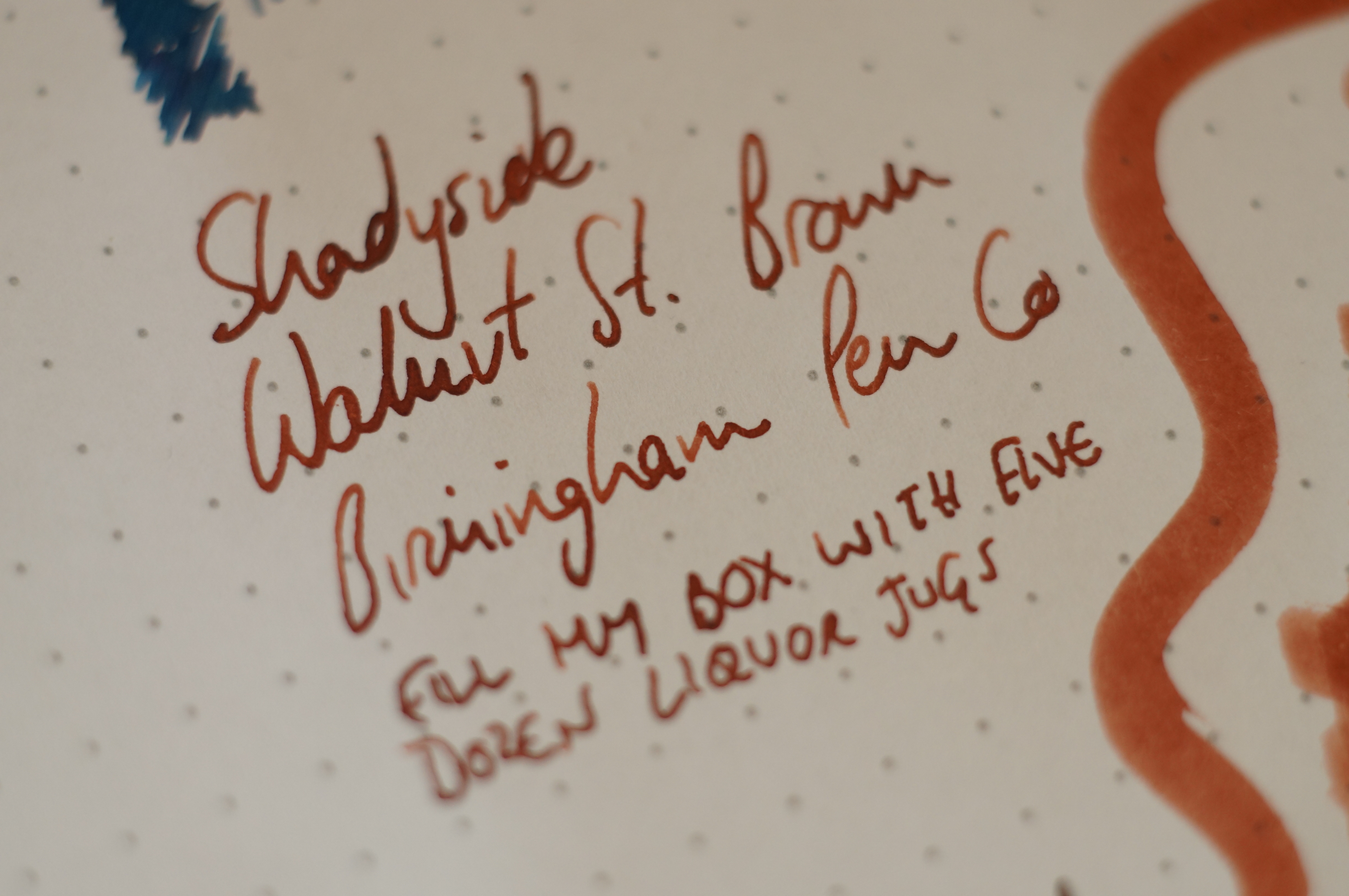
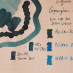
Shadyside Walnut St. Brown
This is definitely toward the red side of brown. Trying to match it against other colours in my collection, it actually has more in common with Diamine Ancient Copper (a rust-red) or the orangey Seitz-Kreuznach Cognac than with a “true” brown like Waterman Havana Brown or Pelikan Smoky Quartz. It shades, but no sheen to speak of on Rhodia.
OK, I was going for “sexy macro depth of field” with these photos, and actually ended up with “mostly blurry”. Forgive me.
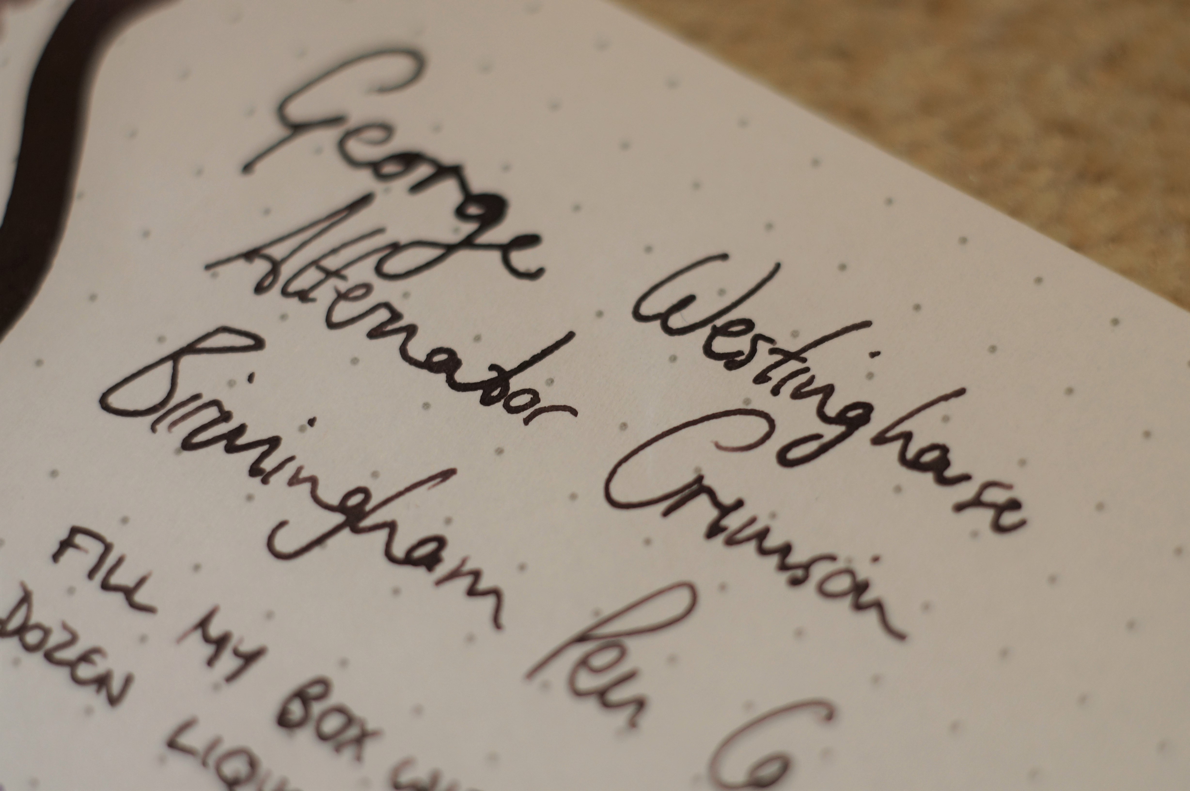
George Westinghouse Alternator Crimson
This is the most interesting colour of the four, in my opinion. It’s a dusky purple when swabbed but writes almost black, reminding me of Ink of Witch or KWZ Grey Plum. I’m a sucker for inks like this, that are office-ready black at first glance but show interesting shading and hidden depths. But when I think of the word “crimson” I think of red — this is not by any stretch of the imagination a red ink.
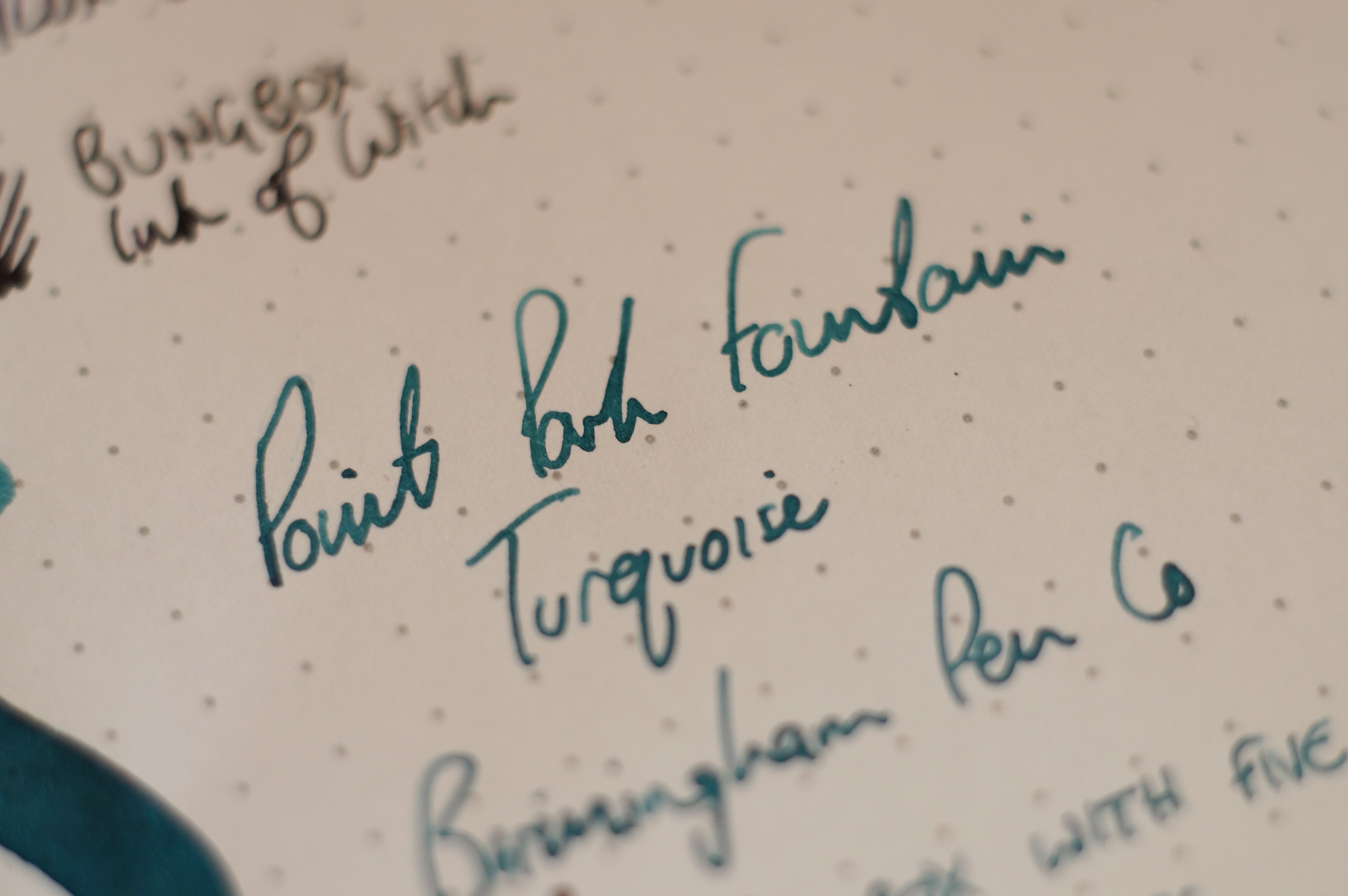
Point Park Fountain Turquoise
Another mis-named ink. Ama-Iro is turquoise. Pelikan 4001 Turquoise is turquoise. Herbin Blue Pervenche is turquoise. To me, turquoise is a bright, vivid sky blue. This ink is much more green. In fact, it’s the doppelganger of Edelstein Aquamarine — an ink I happen to love.
Grandview Avenue Midnight Horizon
This is an interesting blue-black that leans towards grey. It’s a little bit like Montblanc JFK, but actually there was no exact match in my collection. Pilot Blue-Black is paler, more of a straight blue, and more purple; Tsuki-Yo has more green in it. This ink swabs very pale, but from a wet pen (in my case, a glass nib) it writes nicely dark and shows some shading.
Colour comparisons
Final thoughts
I’ve yet to ink these in a real pen with a feed, so I can’t comment on flow, lubrication and general good behaviour yet. But I can say that the design of these inks has completely charmed me, and the Alternator Crimson and Midnight Horizon are really interesting colours that speak to my current tastes. I’m mildly disappointed at the lack of sheen, but that might be partly due to the Rhodia paper… I expect I’d have more luck on Tomoe.
Almost regardless of the product itself, I’m so pleased to see a small pen store take a creative vision and a real pride for its city and its heritage, and quite literally bottle it. I wish Birmingham Pen Co all the very best of luck.
I could see that turquoise becoming a fantastic everyday ink!
Yeah, it’s not too eye-searing. Very usable.
These look amazing, usable inks and I love the bottle design – but sadly the price of buying from the U.S. has put me off! 🙁
I’m lucky, I travel to the US a few times a year. I’d offer to bring some back for you but I already have five more bottles waiting out there for me! 🙂
Have purchased fountain pens from them. A great company!! Quality products. Unique and lovely made in house pens!!
I have had questions and sent them to be answered. Lo and behold an actual person took care of my needs immediately!! Nicholas answered emails promptly. Tended to my needs graciously and was a pleasure to deal with. My destination for all my fountain pen needs. Have bought 5 already. For myself and gifts.