Only two Italian pen makers actually make their own nibs, in house, from start to finish. One of them is Aurora, as you might have guessed.
The other is Santini.
You’d be forgiven for not having heard of Santini. It has one tenth the followers on Instagram as Aurora, and you’d have to work very hard to find a stockist.
Yet Santini has been going since 1998, and produces a surprisingly — even bewilderingly — wide range of models, some of which look like Ancoras…
some look a little like Omas or Leonardo…
and others quite distinctive to the brand.
Until fairly recently, Santini has been kicking out a lot of models with brightly coloured pattered barrels, which I confess didn’t appeal to me at all.
But the company seems to have stepped up a gear, and now offers a range of pens in attractive ebonites, including vac and piston fillers:
Add to this that many Santini pens use ebonite feeds, and that they offer EF, flex and stub nibs, AND that they’re very reasonably priced… well, there’s a good argument that Santini are Italy’s best-kept pen secret.
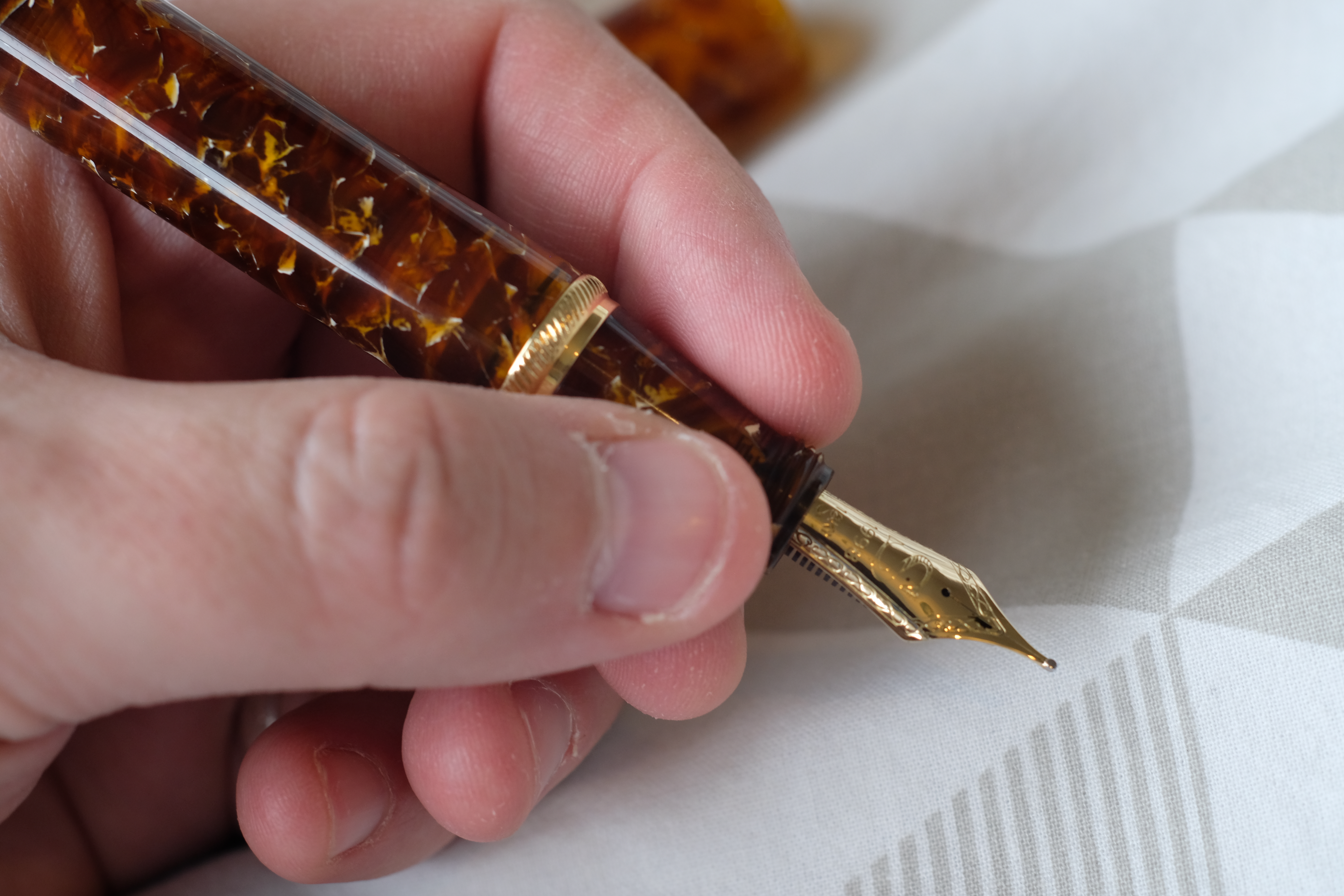
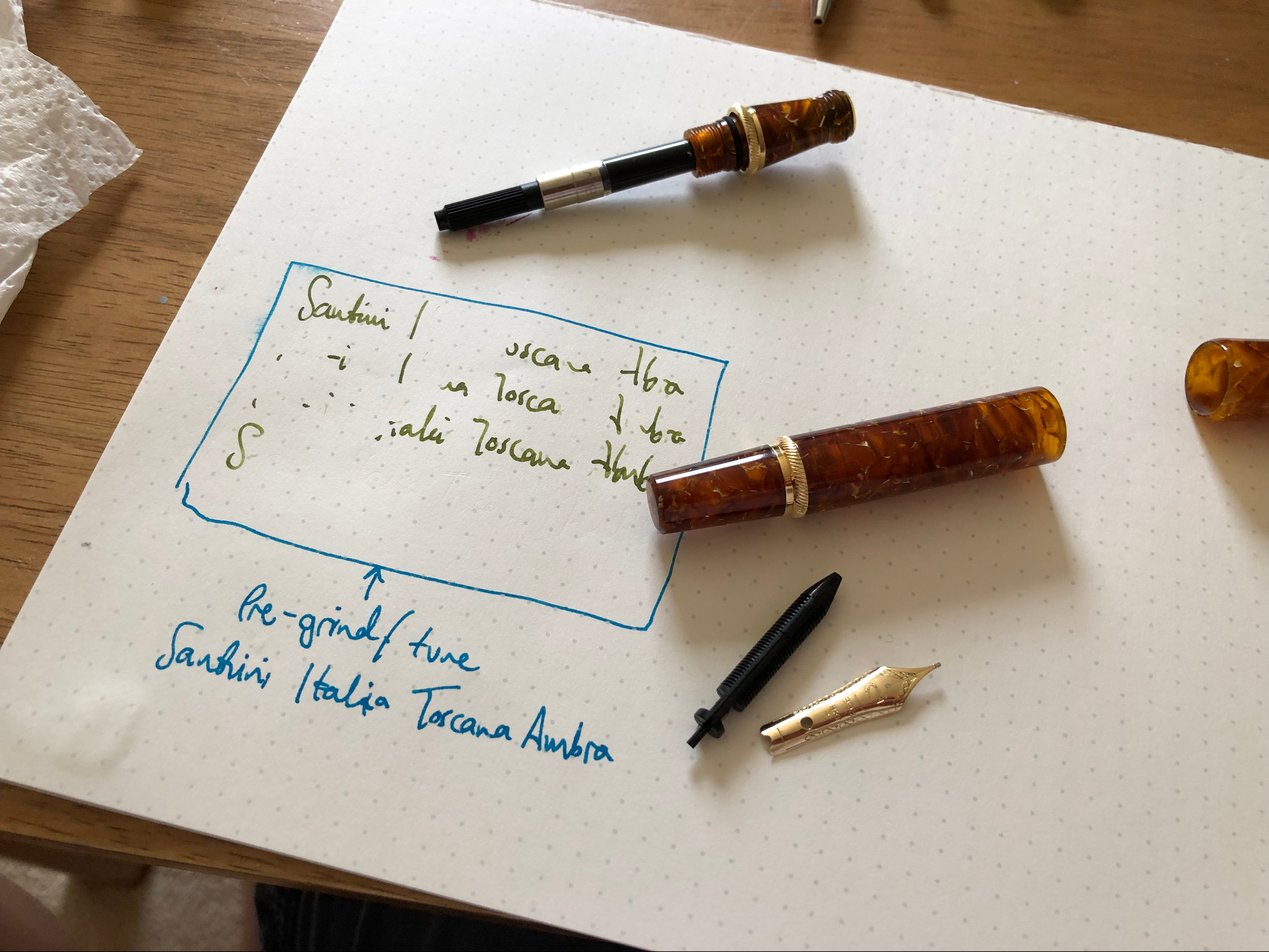
I asked to try a Toscana in Ambra, one of the pens that looks like an Ancora. It’s a cartridge-converter, with the 18k nib and a plastic feed. It costs 230 euros.
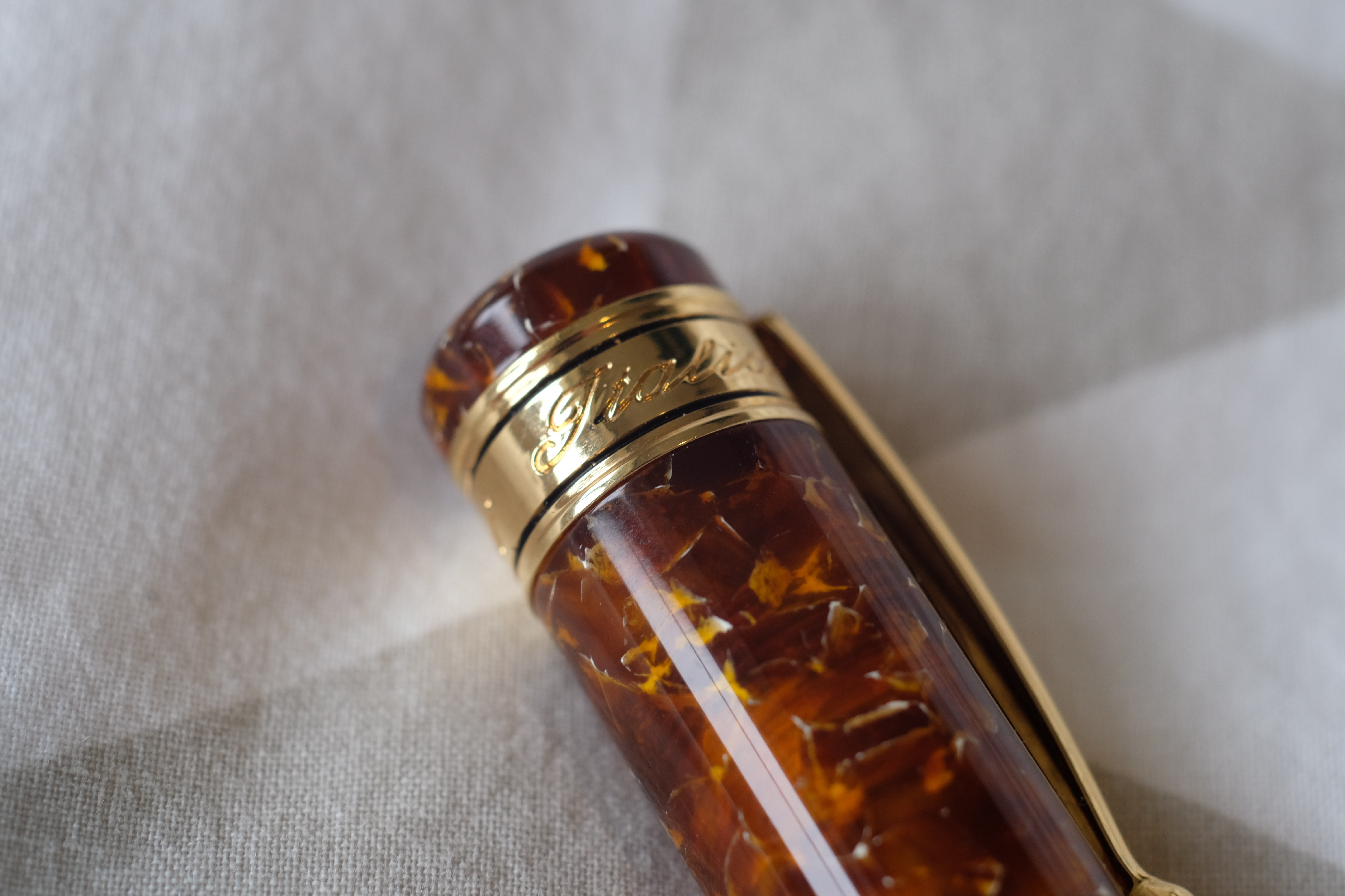
The Santini packaging is simple: a nice cardboard box with the logo in gold.
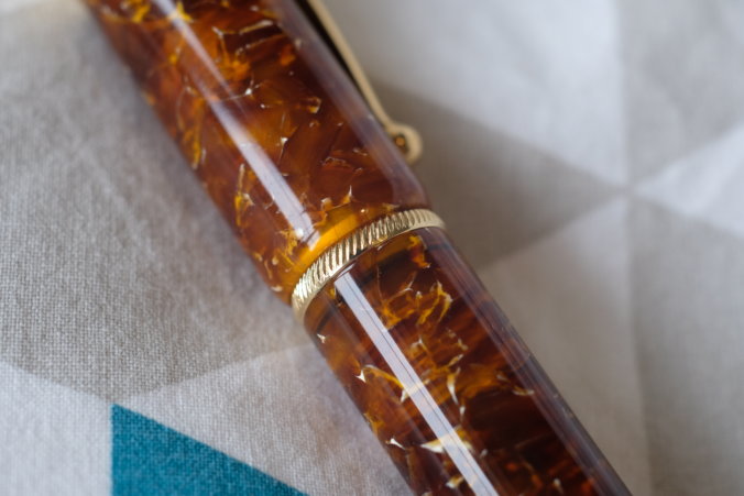
Inside is the pen. The Toscana is a chunky pen, with plenty of gold trim. The material looks like burnt caramel, like a darker version of the Estie Honeycomb. It looks great, with tons of depth to it. All the edges are beautifully rounded and polished, and it feels like a very high-quality pen as you turn it around.
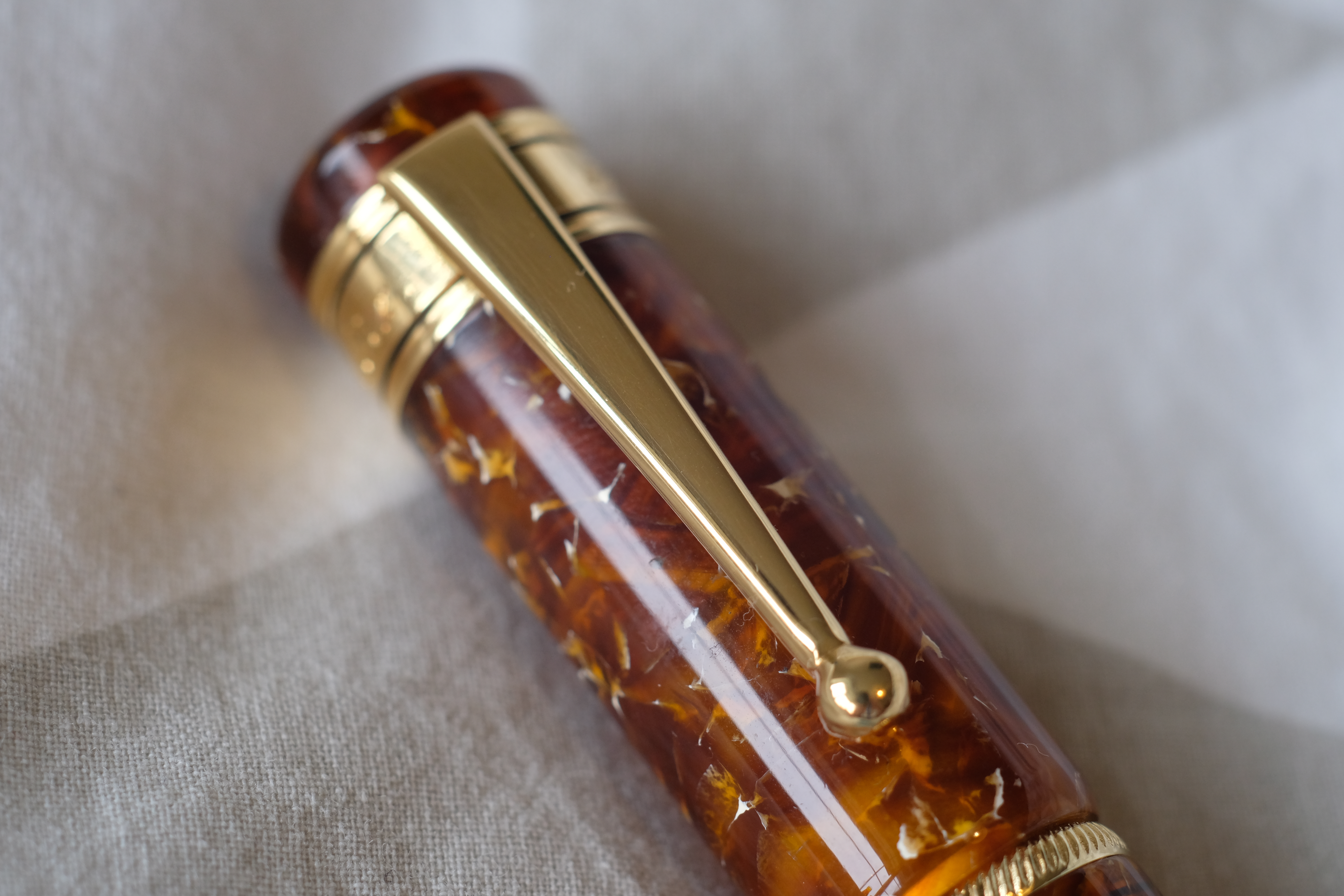
The clip is ball-ended and really rather strong. Since the pen isn’t that heavy, it holds very securely.
The cap comes off in half a turn, revealing the unusually steep section (the distinctive Ancora design) and a bulky set of threads on the end of the pen, like an Oldwin.
I find the section really rather comfortable to hold, and the bump up to the section is truly curved so it causes no discomfort.
When you look at the back end of the pen, there’s a trim ring and a portion of the barrel that narrows. You would naturally assume that it’s a piston knob (which it’s not) or that it’s for posting the cap, with the cap edge snugging up to the gold trim ring. This isn’t the case. The cap barely posts.
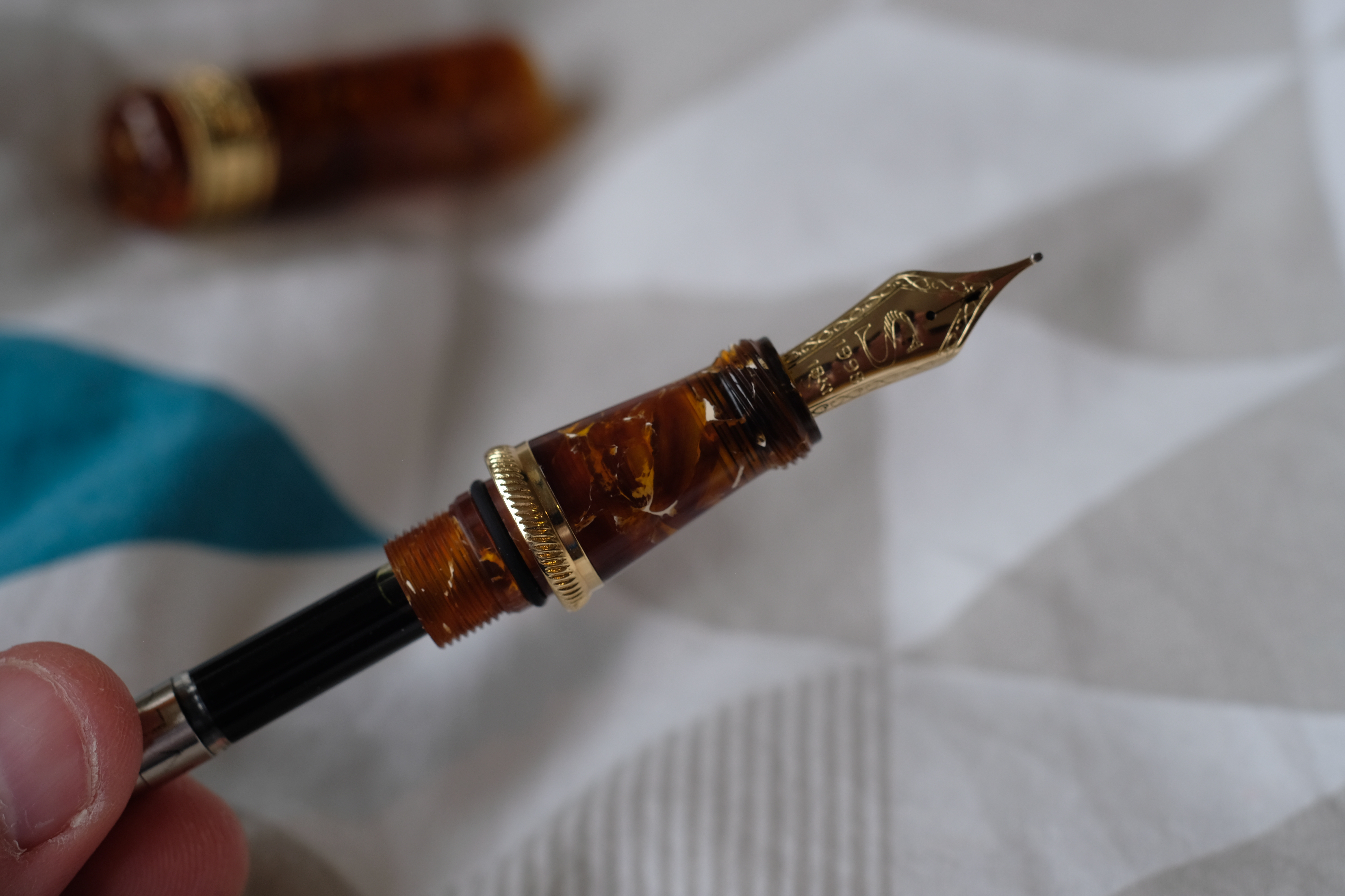
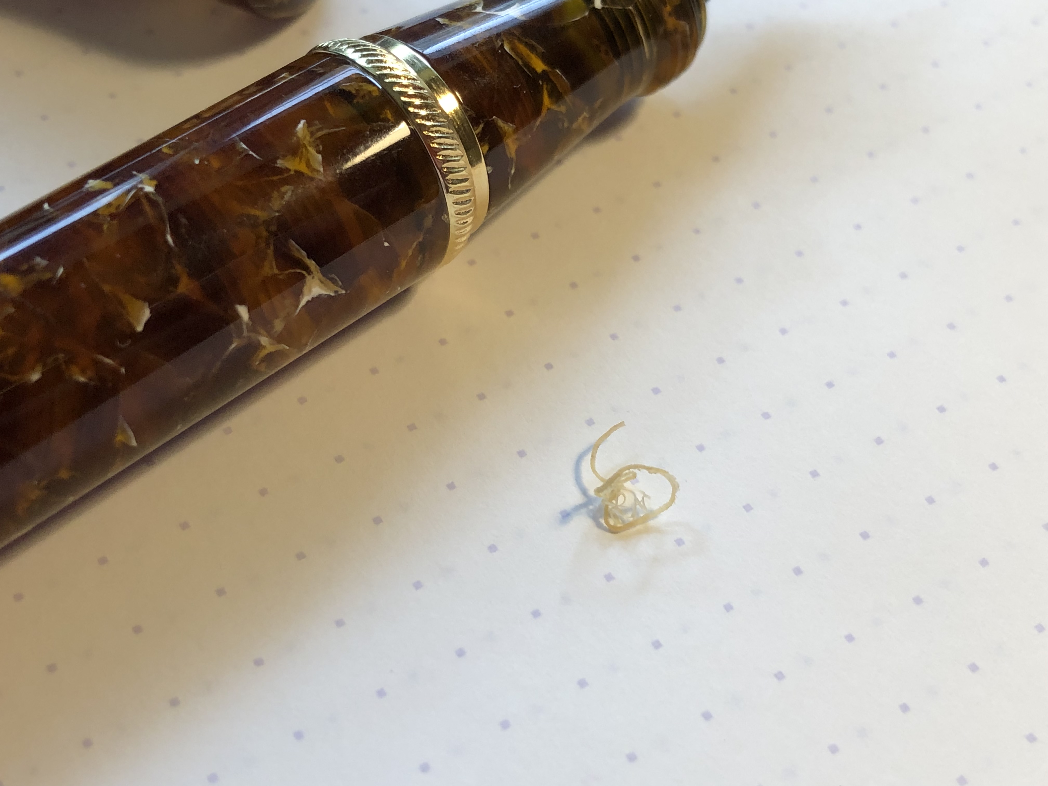
Accessing the converter is by unscrewing the section, which takes a lot of effort: there’s an o-ring compressed in there that adds to the friction. The inside is not as well finished as the outside, but you can see that the material is plenty thick.
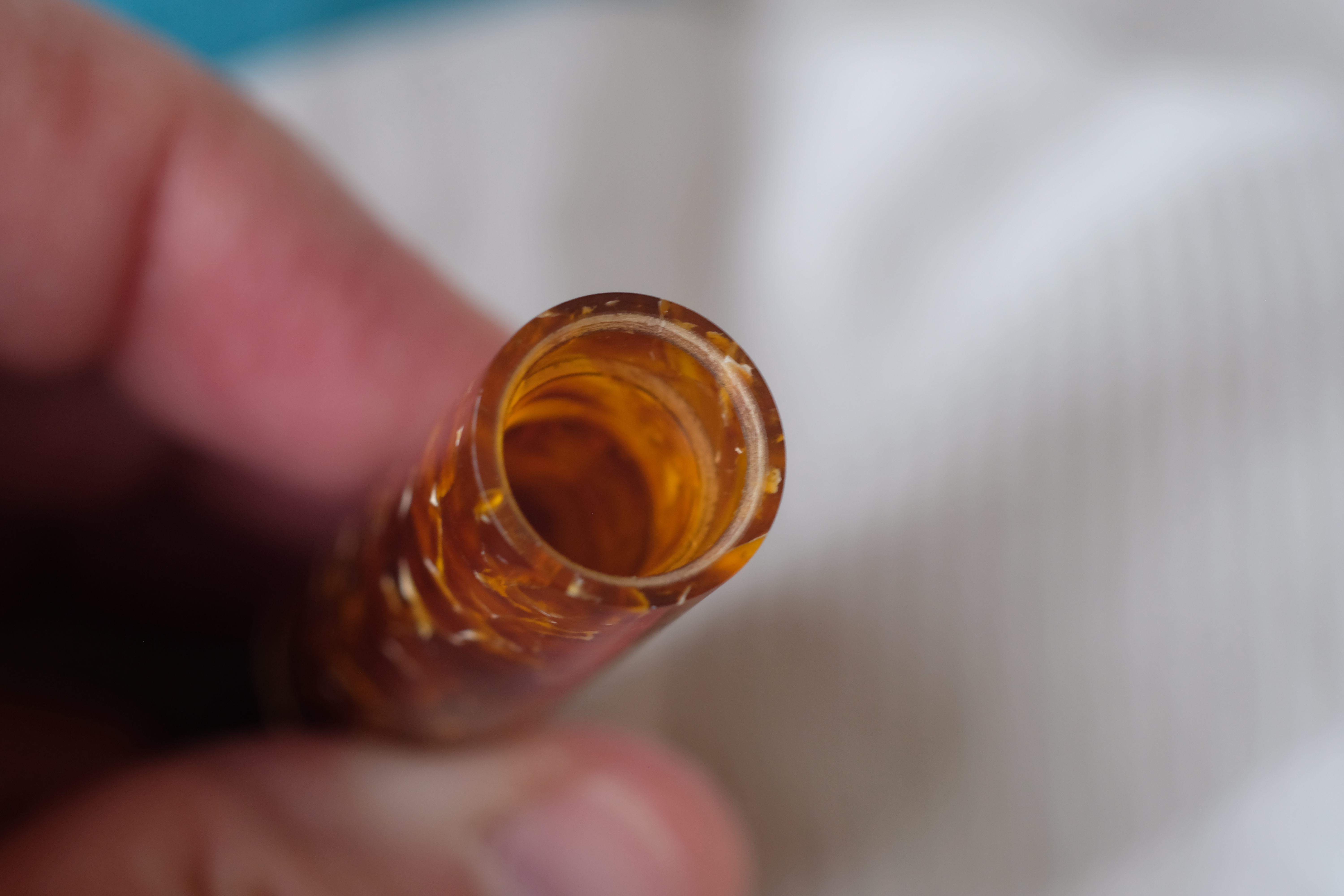
The first few times I removed the section, plastic swarf from the turning process fell out on to my desk. I would have liked a little more pre-shipping tidying up!
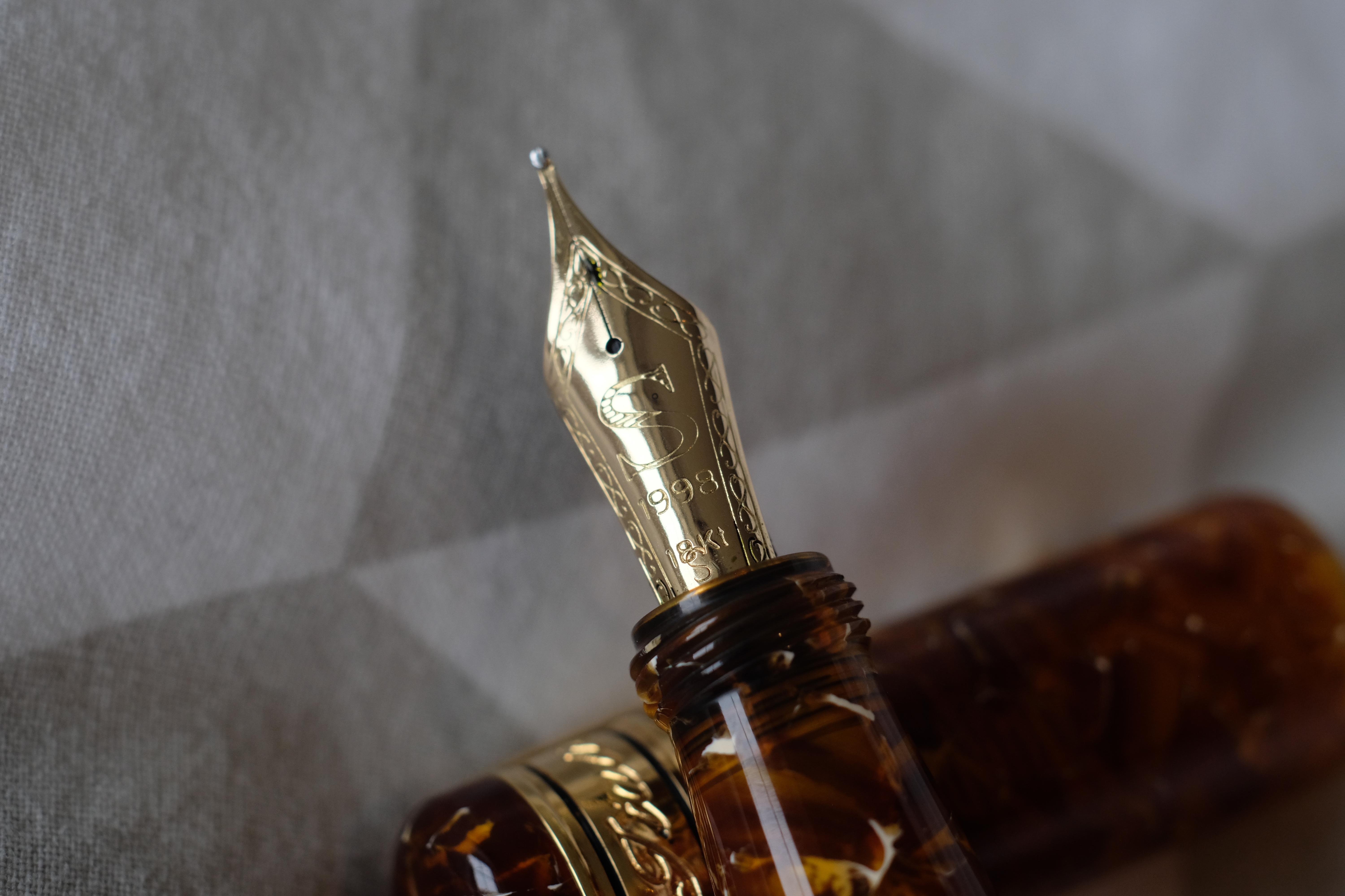
I’m sad to say that I had a big problem with the nib on my Toscana. I asked for a stub, and there is an “S” faintly stamped at the bottom of the nib, but it has no stub characteristics.
More importantly, it did not write out of the box. The tines had sufficient space and just touched at the end, but ink would not flow down to the end of the nib, even when I flushed the pen and primed the converter to the point where ink was dripping from the feed.
When I did get it writing for a moment, it skipped and hard-started like mad.
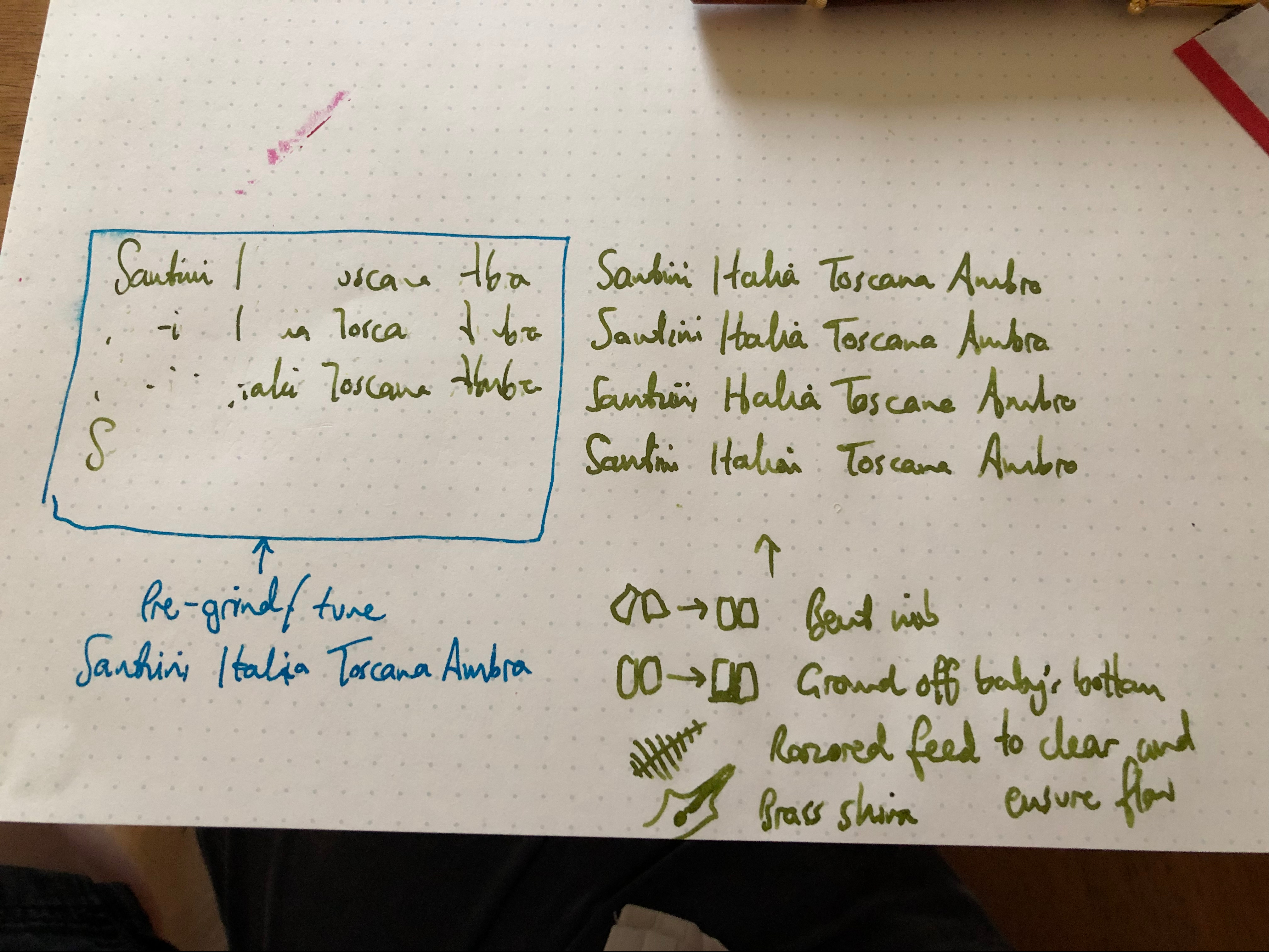
First I cleaned (and subsequently razored) the feed and its channels, but that didn’t completely cure the problem.
Second I reshaped the nib: under a loupe, the tines appeared bent outward and weren’t touching square.
Next I tackled the remaining baby’s bottom with a tiny bit of grinding on Micromesh.
And to make sure that the tension between the tips was OK, I used a thin brass shim.
At this point, the nib wrote really well. The process only took me about ten minutes, but as a novice I would have been flummoxed.
Here’s the before and after shot. After identifying the problem on lots of different papers, I wrote a set of test lines on the left side of this Baron Fig Mastermind Desk Pad. Then I did my work, and wrote the set of lines on the right.
Ink is R&K Alt-Goldgrun, a reliable performer.
With the pen writing, I could appreciate the really distinctive style of the nib. It has huge long tines, and a big blob of tipping. It tends to sing — quite loudly! — on some papers. Here it is on Baron Fig:
[wpvideo UZaby1uF ]
Much quieter on Tomoe, I might add.
There’s a good amount of bounce, but since it’s 18k I wouldn’t push it too hard.
I’m rooting for Santini as an underdog here. It’s a small company that’s pushing with lots of really attractive designs, and I am so excited that they make their own nibs in house. I find a lot of the new models not only pretty, but great value for money, too. And certainly in my experiences dealing with the company, they’re responsive and friendly.
My only concern — and it’s a significant one — is over nib quality control. I am a little more understanding that a small maker like Santini will have a degree of inconsistency than I am about Pelikan, which has burned me so many times, but the Toscana I received really wrote very, very badly out of the box.
Now that I’ve fixed it, I really like this pen! The Ancora-esque design is very distinctive, and the nib is great fun to write with (still not a stub, though).
I’m keen to try another Santini to see if my problem happens again — the Libra piston filler at 250 euros is on my radar, or one of the new Limited Edition Nonagons — but I’d also like to hear your experiences. Please share in the comments if you’ve tried a Santini!
I’ve also invited Santini to comment on this review, so look out for their comments below.
Nice review, shame about the nib. I just ventured into nib work he other week as have a Kaweco EF nib which hard starts and is nowhere near an EF, figured it could be babybottom so had a go on a nail buffing stick and now it’s pretty nice but still somewhere between a fine and a medium I’d say.
We share similar tastes with the amber Toscana but I think the ebonite Libra looks very nice in cherry or lava, especially coming with an ebonite feed too. I’m curious about they’re flexy nib, assuming it’ll be more soft and bouncy like Platinum’s soft nibs. As my Nakaya just got paid for (should be shipping from Iguanasell any day) I’ll have to save up again, then decide between a Santini or one of Leonard Slattery’s pens…
Another great review. Thanks for all your efforts; I’m never going to be in with a chance to own one these pens, so I can at least live vicariously through you! I’ve been reading your blog for about a year and am struck by the number of high-end pens that seem to have serious QC issues. It doesn’t seem to correlate to big or small company size and, really, why should it? For the prices you’ve been paying you’d expect the QC to be better. Any views on why it is as it is?
Mostly it’s because QC costs money. It takes time, it requires robust process methodologies, and it takes trained and skilled people. To truly test if a pen works you have to ink it, as Graf, Lamy and I’m sure others do. A quick visual inspection won’t tell you if a feed channel is blocked, or if a tip has been overpolished to the point of a baby’s bottom.
I think I’m also sensitive to bad nibs because I’m left-handed and write very lightly. A lot of the sub-par nibs I’ve used do write if you press hard, which opens up the tines, and nibs are also much more likely to write when dragged than when pushed. So I probably feel the problem more than most.
There’s also the issue that a lot of pen makers are essentially barrel and cap makers. They don’t make the nib or the feed — they just buy them as components. Even expensive pens often use nibs from Bock etc.
These are new to me and look very appealing, subject only to your caveat as to nib quality control. Thanks for the detailed review.
I have a colourful one – I originally thought it was a wild resin mix but it was a printed pattern unfortunately.
unlike you, my pen’s nib wrote out of the box, however while it is an F it does write like a B.
Hence all in all not that convinced. I prefer Leonardo with a steel nib for the price.
I was turned on to Santini by their clear heritage in other Italian fountain pen brands but specifically by their in house nibs. The Ancora relationship runs deep there and owning a few latter day Ancoras too, I can say the feel of the 18K Santini nib (not the ‘flexy’ one, I’ve not tried that) is similarly soft and the very characteristic tipping style is common too. Not without problems, one of my Santini nibs needed tuning though wasn’t as outright unuseable, just far too dry for my taste. A stub as it happens, like yours it responded well and I keep coming back to my pair for the simple reason that they are great fun to write with and very responsive too. Shame your stub lacks line definition, mine is not remarkable in that regard but distinctive none the less.
I’m not a fan of flex particularly but given that a normal Santini F or EF has a softer feel than for example an Aurora fine flex when writing normally, I wonder what the flexy nib is like.
Anthony, another great review. I have five Santinis, a Toscani (purple, very pretty), two painted (blue galaxy and spring flowers), a Libra wood, and a Libra Cherry. Nibs varied from F to B, including a flex. I started with one and ended with five (with one more to come) because their nib, in all grades, is just marvelous – two of them did have teething problem but was soon fixed by Giovanni (the owner) himself. To me, they write better than my three Aurora (including a flagship 88) and almost as good as Omas. The feel, probably because of the long neck, is very distinctively Italian, and could very well be mistaken as an Omas in a blind test. It has its quality control issues but it probably is among the best value proposition out there, and I am so glad to have discovered them after Omas went out of business. This brand is indeed among the best kept secret in the fountain pen world.
Having the o-ring instantly giving you the option of dispensing of the converter and eye dropping it. I think that’s why it was added.
Both my 1.1 stub and broad nibs had the same problems described in the review, and had to be sent to nibmeisters. I had to send a video before getting customer service for my stub, but was sent back to me without any tuning or information.