I like Montblancs. And not just through brand snobbery. I enjoy the classic designs like the 149, as well as many of the various special and limited editions (though they’re often well beyond my budget). Of my core collection of 20 pens, I now count three Montblancs: the retractable Heritage 1912, the Diplomat 149 in platinum trim, and now this: the Heritage Rouge et Noir.
The Rouge et Noir wears its heritage proudly
I tried out the Rouge et Noir in passing over a year ago, in an airport boutique. I dismissed it out of hand as being way too skinny. And indeed this is an incredibly slim pen, along its full length. It reminds me of the Kaweco Liliput.
Blast from the past
Once you get past the proportions, this is a very distinctive design. Like the 1912, it’s part of Montblanc’s Heritage collection, and is designed to echo a 1906 model of the same name. It also looks like the Agatha Christie special edition that has gone on a serious diet. The heritage touches abound, from a retro ‘MONT BLANC’ engraved logo on the cap:

Etched retro logo is charming
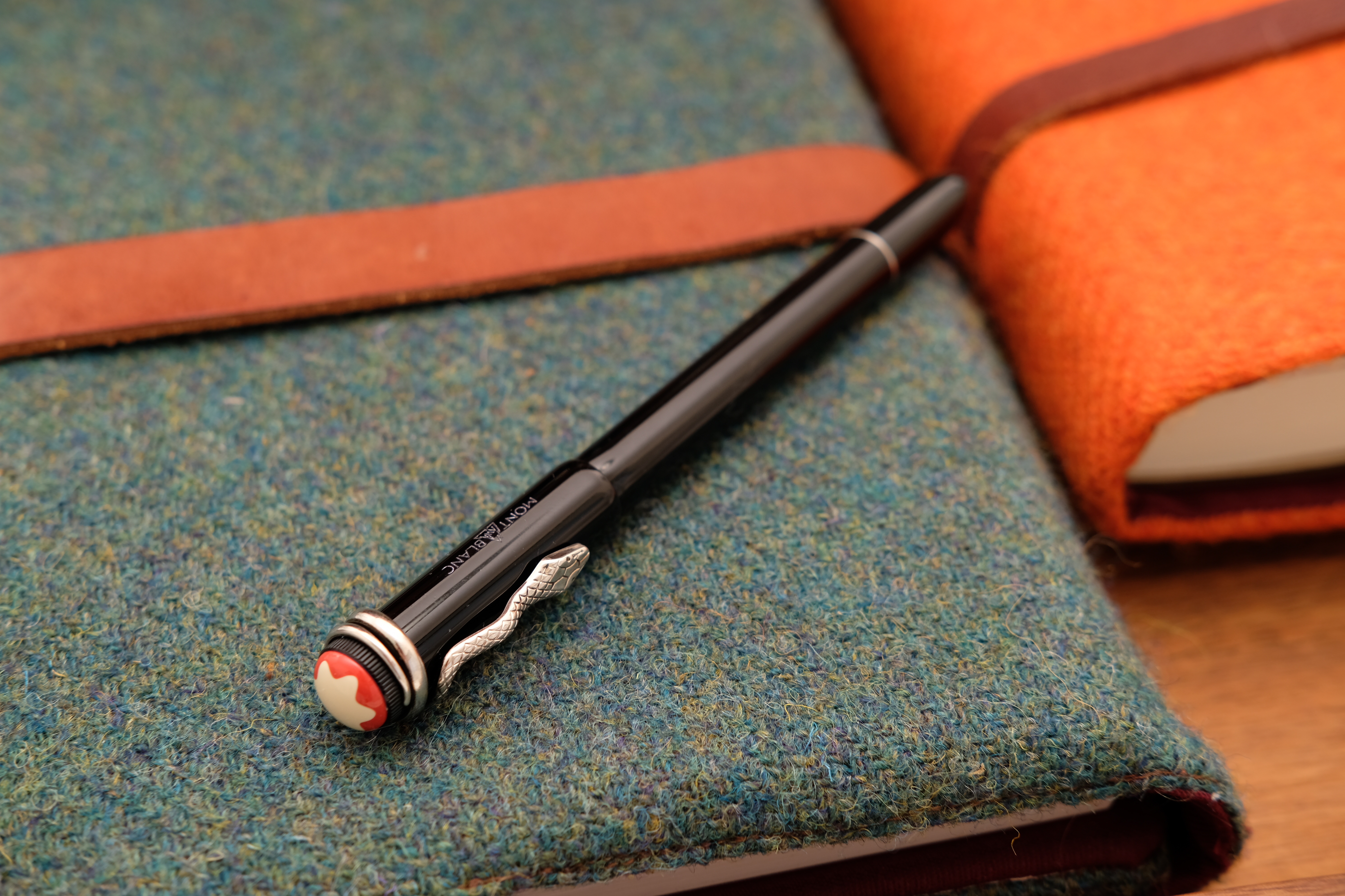
To a cream-and-red snowcap:
Don’t drink the yellow snow
And the aged-metal snake clip, which winds poetically around the cap:
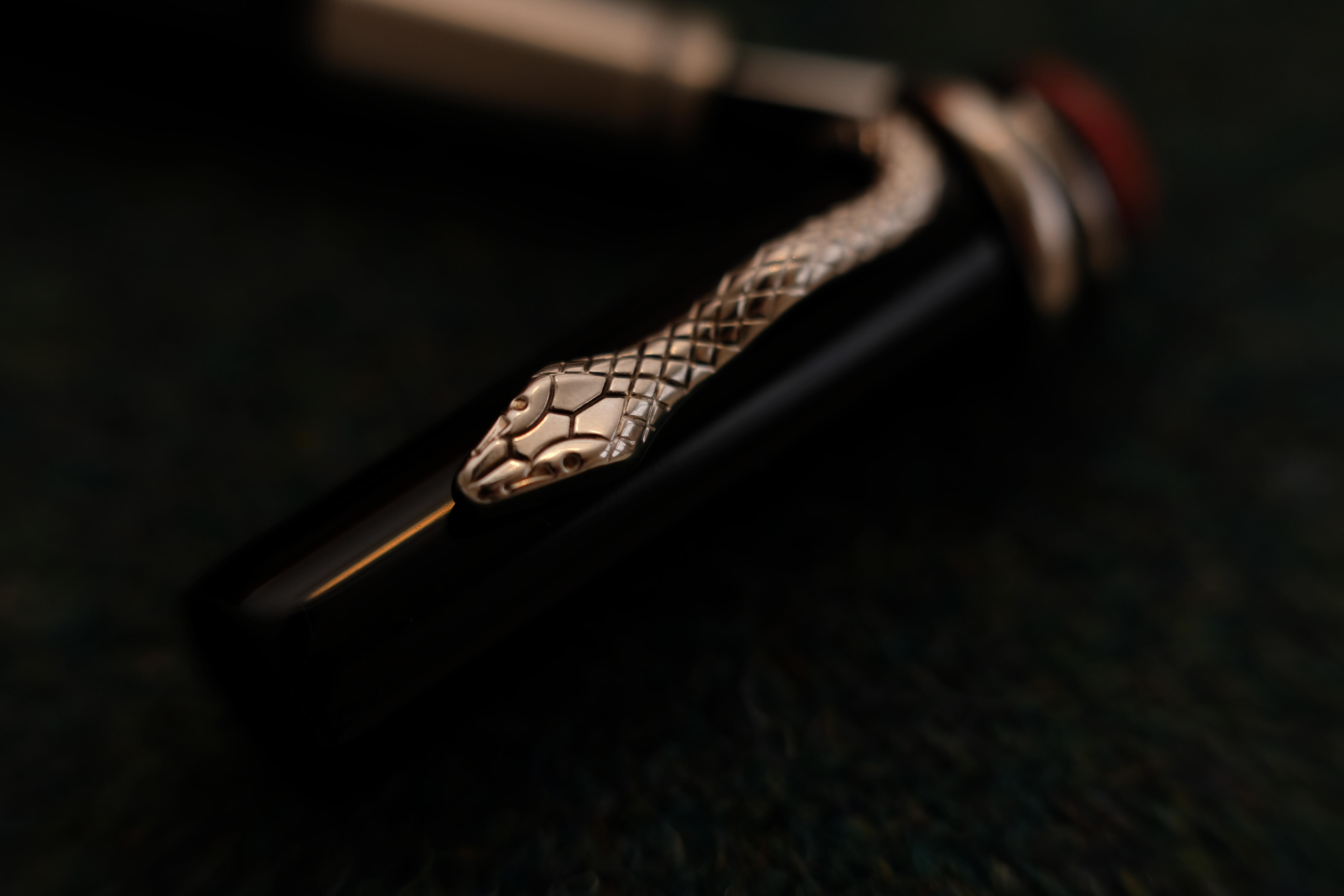
The snake clip is more ornamental than functional
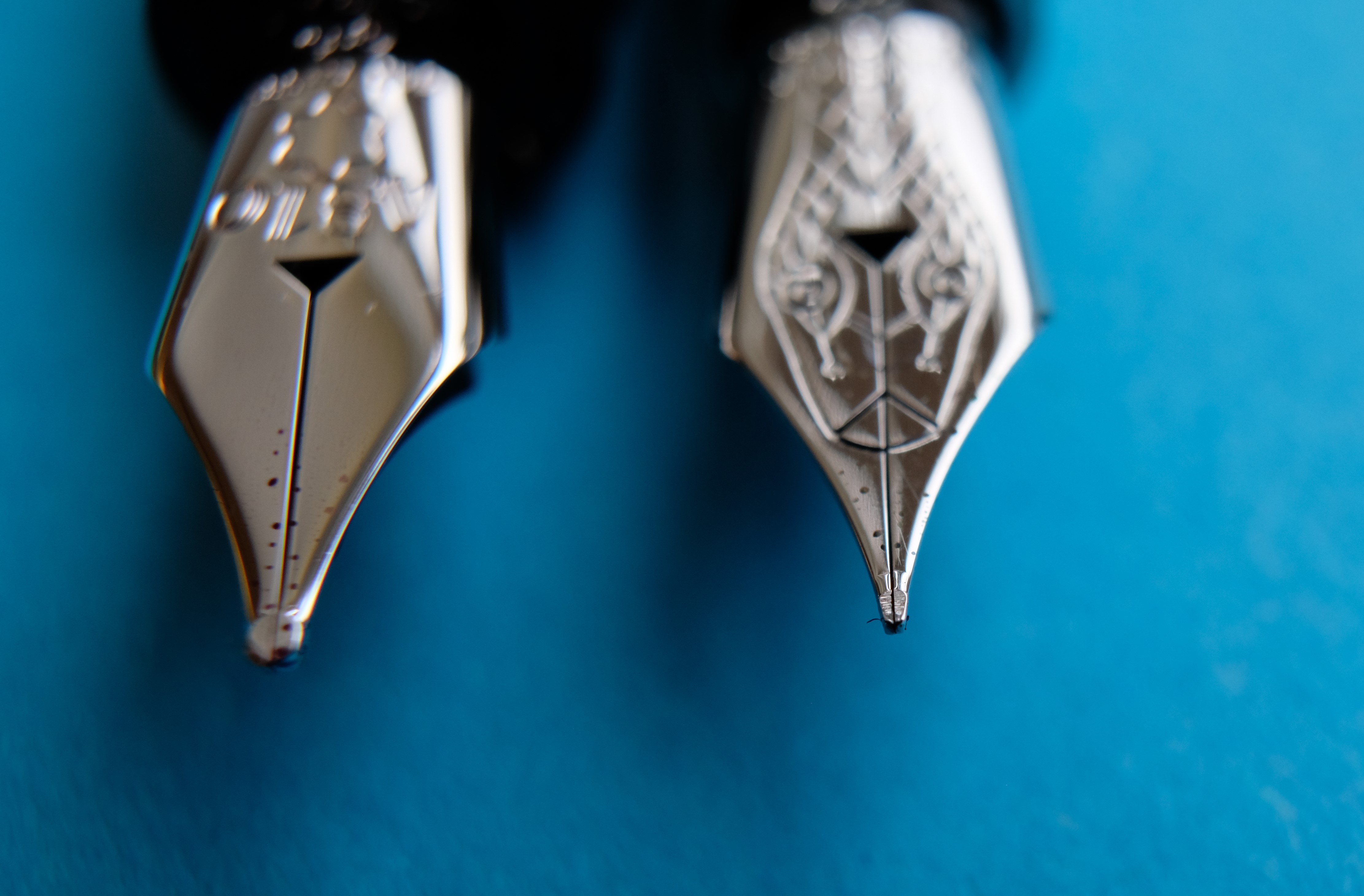
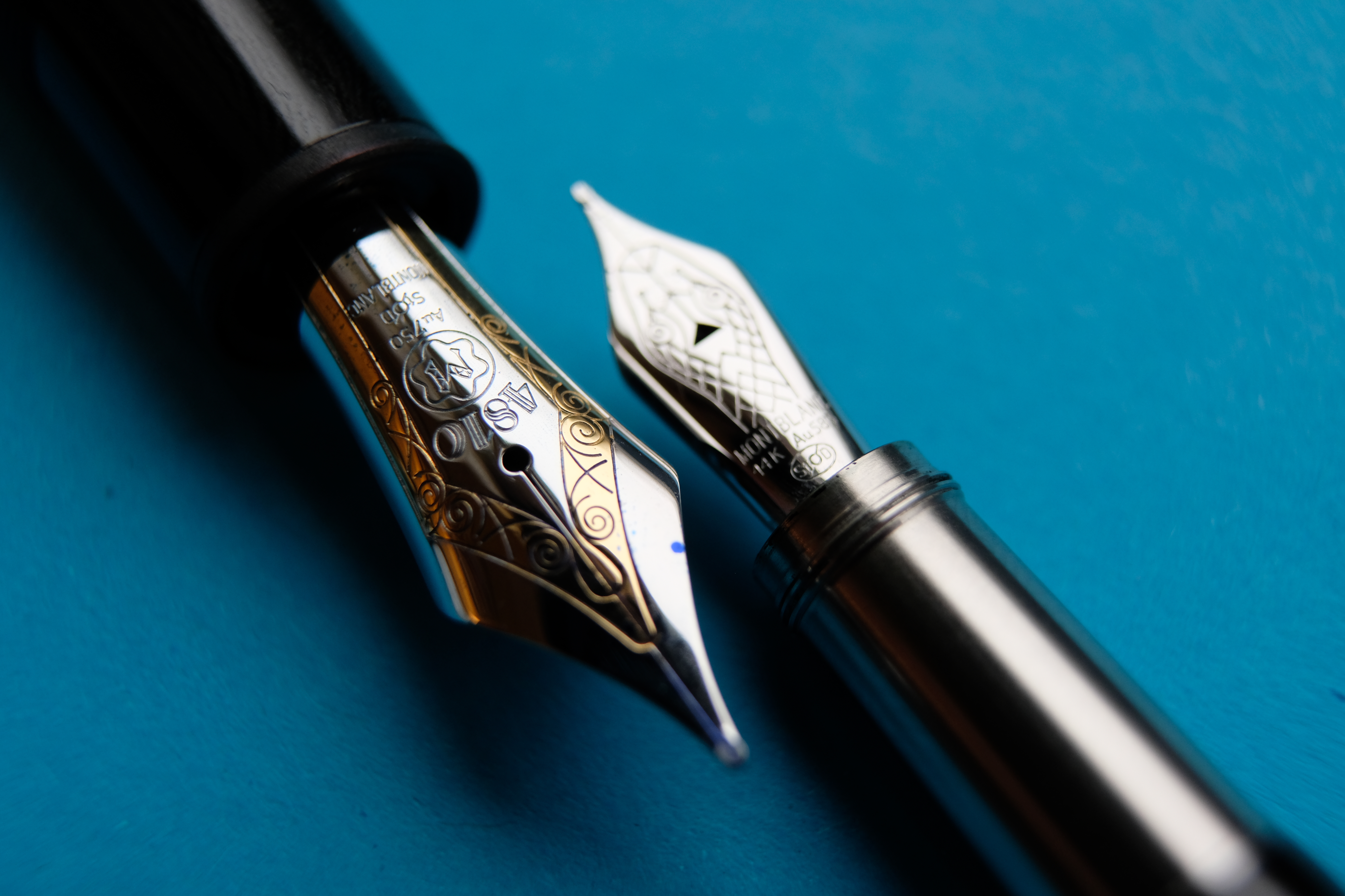
The snake motif is repeated on the small rhodium nib, and I have to say it makes for one of my favourite nib designs.
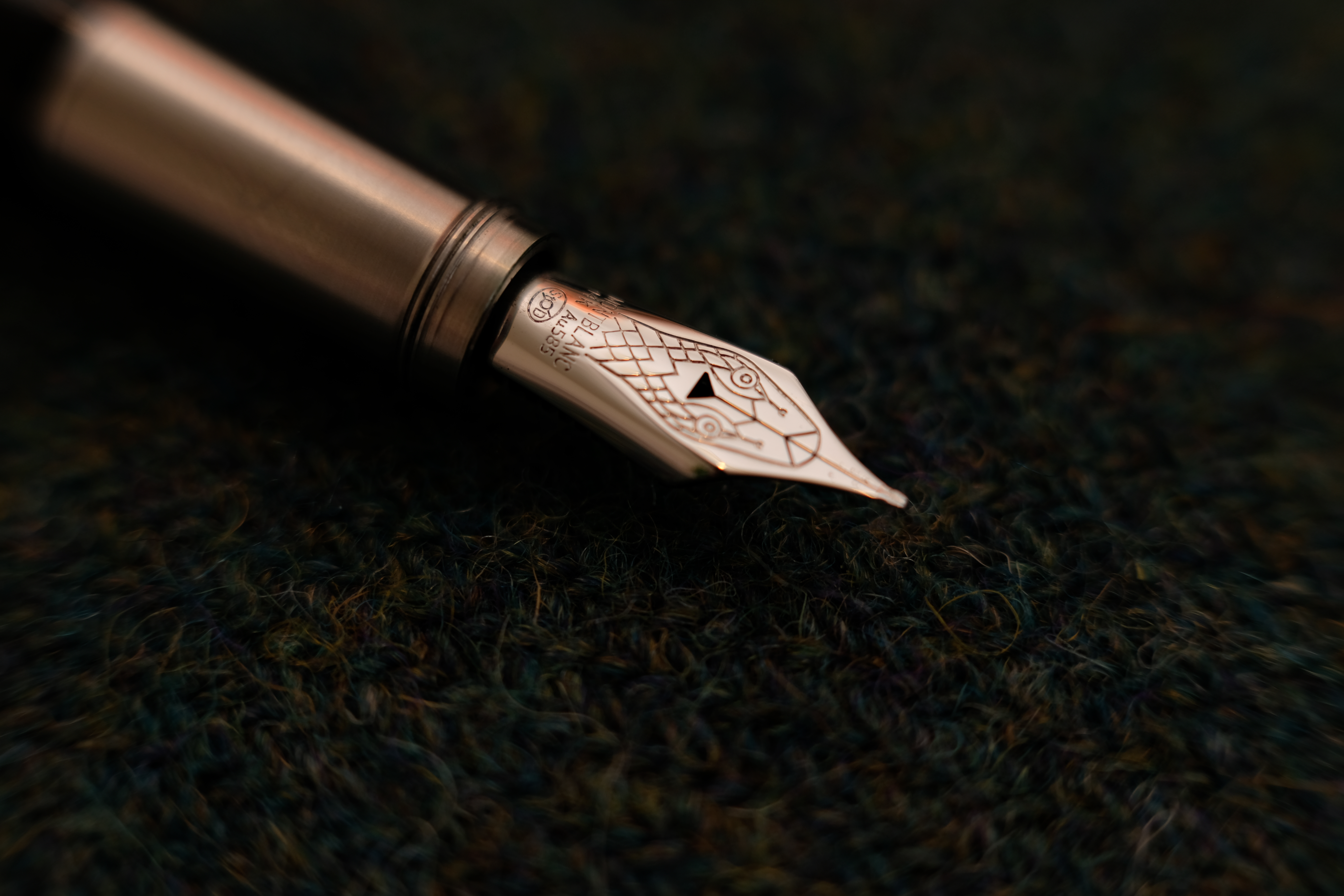
What a gorgeous nib!
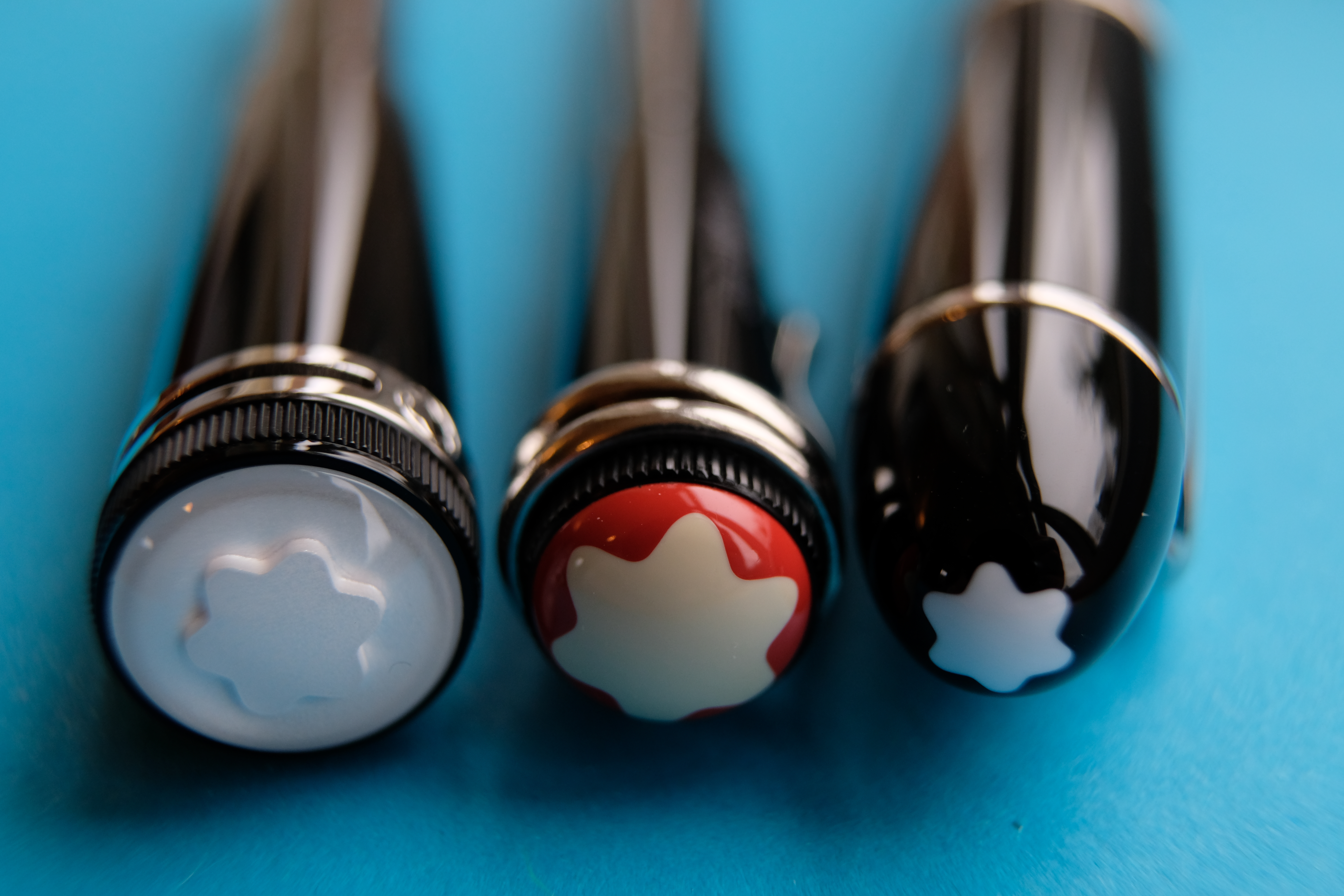
At this point it’s worth noting that my Rouge et Noir is the basic black version. It also comes in coral and tropic brown special editions (each with jewelled snake eyes on the clip), a spider web version, and a hard rubber edition with a slightly different section and much higher price.
Slim pickings
I find the design surprisingly attractive, perhaps because it’s so different to my other pens. The Rouge et Noir is long, and the cap is extremely short (it doesn’t post). Almost all of the design details are on the cap, meaning the pen itself is sleek and unfussy when uncapped.
The main body of the pen is simple and sleek
All you’ll find is a thin metal ring separating the piston filler knob from the barrel, a curved stepdown to the brushed steel section (which has a mildly annoying little ridge), and just a short set of threads almost at the end of the section. The cap screws on in 1.75 turns, and capping is a pleasure because the threads are wonderful.
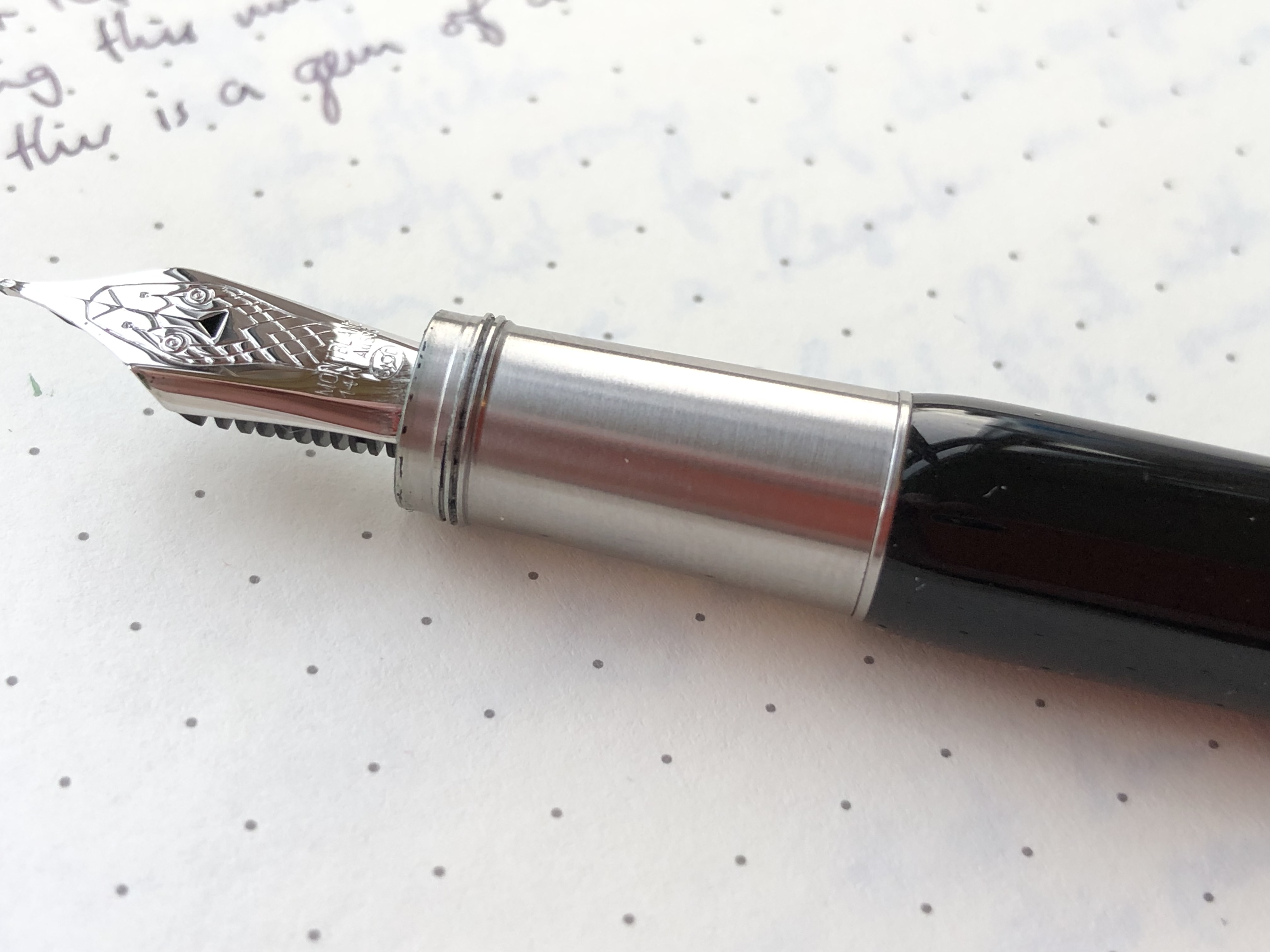
The threads don’t look like much, but they work really well
In the hand the Rouge et Noir is very dense. It’s much like the 1912 in that regard: beneath the lacquer must be brass, plus there’s the weight of the metal section. Even with the snake clip, the cap is light by comparison.
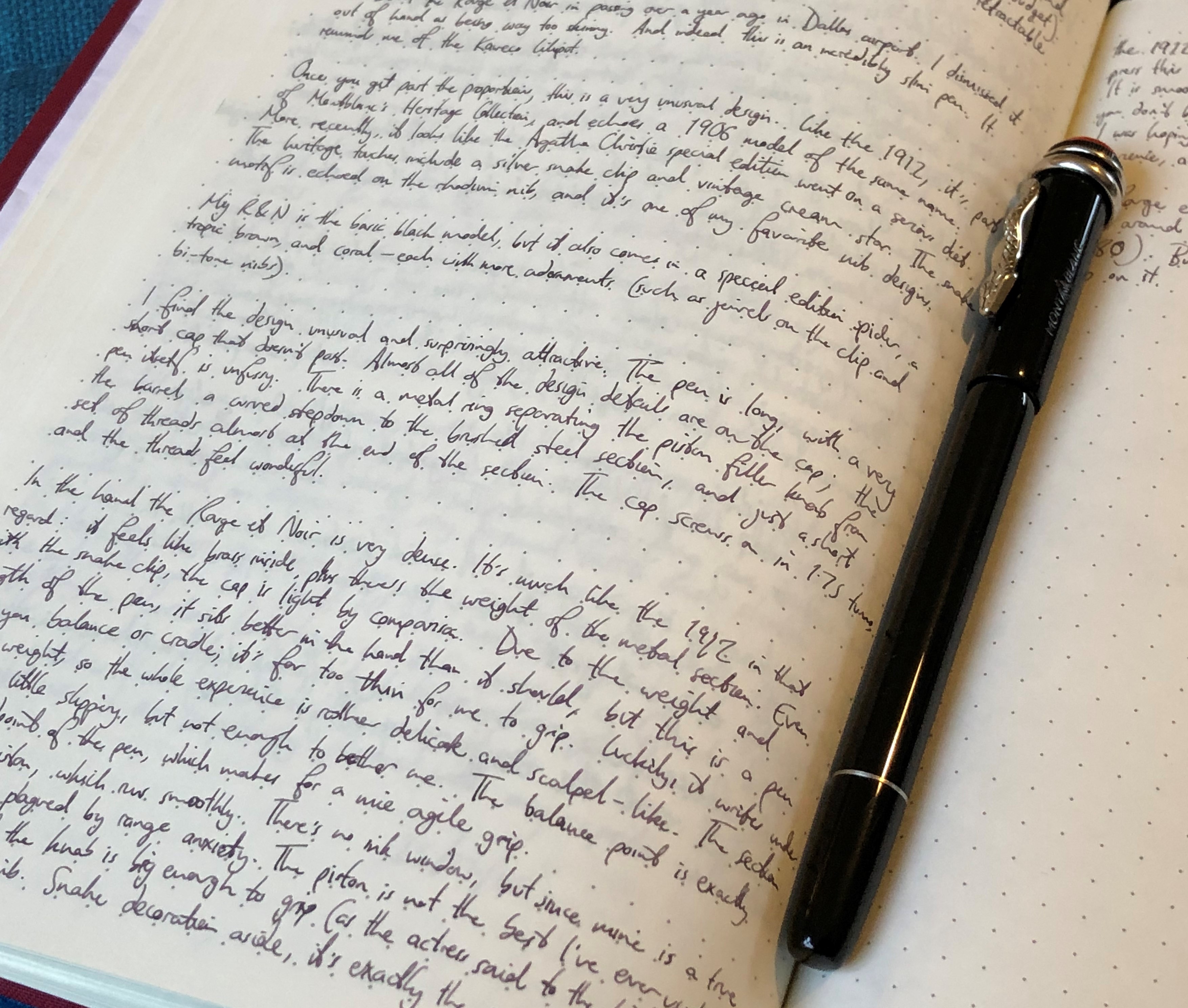
Due to the weight and length of the pen, it sits better in the hand than it should, and the balance point is exactly at the midpoint. The section is only a little slippery and the fact that it’s metal doesn’t bother me. But anyway, this is a pen that you balance or cradle — it’s far too thin for me to grip properly without getting cramp. Luckily, the Rouge et Noir writes under its own weight, so the whole experience becomes rather delicate and scalpel-like. No pressure.
Filling is via piston, which runs fairly smoothly. There’s no ink window, but since mine is an extra fine, I’m not too plagued by range anxiety.
Scalpel-like writing experience
Now, on to that nib. Snake decoration aside, it’s exactly the same nib and feed as the 1912, right down to the triangular breather hole.

Like the 1912, it’s bouncy if you press, but I do not press this nib. I pulled the trigger on this pen because it’s a factory EF, and it does not benefit from pressure.
It is a great nib if you write lightly and benefit from its smooth, slightly stubby grind, which lays down a true EF line with moderate flow. What I had in my head when I pressed the ‘buy’ button was a superlative fine note taker, with an agile slim body and a needlepoint nib. That’s exactly what I got, and it’s the most precise writing instrument I own today.
The ink is Robert Oster Ruthenium, courtesy of Izods
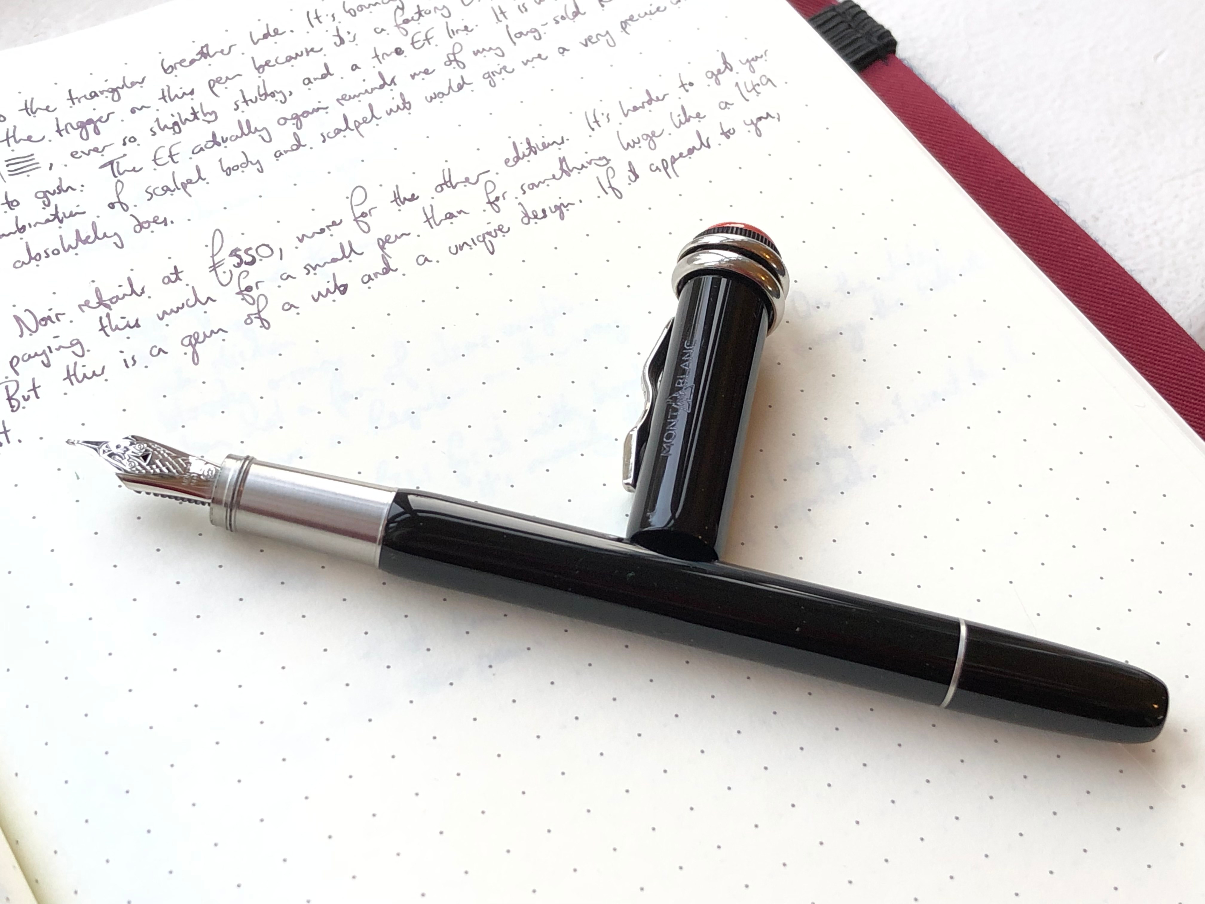
The Rouge et Noir retails at 550 GBP, more for the coral, brown and other editions. It’s harder to get your head around paying this much for a small pen than for something huge like a 149, or than for a design so obviously complicated as the 1912.
You get more gold by weight from a 149, it’s true
But this is a gem of a nib and a unique design, and a worthy addition to my Montblanc trio. Which now resembles Bunce, Boggis and Bean from Fantastic Mr Fox. Hmmm.

One short, one fat, one lean
Thanks for this review. From your photos it does look very long and slender. It is probably one of those pens that you need to handle before you buy.
It really is. I also don’t think I’d like it nearly so much with a broad nib — wouldn’t fit with the pen’s personality.
Nice review. That is one slim pen! The Oster Ruthenium ink looks rather nice too.
I should get around to measuring it — I am sure it’s the slimmest section I own. I treat it like a metal pencil. Ruthenium is indeed a nice colour. I don’t find it particularly wet, so it’s a good ‘stress test’ for new pens before sticking in a lubricated ink that would otherwise potentially mask a bad nib.