I really wanted to like this pen — for a while I had it fairly near the top of my affordable pen wishlist — but on balance it left me cold, consistent with my first impressions. I just didn’t click with it.
Here’s what’s good.
The clamshell packaging makes it suitable for a gift. This may or may not matter to you, but it does leave a good first impression.
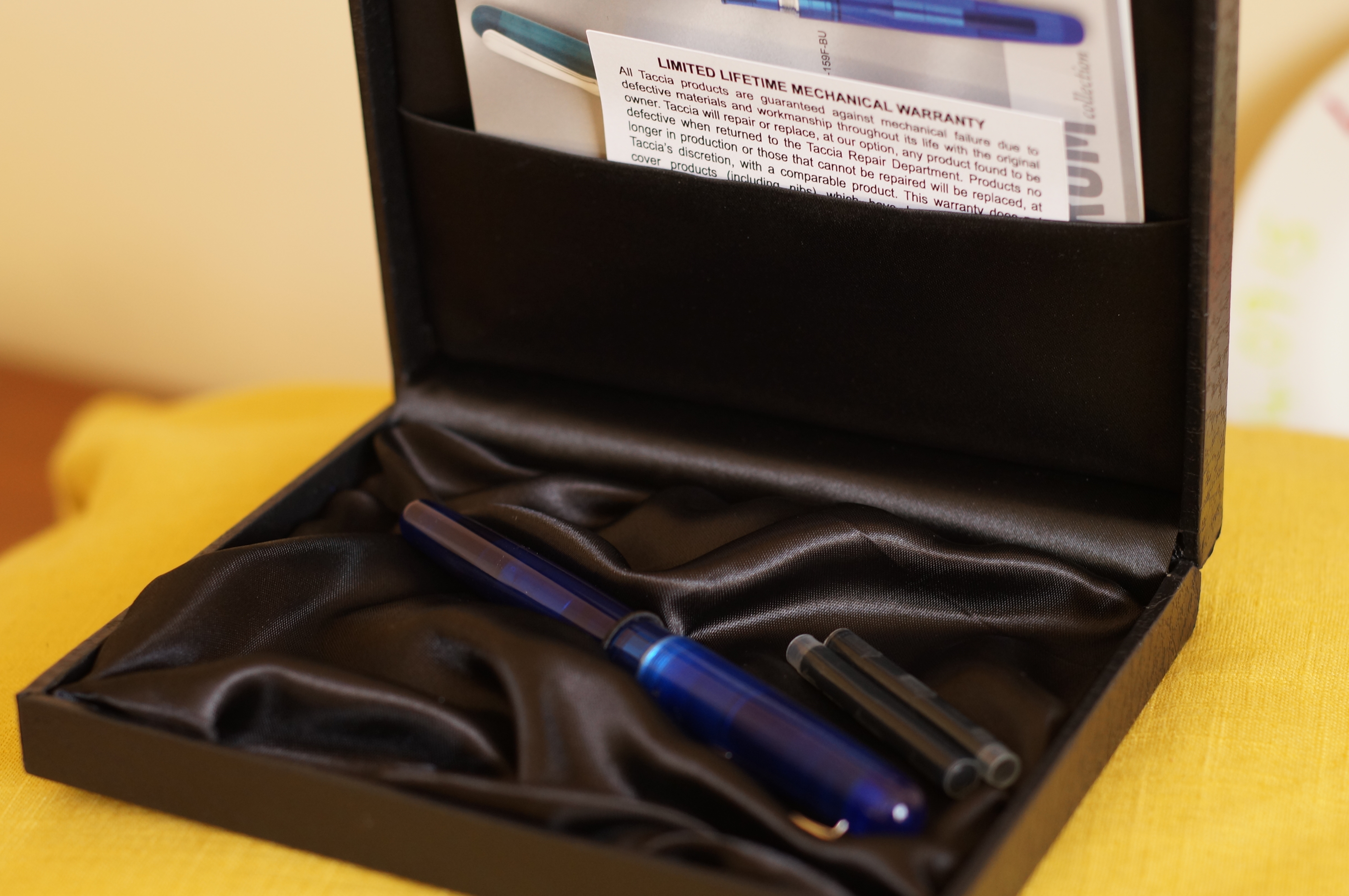
The clamshell box punches above its weight.
The pen is a good size, just the right weight, and every surface and edge is well-finished. The screw-cap closes securely. The clip is solid. If you like bright colours, this will float your boat: the translucent blue is intense and flawless (which is why I paired it with Iroshizuku Asa Gao). I’m partial to the forest green colour; there’s a red version too.
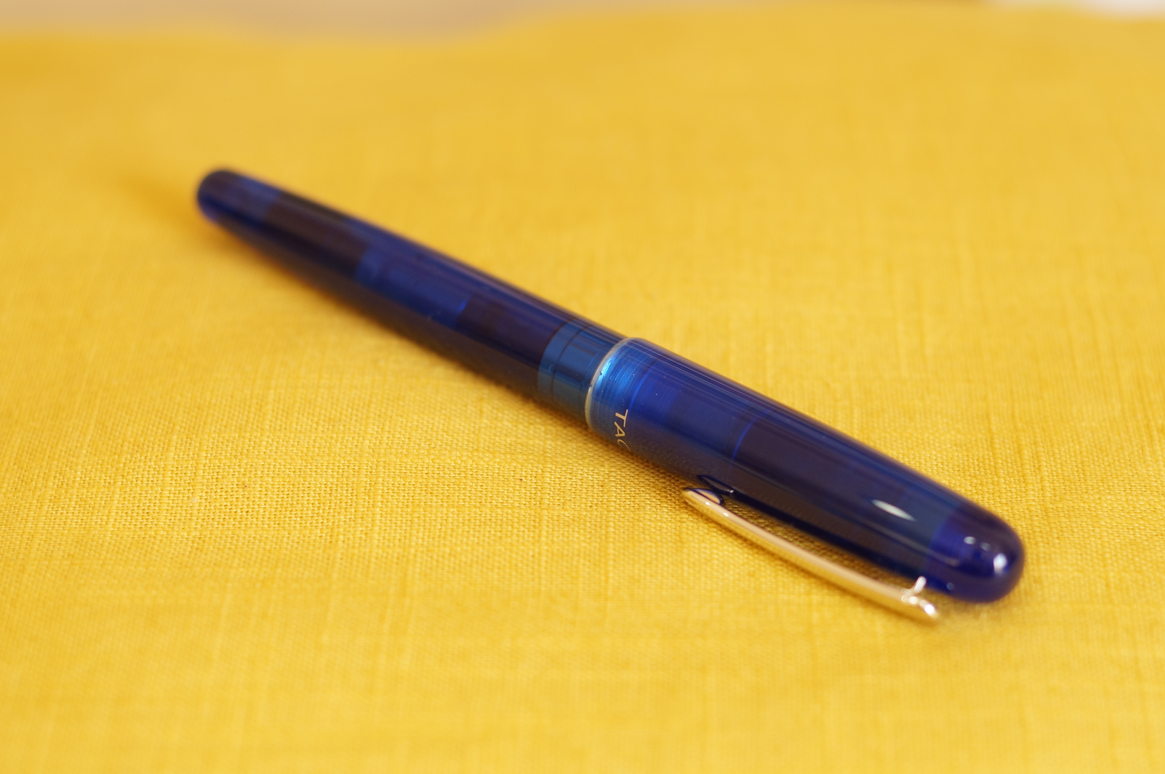
Bright and colourful.
And, in a way, it’s a really good writer. I’ve been using it on and off for meeting notes, journal entries, shopping lists, Valentine cards and so on since I got it, and I’ve been happy but confused by the experience every time.
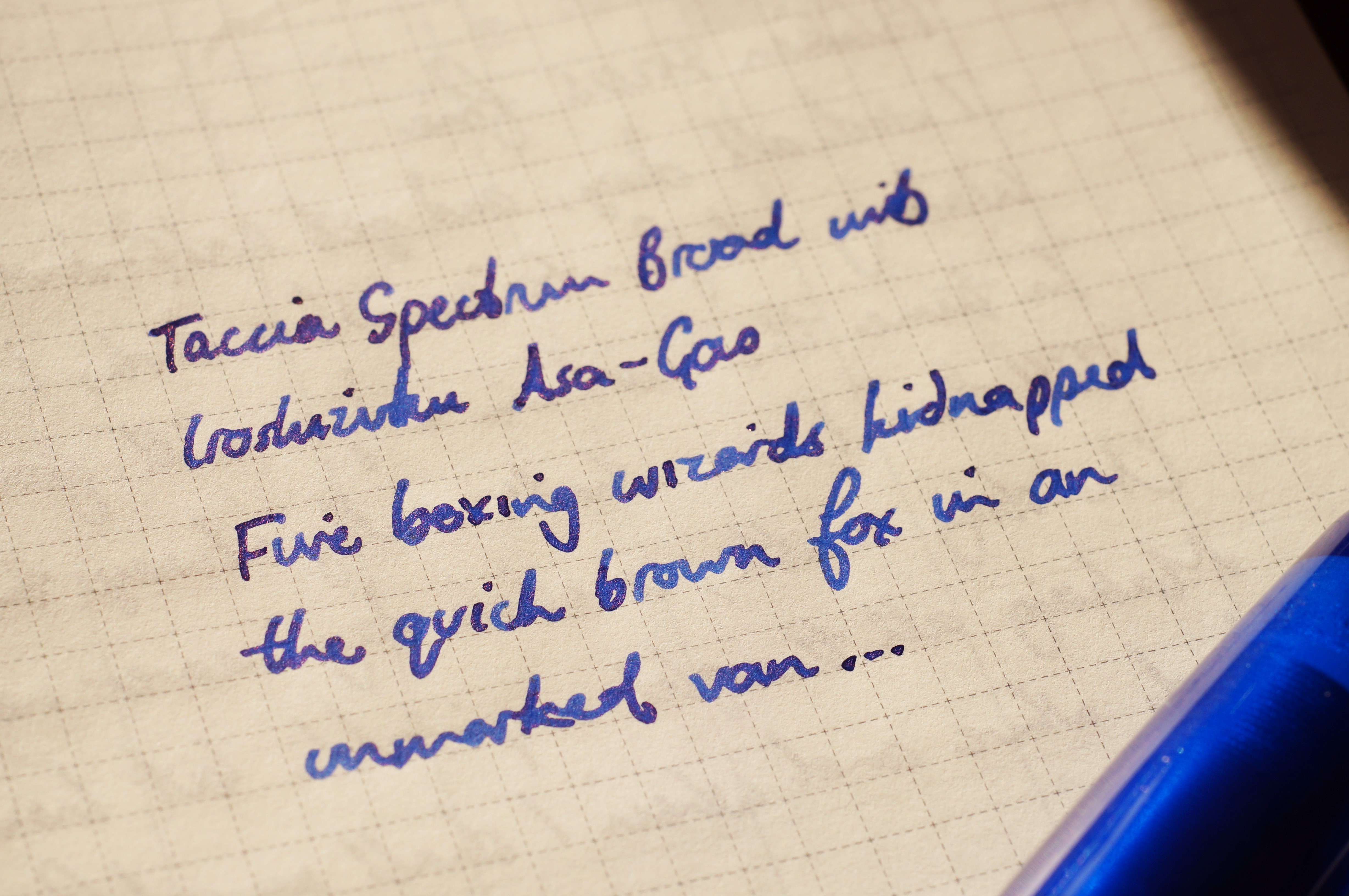
It’s a fun writer.
The two-tone steel B nib looks and feels like a Sailor in terms of flow and feedback, and it’s wet and writes without hesitation, but it’s unlike most B nibs I’ve ever written with.
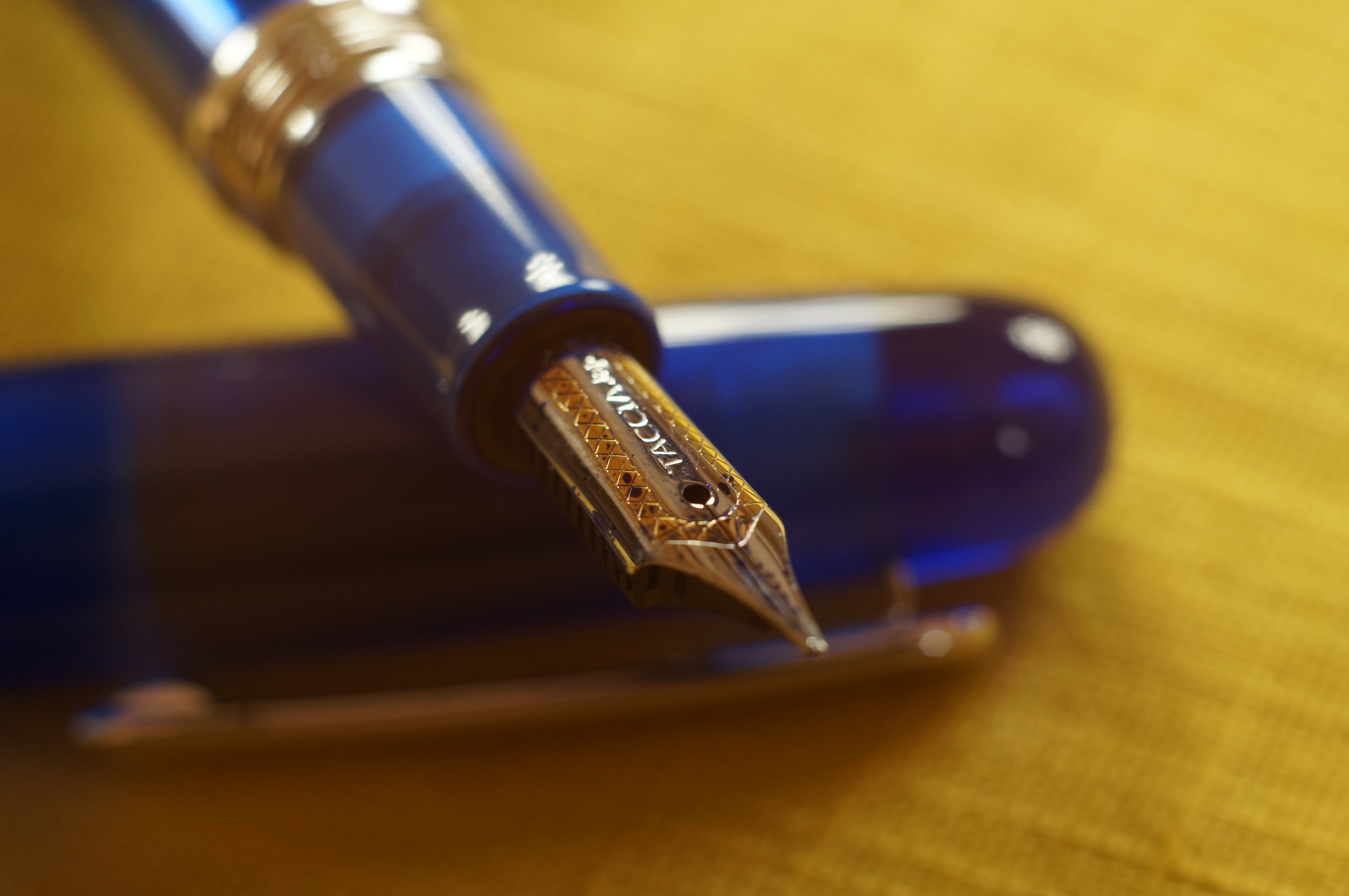
Pretty Sailor styling.
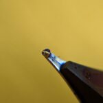
Under a loupe the tipping isn’t just a big round forgiving blob; it’s faceted and shaped into very precise lobes.
- Maker:0x4c,Date:2017-11-8,Ver:4,Lens:Kan03,Act:Lar01,E-Y
- Maker:0x4c,Date:2017-11-8,Ver:4,Lens:Kan03,Act:Lar01,E-Y
- Maker:0x4c,Date:2017-11-8,Ver:4,Lens:Kan03,Act:Lar01,E-Y
This means that as the pen moves around in your grip or tilts relative to the paper, you’ll get a different line and a different degree of smoothness. At low angles the line is much wider, for example. It’s not unpleasant, but to me it was a distinctly odd sensation. Sometimes the nib feels like an oblique, or that the tines are misaligned, but they’re not. As you’ll see from the photos above, this is a very precisely ground nib.
So, that’s the good stuff.
Unfortunately, the list of negatives just a little outweighs all of these positives for me.
It’s a cartridge/converter filler, which I have no problem with at all. However, the converter leaked into the barrel even when properly seated.
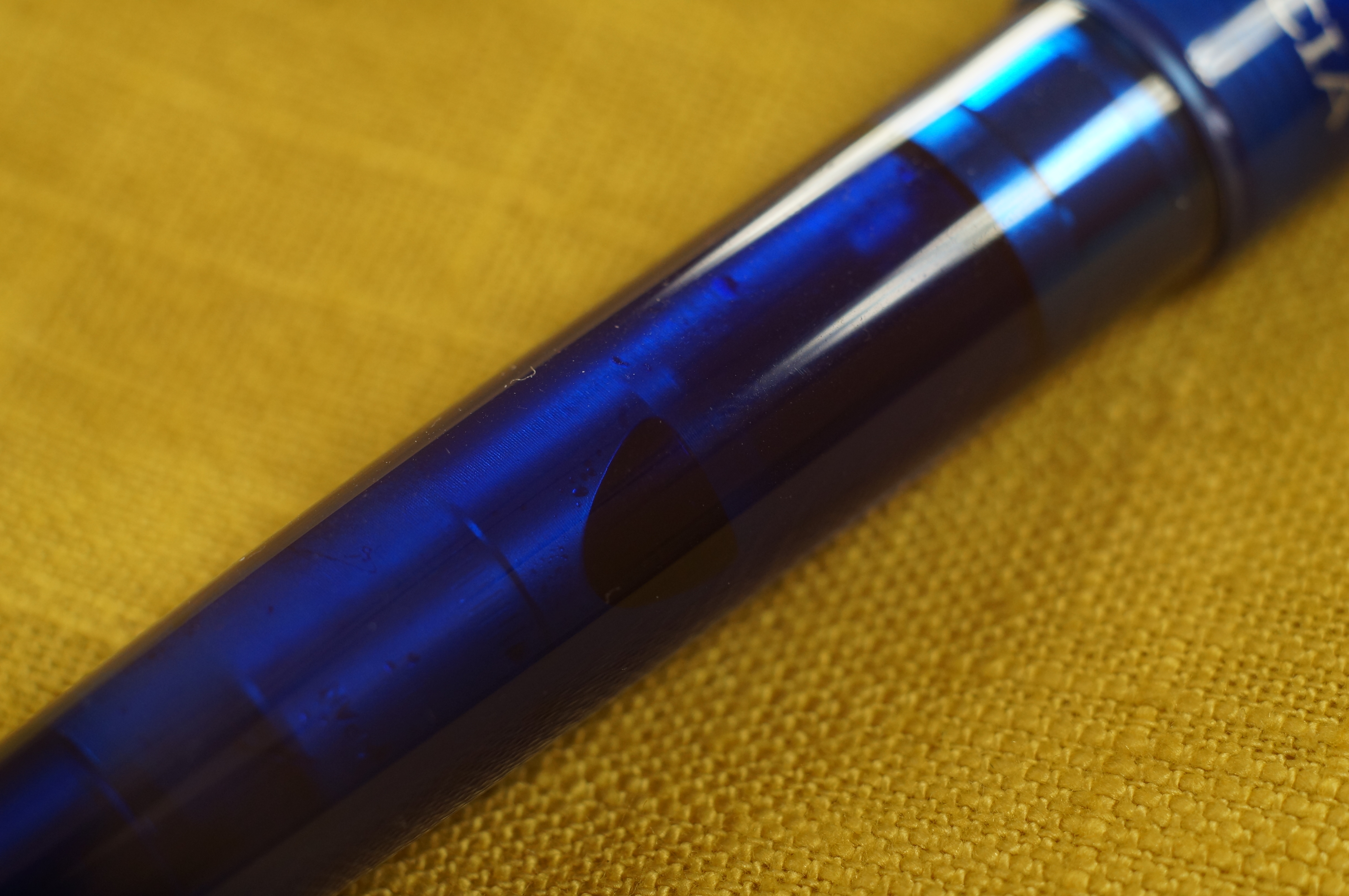
That darker bit right in the middle there? Escaped ink. The converter is fully inserted, honest guv.
I can’t remember ever having this happen to me before. It’s not a massive deal — the section to barrel threads are sealed with an o-ring, and the barrel is one-piece, so there was no possibility of any ink getting on the grip or in my pocket — but it doesn’t inspire confidence.
More subjectively, I wasn’t wowed by the design and its proportions. The section and nib are small relative to the cap and barrel, and the section is short and tapers noticeably. The chromed threads are very prominent, and seem an unusual choice given that there is no cap band, finial or other adornment aside from the clip to echo them or balance them out. More importantly, until the cap is snugged down tight, there is a lot of play in the mating between the two threads.

Still don’t like those blingy threads.
And lastly I was not a fan of the silkscreened logo on the cap.
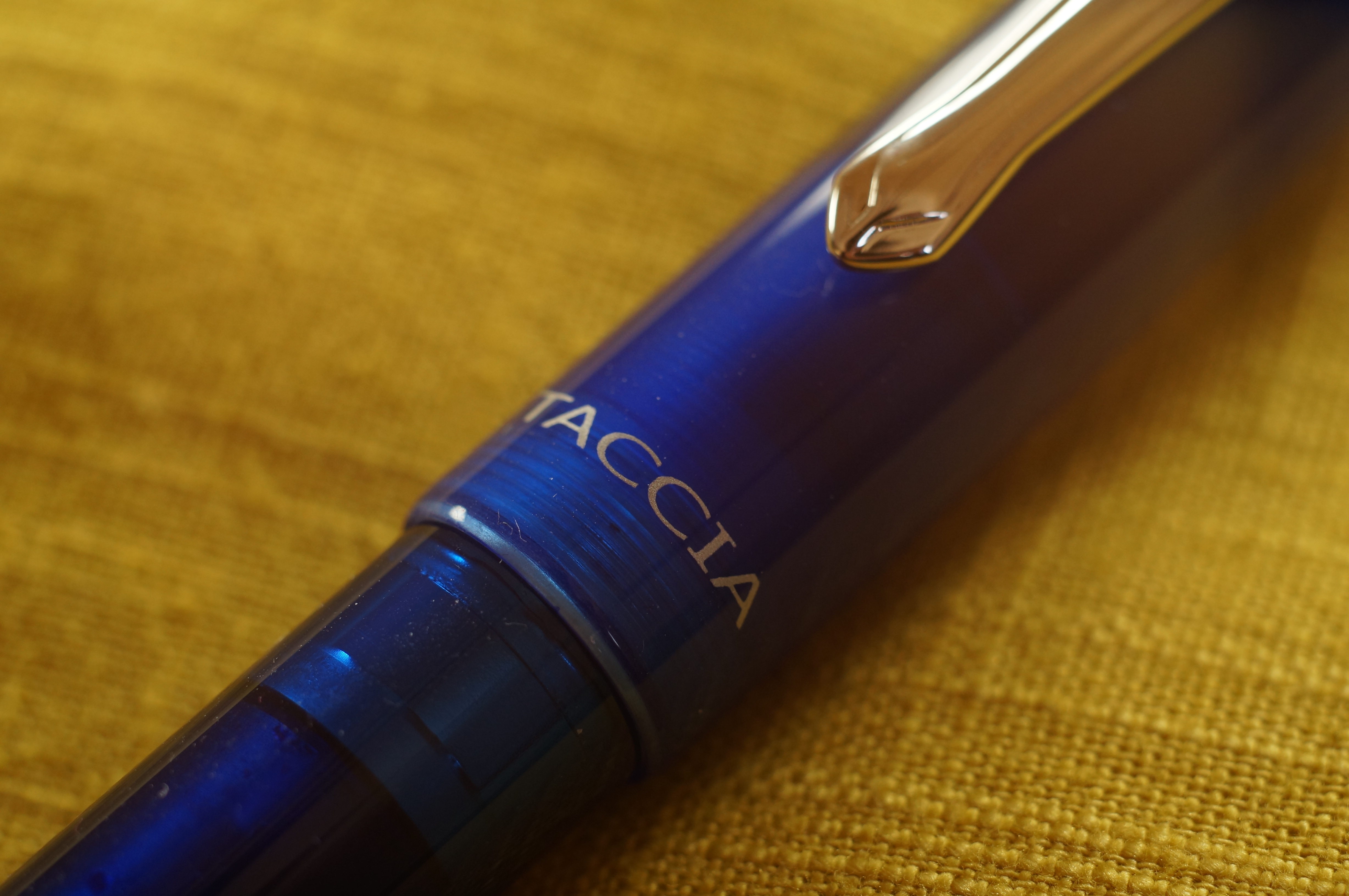
Sorry, the logo is just naff.
At $127 at time of writing from Pen Chalet, this is heading into Franklin-Christoph, Edison or Karas Decograph territory, and with those guys you get a more cohesive design, engraving instead of silkscreening, often more interesting materials, and in my experience an equal writing experience (albeit from a generic nib unit instead of a Sailor nib).

0 Comments
2 Pingbacks