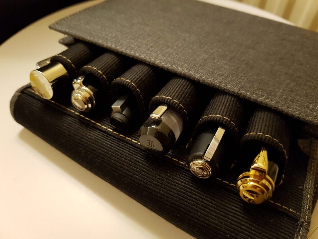
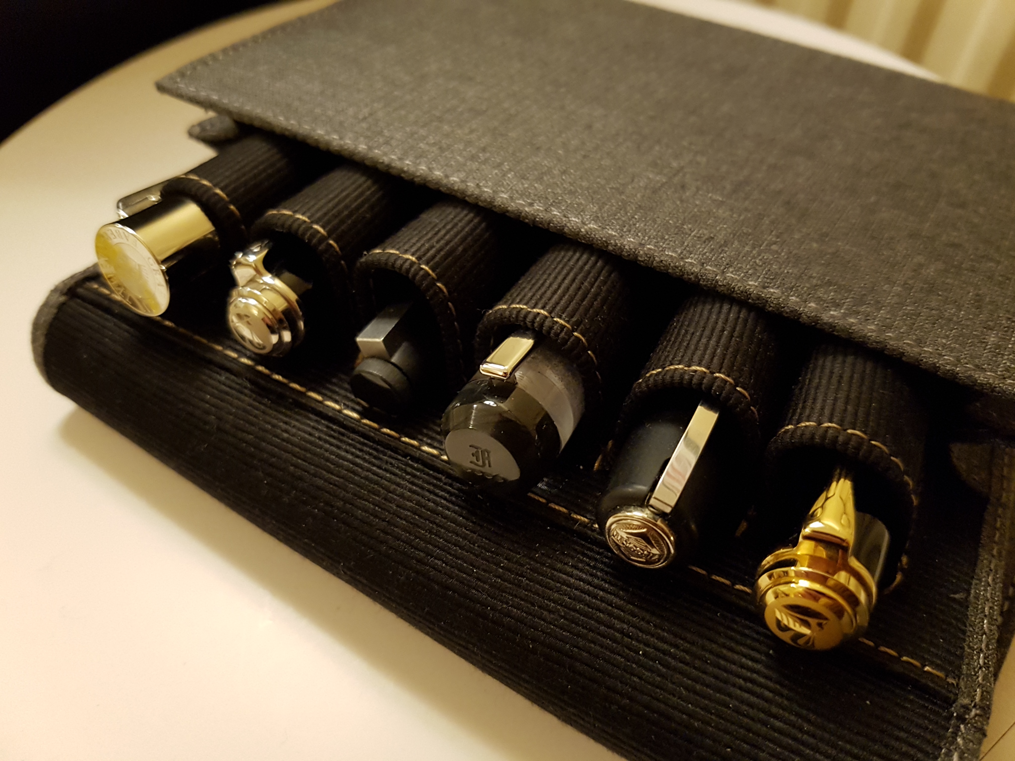
With pens and inks coming and going, and a lot of writing going on (blog drafts, Christmas cards), my currently inked lineup has changed a lot in recent weeks. Here’s how it stands today, all nestled in my new Franklin-Christoph Penvelope.
Just waiting for my Lamy Aion to arrive so I can get some Lamy Dark Lilac in this mix.
This is a very unusual case. Once my thoughts have settled down I’ll review it.
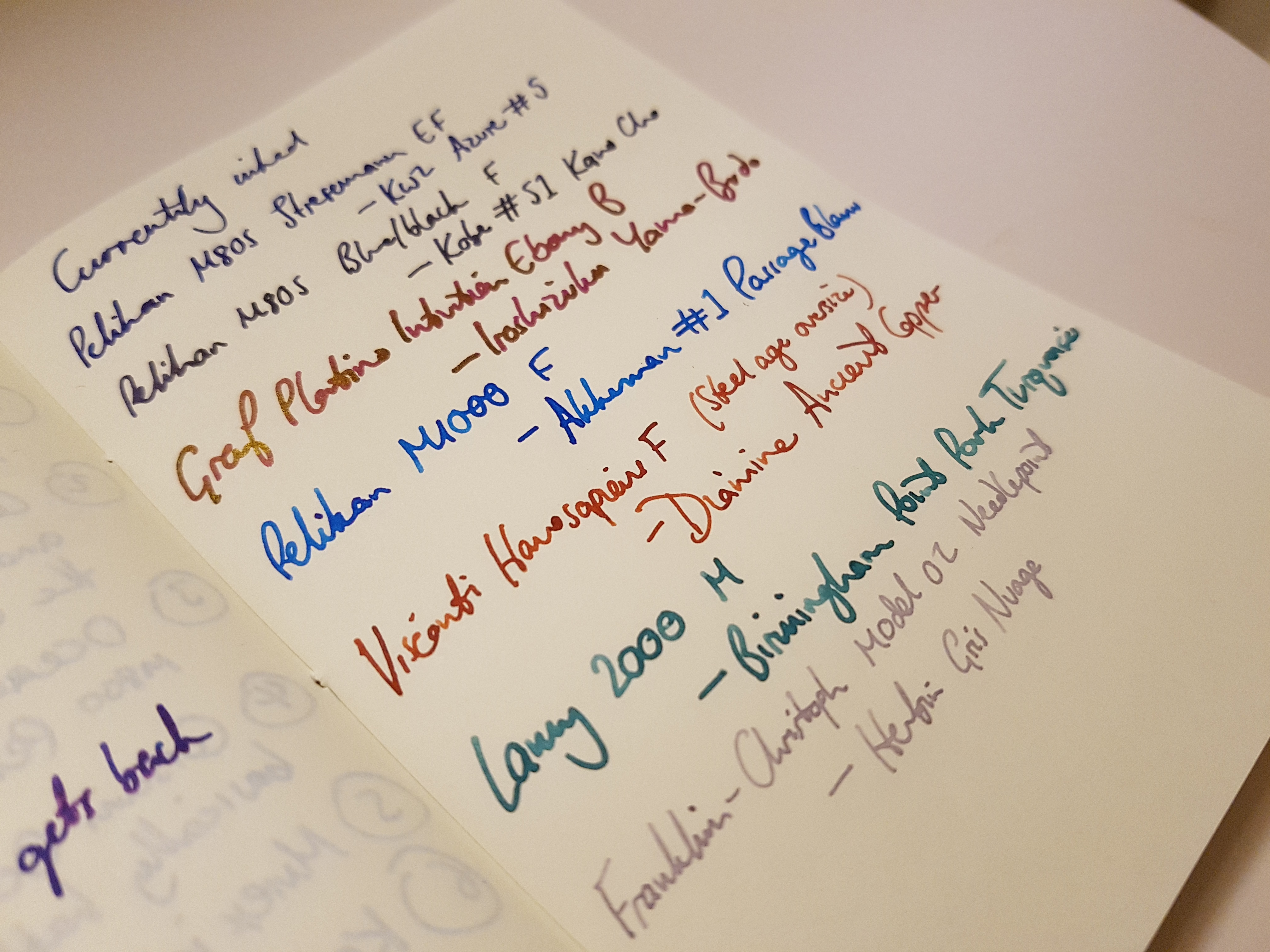
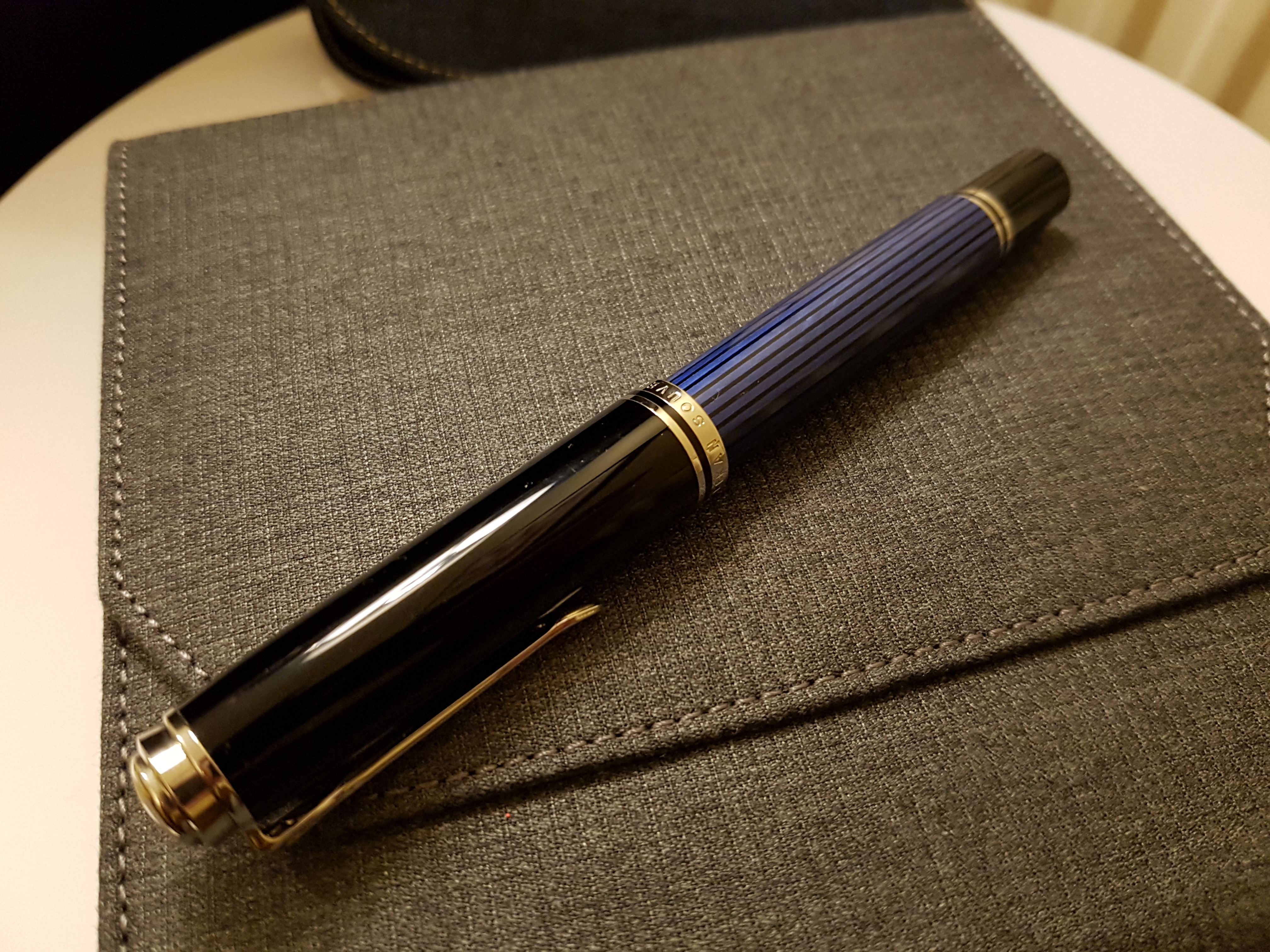
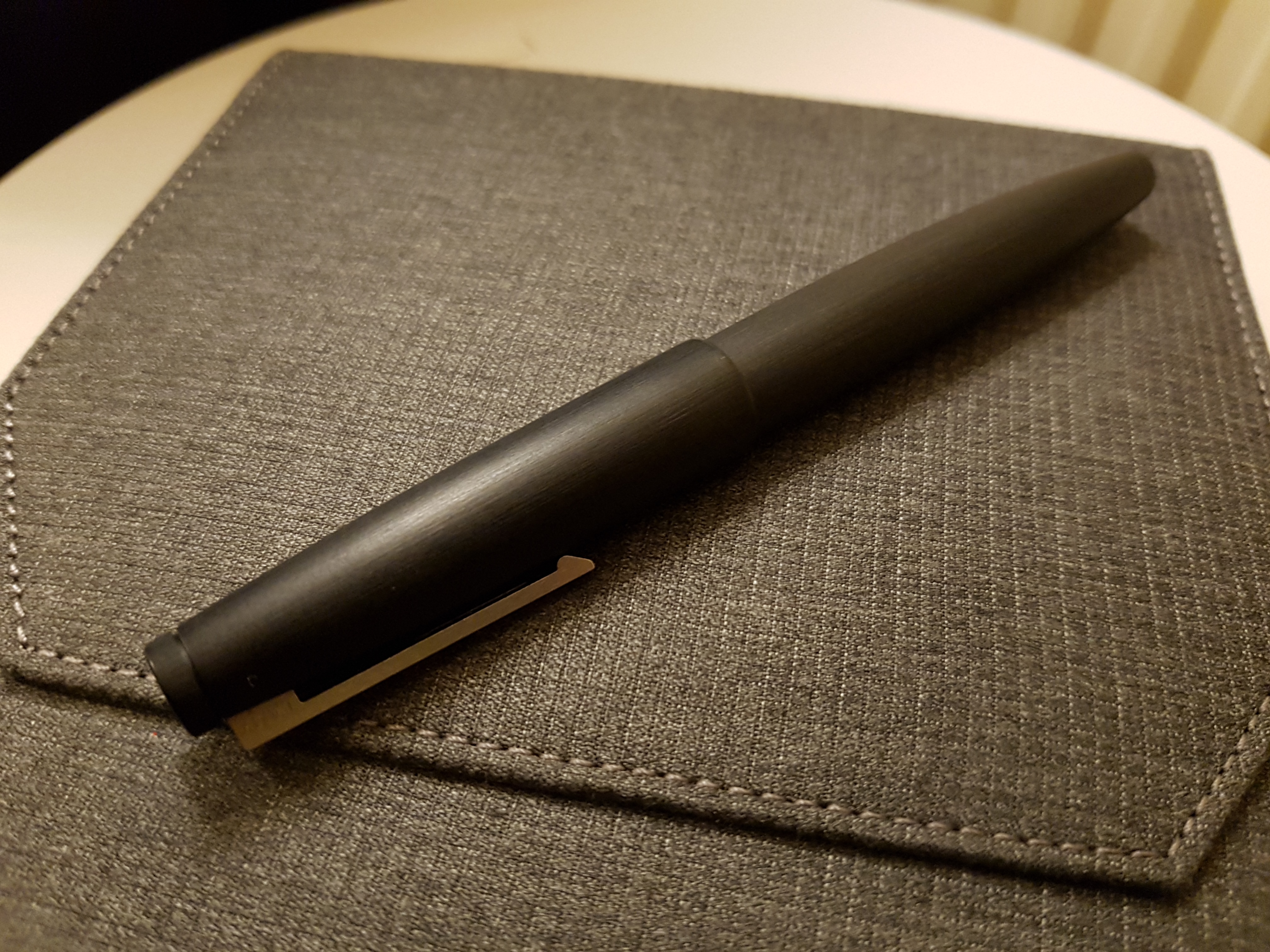
Pelikan M805 Stresemann EF — KWZ Azure #5
This literally arrived today, in trade for my ill-fated Pilot 823 FA. It’s weird getting two of the same pen, but I’m trying to acknowledge that 1) the 805 is one of my workhorses, so it’s better I have two of them than another pen I don’t use as much, and 2) the Stresemann stripes really appeal to me. Unfortunately, the EF nib was misaligned on arrival, which was an easy fix, but (as I feared) it’s exactly the same width as my F. Annoyingly, the famed grey stripes are noticeably slanted/wonky instead of running parallel to the barrel. And unlike the slick piston action of my other M805, this one was noticeably stiff. Oh well.
I chose to ink it first with KWZ Azure #5, a wet ink that I know really well (it was my favourite blue in my desert island lineup). I’m hoping it will help the piston to move a bit better.
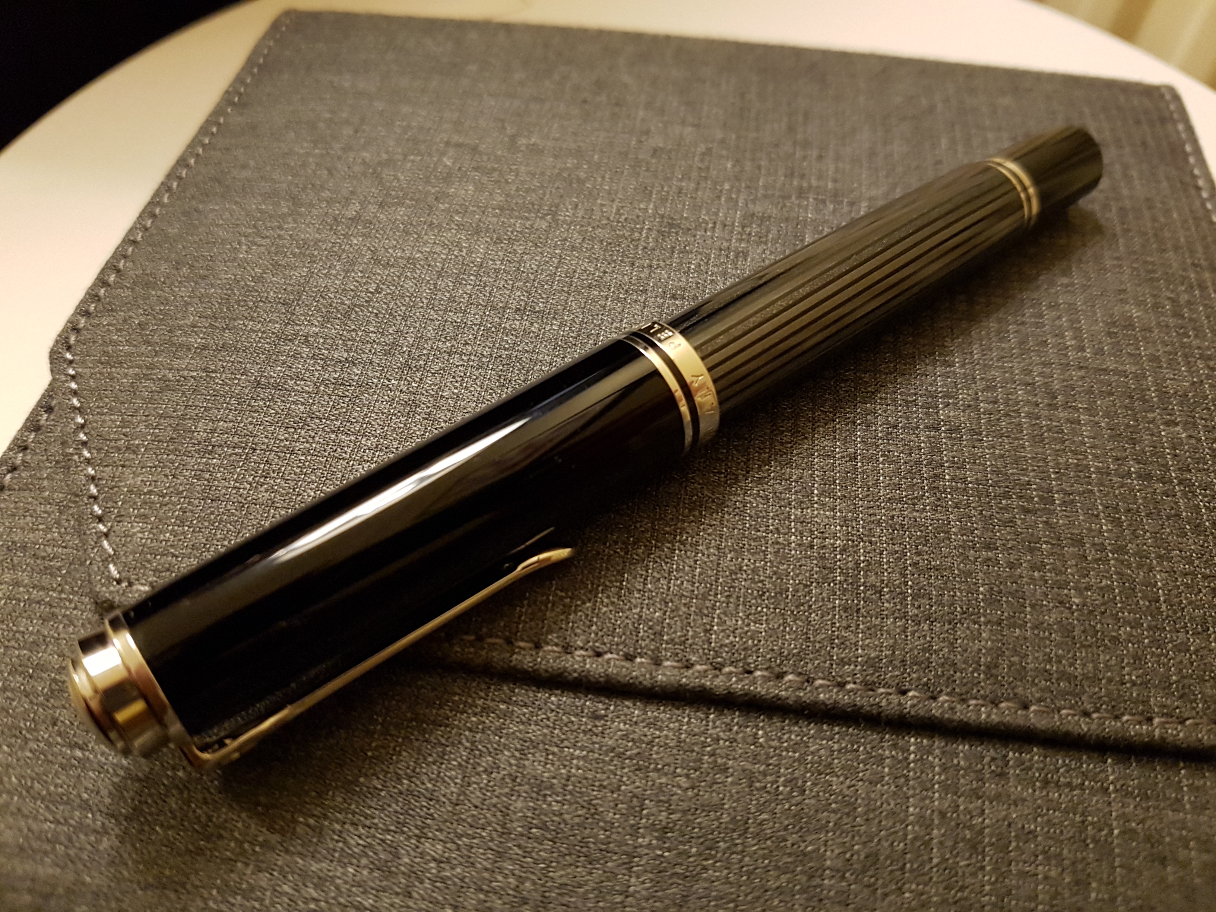
Oh, those canted stripes. Le sadness.
Pelikan M805 blue stripe F — Kobe #51 Kano-Cho Midnight
Two old favourites and a great reliable combination. The #51 is a wet blue black that I’ve often used in my Lamy 2000; here it works just as well.
Don’t worry old faithful, I won’t forget you.
Graf von Faber Castell Intuition Platino Ebony B — Iroshizuku Yama-Budo
The fat, wet bold of the Graf shows off the bold magenta colour and gold sheen of the Yama-Budo really well, and I’m enjoying the combination. When I’ve left the pen unused for more than a couple of days, I have suffered some hard starts, which other reviews have mentioned. But it’s not proving a deal-breaker for me.
Mmm, juicy.
Pelikan M1000 F — Akkerman #1 Passage Blauw
A combination that makes me smile every time. I find the M1000 so comfortable, its bouncy nib so fun, and the Akkerman ink feels wet and shades, and straddles the line between blue and turquoise just perfectly.
Stately.
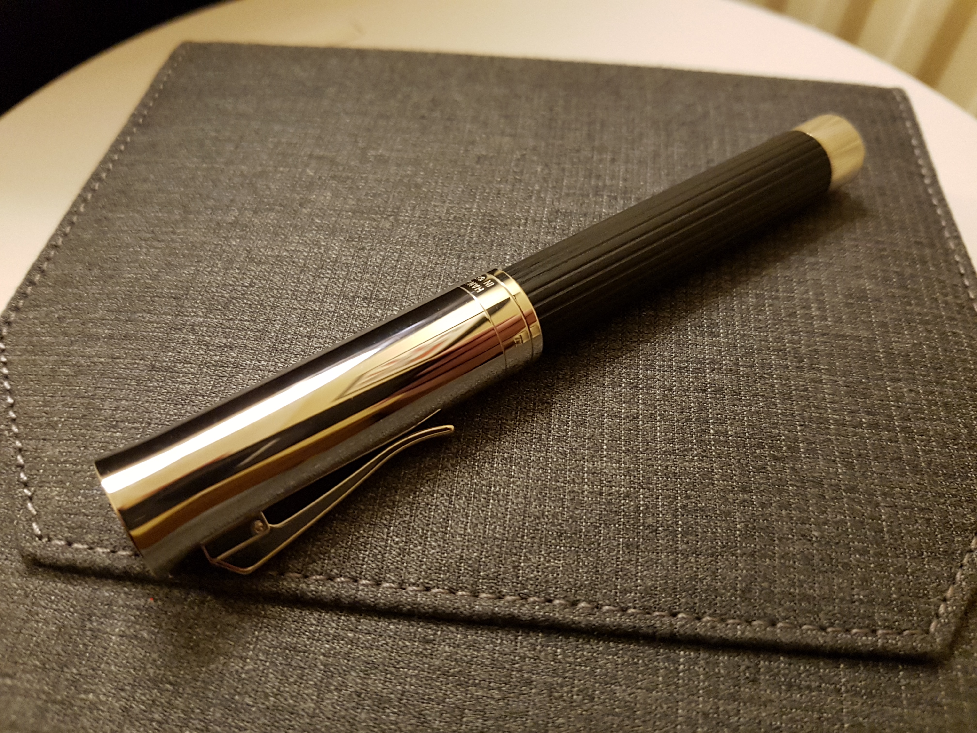
Visconti Homo Sapiens Steel Age Oversize F — Diamine Ancient Copper
I ran the Visconti dry of Earl Grey and decided that Ancient Copper was long overdue for a fill. It’s such a great colour, with brilliant shading and a gorgeous orangey tang that takes it away from a boring flat red. The Visconti is proving utterly reliable and graceful to use. It earned its award.
I missed Ancient Copper.
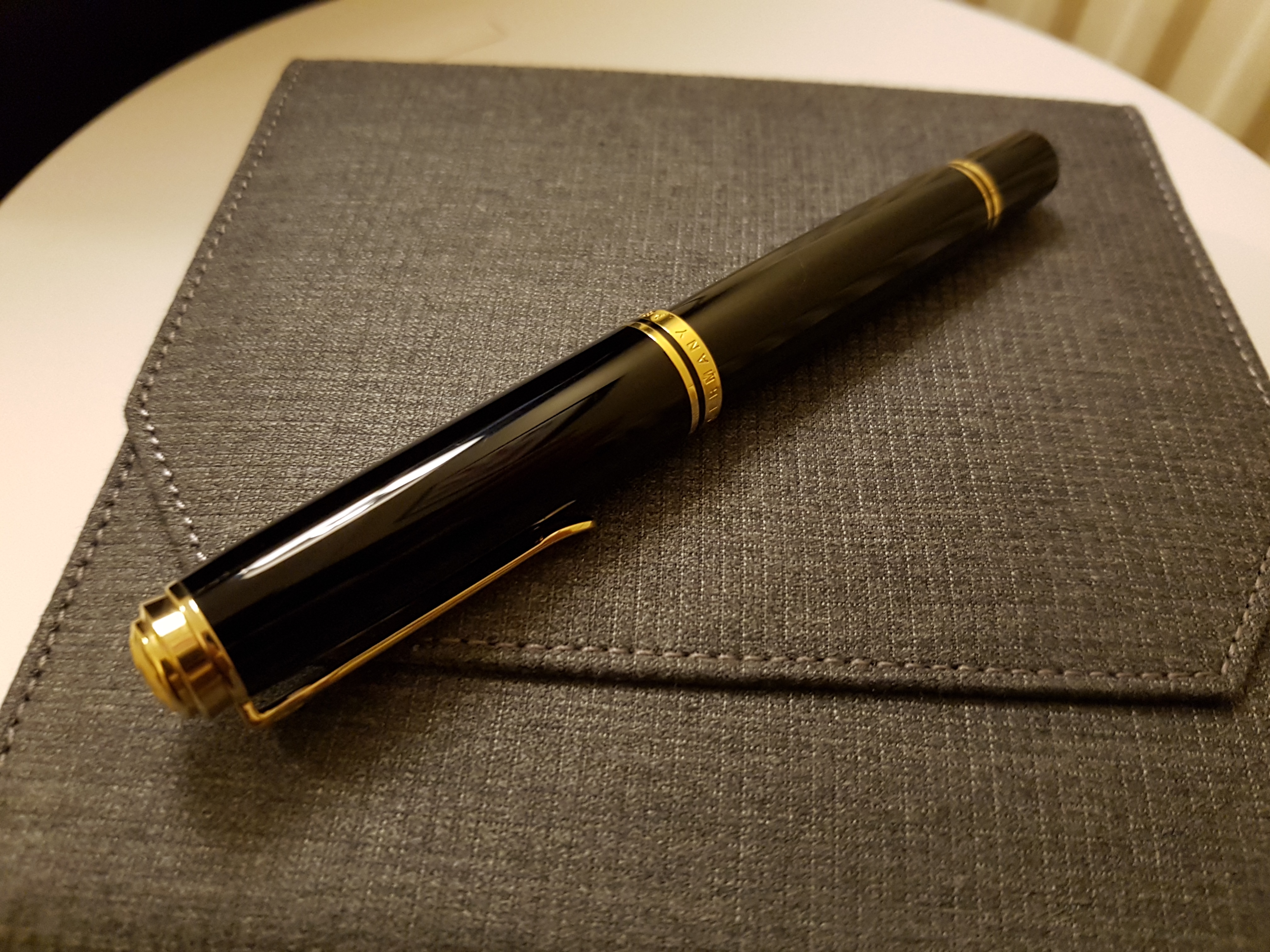
Lamy 2000 M — Birmingham Point Park Fountain Turquoise
For some reason I’ve tended to use the Lamy with darker inks, like the Kobe #51 and KWZ Azure #5 above. Seeing this buoyant green turquoise flowing from the nib is quite a pleasant surprise. And flowing is the word — it’s one of the wettest inks I’ve used.
Workhorse award well deserved.
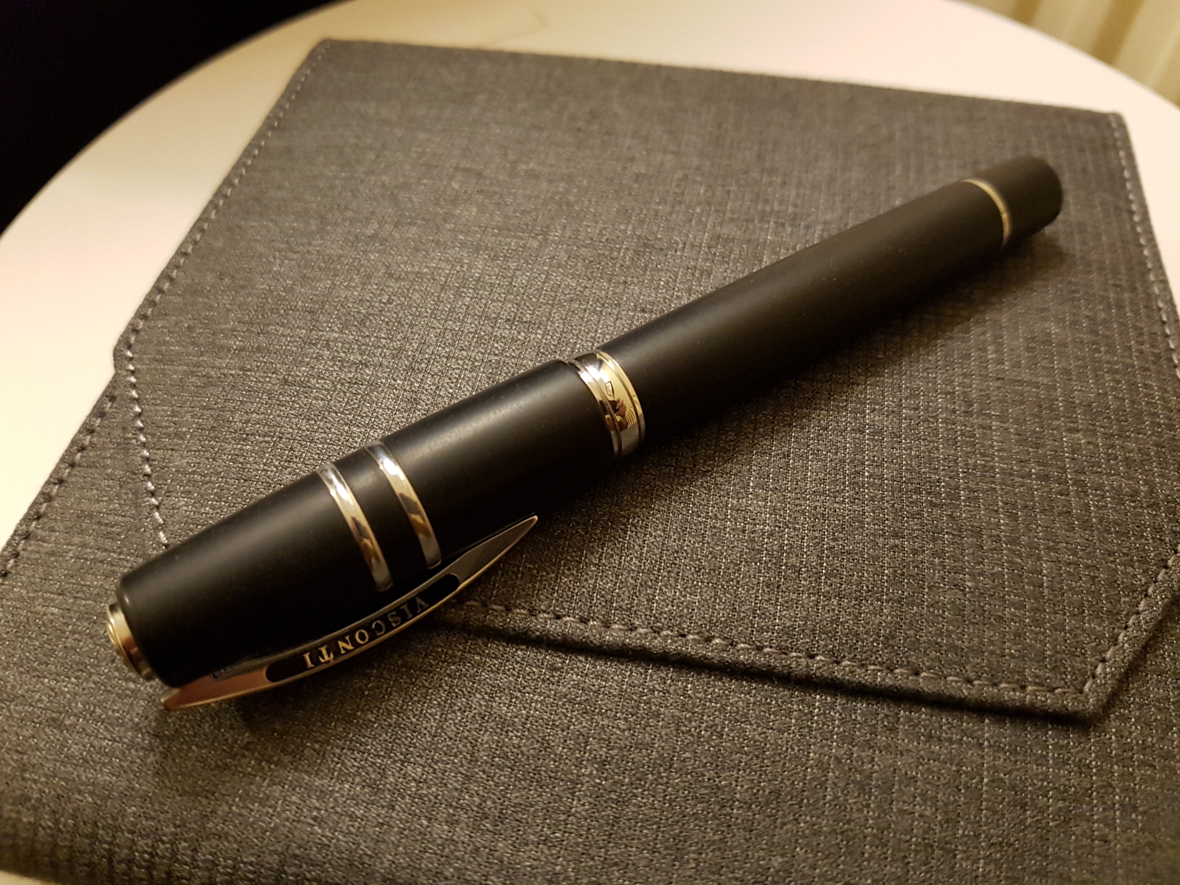
Franklin-Christoph Model 02 needlepoint — Herbin Gris Nuage
When I bought this pen on impulse from a friend, I wasn’t sure I was making the right decision (especially since I sold my Pocket 66 the same week). And when it arrived, the Masuyama needlepoint was incredibly scratchy and dry, much moreso than my UEF or other needlepoints. Cue buyer’s remorse. But a quick run over a nail buffing stick and a bit of nib-wrangling and I miraculously ended up with a super wet, super smooth EF. And now that the nib was dealt with, I could realise just how comfortable the 02 is in the hand. The smoke and ice finish is really pretty, too.
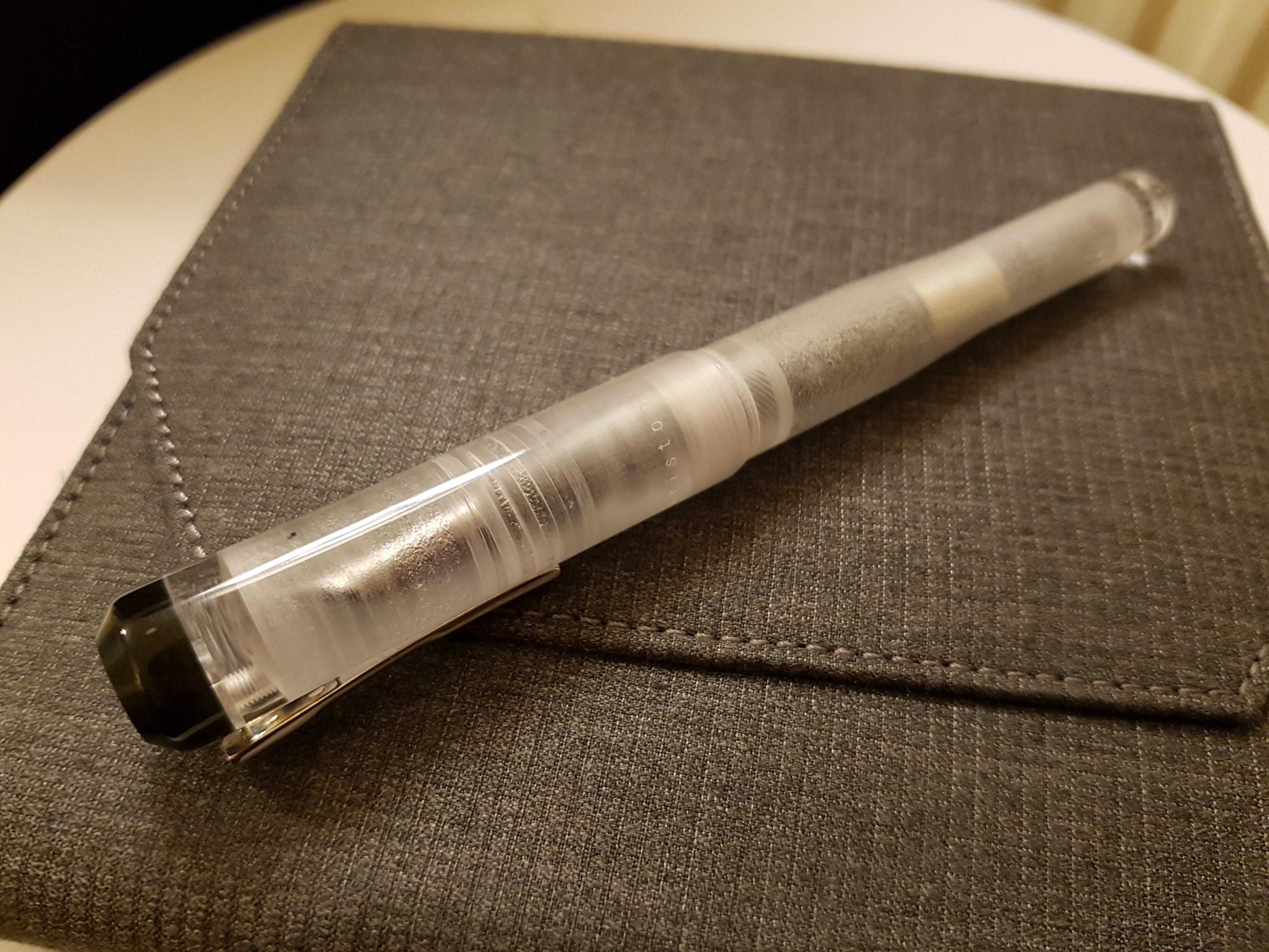
Even seeing a converter through the demo finish doesn’t harm the appeal.
The piston on the M800 you can lubricate really easily by unscrewing the nib section and sticking in a cotton swab with silicone grease on top — you probaly have some of it from TWSBI pens lying around…
Good tip – I will do that next fill!
That is quite a line-up. The fountain pen equivalent of a bunch of elite commandos.
Hah! Great image 🙂