I really, really wanted to love this ink. I’m not quite sure it’s right for me, at least with some of the pens and papers I use every day, but it might just be for you.
The Kyoto / Kyo no oto inks have been on my radar for some time — ever since someone on FPN pointed them out when they were only available from Japanese-language sellers, imported via Rakuten. Now you can get them from the Journal Shop, or in my case, direct from the UK distributor, Notable Designs, at no charge. Isn’t globalisation magical?
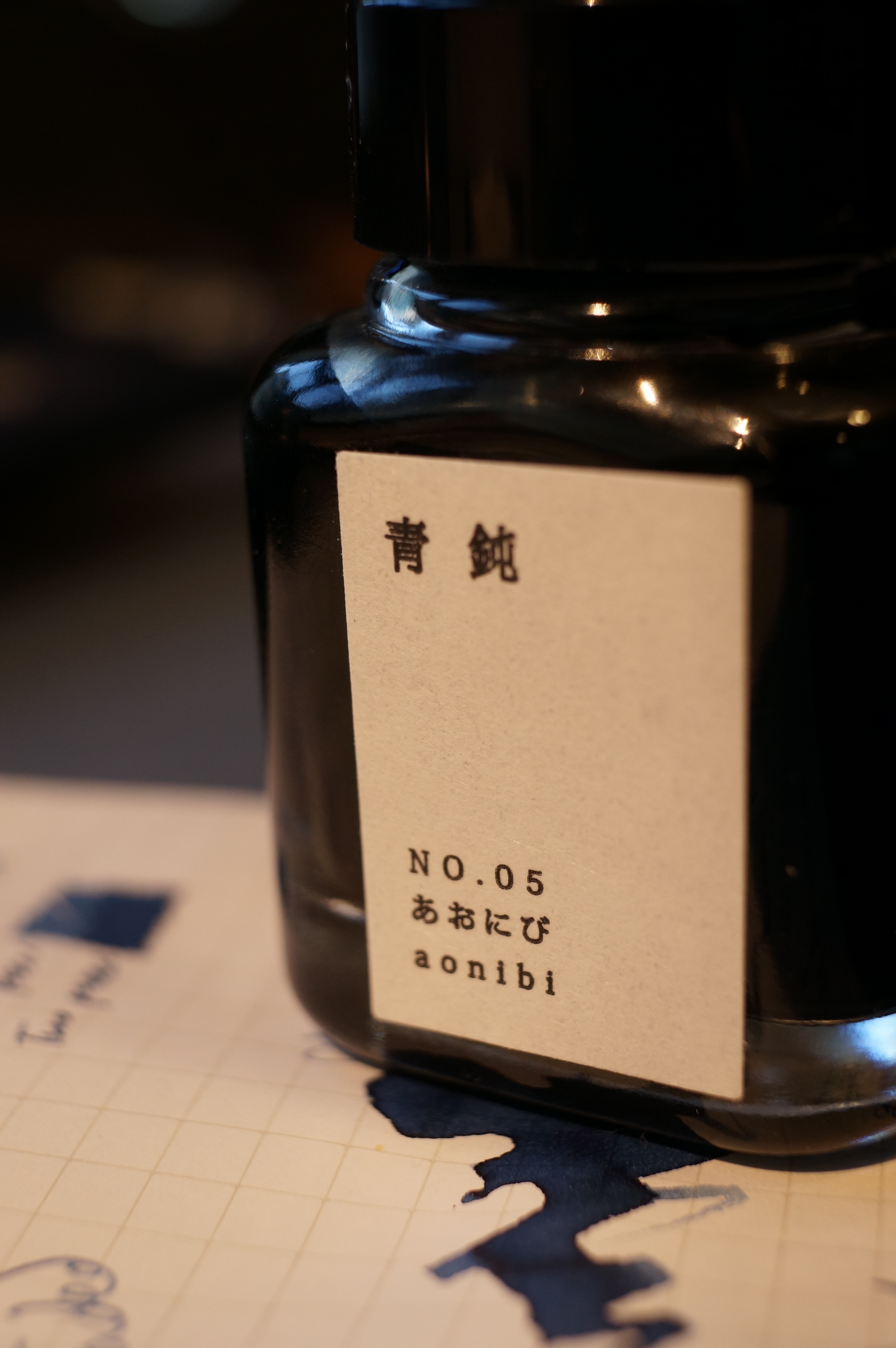
I’m a complete sucker for this stuff. Look at the graphic design on the box. The delicate rounded form of the 40ml bottle. The gorgeous label. The traditional Japanese dye techniques.

Phwooooar.
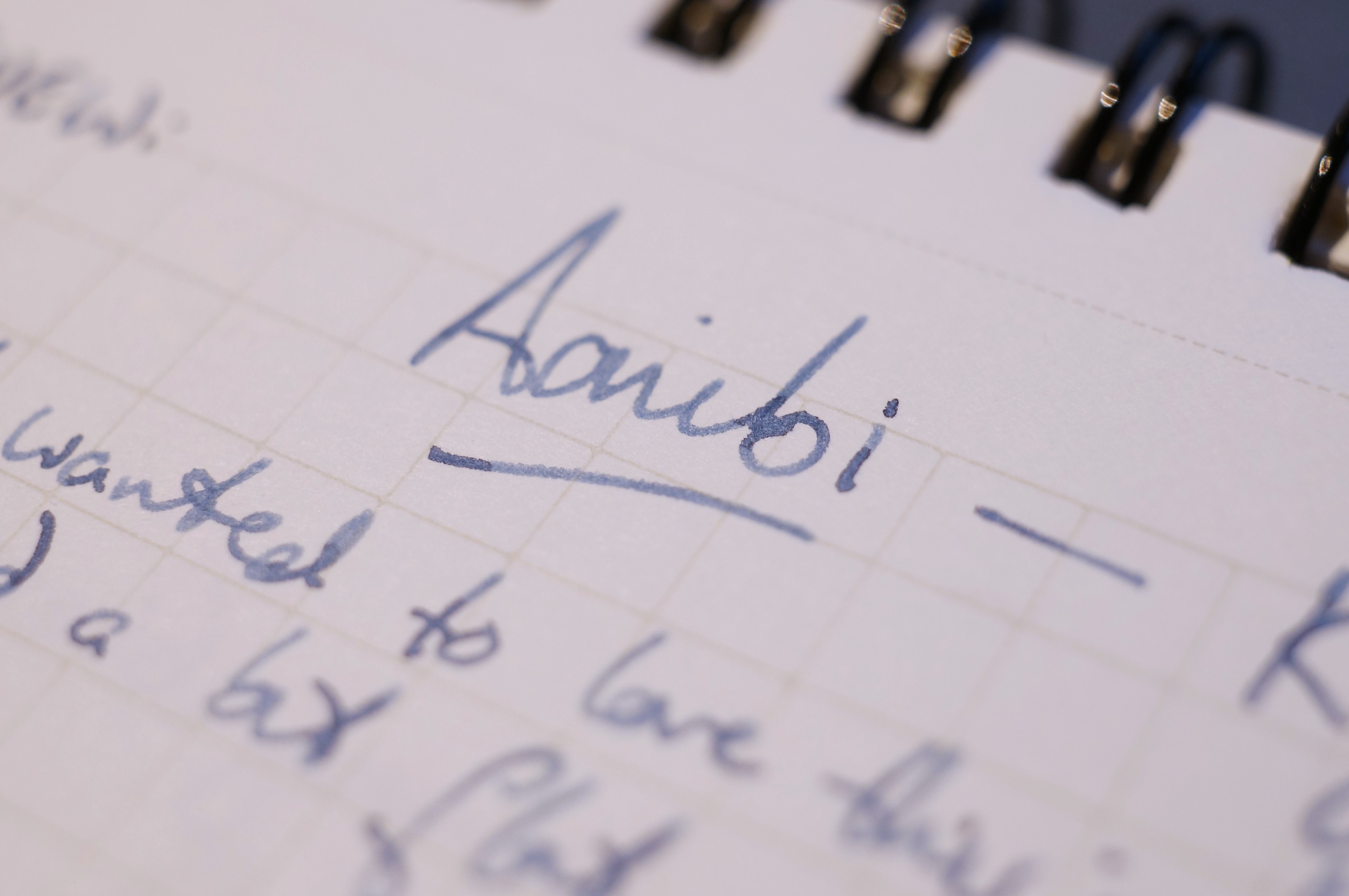
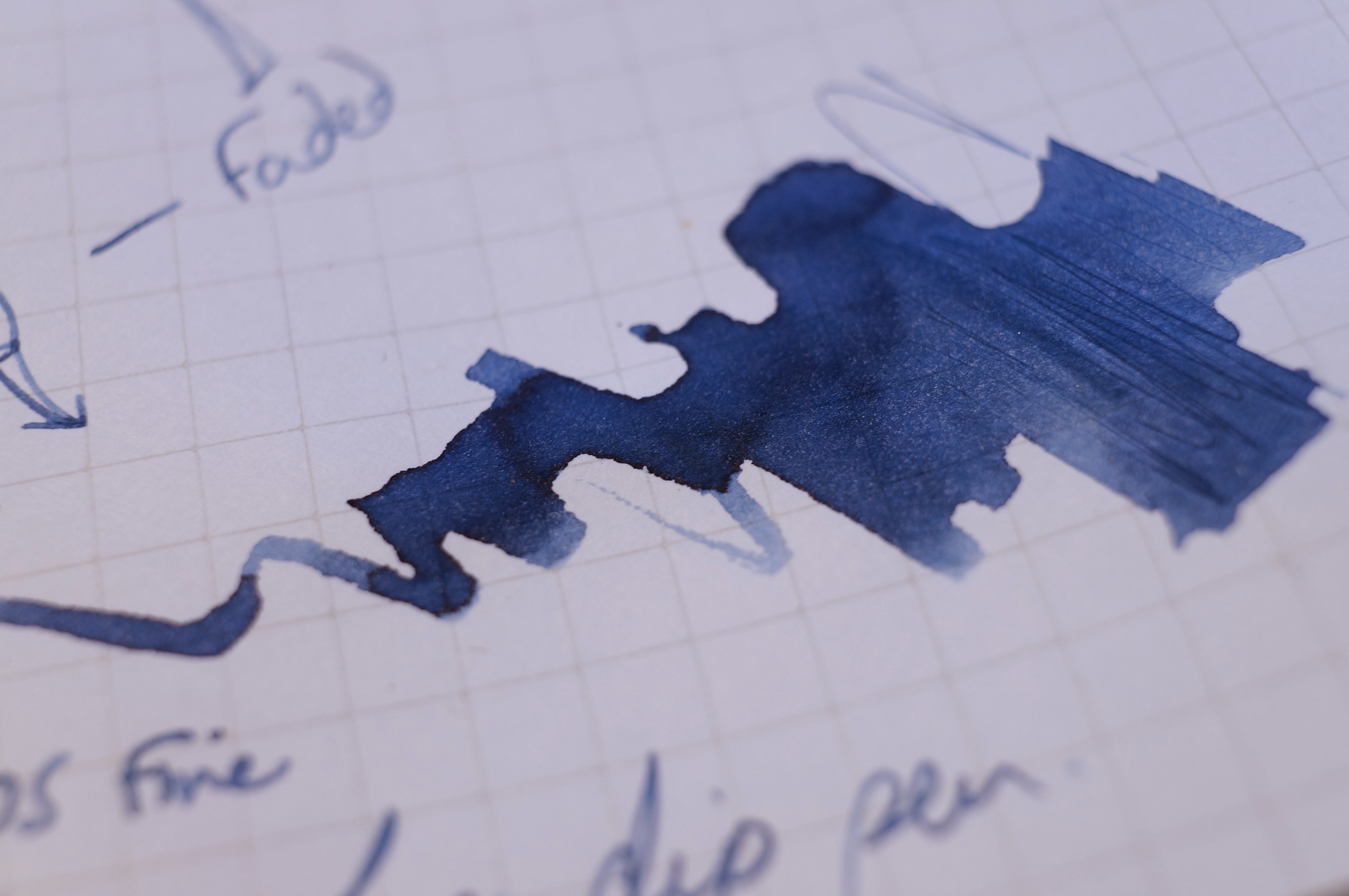
Where I love a wet, super-saturated ink with crazy sheen, Aonibi is a delicate blue-grey that’s at times almost pastel on the page. It’s like faded denim, a washed-out navy. It doesn’t have much green in it, or purple… it’s a true blue-grey, with a calming vibe. There’s a good amount of shading, but no sheen, and the saturation is light.
Aonibi is very well-behaved: I experienced no dry starting, skipping, blobbing or other issues. But in my opinion it runs a bit dry in some pens, and combined with choice of paper, that dramatically affects what you see on the page.
Note: I found this ink incredibly difficult to photograph accurately. Take the pics with a pinch of salt!
I used two pens for my main tests: a Sailor Pro Gear (medium) that I tried on Mnemosyne, Life, and Off-Lines paper. Here’s the Mnemosyne, where the ink looks rather soft and pale:

They should’ve called it “stonewashed denim”.
I also tried it in the ystudio desk pen with fine steel nib, which I wrote with for quite a few pages of my Hobonichi. Excuse the phone shot with slightly different exposure and white balance — Tomoe is a creamier paper but not this much warmer…

VOYEURISTIC THRILL ALERT: you’re reading my diary! Boring isn’t it?
As you’ll see, the ystudio and Tomoe combo performed much, much better than the Sailor, even though the Pro Gear is generally a medium-wet writer. Perhaps the problem is the Mnemosyne paper?
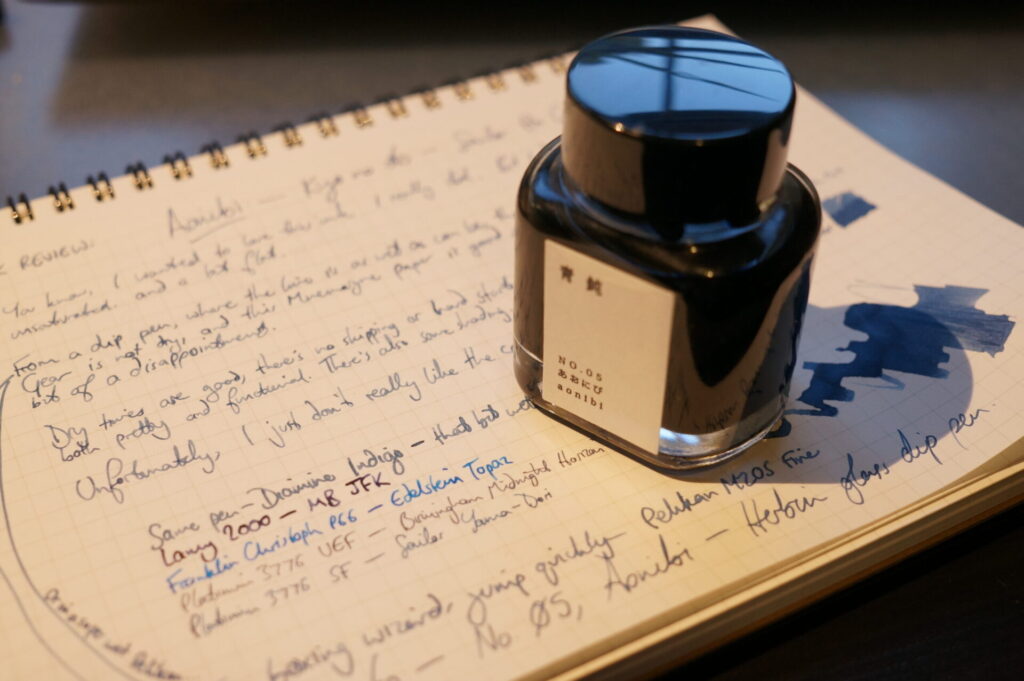
So I switched to my normally very wet Pelikan M205 (fine), and my Herbin glass dip pen. That’s when the colour at last developed a bit of pizazz on the Mnemosyne. Still not a Sailor ink, but more to my liking.

Pro tip: if you like ink, you need a glass pen in your life.

Aha, there you are.
You’ll see that, at full intensity in the swatch, the colour’s really nice. So with a wet, broad pen on good paper you’ll be in luck. Or, of course, if you like a soft, pale ink, you’ll be very happy too. But make sure you pick the right nib and paper for what you want to achieve.
At £20 for 40ml, this is one of the more expensive inks you can buy. You can get almost the same colour by buying Diamine Indigo… £2.35 for 30ml. But hey, then you don’t get the squee feeling of the beautiful Japanese bottle, right?

Leave a Reply