
This is an addictive, yet frustrating pen. Let me talk you through what I love about it — and what makes me just a little sad inside.
Sod all these generic “minimalist” kickstarter pens.
What’s great
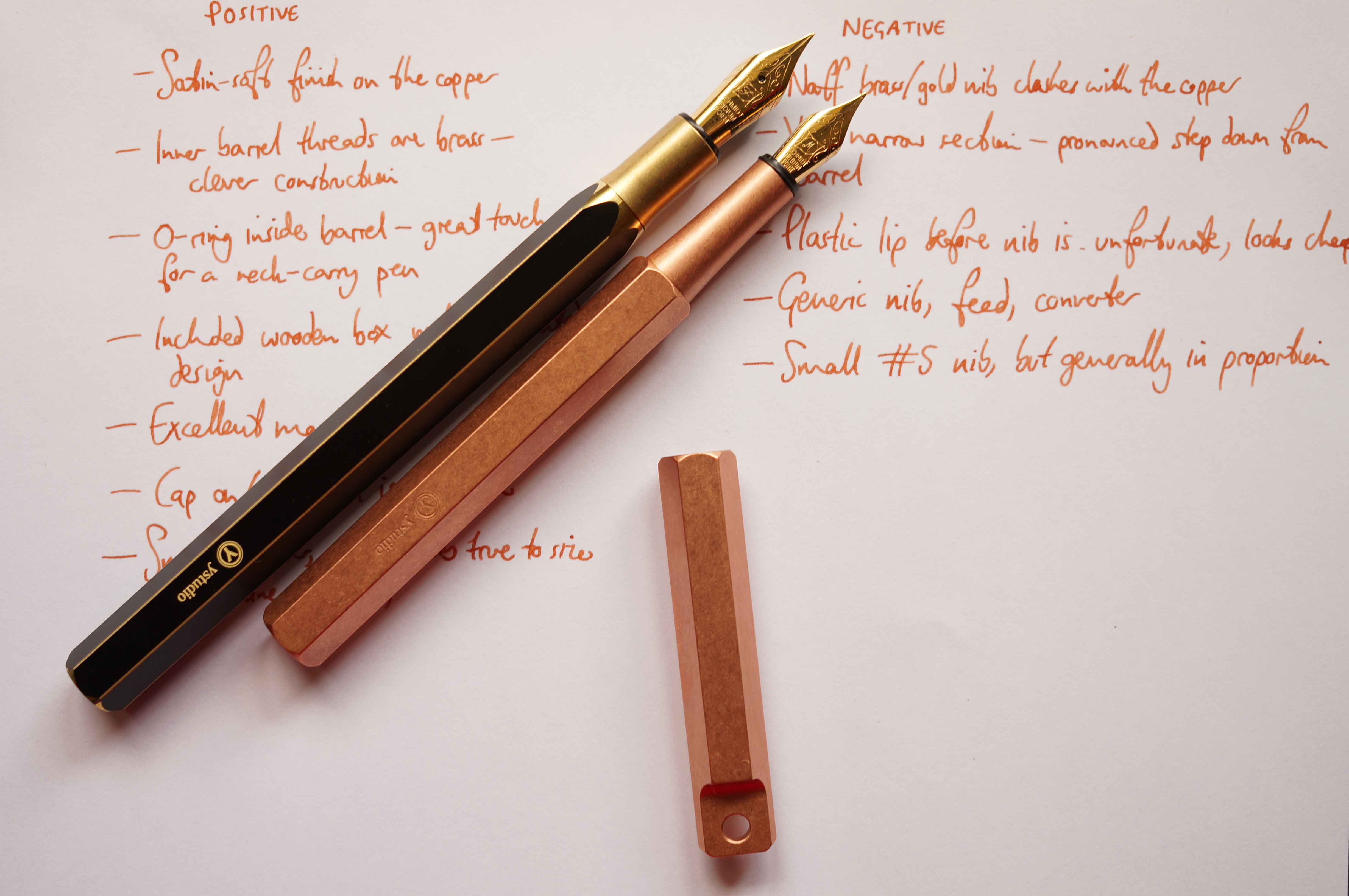
ystudio has done a marvellous job of the machining on this beauty. The copper is stonewashed so it actually feels soft. The branding is a subtle stamp. It almost looks like it came out of a master blacksmith’s forge in feudal times.
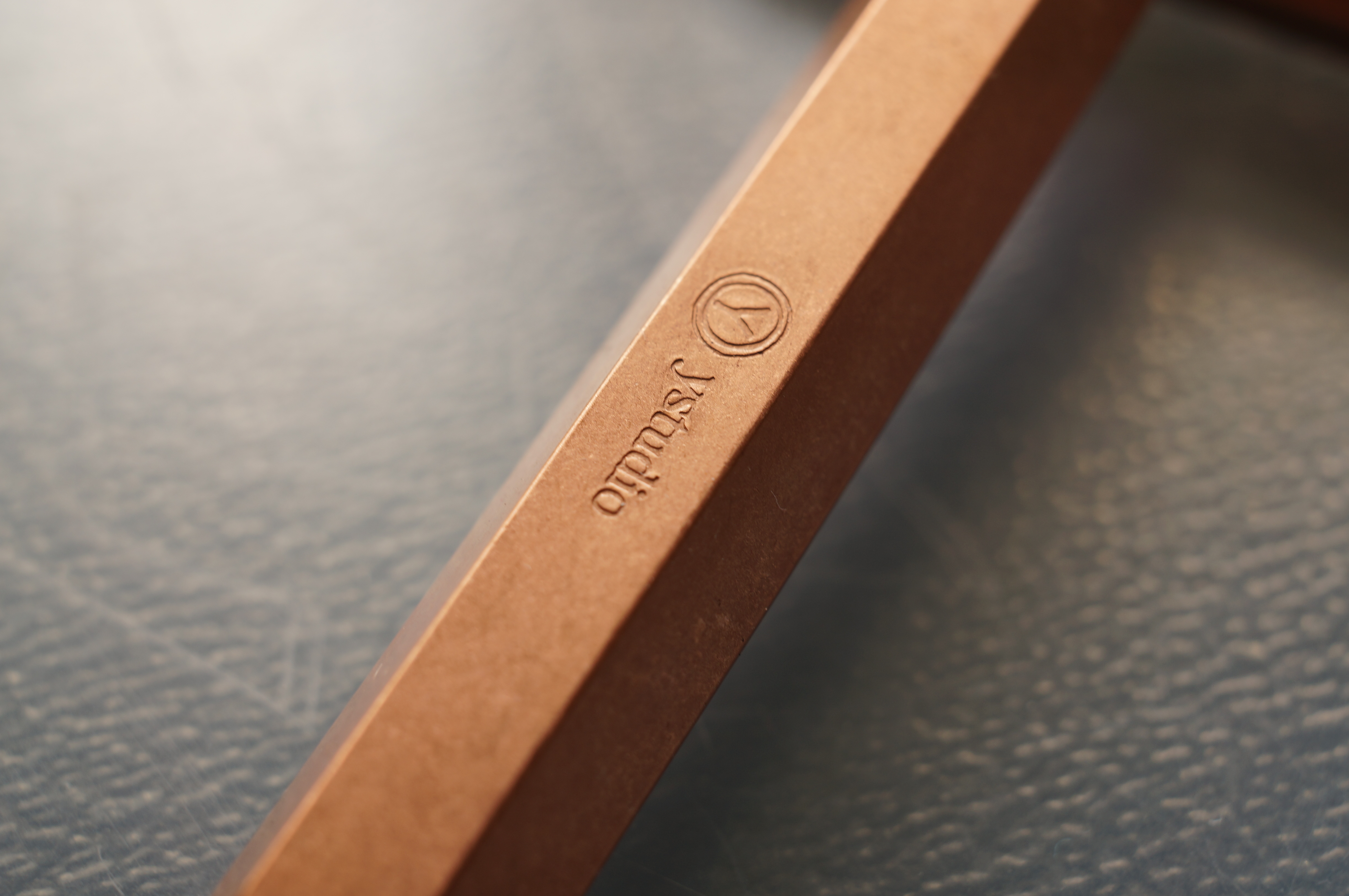
Stampy stampy. Mmmm, stonewashed.
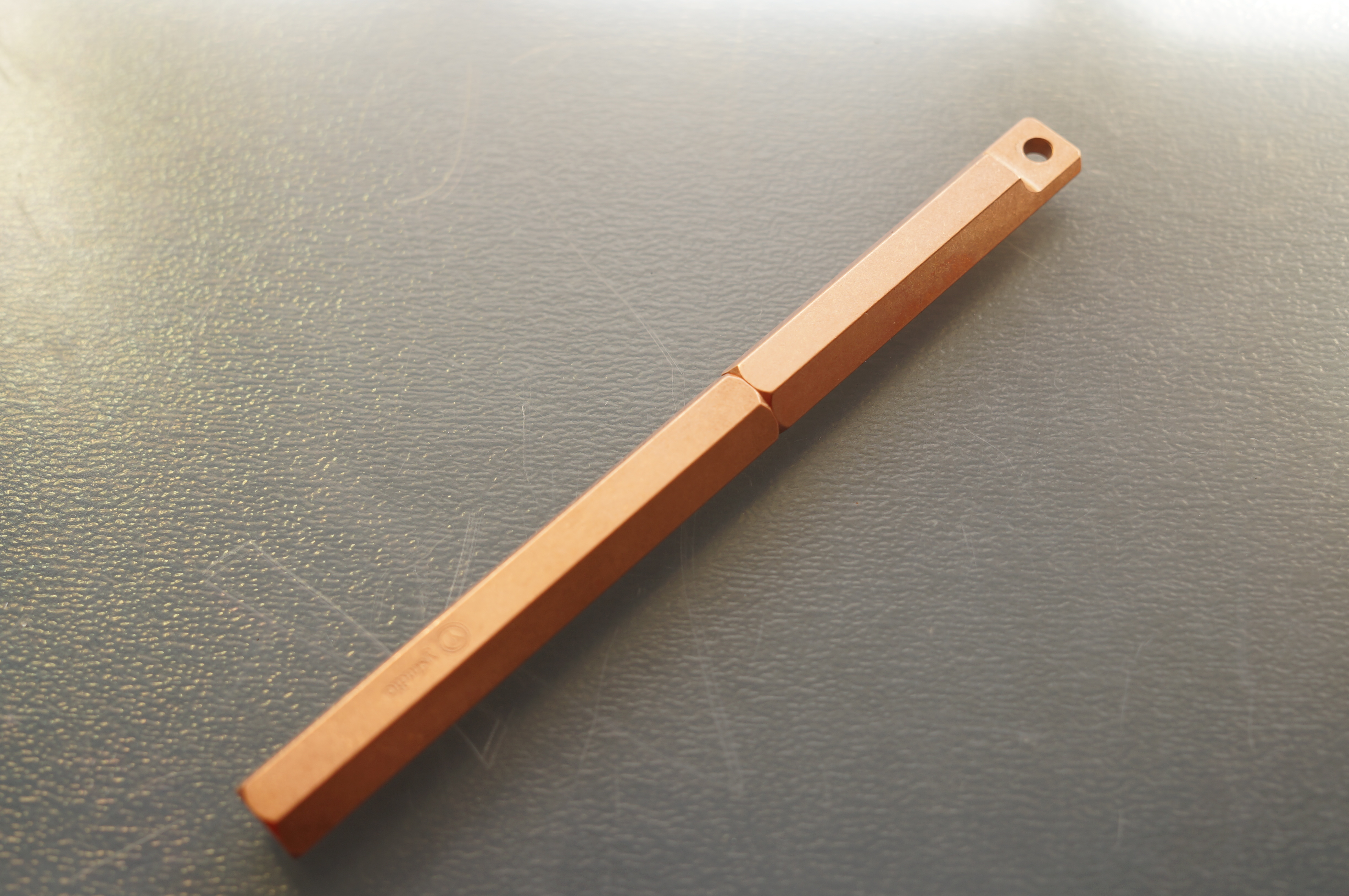
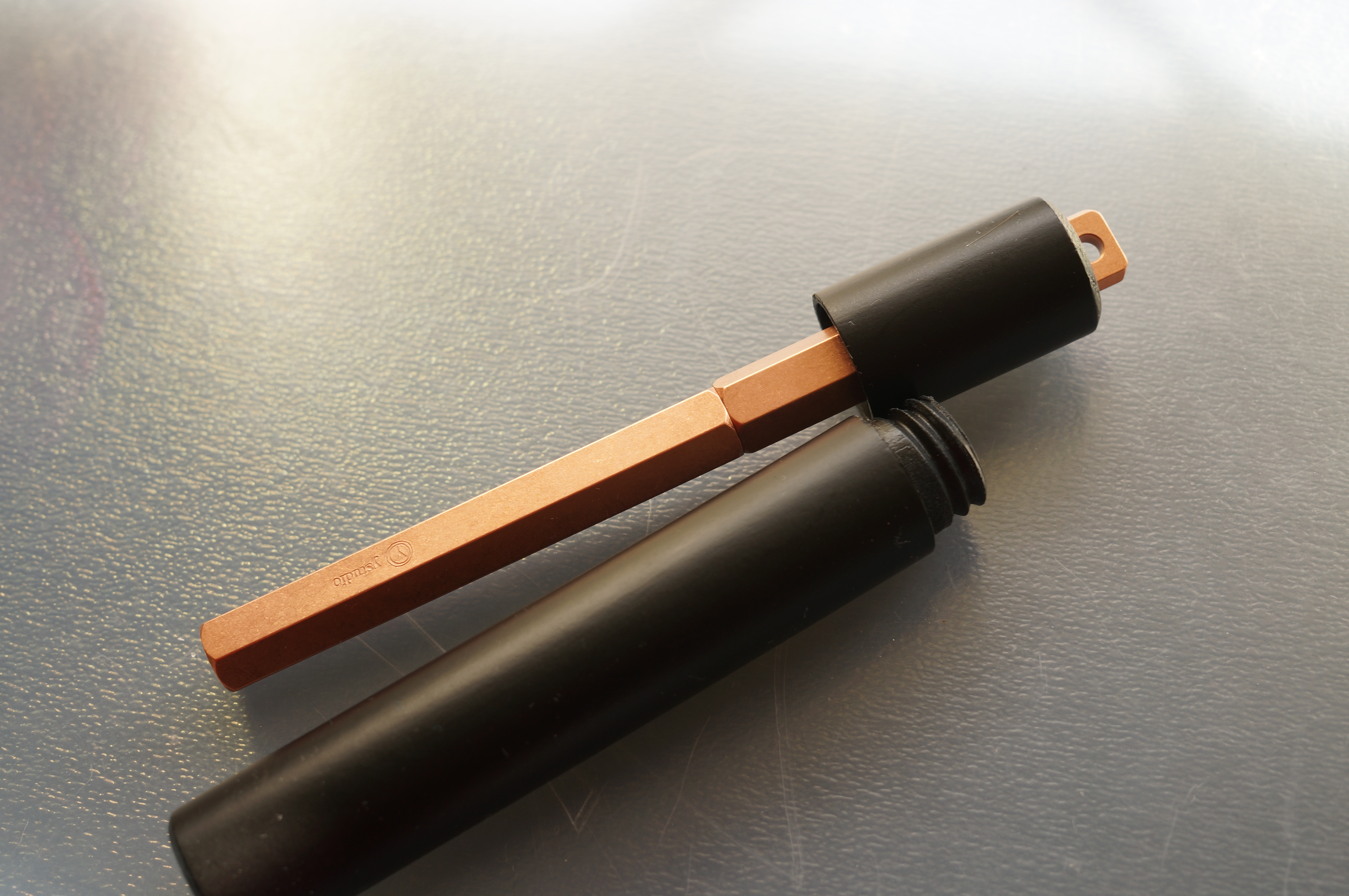
The proportions are fantastic. The lanyard end is neat, simple and well finished.
Look at that. So minimal. Much wow.
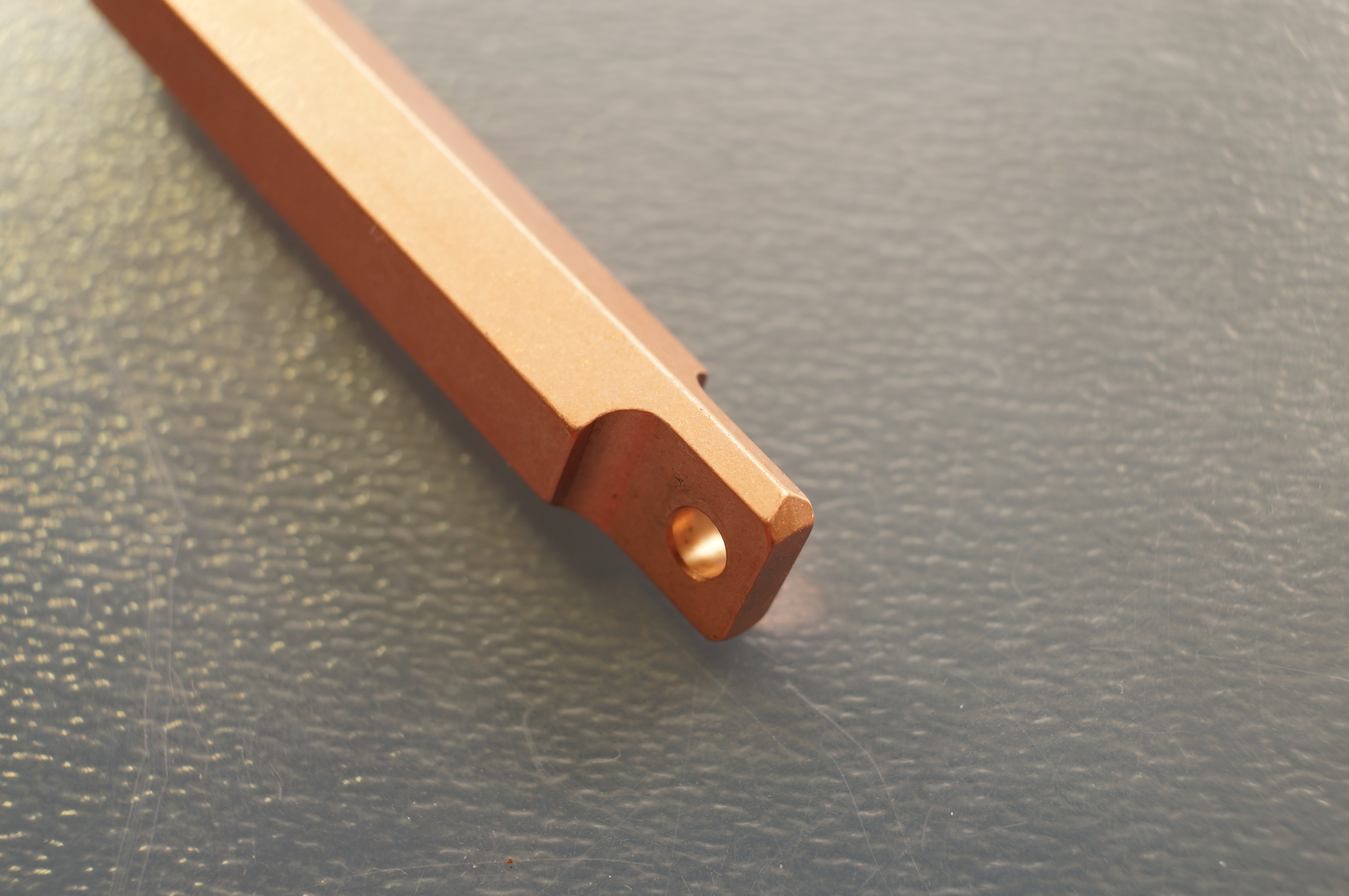
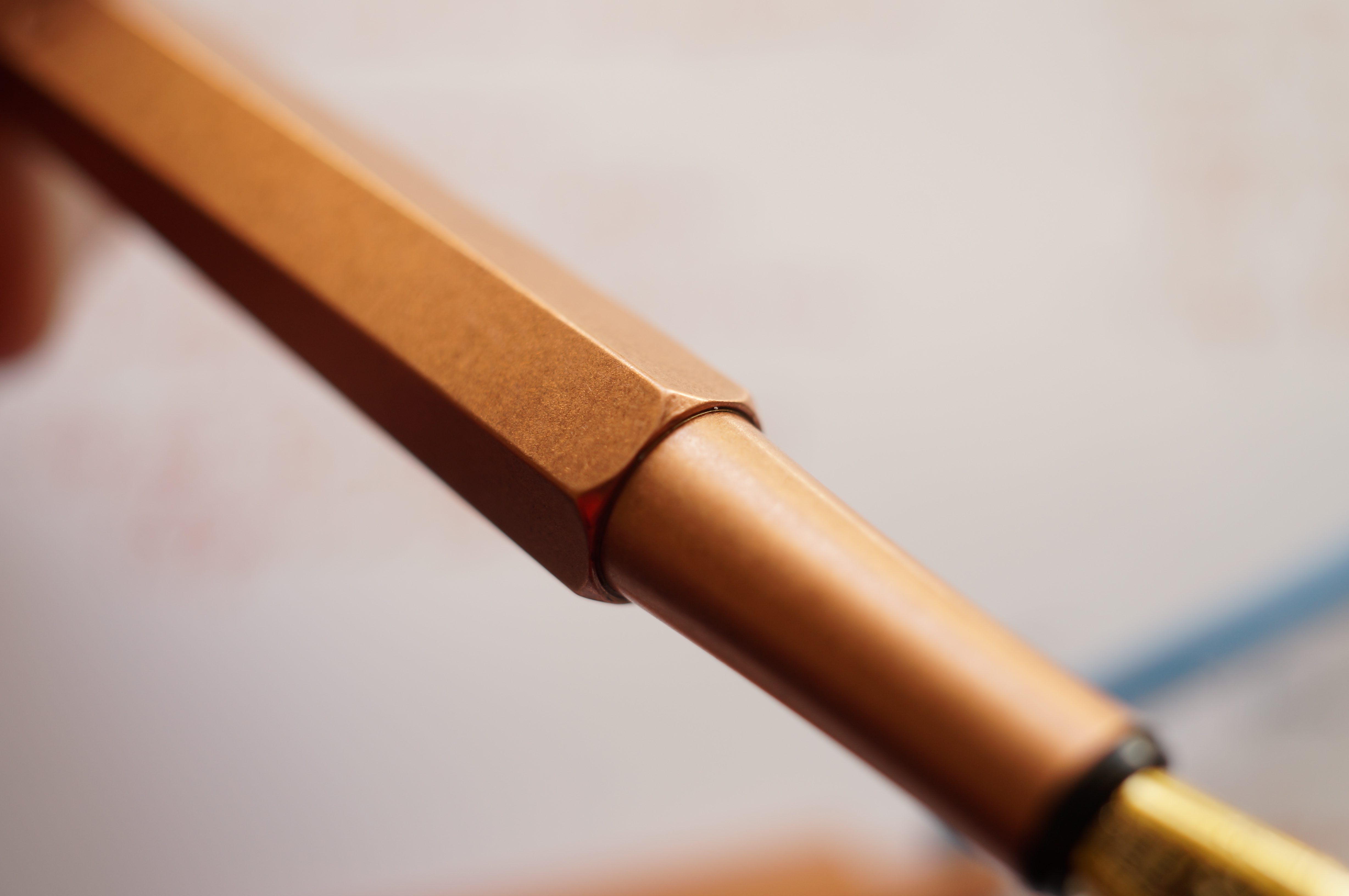
The attention to detail extends to areas out of sight of the user. The barrel threads are a brass insert, presumably for durability.
Brass threads neatly inserted. A lot of work has gone into this.
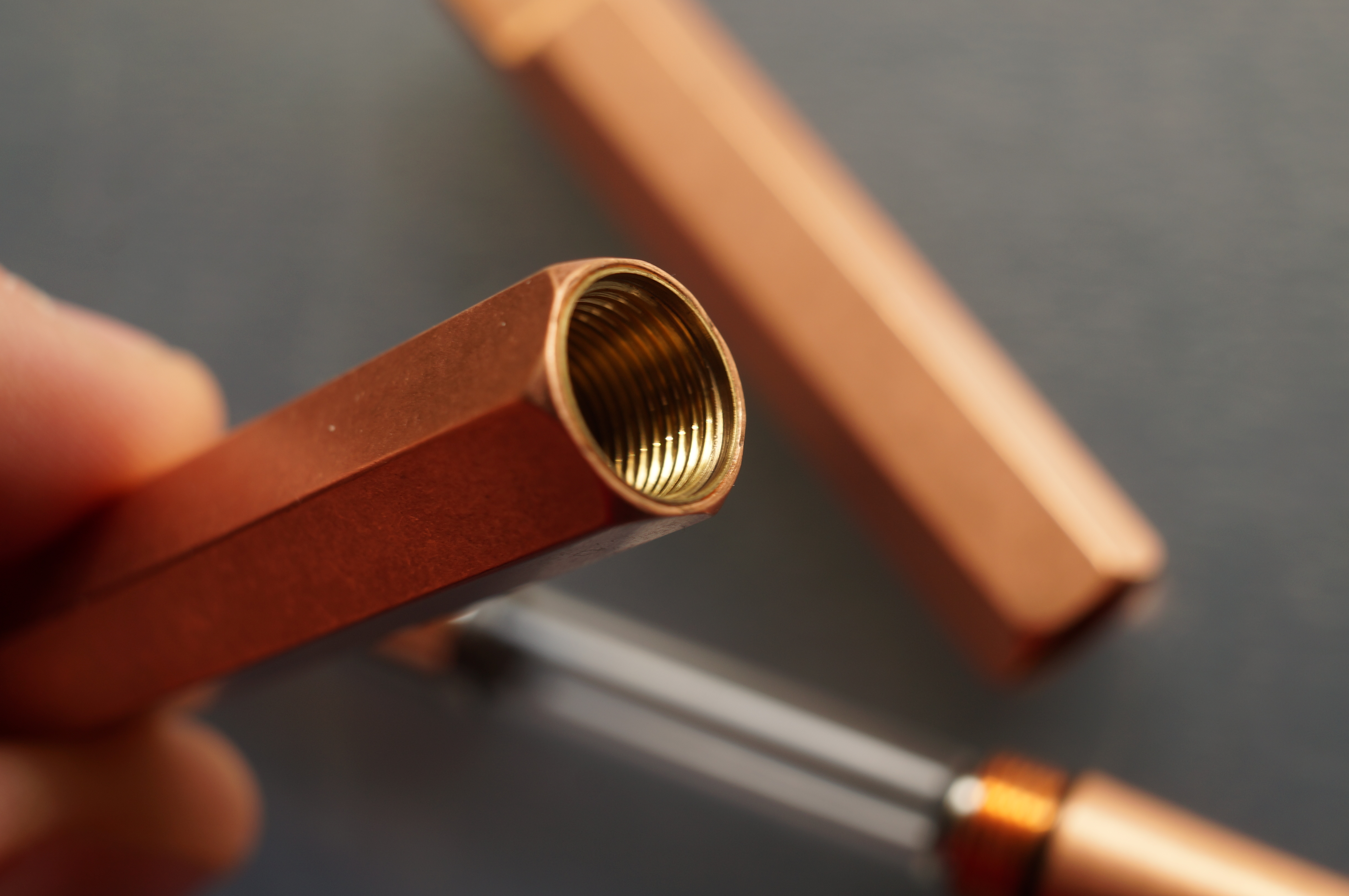
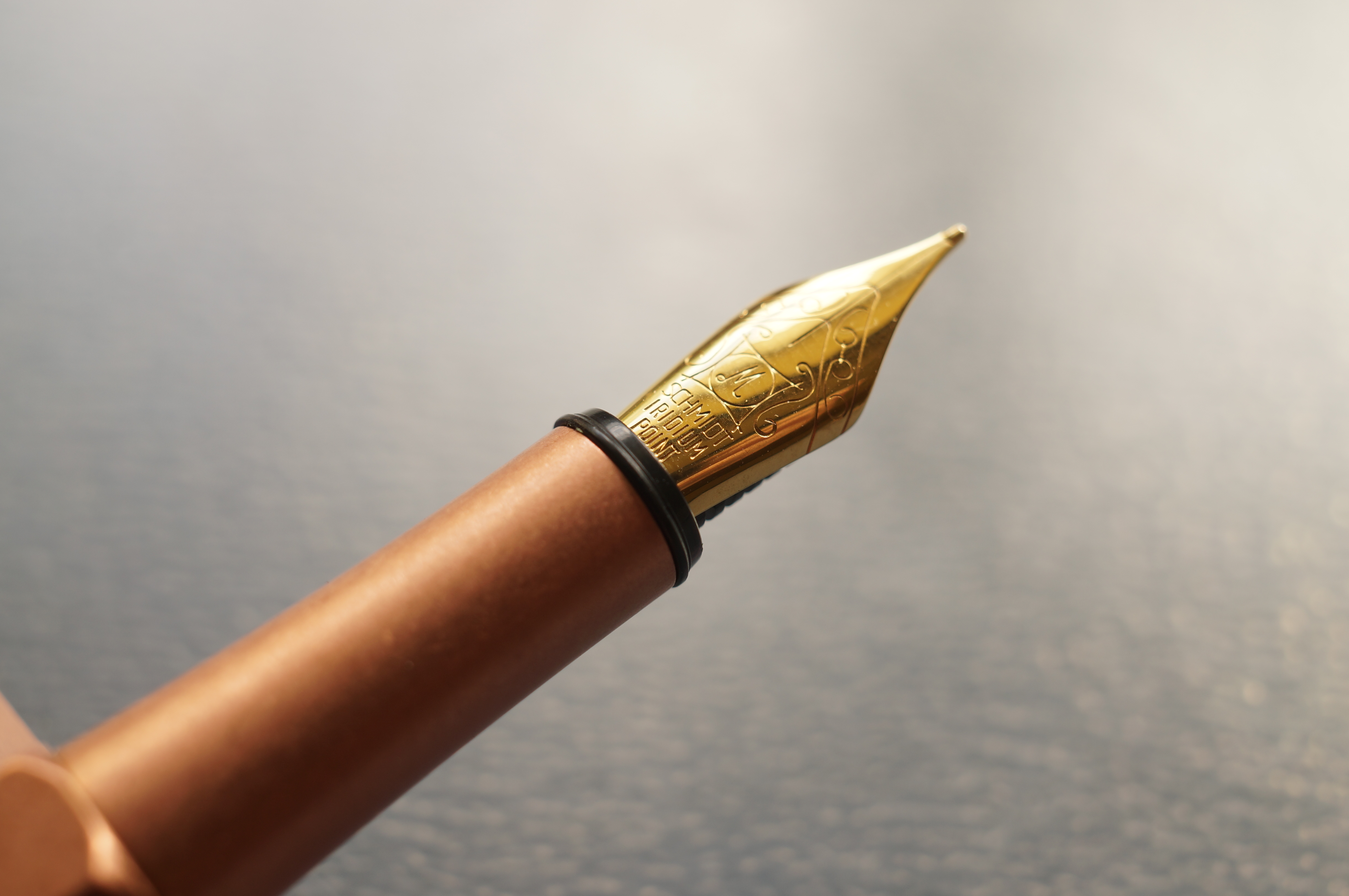
There’s an o-ring too to stop the barrel from loosening if you carry it on the lanyard.
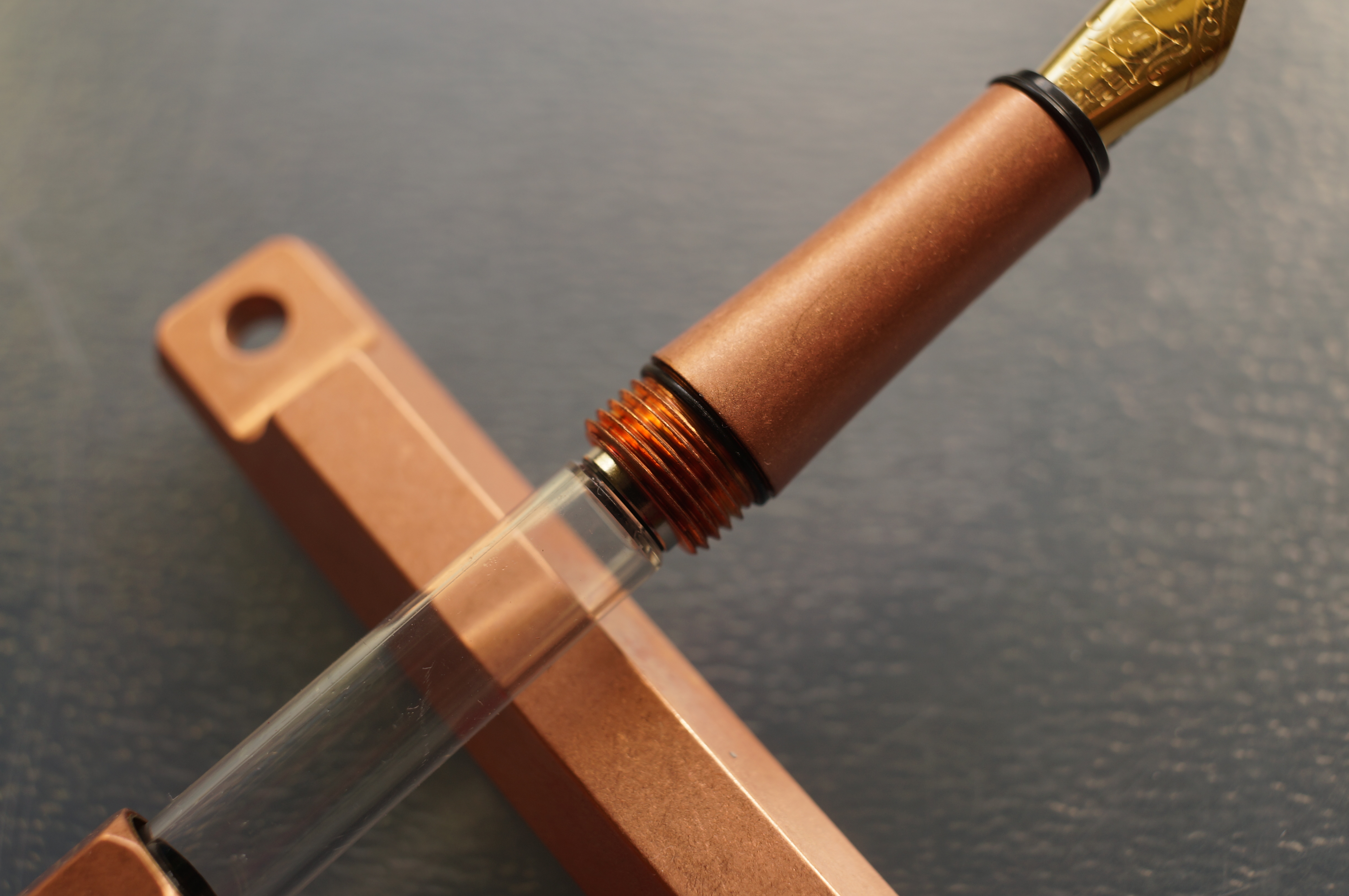
Yep, it’s a generic Schmidt converter — but there’s an o-ring to stop the barrel working loose!
And it all fits together so well. The feeling of snicking the cap on is just addictive — so smooth, so positive. It’s like you’re buying a pen and getting a free fidget spinner.
And that’s before I even get to the concept of the portable pen. It’s just like with the desk pen: ystudio has sat down and thought about how people might fundamentally use a writing instrument, instead of launching straight in to drawing the conventional pen.
So there’s no clip here, just the lanyard hole: you’re meant to attach the cap to a bag or sling it around your neck. With the slipcap, it’s the work of a moment to get the pen ready to write. Because the finish is all raw copper, you don’t have to worry about scratches or scuffs — but if you are worried, you can cosset the pen in a handmade wooden case, complete with wooden screw threads. It’s wonderfully rustic and pairs well with the copper. The cap pokes through a hole in the case meaning it’s actually integrated in how you use the pen. Just unscrew the bottom of the case and tug on the pen. With this usage in mind, ystudio hasn’t bothered to think about anyone posting the pen — why would they? Single-minded. Boom.
Warning: if you have OCD tendencies, lining up the facets will drive you crazy. But that aside: look at how cool this protective box is.
The pen comes with a leather thong and brass bead (not copper?) to suspend it, but the hole is big enough to use paracord if you prefer. Note that the thong isn’t long enough to wear as a necklace.
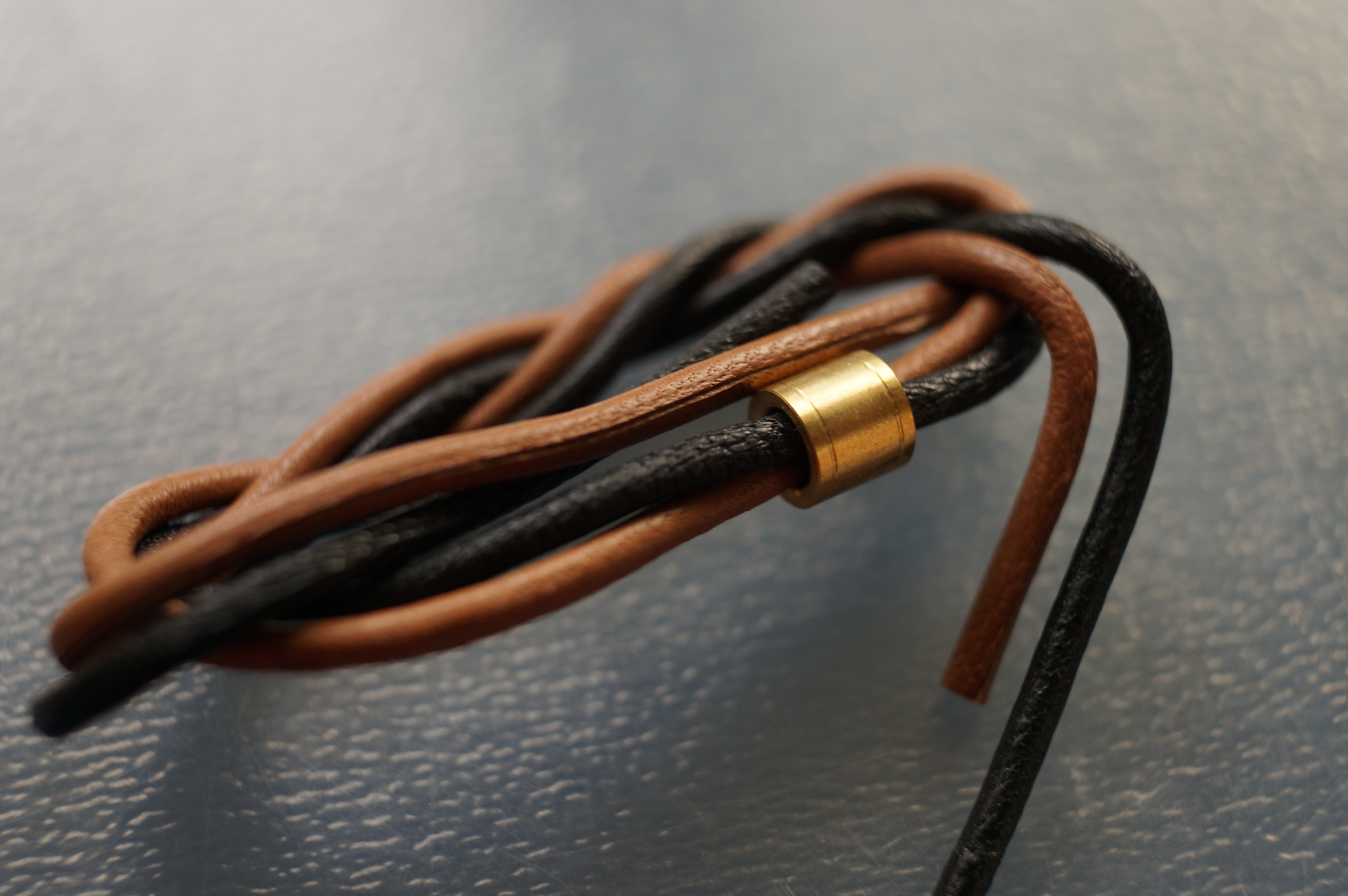
Attention to detail: lots. But why brass?
Vegans, rejoice!
And, of course, the pen’s been designed to be nice and compact for maximum portability. I found the size and weight generally good and comfortable — even though it’s a heavy material, it was well balanced. Seen here against the much, much larger desk pen.
The desk pen dwarfs this baby.
Just like its larger brother, the portable comes in exquisite packaging. This time the cardboard sleeve is white.
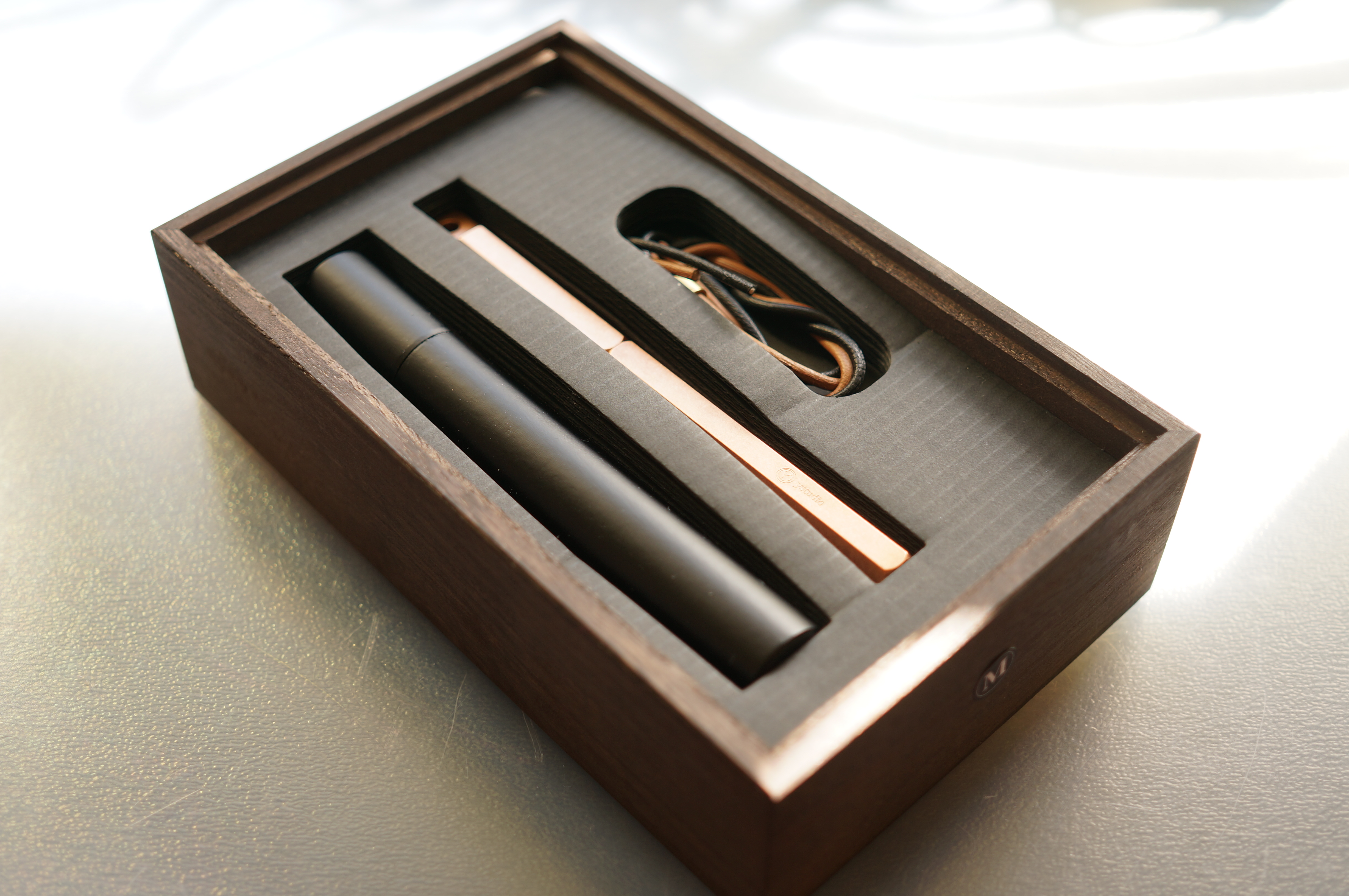
This is not just a pen — it’s a package.
What about the writing experience? Well, it’s a smooth writer, medium flow. The nib’s a medium and it runs true to size. No flex, of course, but I actually quite enjoyed the no-nonsense line it put down. You can see some of the samples in the pics above, but here’s a close-up.
That ink is Moonlight of Higayashima by Kyo-Iro. Pro tip: if you see moonlight that burnt orange, the world is ending. Run for the hills!
Now, let’s take a look at the flipside. Where does the pen fall down?
From great to hate
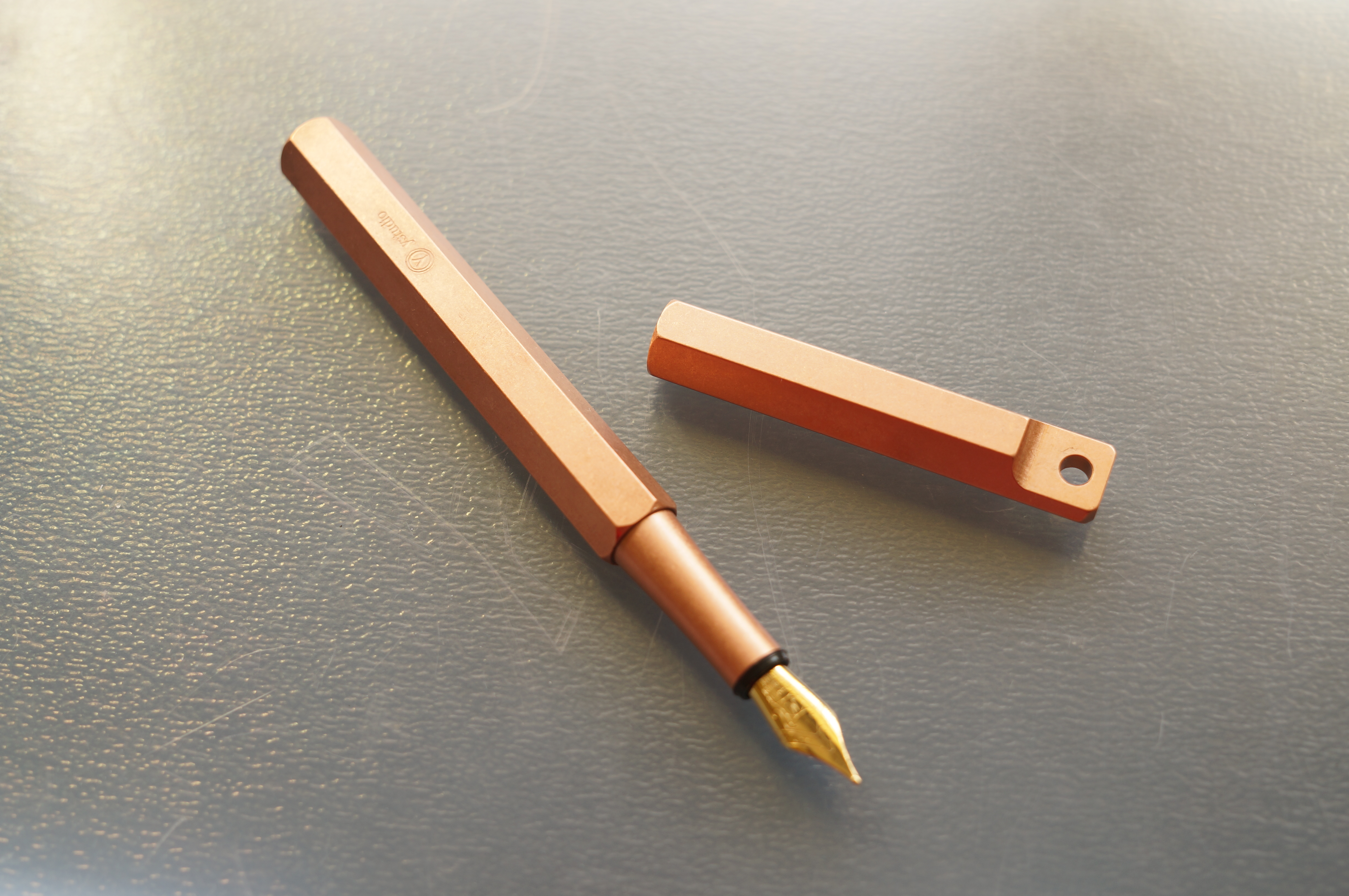
Let’s start with the design. As wonderful as the pen looks when it’s capped, there are some minor crimes hidden beneath. The brass/gold nib is generic Schmidt, the small #5 size, and clashes with the copper. More importantly, there’s a huge black plastic band between section and nib. It sticks out like a sore thumb and it’s one of my biggest complaints about the pen. I wouldn’t mind, but the rest of the design is so clearly refined.
Honestly, what the fuck is that black band about? And scrollwork?
The section itself is very narrow and tapered. The stonewashed finish means it isn’t slippery, but it is definitely on the slim side. And there’s a pronounced, sharp step-down from the faceted barrel that I found uncomfortable.
That is precisely as uncomfortable as it looks.
And speaking of that faceted barrel, the edges feel a bit sharper than on the desk pen — probably because it’s not had the abrasion treatment to reveal the brassing.
Of course, as with the desk pen, my biggest problem is with the nib itself. For a 145 quid pen, I expect either a gold nib or at the very least an in-house made steel nib, or titanium. I definitely understand why ystudio has priced the pen the way it has, due to the material and the obvious amount of work that’s gone in to the extras: the finishing, the wooden case, the lanyard, the packaging. This is not just a plastic pen in a clamshell leatherette box.
But such overall attention to detail and quality makes the slapped-on generic nib even more of a disappointment. This nib has got scrollwork on it, for Christ’s sake! This is not a pen that suits scrollwork. I’d actually rather the overall price went up and get a nib that suits the design, materials and ethos.
This is a FIFTEEN DOLLAR NIB UNIT — at retail. Ystudio probably paid five bucks for this nib. That galls a bit. They no doubt spent more on the packaging.
Final verdict
This is an easy pen to love but a hard pen to like. Or vice versa, I’m not so sure. You get my point.
It’s frigging gorgeous: the smooth copper, the faceted sides, the simple lanyard design, the packaging and branding. Utterly compelling. Then you pull off the cap and there’s a painful grip, skeletal section, ugly black plastic ring and naff gold-plated steel nib. What gives?
In short, it’s a bit of a disappointment. I wouldn’t be so disappointed if the unboxing experience and initial moments in hand weren’t so amazing, so I may be being a little unfair. But it has undoubtedly coloured my view of the pen.
I love you. But.
Should you buy it? Well, I’ll refer you to the conclusion in my review of the desk pen. If you appreciate this as a piece of design, an accessory, an item of homeware, an expression of ideals — then go for it. The lovely people at the Journal Shop will be happy to help. If you’re looking for the best possible writing experience — I’m sad to say you should look elsewhere.
As for me? I’m torn. I hope ystudio comes out with a version 2, basically.
A final note: this pen was loaned to me by Notable Designs, the UK distributor for loads of drool-worthy eastern brands. I’ll be returning it after the United Inkdom crew have taken their turn. Check out my ethics policy.
There’s so much to like about the design of this pen – it looks rgeat. It’s just a shame that they cut a few too many corners at the business end of it!
I’m hesitant to use words like “cutting corners”… everything else has so much attention to detail that the choice and implementation of the nib simply can’t be laziness or sneaky cost-cutting. It wouldn’t make any sense. The only thing that makes sense is that the choice of nib fitted what they were going for or their design priorities — that they felt these nibs were the right choice. And they’re fine. But I don’t think they’re great and I don’t think they fit how the rest of the pen looks 🙁