Ystudio’s pens have drawn a lot of attention, and for good reason. One look and you can see that they’re genuinely different from other pens out there in terms of materials and design. More than that, they in fact show a fresh approach to how people use pens. For example, the ystudio “portable” fountain pen has a lanyard cap so you can keep it with you everywhere.
Time for a renaissance in the desk pen?
This model in particular shows the unconventional approach: it’s a desk pen (and how many fresh takes on the desk pen have you seen in the past 50 years?)
The concept of a desk pen is simple: instead of a cap, you have a dock, fixed to the desk. You know, like a bank manager or captain of industry sat behind some expanse of walnut.
Your pen is always there at hand with a desk pen — that’s the main benefit. But the idea is also that the designer doesn’t have to worry about the compromises normally involved in making a pen “portable”; desk pens can be long and tapered, no need for a cap-step or other ergonomic compromise.
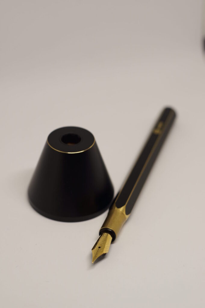
And just look at the result.
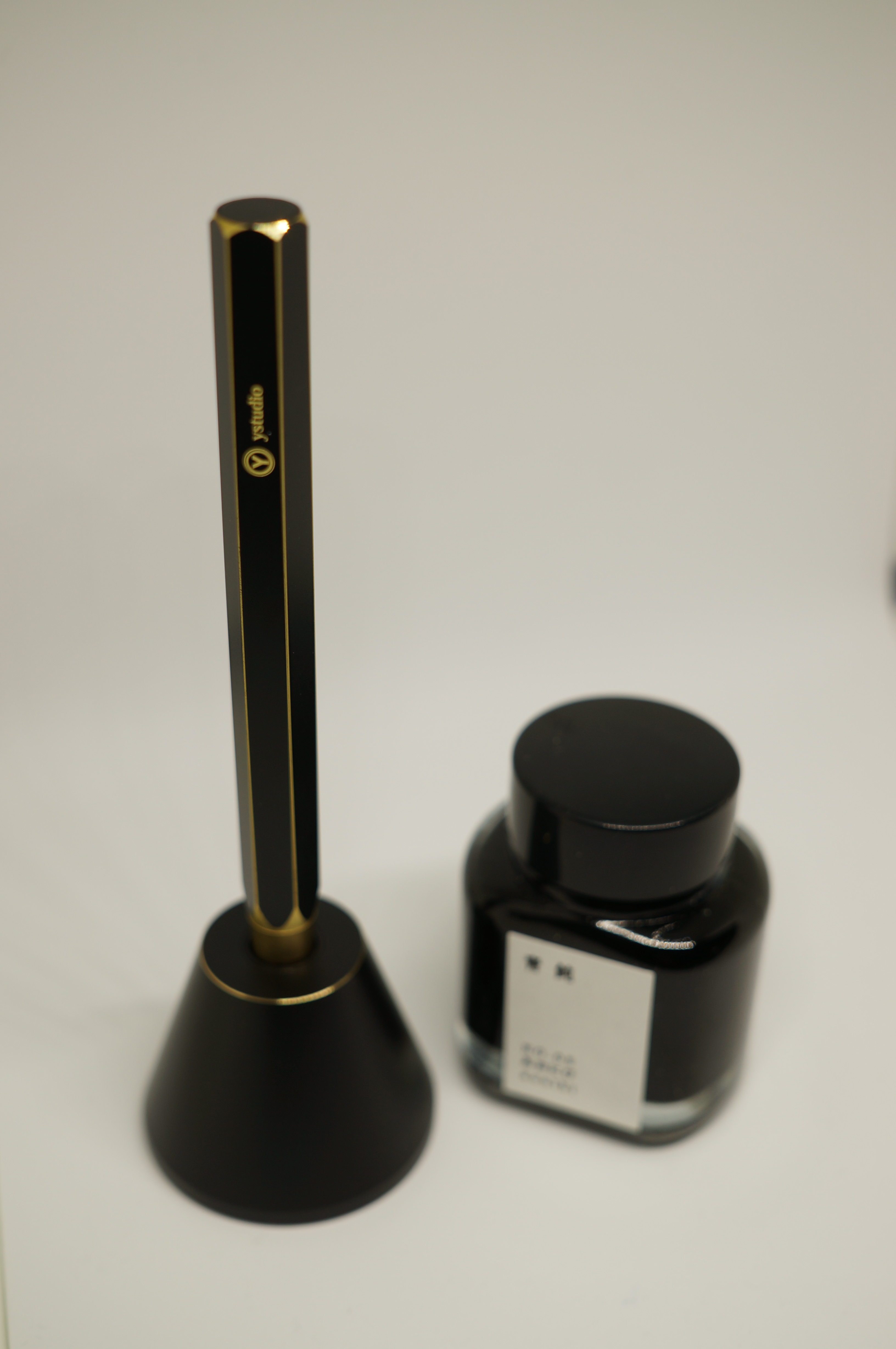
What a striking design. The brassing concept is just gorgeous.
So I really, really wanted to try this pen out. Luckily, the nice people at Notable Designs (the distributor behind the Journal Shop) obliged by loaning me a review sample.
Brass rubbing is not just for kids
Let’s start with the basics. This pen is made out of solid brass, coated in black paint and abraded at the edges to reveal the brass underneath — just like battle-scarred film cameras of old. It’s a natural phenomenon called “brassing”, here reproduced artificially. Note that the finish is very neat, so it’s not the pocket-worn effect that Kaweco delivers with its stonewashed AL Sports. That said, ystudio includes a sheet of abrasive paper in the box so you can accelerate and personalise the brassing process. I was too cowardly to try it out!
I personally think the brassing is a great look, one that seems to fit with Japanese concepts like Wabi-Sabi (the beauty of imperfection) and at the same time evokes nostalgia for that old camera lurking in your wardrobe. It reminds me of my favourite Nikon FE. Although note: ystudio is from Taiwan, not Japan.
Essential to the brassing effect is the hexagonal cross-section of the pen. Otherwise there wouldn’t be any edges to wear through. I didn’t find these facets irritating, especially since the grip section is round and the transition from section to barrel is smooth.
The weight of words
Brass also means that the pen is heavy. And the desk dock is even heavier. Seriously solid. You may like that… it feels weighty, it has presence. It’s part of ystudio’s brand: they call it “the weight of words”. However, watch out. The length of the desk pen means it’s back-heavy. If it had a cap, you definitely wouldn’t want to post it. I found the best way to write with it was nearly vertical. That kept the weight in check.
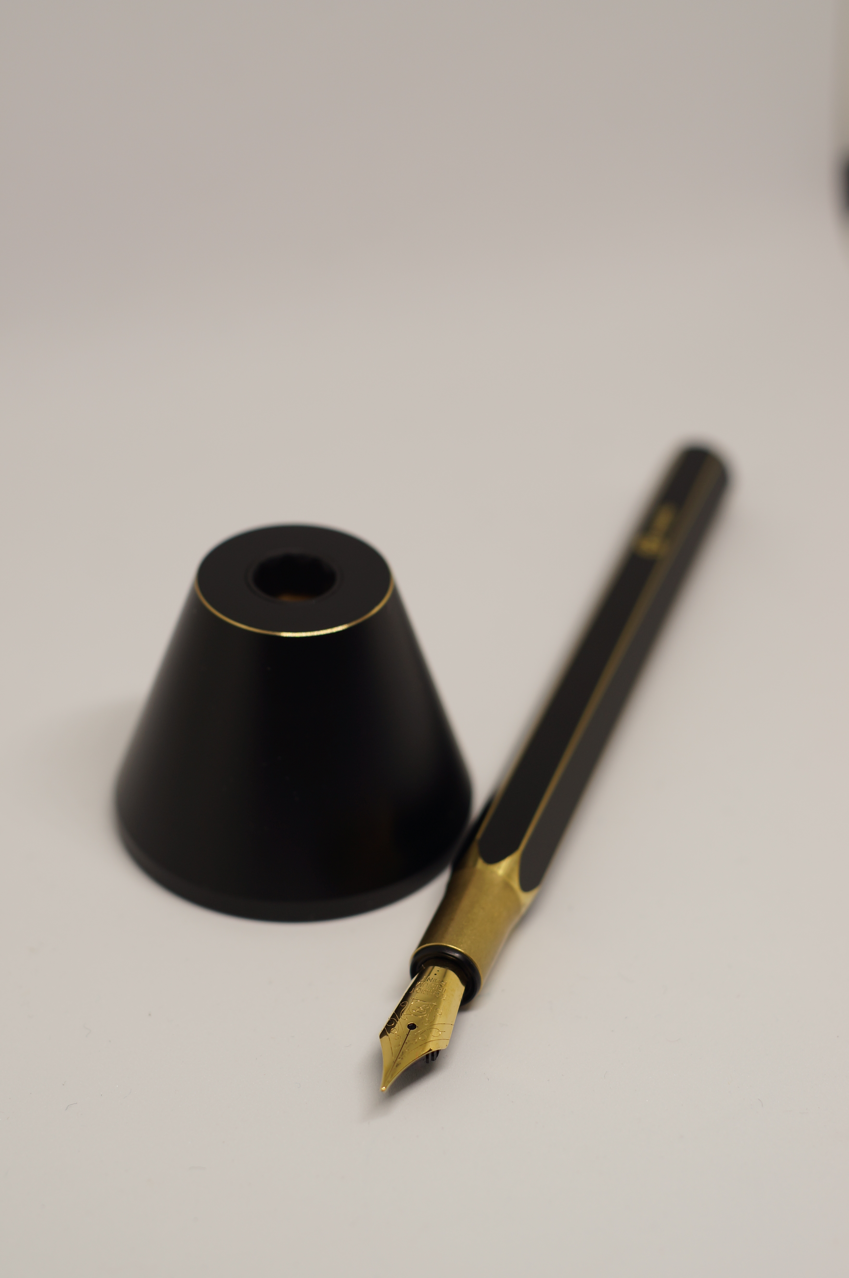
Smooth transitions, unfortunately imperfectly executed.

Generic #6 nib, steel, by Schmidt. Disappointing on a 165-quid pen.
You might notice a couple of unfortunate details from the shots above. First, that looks like a suspiciously generic steel Schmidt nib — at least it’s number six size and well in proportion with the rest of the pen.
Second, the section doesn’t merge seamlessly into the barrel, in colour or feel. I’ve had brass, steel and titanium pens from other makers where the joint is invisible and utterly smooth. So, a couple of distinctly non-premium features for a pen that costs 165 pounds. A third disappointment is inside: a very generic Schmidt converter.
Packaging perfection
But there’s plenty else premium to reassure you that you’re getting your money’s worth. To start with, the packaging. It’s simply sublime. A black cardboard sleeve, printed gold, surrounding a gold-printed wooden box. Pen and stand nest inside, tucked behind a rice-paper booklet. Of course, you don’t write with packaging — but it colours your impression of the product and would particularly make the ystudio a great gift.
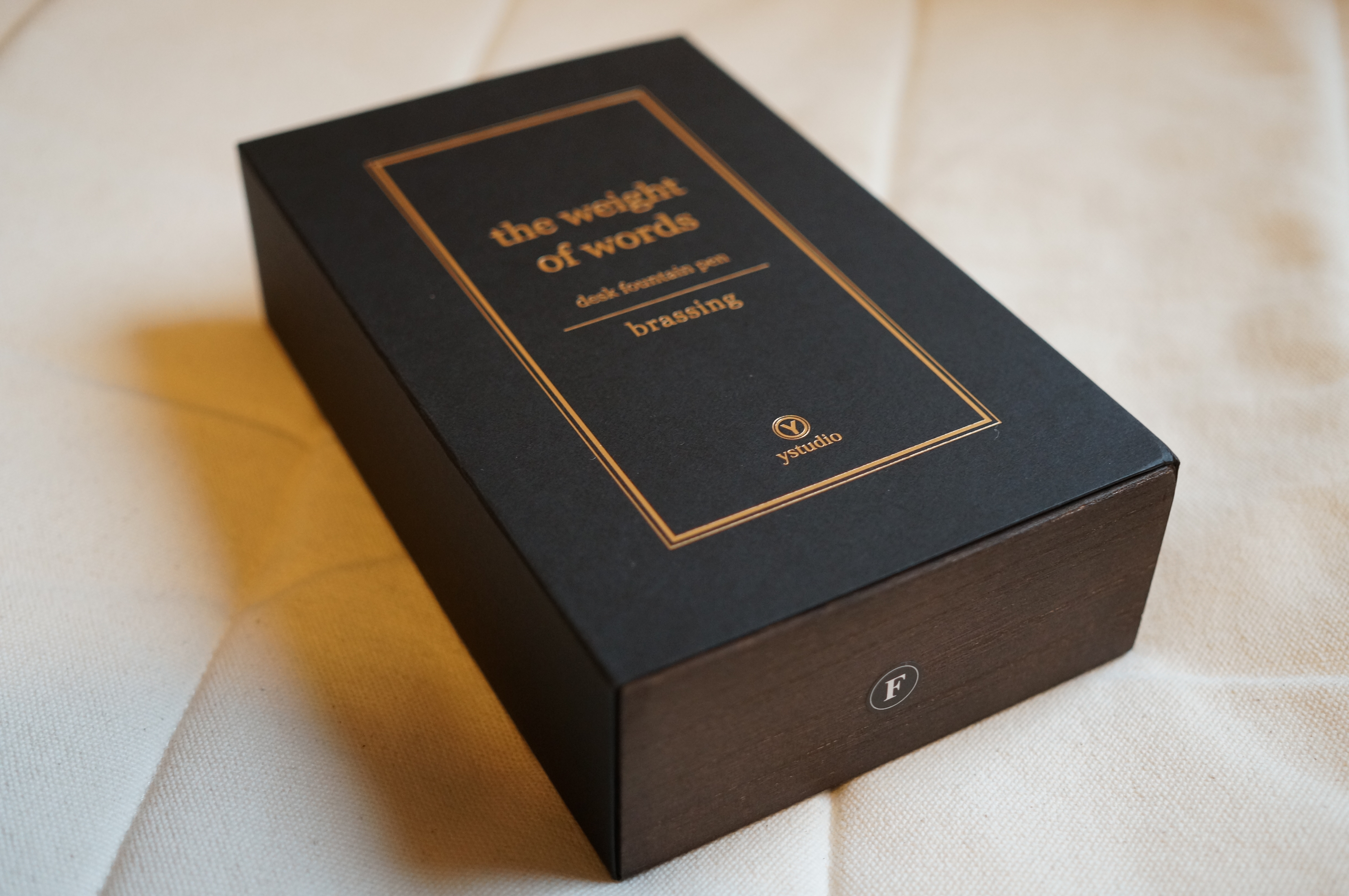
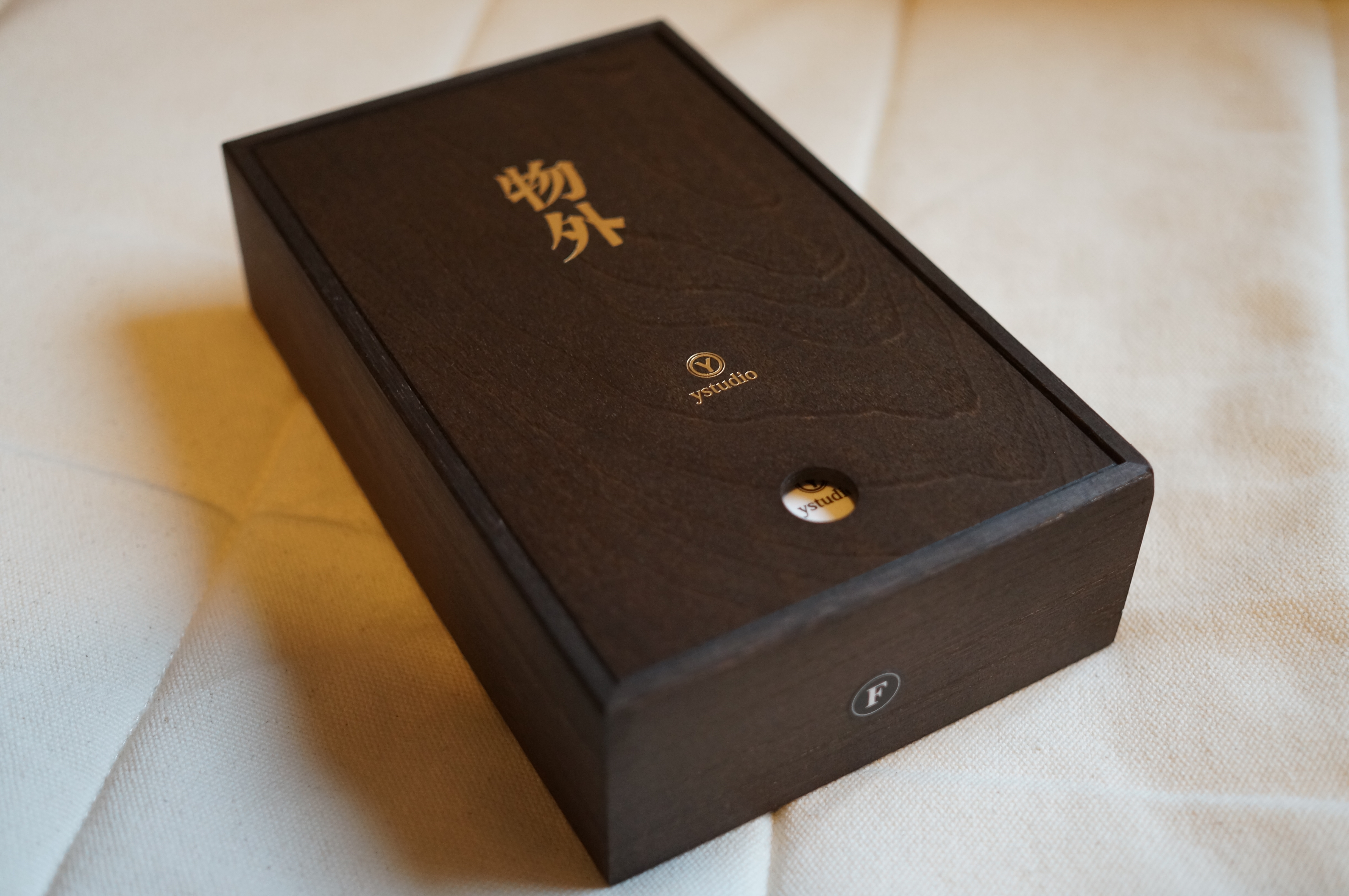
Boxing clever.
In out, in out, shake it all about
So the desk-pen concept is interesting. The brassing design is truly different, and generally well-executed. What’s it like to use?
The desk dock is good. Placing the pen feels secure, and because there’s a plastic inner, you don’t feel like you’re scratching the pen. Even though the pen is stored nib down, I’ve not experienced any dripping; and if there were to be any, the dock looks simple to wash out, with nothing to stain.
Drawing the pen generally works well. The dock is, like I said, heavy. But if you pull slightly off-axis, you can end up skittering the dock across your desk. There’s no rubber or felt base, it’s just brass on the bottom.
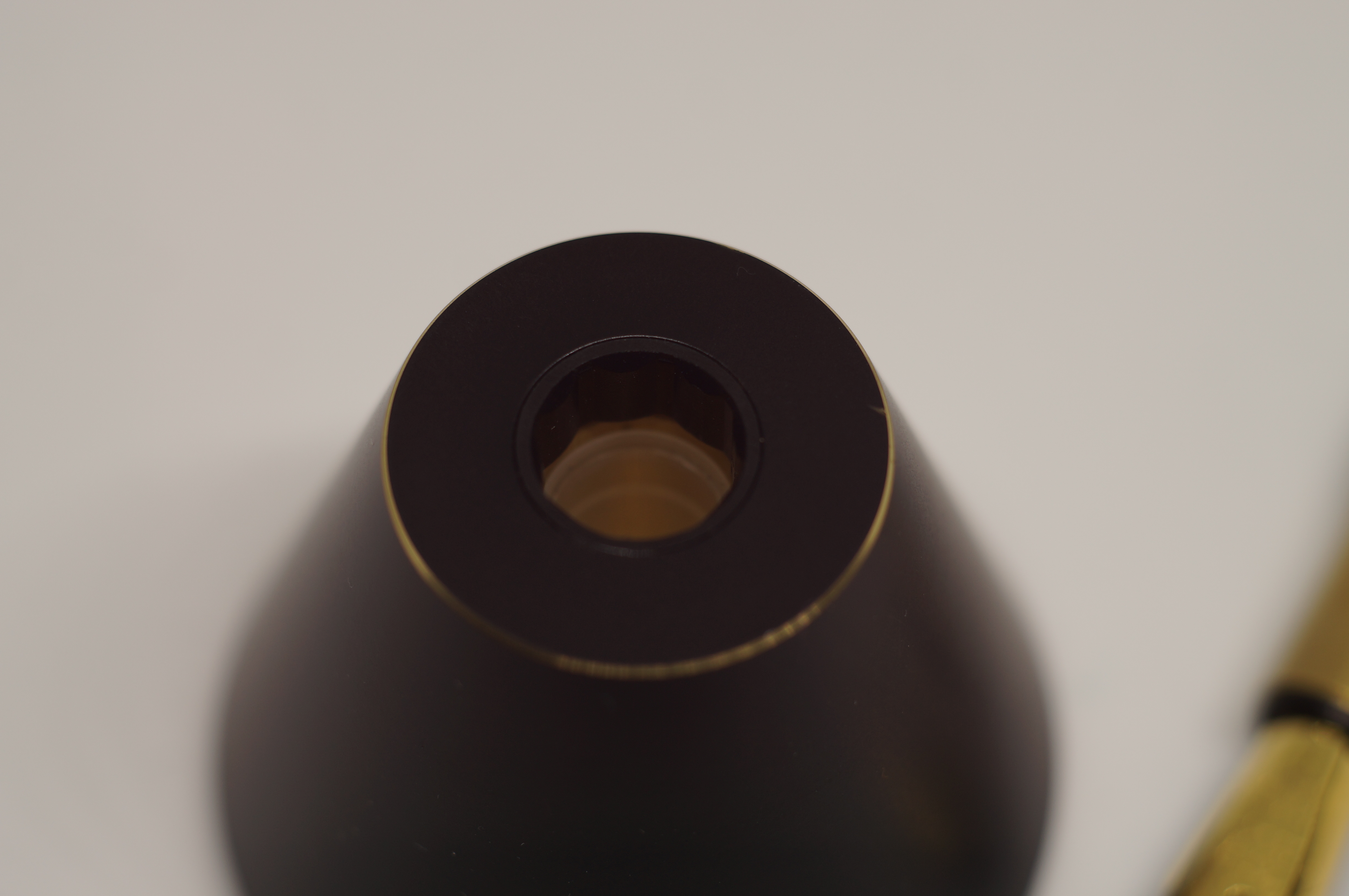
Note the non-scratch plastic inner in the dock. That should also help slow down nib dryout.
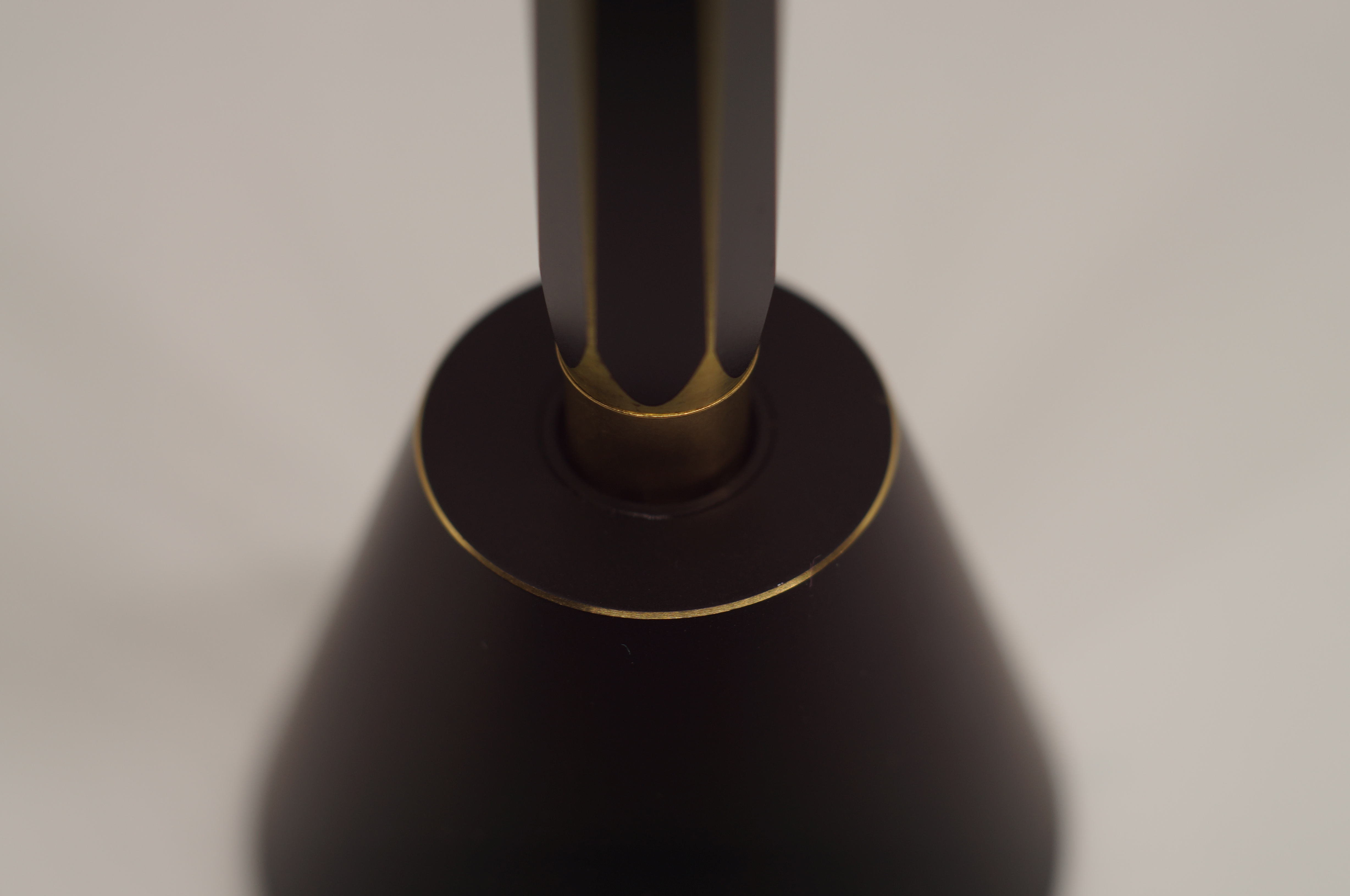
The pen docks securely, like some kind of Kubrickian monolith.
In use: fine’s the word
Filling is painless — it’s a C/C mechanism, of course. Nothing to say.
Writing? Well, the Schmidt nib is marked as a fine and it’s pretty consistent with the other steel fine nibs in my collection. Here it’s inked with Kyo-Iro Aonibi, incidentally — a well-behaved ink with average saturation and flow. I’m sure you could get a beefier line with a Sailor ink.
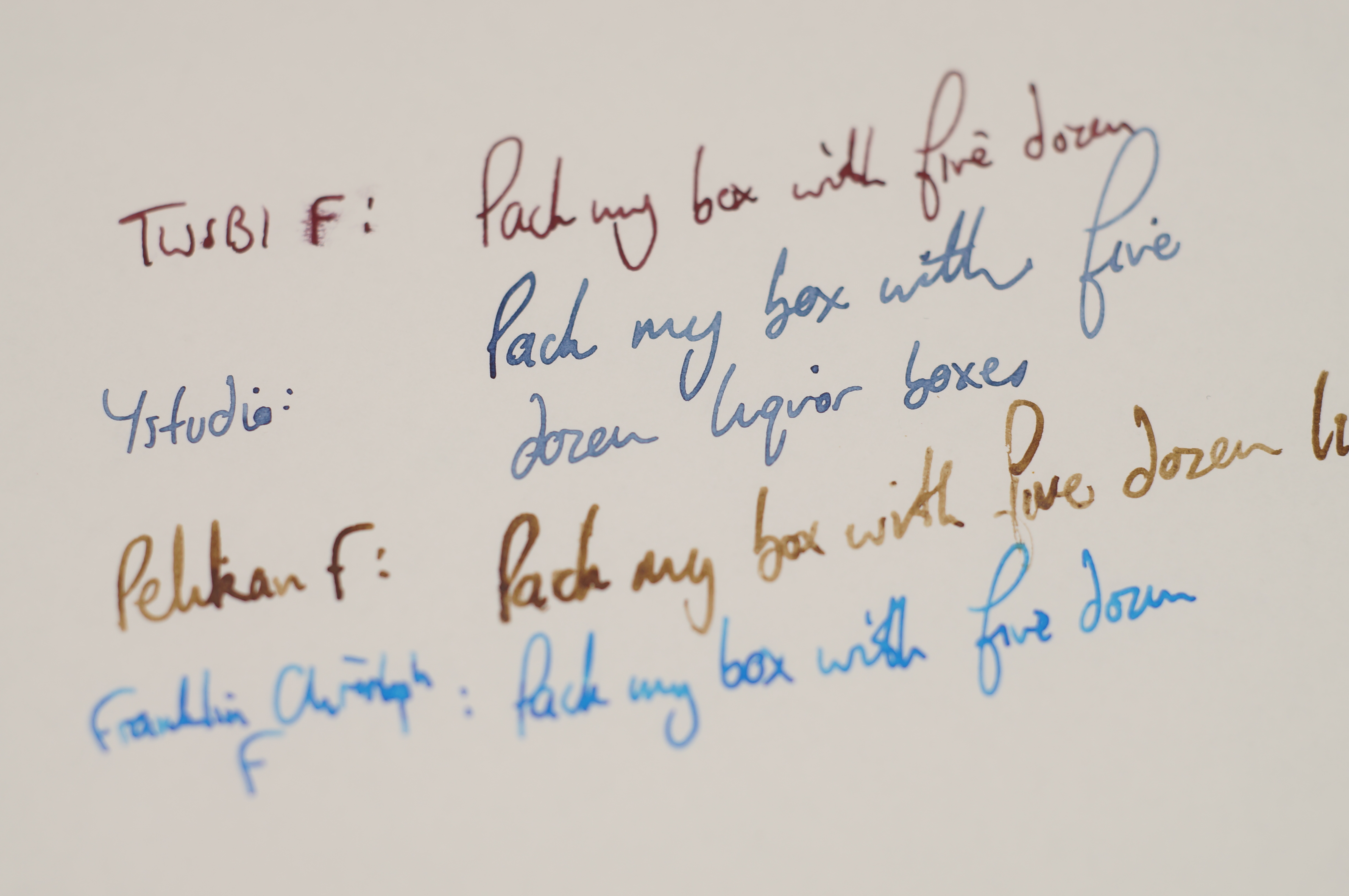
The ystudio lays a nice smooth line, and runs a true Fine.
The nib’s a 5/10 for wetness, of decent smoothness, and has literally zero line variation (if that matters to you). As a result of all that, and the heavy, narrow, ruler-straight barrel, it feels like quite a precise writer — closest to the TWSBI Eco, for what it’s worth. But, in my humble opinion, the ystudio lacks a bit of personality where the “rubber meets the road”. It’s fine by name, and simply fine by nature. Is that enough?
What are you buying?
So here’s the killer question: is the ystudio desk pen worth the considerable money? I’ve covered several times the fact that you can order many wonderful-writing pens with in-house made gold nibs and piston mechanisms direct from Japan for £60+. So it’s a little disappointing that the heart of this premium pen is a generic steel nib with a generic converter.
But the ystudio is the polar opposite of the Sailors and Pilots and Platinums, with their amazing nibs and yawn-worthy bodies. It’s been designed as a lifestyle tool, one with a bold aesthetic. As a desk ornament, it’s gorgeous and impactful. The minimal straight lines, the warmth of the brass, the clever worn appearance… they all make a statement that’s distinctive and cohesive.
Functionally, the desk pen is well thought-through. As a quick-access note-taker or document-signer for a desk-bound employee, it’s perfect — much, much better than scrabbling around for a biro (or indeed fountain pen) lost beneath papers strewn across the desk. The ergonomics of drawing and replacing the pen in the dock work well and honestly couldn’t be simpler.
So that’s what you’re paying for: design, in both aesthetic and functional senses. This pen would be just as beautiful and effective if it were a rollerball. Coming from a guy like me, who loves pens that display their personality on the page through a characterful nib, that sounds like damnation through faint praise. It’s really not: I love the ystudio. But you have to be clear about what you’re getting for your money. And here’s the thing: it’s not the nib.
If you’d like to see the ystudio pen on your desk, you can pick one up from the Journal Shop right here.
The ystudio brassing desk pen was supplied to me on loan by Notable Designs for free for the purposes of this review. It’ll be returned once the United Inkdom metareview has been completed. Find out more about my ethics.
0 Comments
2 Pingbacks