
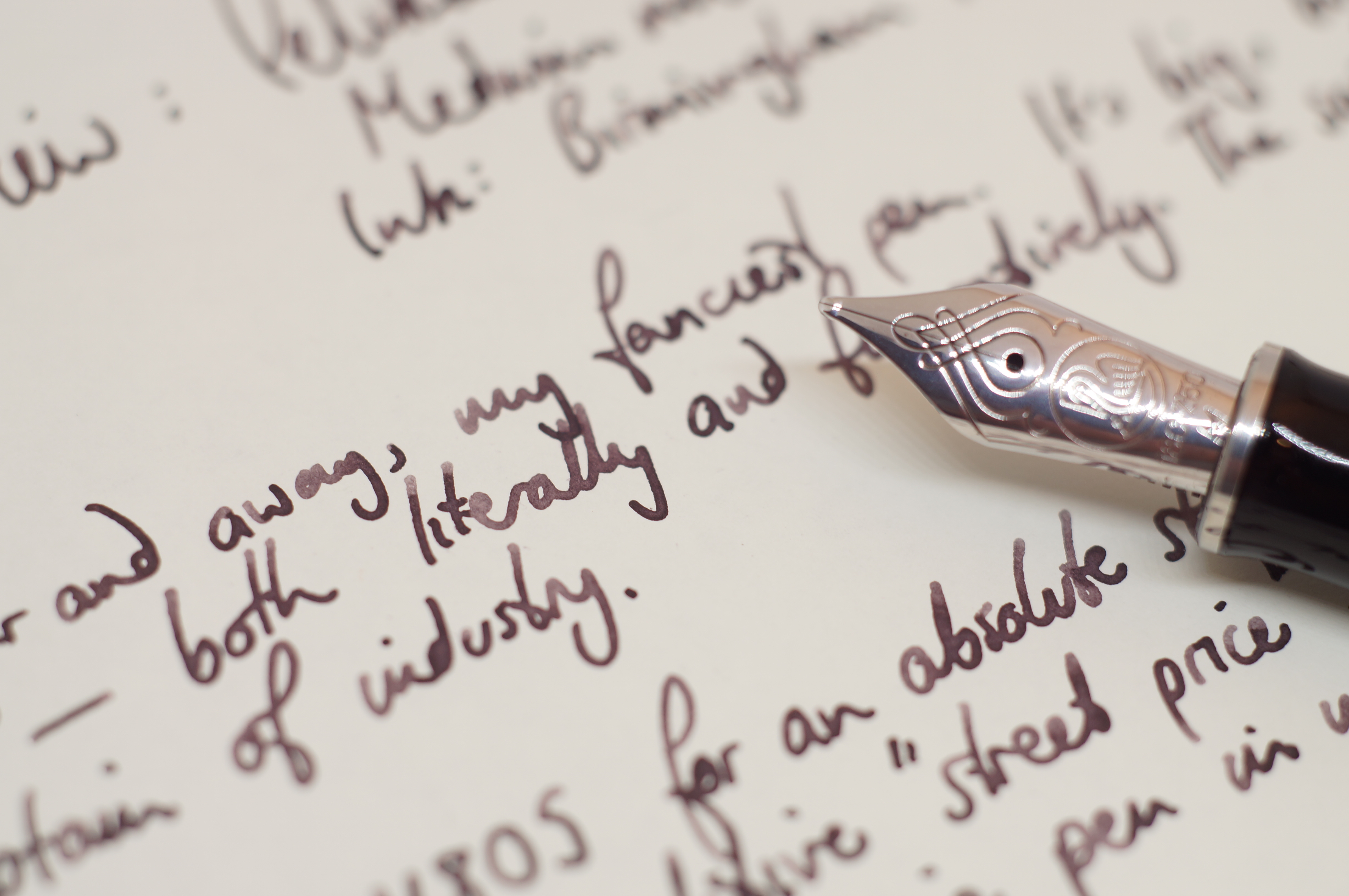
The Pelikan M805 is, far and away, my fanciest pen. It’s big, built like a tank, and extremely polished — both literally and figuratively. The sort of pen wielded by a statesman or captain of industry.
I purchased the M805 for an absolute steal, somewhere between £65 and £120 under even the competitive “street price”. And still it’s more than twice the price of the second most expensive pen in my collection, which is why it didn’t even make it onto my wishlist post. The only reason I sprung for it was an unexpected tax rebate landing in my bank account, and the certainty of being able to sell if for what I paid for it if I didn’t end up liking it.
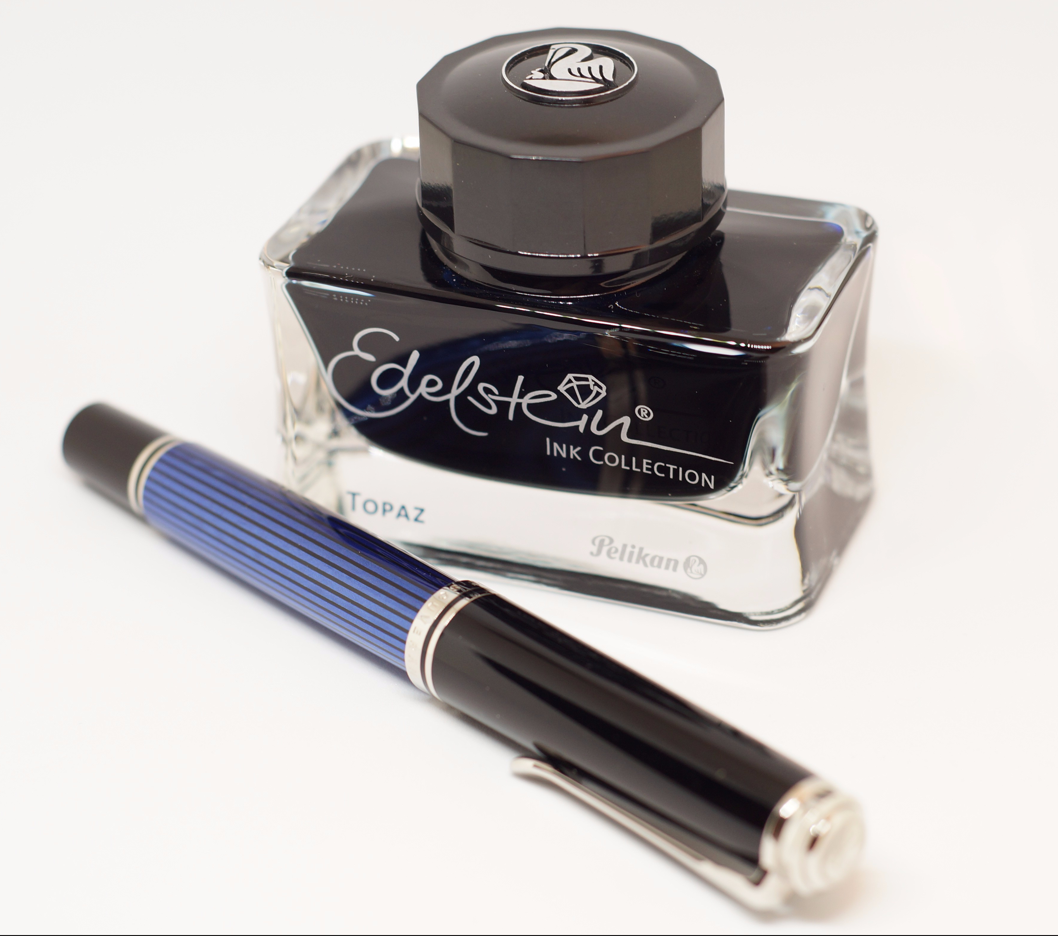
Once you go blue-black, you never go back. Or so I hear.
Solid as a rock
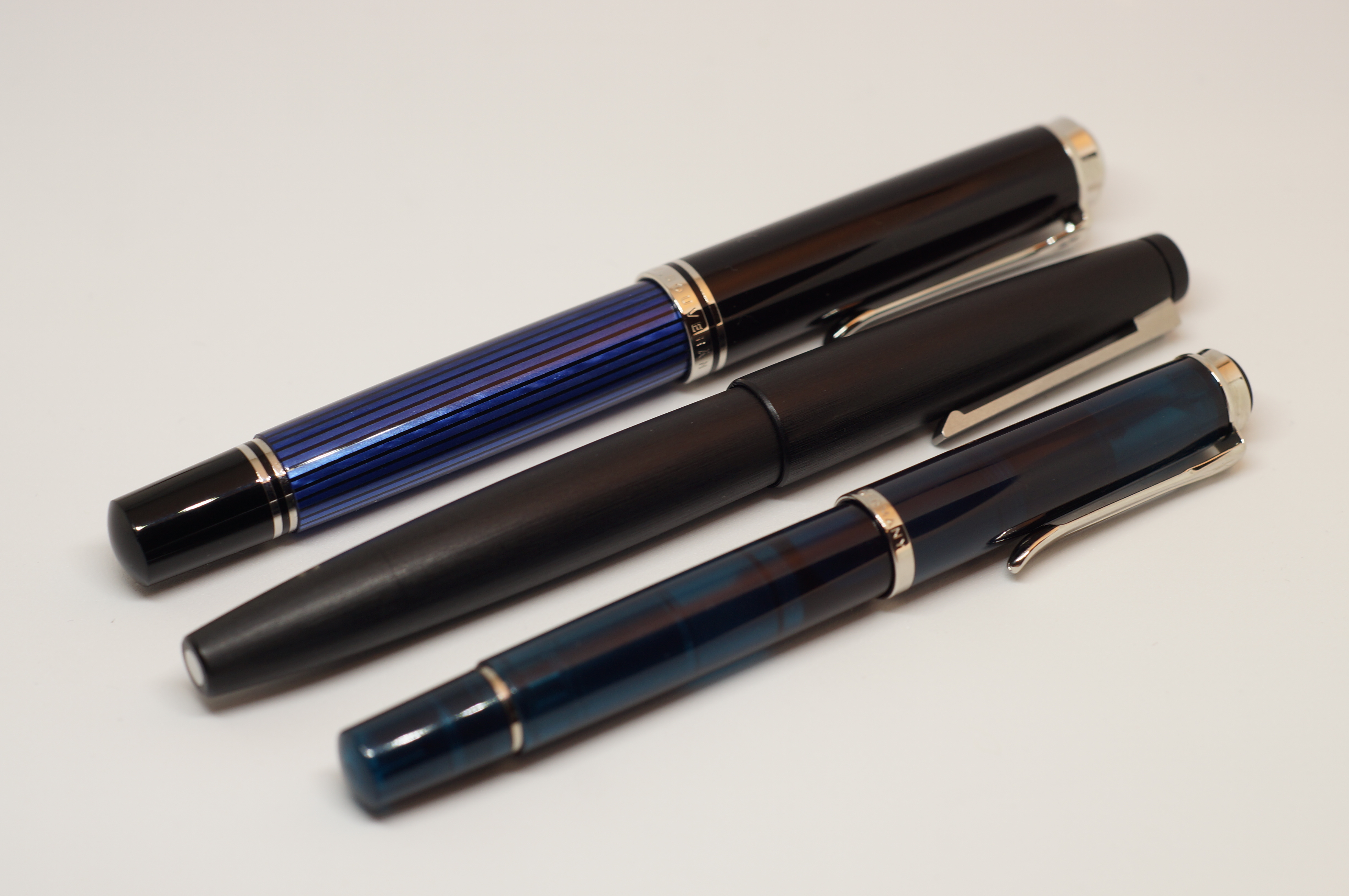
What do you get for the huge premium over more everyday pens? Size is the most obvious answer. Compared to the M205, my only other Pelikan, the M805 is simply enormous. Side by side with the Pilot 912 and Lamy 2000, there’s not much in it in terms of overall length and widest point, but the Pelikan is a smidge longer and more importantly is squarer in cross-section, so it feels bigger in overall volume. Visually, the bigger nib makes a difference, as does the feel in the hand. The M805 just feels solid and weighty, and indeed it clocks in at 30g on the scales compared to the Lamy’s 26g and the Pilot’s 25g. All that brass inside, see. I certainly can’t see myself wanting to step up to the even larger M1000, which clocks in at 35g and a full 5mm longer.
Big is beautiful.
The comfort in hand is great. Due to the size and weight, the M805 feels really substantial. The section is surprisingly short, but the nib is long and the cap threads aren’t noticeable, so I quickly found comfortable ways to hold the pen. For my average-size hands, the M805 is plenty long enough to use unposted. The section tapers toward the nib, then ends in a very pronounced flare, so there’s no chance of your grip slipping.
Flying in formation. Pelikans. Geddit? (Yeah, Lamy isn’t a bird)
A pinstripe suit distilled into a pen
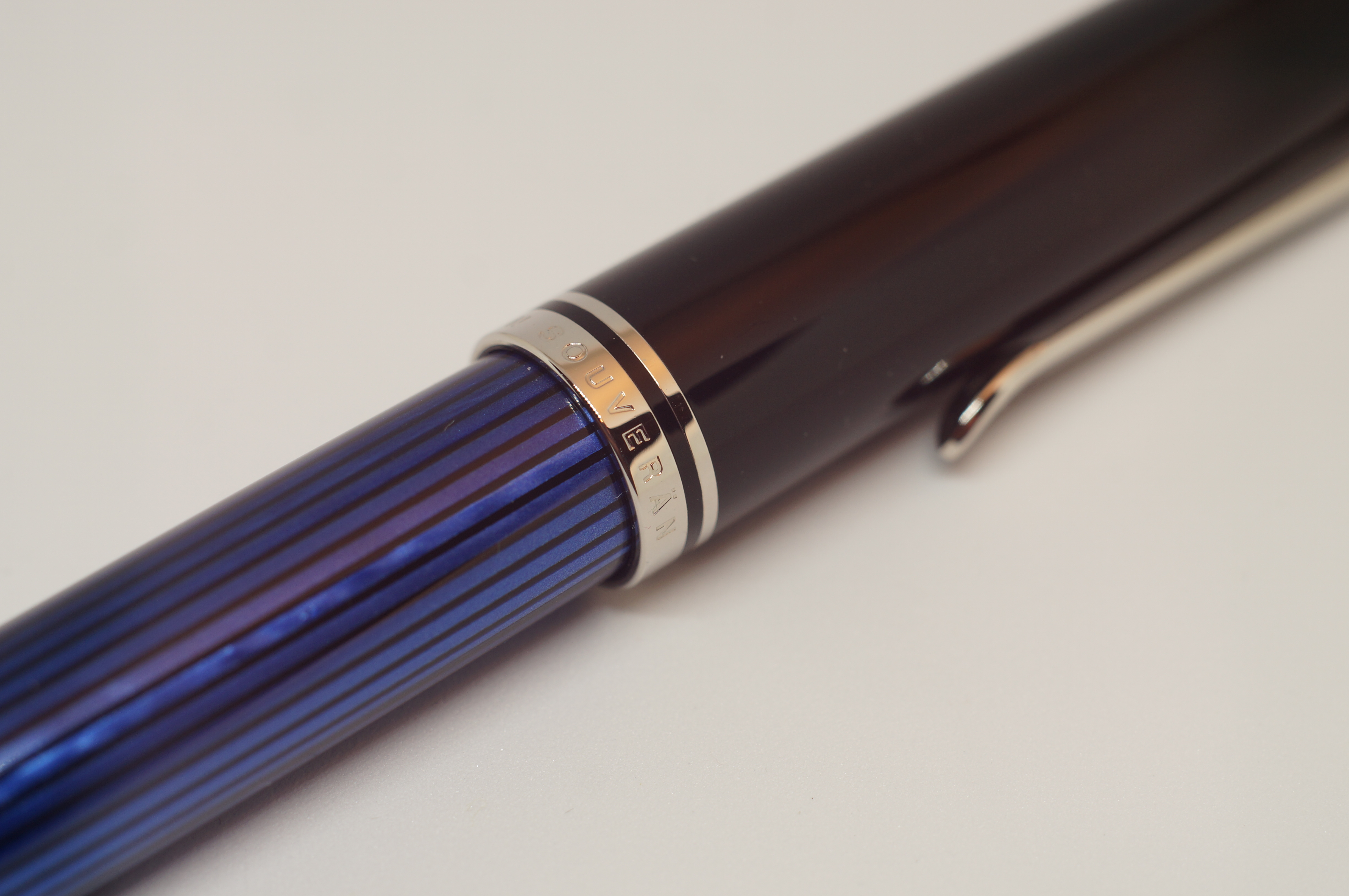
Visually, the M805 is simply stunning. Mine has the blue pinstripe barrel, which is irregular and opalescent. The section, cap and piston knob are black and glossy. Silver double bands ring the cap and piston knob, another single band circles the end of the section, and the Pelikan-beak clip and mother-Pelikan-etched finial are also silver.
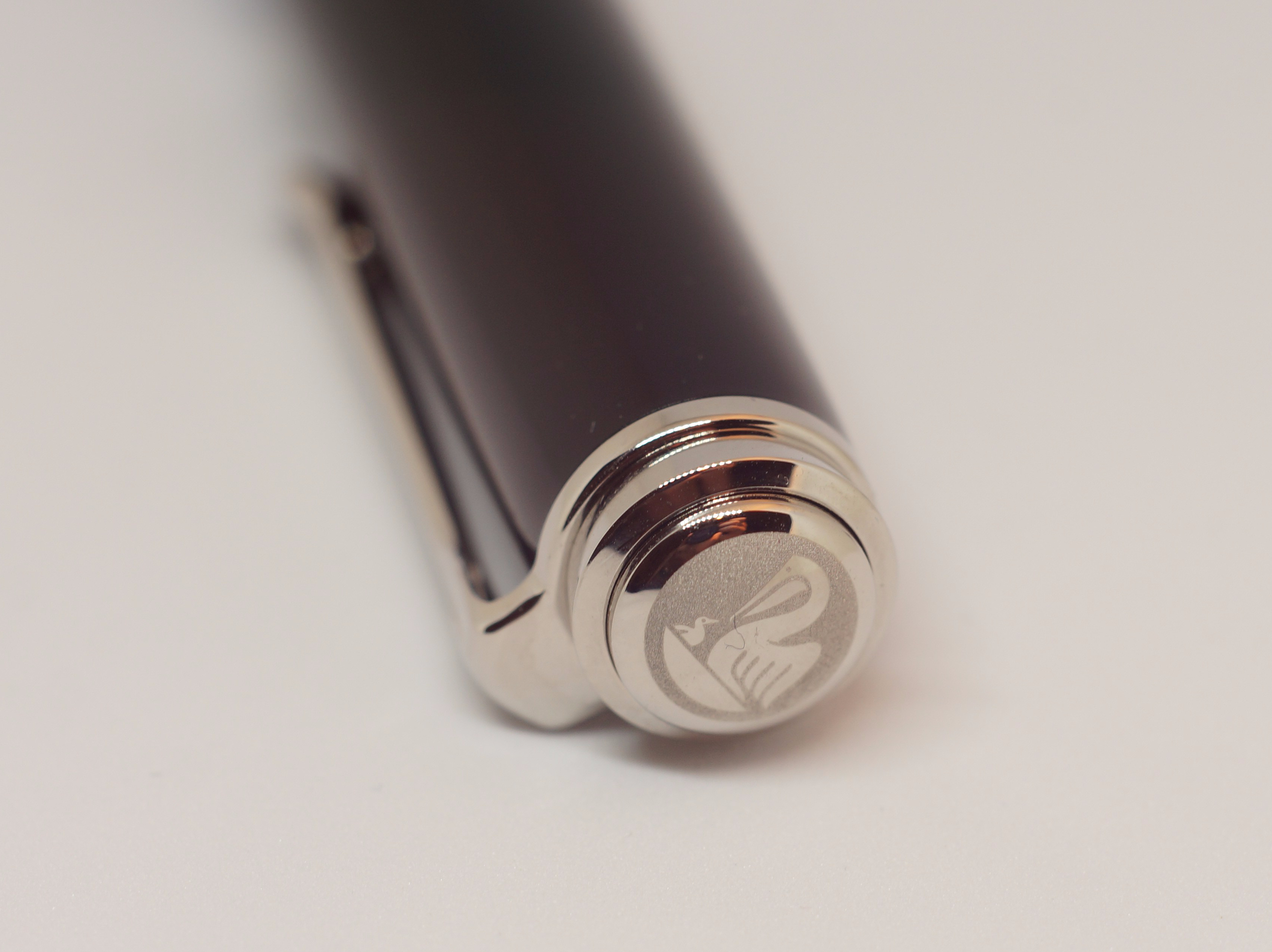
Those aren’t machining marks — they’re the LEDs in my lightbox. And yes, the mother Pelikan does seem to have some fluff in her beak.
I believe (correct me if I’m wrong) that all this silverwork is palladium plating. Every element is beautifully finished, no gaps or mars in the surface.
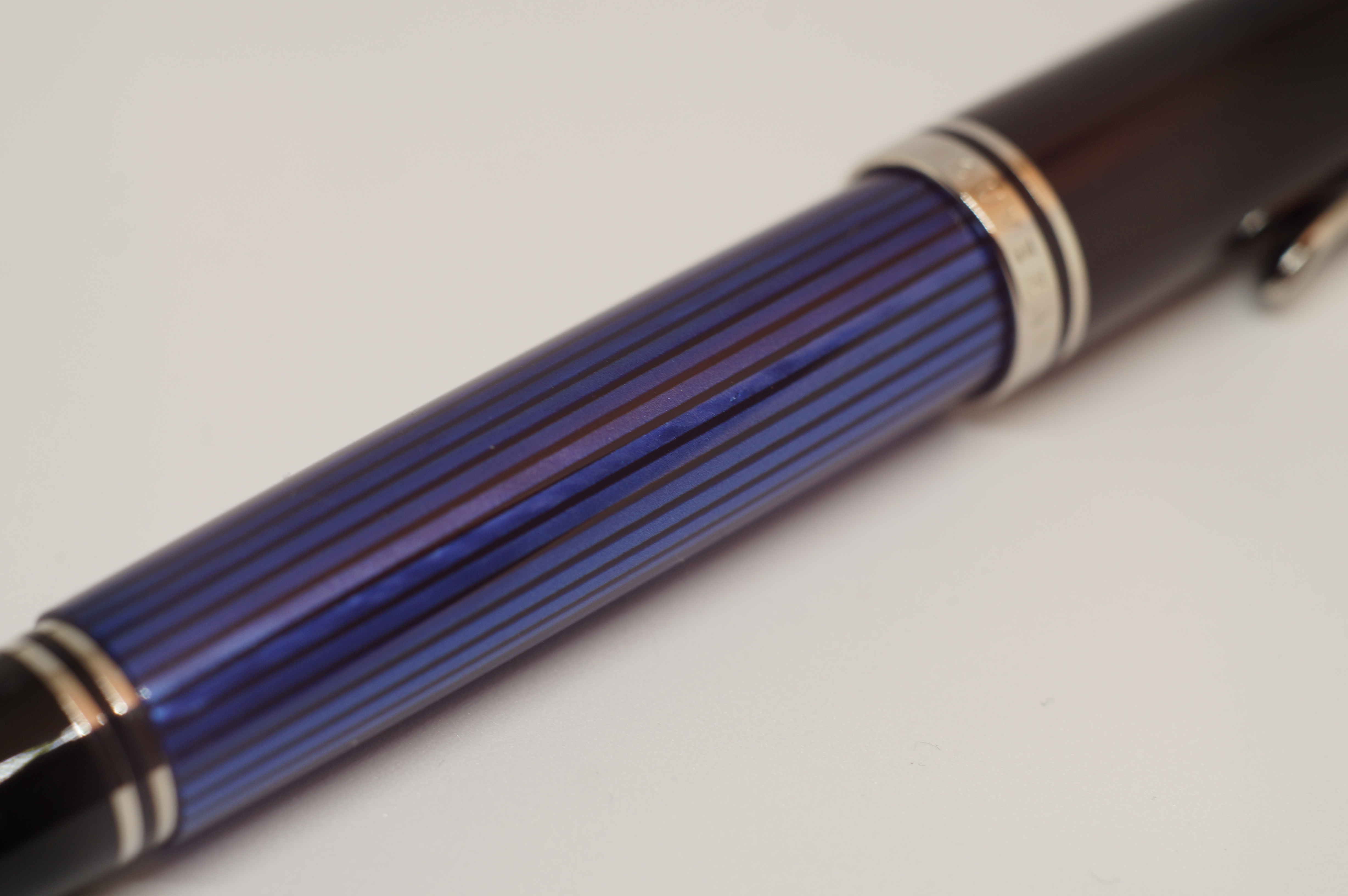
The blue pinstripes are rather fetching. On a suit? Car salesman. On a pen? SOUVERAN!
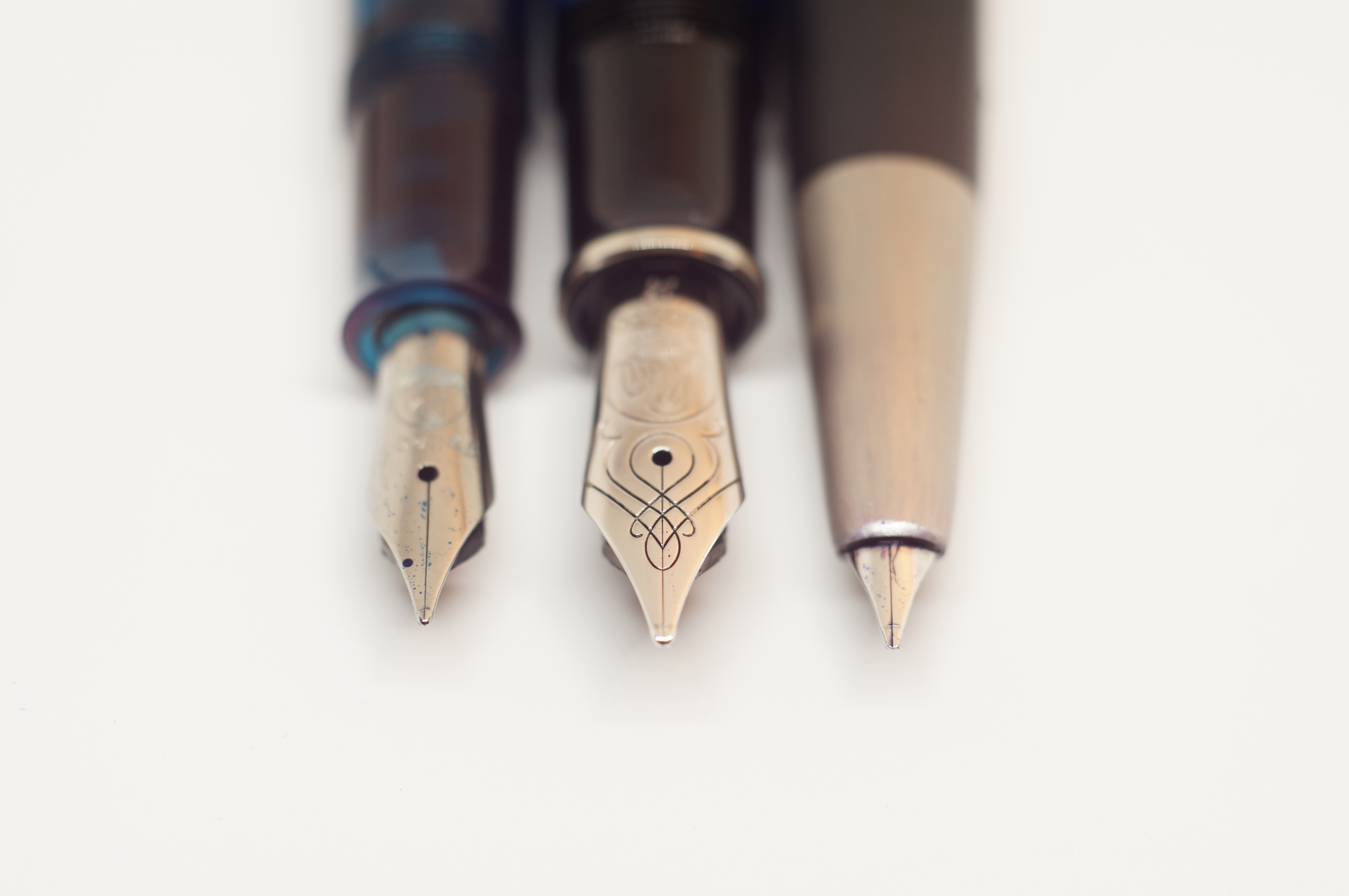
Now THIS is serious nibbage
The nib is worth waxing lyrical about for a moment. It’s rhodium-plated 18k gold (while many are two-tone, mine’s totally silver). Around the breather hole is delicate scrollwork that makes an artform of nib creep. It’s really pretty. In proportion with the rest of the pen, this is not a slender, sword-sharp nib; it’s stout and rounded. In fact, every aspect of the design feels cohesive.

I’m a creep. I’m a weirdo. What the hell am I doing here?
The filling mechanism is an extremely high-quality piston mechanism. It’s super smooth and easy to use. Importantly, it’s easy to clean, too: simply unscrew the nib unit in a moment, and flush through the section. It takes seconds… anyone who has spent 15 minutes winding a converter in and out, plunging a Vacumatic or pumping a lever filler will weep tears of joy after cleaning out a Pelikan.
Ink levels are visible between the pinstripes if you hold the pen up to the light. Uncapping the M805 takes just under one full turn. It’s quick, easy, yet feels secure. A design feature other manufacturers should pay attention to.
So the pen is in hand, filled, uncapped. What’s it like to write with?
Buyer’s remorse! Mayday, mayday!
My first experience putting pen to paper was distinctly underwhelming. I felt disconnected from the page, almost like the wide nib, heavy pen and big blob of tipping meant I couldn’t tell where ink was actually going to touch down. The line was a little hesitant, not as wet as I was expecting based on internet wisdom, or indeed my experience with the M205. True to reputation, the medium nib was actually a broad by any other manufacturer’s measure, and distinctly obese by the Japanese standards to which I’ve become accustomed. The nib felt overpolished and vague, although everything looked perfect under a loupe.
After an initial scare, the M805 writes beautifully. Phew.
Finding the rhythm
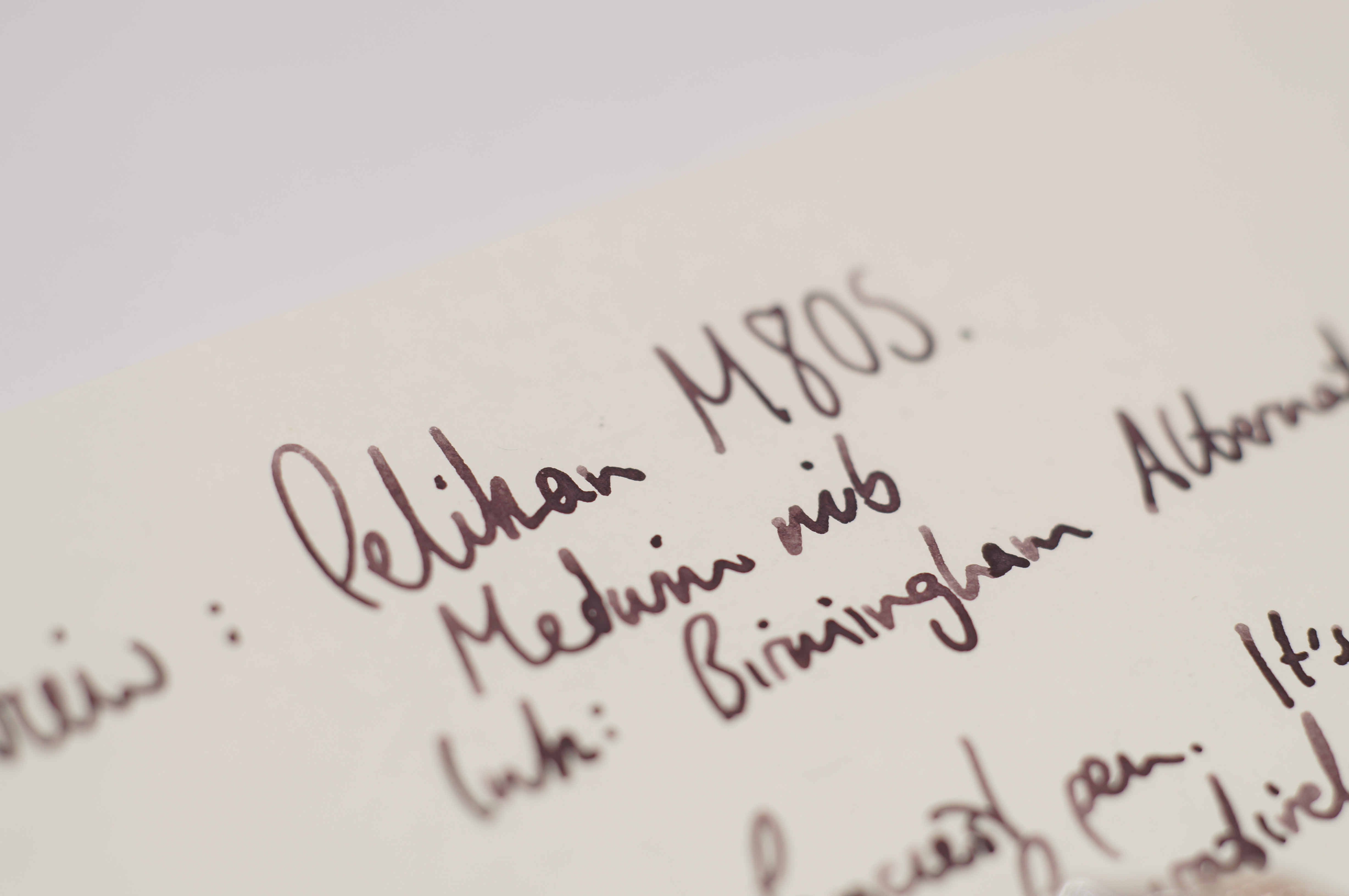
With increasing desperation, I changed ink a few times, from Edelstein Topaz to Smoky Quartz, and then to this Birmingham Alternator Crimson. I tried different paper, including Say Nice Things, Rhodia and Tomoe. I gave it a bit of time. Here and now (as I write my first draft by hand), on Tomoe River and a spacious 7mm lined guide sheet, I really enjoy the way this pen writes. It hasn’t missed a beat. It no longer feels skittish or imprecise, or indeed too fat. It keeps up with even the fastest scribbles. Sure, the nib doesn’t have the personality or unique behaviour of other nibs I’ve reviewed recently — it’s fairly inflexible, has zero line variation in its grind, isn’t crazy wet, doesn’t have interesting feedback… it’s just a nib. It writes, smoothly, consistently.
Does my nib look fat in this? Erm, no love… you’re definitely still a medium. Yup. Uh-huh.
What gives? It it me that’s changed, or the pen? Did the feed need a flush, or the nib need breaking in? Or did I just need to get used to such a different design approach after so much time with Japanese fines? The answer is likely “yes to all of the above”. Anyway, I have approached the UK distributor to take advantage of the free nib-exchange service that Pelikan offers. As much as I am now enjoying this medium, a fine (that’s a Pelikan fine) would suit me better.
Serious competition
Comparing list price against list price, this is a pen that is pushing £400. That puts it up against some serious competition. Nakayas, with their crazily time-consuming laquered finishes, start at about $550. The Sailor Pro Gear Realo is about £300. The Pilot 823 is somewhere around £250. And if you’re willing to bust the £400 ceiling you can get an Aurora 88 or “entry level” Mont Blancs. Of course, within the £400 budget there’s a host of Edisons, Kanileas, Pilots and Platinums… take your pick.
Even today, Pelikan has a hugely loyal following, who add to their “flocks” regularly. That’s despite significant price hikes in recent years, and some complaints even from the faithful about boring or inconsistent nibs. I can really see, and feel, what keeps them loyal.
Is price about more than function?
It’s not just that the M805 is a big, premium pen that makes you feel important. It’s that every aspect of the design and construction is consistent and refined across the board. I’ve complained in the past about pens with fancy bodies and generic steel nibs, or pens with fancy nibs and disappointing cartridge/converter setups, or great big pens with disproportionately tiny nibs. None of that here. You get the best piston, the best barrel, the best 18k nib, all sized together. And the little details are there too: the easy-to-clean mechanism, the quick cap threads, the functional clip, the ink window.
Quite literally feel like a king. Or queen.
Now that I’ve got over my initial misgivings about the writing experience, I’m finding precious few things to criticise about this fine example of German engineering. Is it worth the eye-watering (for a normal person) price? After all, it puts ink on a page just like a $2 Jinhao. For me, writing is about pleasure, about experience… and the M805 offers a definite step up in luxury and quality from my cheaper pens. For me, that’s worth the premium.
0 Comments
14 Pingbacks