Note: I’ve been at home for the past few days due to a bit of a family crisis, and I’ve been trying to keep myself busy with non-taxing things. So it’s quite possible that I’ve beanplated my decision here — but enjoy nonetheless!
It’s no secret that I have Far Too Many(TM) pens. Despite my best efforts I’ve normally got around ten pens inked, which is great for choice, but not great for my guilt at leaving pens sat idle when inked, or for transportation to and from work. So I’m pleased to accept the Six Pen Challenge.
The premise is pretty simple: for the whole of March, you keep six or fewer pens inked. You can swap inks and pens, but never exceed the limit. Today I flushed a few pens and decided on my initial lineup.
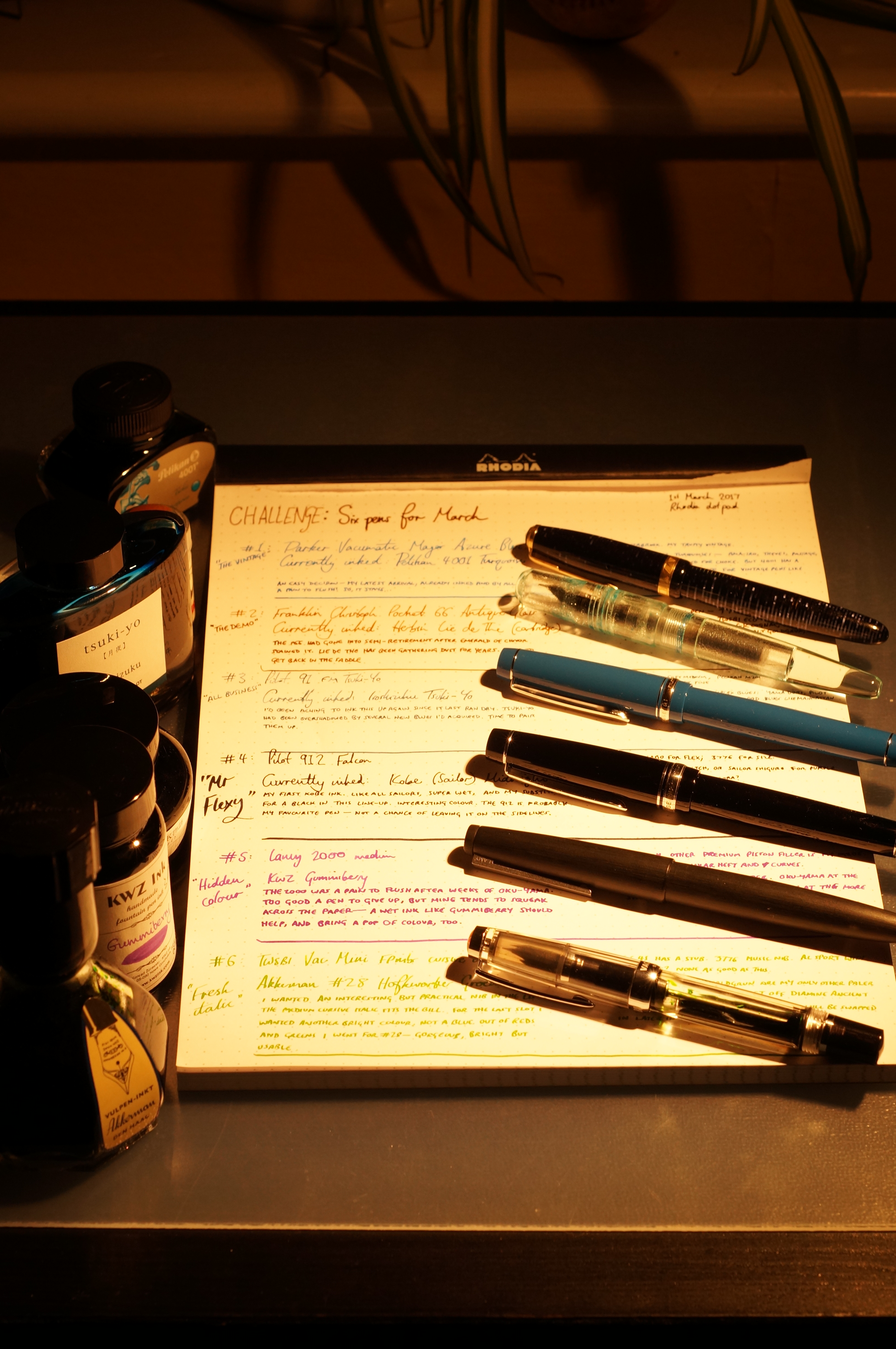
This is what we call an “atmosphere” shot.
Here goes.
#1: Parker Vacumatic Major Azure Blue (fine?), Pelikan 4001 Turquoise

Good thing I like this ink, because it would be a bastard to flush.
This was a shoe-in. It’s my most recent pen acquisition, so of course I’m going to keep it in the list. But Vacumatics are a pain in the arse to flush, so even if I wanted to drain it and shelve it I’m not sure I could. And for that reason, the ink was decided for me: there’s no way I’m swapping inks in a Vacumatic. I specifically chose the Pelikan because blue inks don’t stain Vacs, and the 4001s are meant to be safe for vintage pens. So this is likely to be the lifetime ink for this pen.
This first decision helped dictate the rest of my choices: no more room for other vintage pens (bye-bye old friend Esterbrook), and no more turquoises. Which is a shame, because I’ve got at least four other turquoises, and love them all.
#2: Franklin-Christoph Pocket 66 Antique Glass steel fine, Herbin Lie de The (cartridge)

I’m sorry for ignoring you, guys.
This is an atonement choice. For a long time the Pocket 66 was my first choice, my loyal friend, inked as an eyedropper with Emerald of Chivor. It was flawless. But eventually I flushed it, and ever since it’s been sat on my desk, as I stared at the stains left by Chivor. Bastard. I felt guilty for retiring it, and it’s such a fabulously comfy pen. Maybe I’ll give it a go with a cartridge.
So why Lie de The? I had a real downer on Herbin inks, based on a brief dalliance with Lie de The and Violet Pensee back before I knew anything about pens. They were faint and yucky. But I recently loved Bleu Pervenche in my Pilot 91, so dug out my Lie de The cartridges. Lo and behold, it’s a very nice brown and seems well behaved. Herbin is back on my “nice”list.
Knock-on effects? Obviously no more browns, but that was never going to be an issue for me. But no more “standard” steel nibbed pens, either — so my Tactile Turn Gist is on the sidelines, and the Pelikan M205. And probably no more demonstrators, so there goes the TWSBI Eco. The strategy is falling into place.
#3: Pilot 91 fine medium Tsuki-Yo edition, Iroshizuku Tsuki-Yo
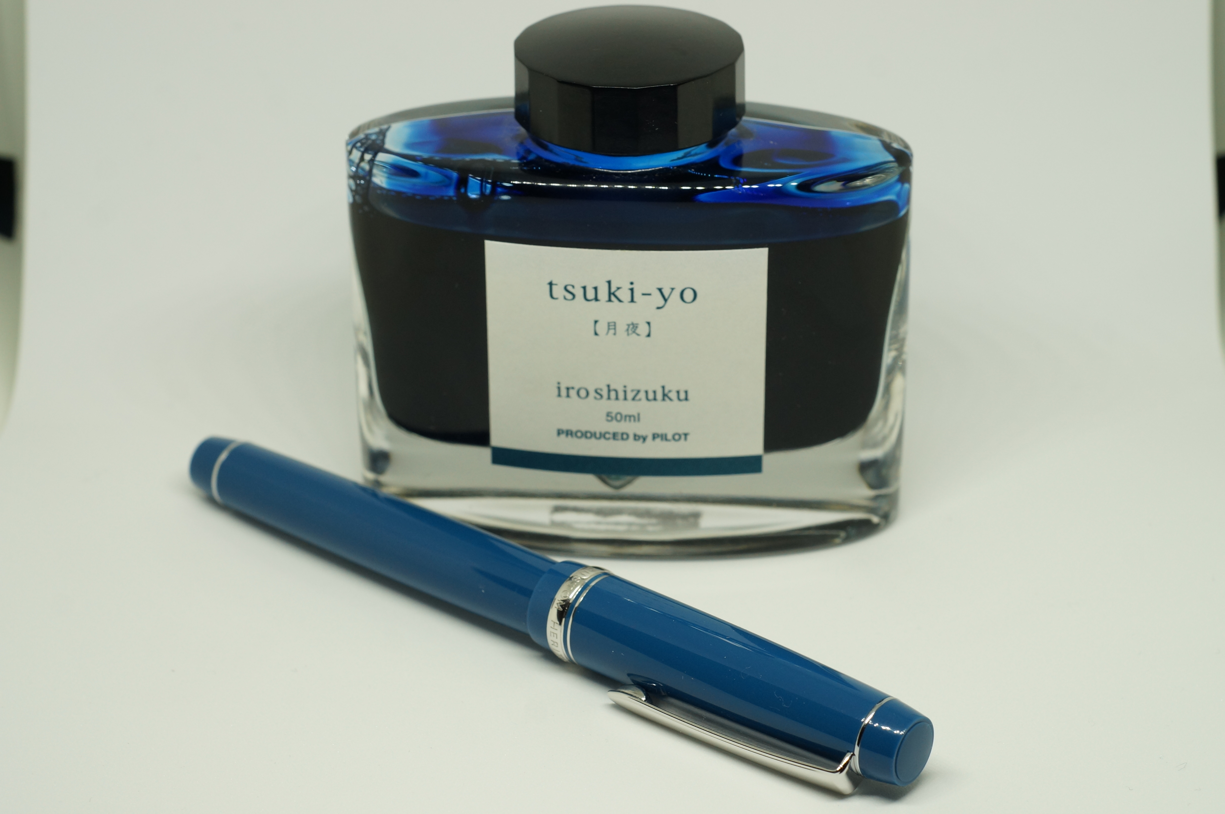
Moonlight by name, er, darkish blue by nature.
I ran the 91 dry after my handwritten review, and I’ve been itching to ink it up again ever since. I loved the Bleu Pervenche I first inked it with, but turquoise is already ticked — and I’ve never inked it with its namesake Iroshizuku. Time to correct that situation.
This choice knocked a load of other pens and inks out of contention. No more medium/fine Japanese pens, like the Elabo or Platinum 3776 (yep, there are no 3776s on this list at all, despite me owning three of them). No more “complex” blues, like Yama-Dori, Pilot Blue-Black, Iro Ku-Jaku. And no more mid blues like Noodler’s Manhattan or KWZ Azure #5. This thing had better be worth the sacrifice.
#4: Pilot 912 FA, Kobe #51 Kano Cho Midnight
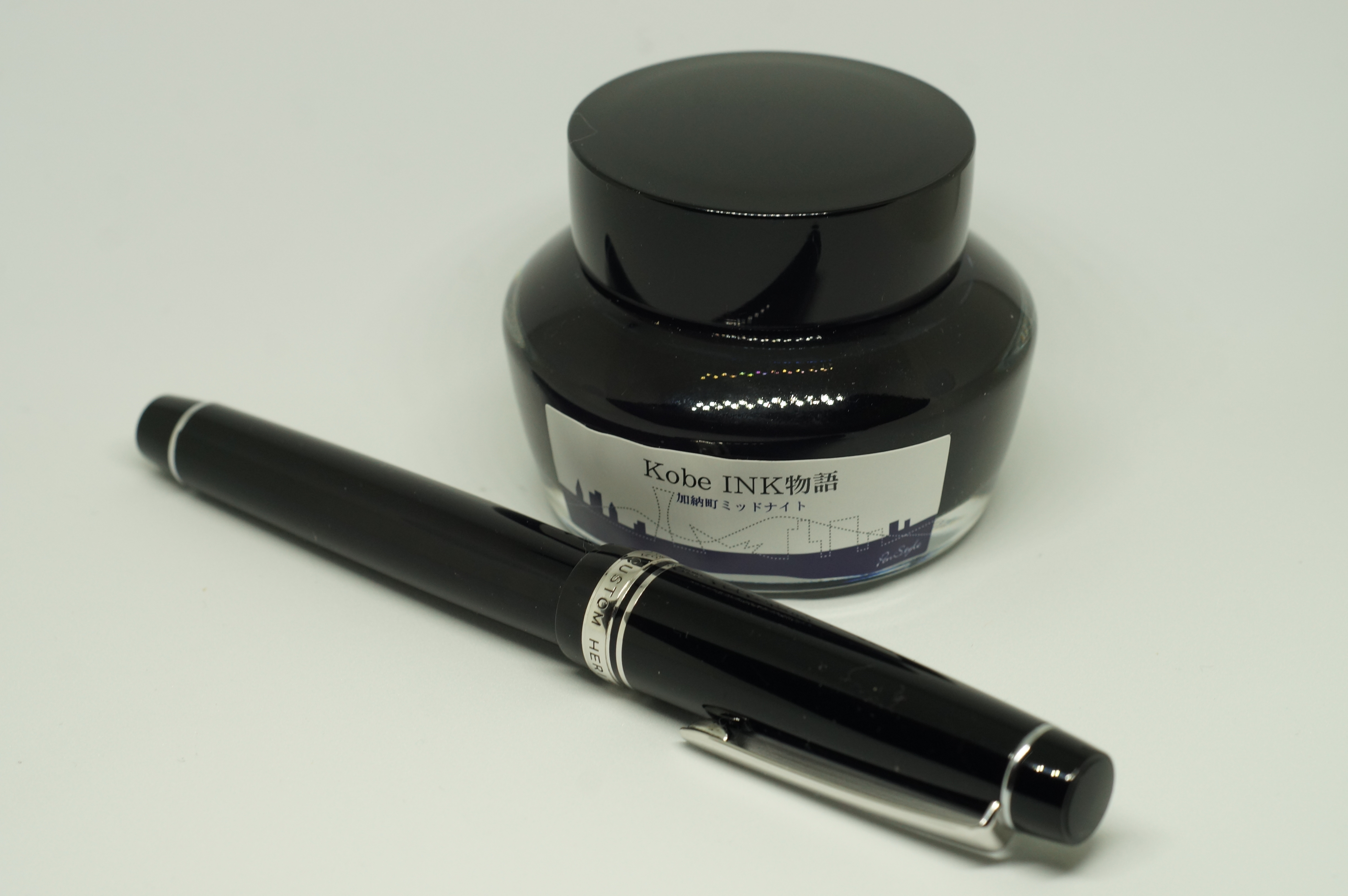
Like writing with liquid darkness.
If I’m honest, this is the only pen I own where there wasn’t a doubt in my mind about inking it. It’s my favourite pen, my favourite nib. Also, the only flex nib on the list — the Elabo comes a poor second.
I love Sailor inks (Sailor makes all of Kobe’s inks): they’re wet, saturated, and usually interesting colours. Midnight is no exception. It’s so wet I can’t take advantage of the 912’s fine point to write small caps. And although it’s really a dark purple, this ink comes through as close enough to black that most people wouldn’t notice. So, no need for a black ink in my last two places.
If my bottle of Ink of Witch had arrived, there would be serious competition. Fortunately, it hasn’t. And I only remembered that I owned Sailor Shigure after inking with Midnight. The only other competition? One of my true blacks, like Kiwa-Guro or Aurora Black.
#5: Lamy 2000 medium, KWZ Gummiberry
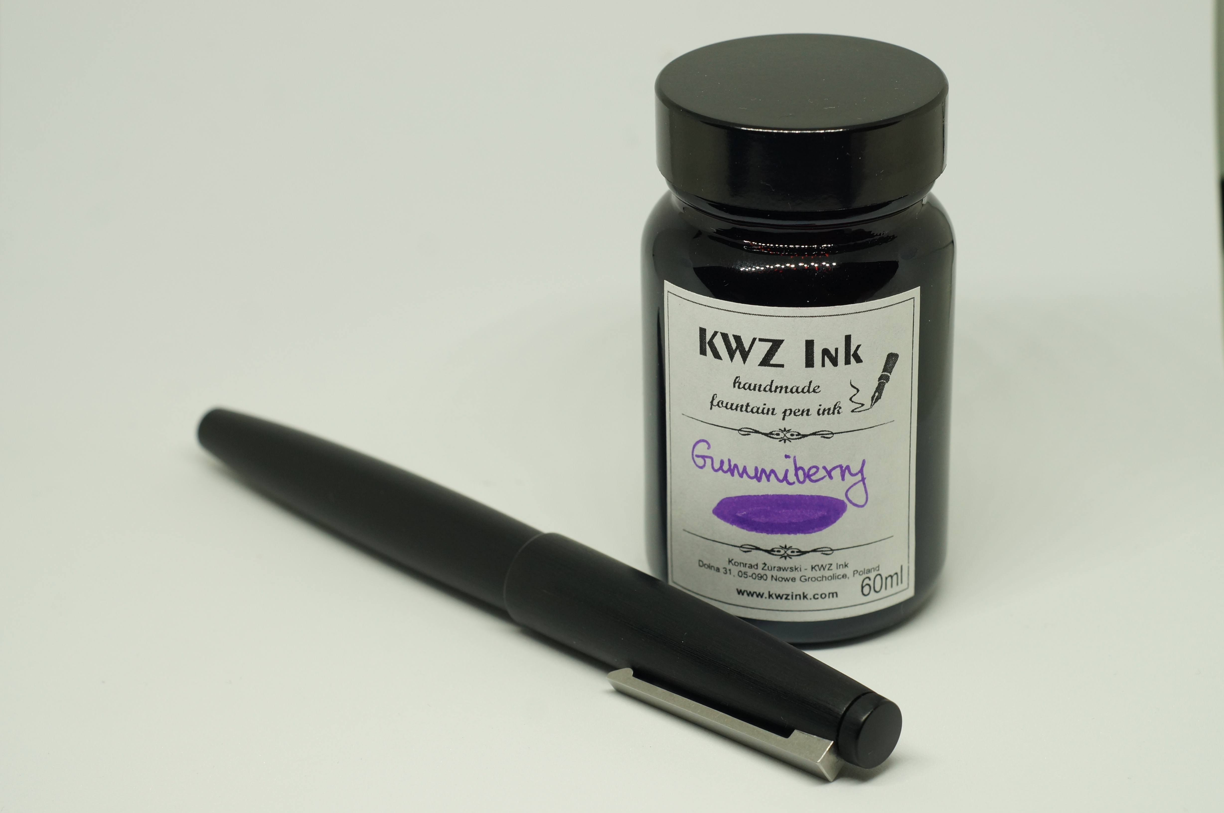
Dark and utilitarian outside. Inside, a pop of colour.
I thought twice about inking the 2000. It holds a fuckton of ink, which means I can get bored before running it dry, and then it feels like a chore to use. It’s also a pain in the arse to flush, and doubly so when you’ve had a red-based ink like Oku-Yama in there for weeks. Ask me how I know. But ultimately it’s just such a design icon, so reassuringly made, that I couldn’t leave it on the shelf.
The 2000 is a big, hefty piston filler. So, another nail in the coffin of the M205 (piston filler) and Gist (hefty and curvy).
The list so far has two blues, a black and a brown. Pretty dull. Time to brighten things up a bit. I’d just flushed out Oku-Yama, so that’s out. But something purple would be good. At the more regal end of the spectrum I have Diamine Imperial Purple. At the other end, Montblanc’s Lavender Purple. In the middle, KWZ’s Gummiberry: super saturated, wet and fun to use.
#6: TWSBI Vac Mini with FPnibs cursive italic, Akkerman #28 Hofkwartier Groen
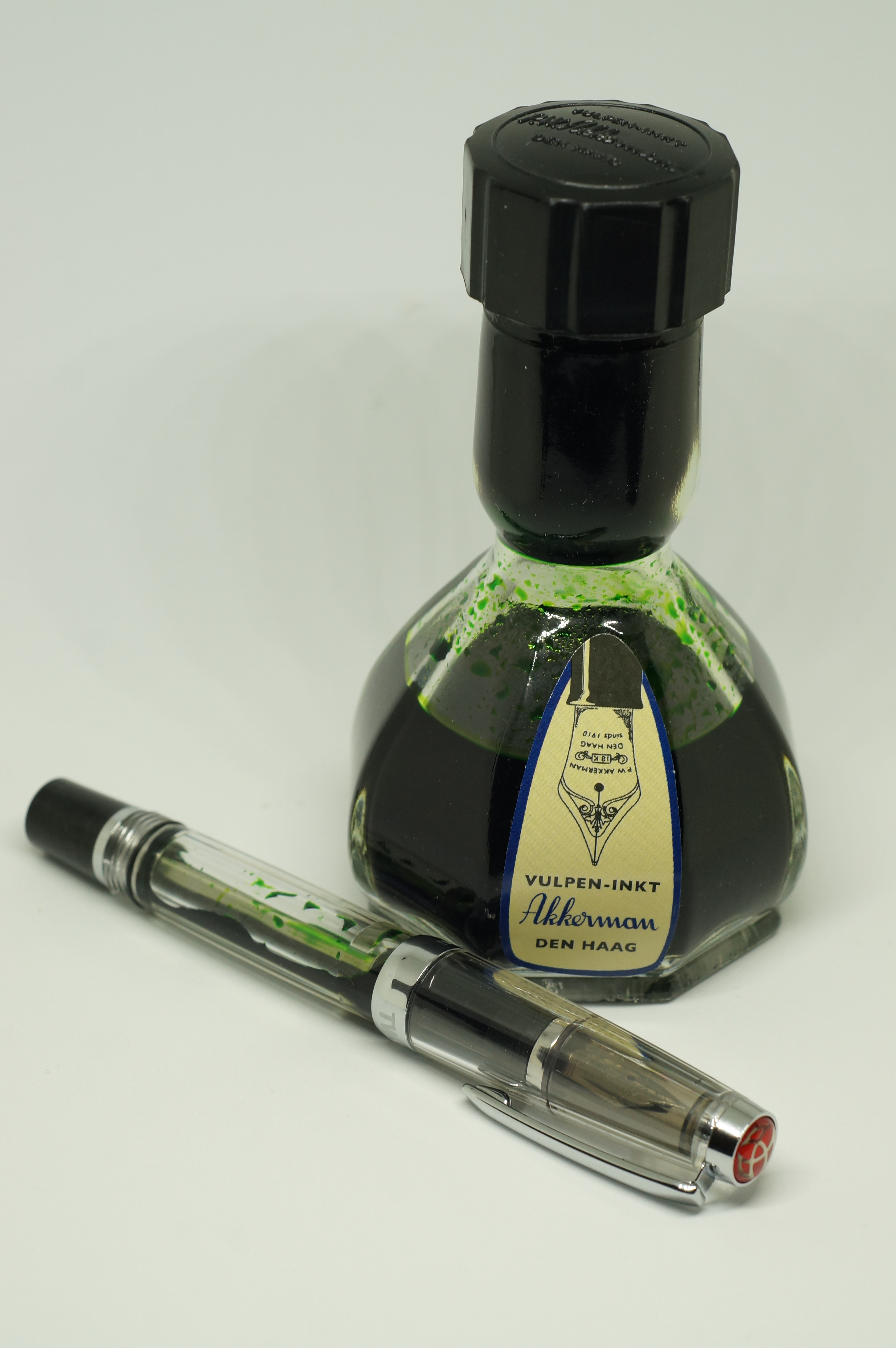
My fresh italic. A great pairing of unusual designs.
One thing the list is missing so far is an interesting nib. I’ve got a few: Al Sport with Architect grind; Franklin-Christoph 45 with 1.1 stub; Esterbrook with relief, 3776 with music nib. But the one that leapt out (and wasn’t discounted for other reasons) was the Vac Mini with cursive italic. Yes, that means I’ve got two demonstrators in the list, and hell, I don’t even like demonstrators all that much. But this is right up there in my top three nibs, and it’s practical for daily use, unlike, for instance, the Platinum Music nib. Also adds another filling mechanism to the list.
What about the ink? I’m still missing anything from the red/orange/yellow end of the spectrum, and crying out for me was one of my favourite inks, Diamine Ancient Copper. Close behind, Autumn Oak, which I’d just flushed from the Pelikan M205. And since this is the last slot, I’m also notably missing a grey — and I’d just had such a nice run in the 912 with Iroshizuku Fuyu Syogun (old man winter) that I was seriously tempted to give that another spin. But, ultimately, I settled on green, and on the bright but very usable Hofkwartier Groen.
Final thoughts
So that’s the list done. A few difficult choices, like not using any of my Platinum 3776s. Like admitting to myself that I just don’t like the soft-medium Elabo nearly as much as the 91 or the 912. Like leaving out a few favourite inks and manufacturers, such as Diamine.
But I think I managed to get a good balance:
- Nibs: two fine, one fine medium, one medium, one flex, one italic; four gold, two steel.
- Manufacturers: one English, one Taiwanese, one American, one German, two Japanese (both Pilot).
- Ink brands: six, representing Netherlands, Poland, Japan (two), Germany, France.
- Filling mechanisms: vacumatic, cartridge, twist converter, button converter, piston, piston vac filler.
- Colours: aside from two blue-ish inks, no repetitions; only red and grey notably missing from the list.
So I’m happy with my choices. And, after that amount of thought, I’d bloody better be.
0 Comments
2 Pingbacks