“Why do you need so many inks?”
I’m an ink addict. If I include cartridges and samples, I’ve got over 40 inks. More than I could use up in ten years. And I keep wanting to buy more.
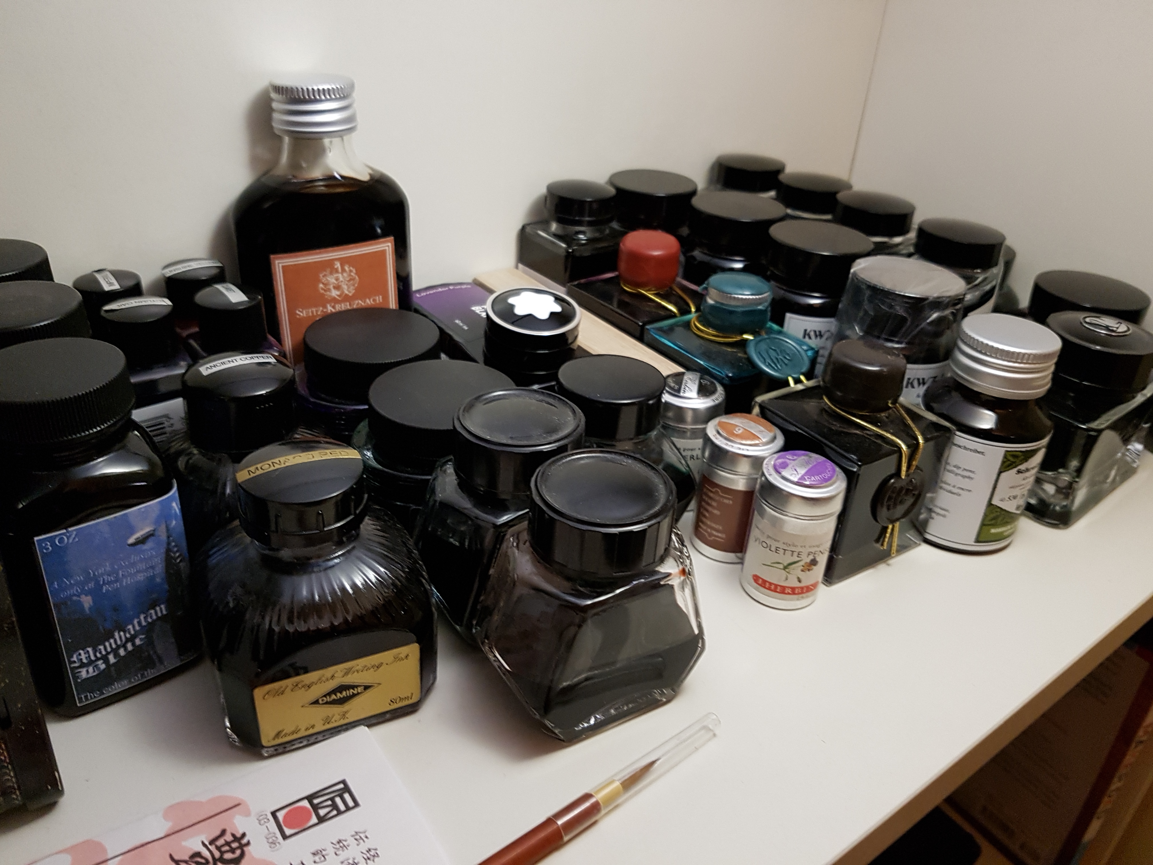
(Part of the collection)
Why?
Most people are happy with black, or blue, their whole lives. Couldn’t I just be happy with one of each colour? Say, a red, a green, a purple…
Nope.
Like a fool, I’m hunting for the perfect ink. And not just one perfect ink — the perfect blue. The perfect purple. And so on.
That’s not a simple task.
Hunting perfection
It’s particularly difficult because there are an infinite number of colours. And colour is just one attribute of fountain pen inks! There’s also sheen, saturation and shading, the magic properties that turn a flat colour into beautiful depth and detail.
There’s flow and lubrication, which can turn a scratchy nib into a smooth glide. Nowadays there’s the addition of glittery particles and scent. There’s drying time, feathering, water-resistance, pH and bleed-through, practical properties that can mean the difference between smeared frustration, hard starts, and happiness. And then there’s the bottle and the price (hey, it works for whisky and perfume…).
Invariably variable
The hunt for the perfect ink is complicated by the fact that (especially from smaller manufacturers) every bottle of ink is slightly different, and can sometimes produce startlingly different results depending on the nib and the paper. Generally a broad, wet nib on non-absorbent paper will produce the darkest, most saturated line with the most sheen; a dry extra fine on absorbent paper will leave a faint line.
Even handwriting can have an effect. Then there’s lighting…
Put all this together, and looking for the perfect ink is like chasing a mirage.
So it’s a good thing that we don’t have to find all the perfect inks!
Narrowing the field… really?
I’ve got a couple of blacks and a couple of greys, but generally only use them as a palette-cleanser between brighter colours. Browns tend to disappoint me. Waterman Havana? Not bad. Caroube de Chypre? Didn’t live up to the hype.
I’m not big on greens. I’ve got a couple (well, six), but I generally don’t find myself using them. Iroshizuku Chiku Rin is a lovely grass green, but too pale in all but the wettest nib. Noodler’s Eel Green scares me. Private Reserve Sherwood Green leaves me cold. Conway Stewart is dull except in my flex nibs. Herbin Emerald of Chivor is lovely, but it’s far more complicated than just a straightforward green, both in colour, sheen and its gold particles. And part of what makes R&K Alt Goldgrun so compelling is trying to work out exactly where on the spectrum it falls — it’s got so much shading, it can be anywhere from lime to forest green.
I’m not big on reds, either. I’ve got a couple, but I prefer oranges, particularly interesting ones that shade, or sit between orange and brown (like S-K Cognac or KWZ Honey), orange and yellow (like Diamine Autumn Oak), or orange and red (like Diamine Ancient Copper). In fact, there’s always something a bit special about an ink that won’t sit neatly under a simple label.
Purples are much more my bag. I’ve got Mont Blanc Lavender Purple, Kaweco Summer Purple, Lamy Dark Lilac, Diamine Imperial Purple, Herbin Violet Pensee, KWZ Gummiberry — and that’s before you get to the purple-blues like Private Reserve Tanzanite, or the purple-reds like Sailor Oku-Yama. Purple has a richness and saturation that I love.
But it’s the fine line between blue and green — the teals, turquoises and so on — that I’m most drawn to. Sailor Yama Dori is my long-time favourite ink, but it’s been joined by Pelikan Aquamarine, Iroshizuku Ama Iro and Ku Jaku… all charming, tantalising, and excellent shaders. They’re just interesting colours.
For a long, long time pure blue was not interesting to me. Blue was the colour of school, of Bic ballpoints, and I’d grown allergic. I’m still not quite there, but I’m on my way to rehabilitation.
Tsuki-Yo is dark, smoky, a blue for the night-time. It should be, for an ink called ‘Moonlight’. KWZ Azure #5 is like an oil slick, uninterrupted and deep, smooth and saturated — like a school blue cartridge turned up to 11. Noodler’s Manhattan Blue is similar, but with the added allure of being exclusive to a single retail store in Manhattan, with a historical back story (and as Lamy’s Dark Lilac proved in 2016, limited editions provoke ink addicts into a frenzy).
I’ve been looking at some of the other Iroshizuku blues to expand my collection — perhaps Kon Peki, or Asa Gao. But I’m not sure they’re different enough.
What counts as a duplicate?
Which brings me on to why I started to write this post in the first place. I’ve been eyeing up Akkerman inks for a long time — partly due to the amazing bottle design, partly because they’re not widely available, and despite the fact that many believe they’re just rebranded Diamine shades. I’ve been eyeing up #28, a saturated green that looks amazing on Instagram (remember, I’m not that into greens… but perhaps this could be the one?!). #11 is a rich turquoise (a bit darker than Ama Iro… maybe a step closer to perfect?!).
But it’s amazing how many matches I can find for inks I’ve already got. #9 looks like Tsuki-Yo. #24 looks like Aquamarine. #22 looks like Cognac. #8 looks like Yama Dori. #6 looks like Imperial Purple. I guess I shouldn’t buy an ink that seems like a duplicate for one I’ve already got.
But you never can tell from swatches. Maybe I should order them just to be sure?
I don’t have that many, but the syndrome is the same. Constantly searching for the, in my case, perfect blue. There’s a bottle of asa-gao in the mail somewhere … maybe that will be It! I’m not drawn to blues with too much green in them. Just got a bottle of Diamine’s Blue Velvet, and I’m not sure I like it. There’s also a sample vial of the Akkerman green colour you mentioned, in the mail. Green is iffy. I like Moss Green from Graf von Faber-Castell.
Heh, blue-greens may be my favourite but if it goes too far towards green it puts me off! The soft minty greens in particular.
Blue velvet looks great to me – super saturated, very much like the Azure #5 I mention in the review. Different strokes…!
Let me know how you get on with Akkerman 28 and I’ll check out Moss Green – thanks for the tip!
Oh, and by the way … Edelstein Topaz is very similar looking to Iroshizuku kon-peki … not the same lovely sheen as the latter, though 🙂